Pitchers and catchers haven't reported yet but we can pretty much say baseball season has arrived as the first release of the year has made its way onto the shelves. Thanks to
my wife bringing home a blaster for me the other night, I finally have some to scan and digest. Let's take a look at the 2014 Topps Series 1 design offerings.
I've mentioned it
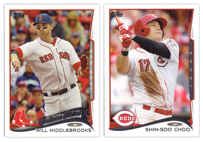
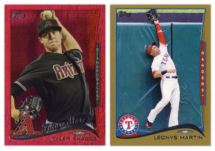
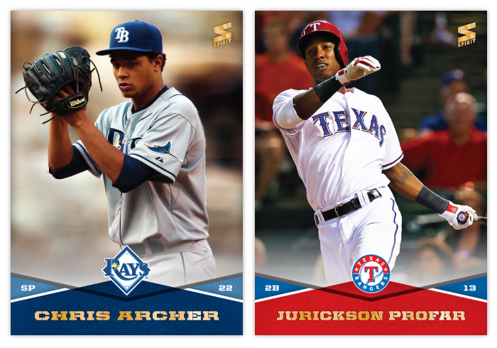
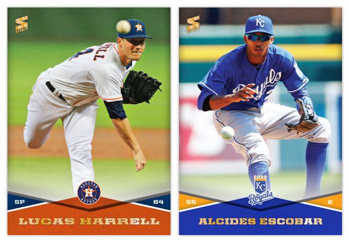
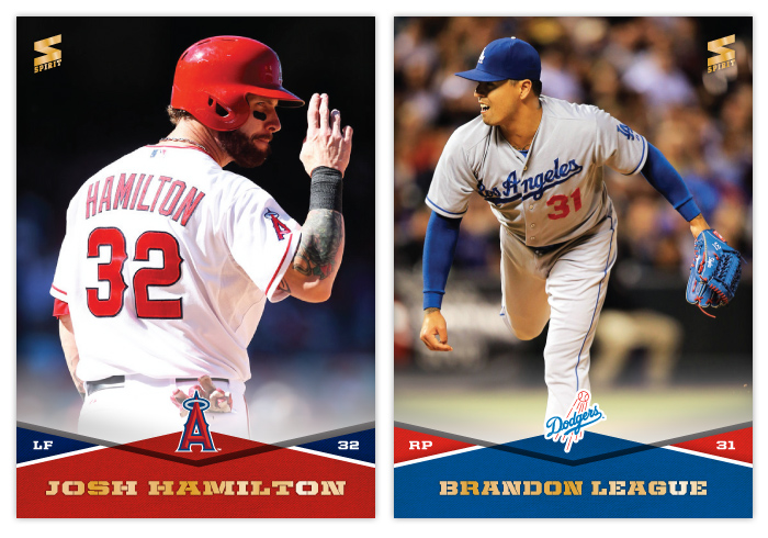
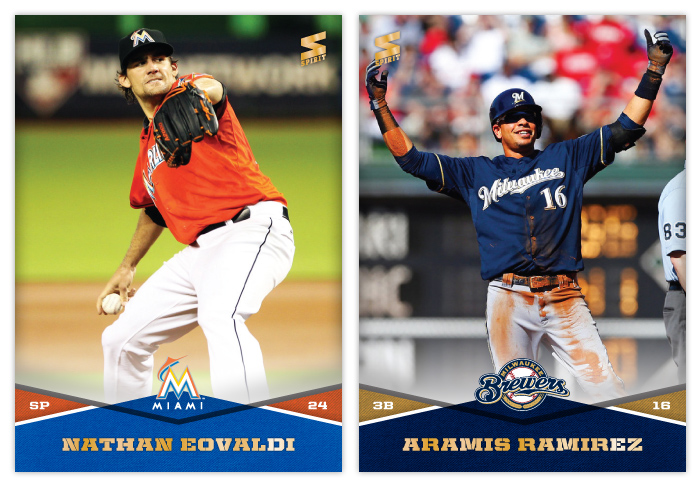
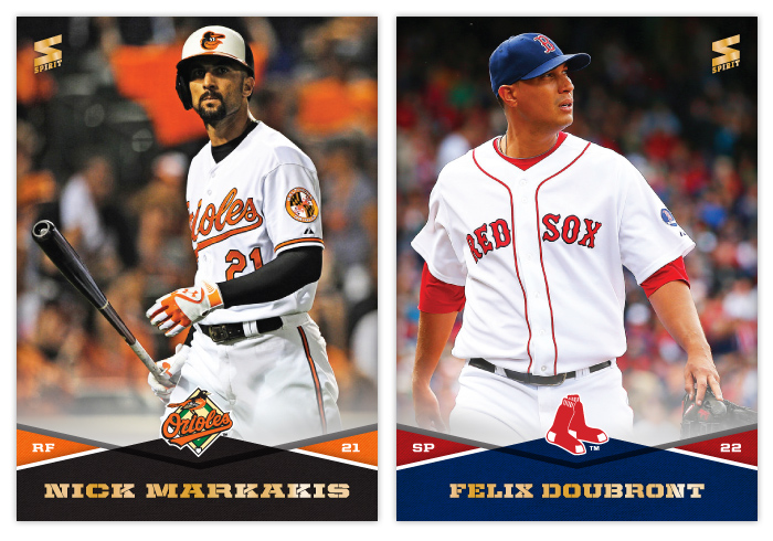
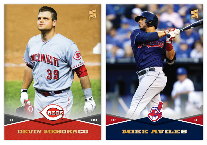
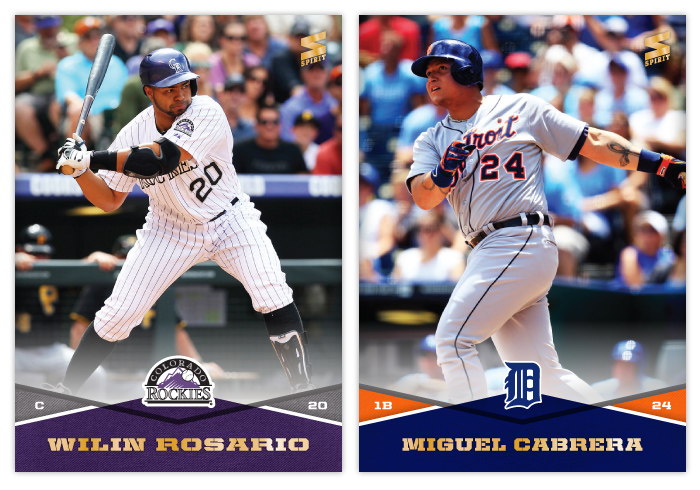
before but I'll reiterate that I'm not a fan of the base design. The white borders are back. Even though I know it's only so Topps can go parallel-crazy like they always do, I don't have a problem with the white borders. When you move onto to basically every other design element, that's where the problems start to pop up. The biggest offender here is the foil wave at the bottom. Outside of Nike, swooshes need to leave the visual landscape. They've been
overused for the last 5-10 years.
Even worse than the wave's existence is its execution. The tapering of
the curves on each end are unbalanced. Plus the angles themselves are
all wonky. Look at the Middlebrooks card above. His name is so long that
it overlaps the foil wave since they didn't allow enough room for it to
run across unfettered. Then squeezed between the name and the swoosh is a little oval to house the player position. I think it's nice that they included the position again this year but it looks sooo cramped between these two elements. Behind the foil wave is a team-color wave that's an extension of the photo border around the rest of card. It's a nice way to add some more color to the design but I think it could stand to stick out a bit more. On top of that is the team logo.
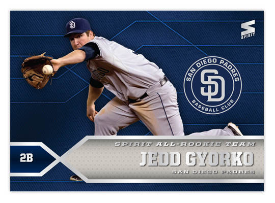
Another thing you'll notice on the Middlebrooks card is the return of the Future Stars designation.
Others have chronicled its history from the 80s through 90s and I'm not that enthusiastic about seeing it back. For some reason, Topps has found it necessary to have a theme running across its flagship release for the past 3 or 4 years. This year they're really shoving the whole rookie/young player angle everywhere as you'll see in the inserts. I can't decide which irks me more: how stale it is or how much it's an obvious case of pandering. Anyway, as far as the Future Stars logo thing, I guess it's not too bad. It fits in with the rest of the design, though it's odd how the tail of the start actually indicates it's falling.
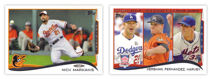
The element that seems to biggest target of most people's ire is the team name tab along the right side of the card. At first, I was like everyone else and hated it. But after seeing these cards more, I think it's actually a nice element. It's just completely out of place here with the rest of the card design and a little redundant. I think if they were to go back to the drawing board on this design, the tab would be the one thing I'd suggest they keep and work into the rest of the design.
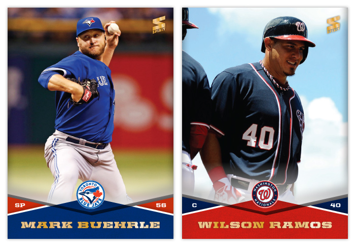
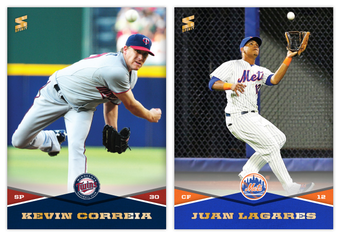
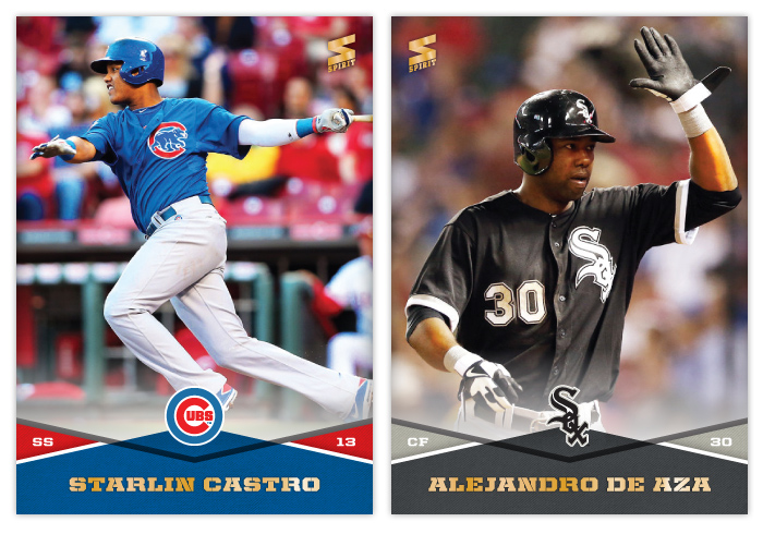
You can see on the horizontal cards that the tab doesn't encroach on the rest of the design as much and doesn't stick out in the same awkward way. There's also more space along the bottom for the player name with the wave stretched out more. It's a better overall shape, too.
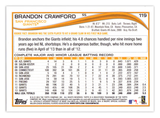
Taking a look at the back of the base cards, the format's basically the same as the last couple years have been. The card number in the upper right corner looks a little small and the player position looks like they forgot where to put it until the very last moments before going on press. About the only other things of note are the addition of WAR to the stat line (yay!) and the "Rookie Fact" tidbit (boo!).
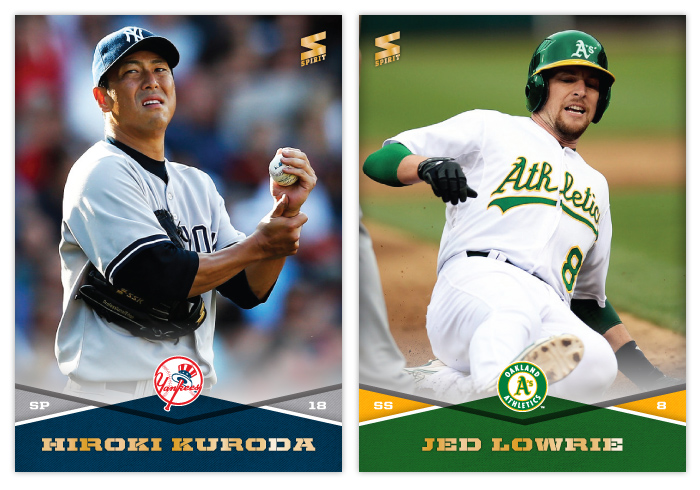
There are plenty of parallels as usual. The sparkly color for this year is red. I guess since there are so many MLB teams with red in the color schemes they'll turn out okay. The red just seems a little dull to me. Gold cards are also back because of course. Not pictured are the standard red, blue and purples from Target, Walmart and Toys 'R' Us, mostly because there's only one of those three stores in town, but also because I'm sure you all know what they look like anyway.
The newest parallel wrinkle is the addition of two new retail-only colors. The lime green actually isn't as bad as I thought it'd be when I first saw them online but the yellow is as
Fleer-tastic as you would imagine. Really not a pleasant couple of colors to feature so prominently on cards.
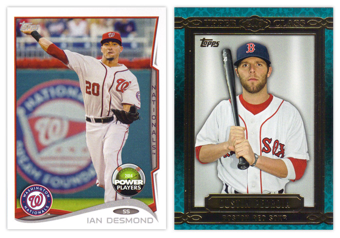
Now onto the inserts, though the Power Players cards are about half insert, half parallel. As you can see, the design is the same as the standard base cards, only the foil is just gray ink and there's a Power Players beach ball about to crest the hill. This is Topps' online component for the year. Without really knowing how the whole setup works yet, I will give them credit for at least making these somewhat collectible this year. Even after the code is redeemed, they'll still be desirable depending on the player depicted. They're less ubiquitous than the old Topps Town and Topps Attax code cards from years past, so that's another plus. The first true insert there on the right is Upper Class. This is probably the weakest insert so far this year. My first beef is with the name. I know they're nowhere near what they used to be but it seems foolish to plant even the tiniest clue to one of your competitor brands' names on your cards. I honestly have to stop myself from saying Upper Deck every time. I'm also not a fan of the design itself. The flourishes in the background are too pronounced, the colors range from teal to gray to brown without any sort of reasoning and the solid gray background is just way too plain. It makes the whole thing look rather generic. I guess the design is supposed to recall framed portraits lining a decorative wall but the drab backgrounds remove any ounce of 'class' that the rest of the design may impart. And as far as the checklist goes, pretty much every player ever is eligible to be included. Again, there's no rhyme or reason behind including anyone in particular. It's not something like the top 3 rookies from each class for the past 10 years or something like that. It's really a random crap shoot.
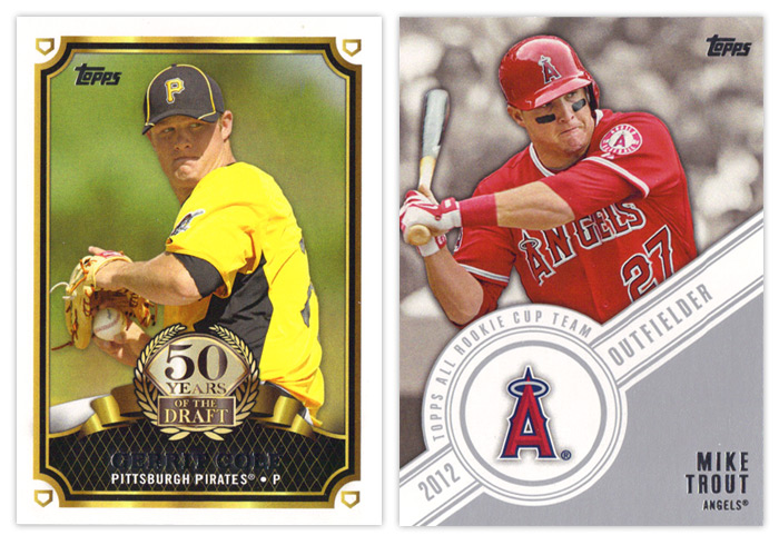
The 50 Years of the Draft insert is actually a pretty nice design. The frames are solid without being overdone, the logo part is well balanced and not too gawdy and the overall composition is nice. My only thoughts would be to make the fake gold on it actual gold foil and for the home plates in the corners to maybe be rotated so the points are all facing the corners instead of all being upright. The Topps All Rookie Cup Team design is also pretty solid but has one glaring issue. The angle of the banner should really be reduced so there's not as much wasted space above the player name. It would allow for more of the photo to be shown and not crowd the guy as much.
2012 Series 1 had a poorly conceived insert set called
Golden Greats that featured multiple cards of the same handful of legends. Topps realized how bad an idea this was and stretched out the Series 2 checklist to feature 25 other guys a single time. I wonder if they'll follow the same script for Series 2 with the Future Is Now inserts here. They have multiple cards for 13 different players here, which happen to be some of the hobby's most desirable players. Funny how that happens. Design-wise, these look very similar to a Topps football
Prolific Playmakers insert. You have the overlapping curves, the player cutouts over a dulled background. It's a nice looking design so I can't blame them for overusing it. I guess they've made enough alterations that the difference is noticeable. I do think they could do without the fake lens flare, though.
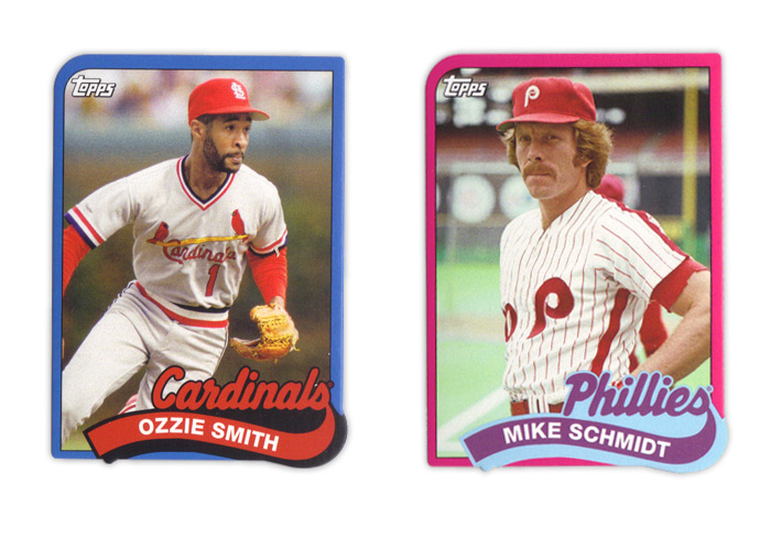
Making my blood boil are these 1989 Die-cut Minis. The 1989 Topps set was the first complete set I ever got so I'm already very protective. Somehow, Topps thought it was a good idea to cut off the margins and shrink these babies down. As I'm sure you can notice, the big issue with that is the fact that the name banner has a little notch at the bottom that hangs over the photo frame. Not only is that a problem for safely securing these while keeping the notches intact, it's just flat out ugly since the die isn't going to match up perfectly to the printing every time. That's also apparent on the bottom right corner as well. I've mentioned it before but I really hate die-cuts that don't have at least one standard corner and this is a perfect example of why. Then you add in the fact that they messed around with all the colors and the border thickness and these keep breaking my heart. Topps, please stop reusing old designs on anything other than Heritage. Please.
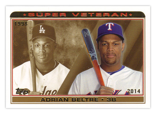
The last insert I have is the Super Veteran collection. Even though they look like a mature version of something from the 90s, I thin this is a nice simple design. Seeing how a player's looks have progressed from their rookie season to now is a kinda fun. The sepia background is nicely employed against a full-color current photo. I really have no complaints for this one.
Well that about wraps it up. I know there are more things out there than what I happened to pull in my couple retail purchases, but you can check
last year's review if you wanna see my thoughts on the camo and pink parallels. I guess I'll boil this review down to what I like and what I don't like.
TLDR REVIEW
WHAT I LIKE:
• Horizontal design works less bad
• Addition of WAR stat
• Power Players cards are worth keeping
• 50 Years of the Draft design
• Topps All Rookie Cup Team design is good with a subtle change
• Future Is Now design
• Super Veteran design and execution
WHAT I DON'T LIKE:
• The Wave
• Player position egg
• Not holding free agents over until Series 2
• Green and yellow parallels (or most of them, really)
• Everything about the Upper Class insert
• Future Is Now concept
• Everything about the 89 Diecut Minis
• The gimmick of rookie/young player focus