Wednesday, October 31, 2012
THIS IS THE REMIX: 1986 Topps
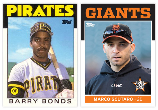
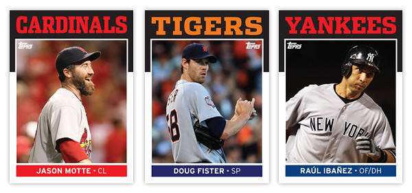
As per Rod's request, here's my stab at remixing the 1986 Topps design. And since this is my first chance to brag a bit about the Giants' World Series victory, I figured I'd feature some of the standout players from the 4 teams that made it to the LCSs this season.
Let's take a look at the original 1986 design. This is probably one of the most iconic sets for collectors of my era so I hope I'm not treading on sacred ground here. The most prominent feature is the big, funky team name over the black border. The big team name in team color is really effective but my goodness, that font... Those As and Es are from another planet. That quirkiness is probably a reason why some love this design while it's likely the reason some might hate it. No matter which side of the fence you reside, it's way past its prime here in 2012.
The rest of the design is refreshingly simple. The black border extends down the edges just a little bit more before giving way to the white border around the rest of the photo. At the bottom, the player name is set in all caps and loosely spaced to fill up the horizontal real estate. The last element is the player position tucked inside a colored circle tucked into the bottom left corner of the photo.
Now let's take a look at the updates. First up is the font up top. I went with Dispatch Black once again since it comes in a variety of widths. That flexibility helps when you have team names of varying length. The Cardinals is the condensed width while the other 3 are the standard width. It has enough personality to help it balance between boring and obnoxious. It hits the sweet spot right in the middle.
Next up is the player name found at the bottom. I wanted to add a little more color to the design so I made a rectangle at the bottom of the photo to house the player name. There's also room in there for the player position so it isn't hanging out by itself in the corner like before. There are also some minor tweaks to the border widths to help with the centering issues that plague the 1986 set.
This is probably the most subtle of my remixes so far but that's partly due to the success and simplicity of the original design. The biggest change is definitely the font up top, the most iconic feature of almost any card design from the 80s. So what's up next?
Friday, October 12, 2012
First Class
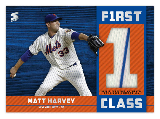
With the 2012 season winding down, we continue looking ahead to 2013. On top of having a triple crown winner, 3 perfect games thrown and 4 other no-hitters, 2012 will probably be remembered for one of the best class of rookies. We all know Mike Trout had an MVP-caliber season and Bryce Harper took some of the steps to justify all the hype. But moving even further down, there were lots of guys that put up good-to-great rookie campaigns. So how about an insert to commemorate this class?
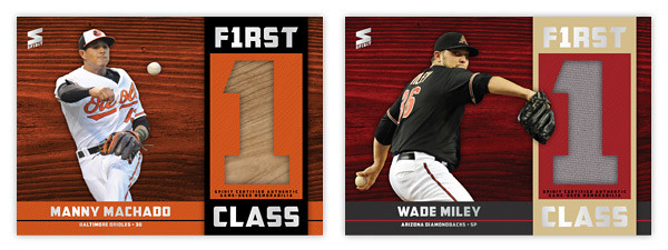
The design is horizontal with the most prominent feature probably being the box on the right with a big 1 cut out to display a relic. Just to add some variety, the position players have bat swatches while the pitchers have jersey swatches. The rest of the design is bathed in team colors with the player cutout overlapping a colored wood background. The 'FIRST CLASS' text has a 1 hiding in 'first' to really play up the number aspect of the design. There's also some silver foil to add a bit of flash.
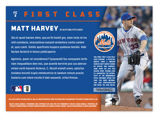
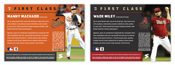
Onto the backside where we have team colors filling the majority of space with plenty of room for a summary of each player's rookie season. On the right side, we have another 1 cut out but this time housing another action shot. To the left we have the team logo along with the authenticity statement for each relic. It's less vague than what you see on Topps relic cards these days and there's even a unique code for each card that you could enter to find out specifically when each memorabilia relic was used in-game.
Along with these 3 here and Trout and Harper that were mentioned above, this set would have guys like Todd Frazier, Jesus Montero, pretty much any of the A's starting pitchers, Will Middlebrooks, Yu Darvish, Anthony Rizzo and more.
Labels:
2013,
concept,
insert,
machado,
matt harvey,
relic,
rookie,
wade miley
Subscribe to:
Comments (Atom)

