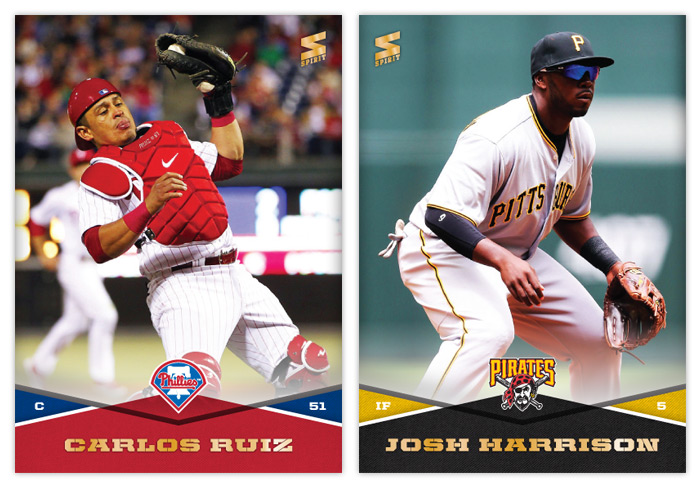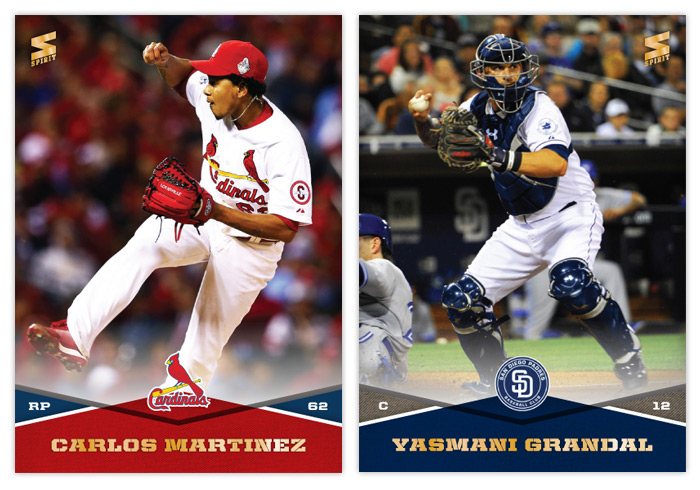
Oh, hi there. Long time no blog. Just to bring you up to speed, I'm going to make my first 2015 Spirit post some time in February. But if you don't wanna wait until then to see the 2015 design, I'm in the midst of posting a card a day on my Instagram. Once all 30 teams are up, I'll do a standard post here discussing the designs and whatnot. In the mean, I thought I'd revive the long-dormant feature known as "THIS IS THE REMIX."

1989 was right when baseball cards entered my universe. Up to that point I had acquired a few random cards from either my dad buying me packs or cousins tossing me some of their duplicates. Just stuff stacked along with my Batman trading cards. But the summer 1989 is when I started paying attention to baseball. I would look for wax at every convenient store I entered, saving up quarters and dimes to buy a pack whenever I could. There was a gas station three blocks from my house I could ride my bike to whenever I had 54 cents burning a hole in my pocket. They usually had a box of both Topps and Donruss there amongst the candy. I seemed to favor Donruss. They were more colorful than '89 Topps and they came with a freaking puzzle. How could I resist?
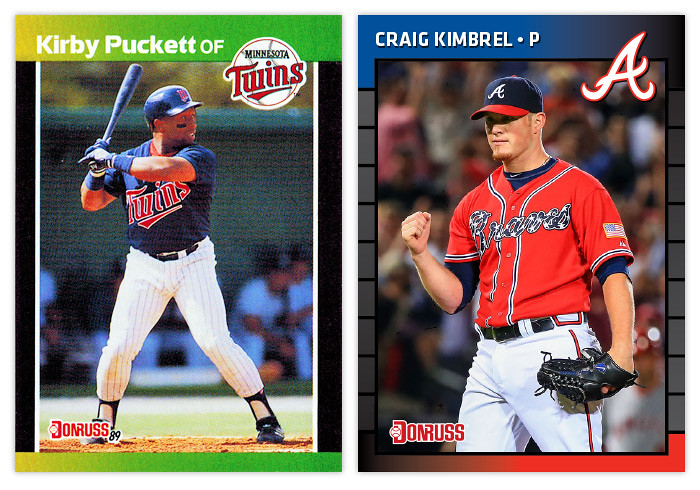
I'm not really sure if there's a consensus regarding the '89 Donruss design. Obviously it's not a masterpiece but I don't seem to recall it garnering hate like so many other designs of that period. My guess is the color strips are kind of endearing. That and the fact that it's not cluttered with unnecessary design elements like little baseballs, Super Mario tubes or paint splatters. All in all it's a pretty simple design, but there's still room for improvement.
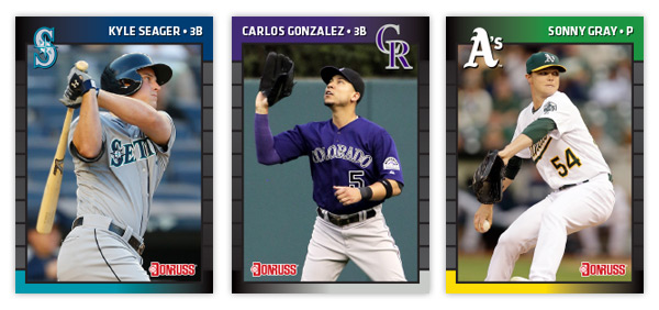
The basic build is the same but with just a few minor tweaks. We still have gradient color bars sweeping horizontally from edge to edge. My first decision was obvious – change the colors to team colors. Call me crazy but if you're gonna have the colors vary from card to card, might as well make them fit the player and their uniform. As I continued to tinker, I thought about having the top and bottom bars go opposite directions, i.e. the Braves would go red to blue on top and blue to red on bottom. It wasn't horrible but it just didn't quite work. Then I had the notion to fade each bar to black instead of the opposite team color. Perfect. It put the team colors on opposite corners and kept the whole gradient motif without affecting readability.
After having the black in the corners, I played with the tiled line edges. I made sure to lighten them up so they're visible no matter the ink saturation. On a lot of '89 Donruss cards, the edges just look solid black. Making them fade from black to a light gray would help with that and it really tied into everything else at that point.
I decided to go with team cap logos instead of their primaries. The thought behind that is to try keeping the logo from getting too big. Look at that big, boxy Braves logo from 1989. That thing takes up a lot more space than the A does. And since the logos do dip down into the photo a bit, I thought it would be best to have the option to flip the design to accommodate any particular photograph. For instance, the Mariners logo would cover up the helmet bill on Kyle Seager's card if I had gone with the normal orientation.
The final change was the picking a new typeface. After going through several, I landed on Klavika. It's definitely more modern looking than the previous font but still has some of that same "square but not really" flavor to it. I made the names all caps and just added a bullet after, followed by the player position. It really bugs me how the position is a different typeface and smaller on the '89 cards. Problem solved.
Overall I think this has been one of the smoothest remixes I've done. That probably has a lot to do with the starting point. I've always chalked my '89 Donruss fondness up to nostalgia but I'm starting think it was just a secret little gem in need of a polish.