Welcome to my second product review here. I skipped Heritage
* since the design is the same as 1963 and there were only a few inserts to mess with. That means Gypsy Queen is next up on the docket.
*For the record, I really dig the 1963 design so I think Heritage is a winner this year. My only gripes are peripherally design-related (Rookie Stars variations? No thanks.)
So far, I've only opened a blaster and a rack pack, so I don't have an example of everything in-hand, but I've seen enough pics online to have a good understanding of the designs.
Starting with the base design, it's definitely more ornate than last year. They've added some of the flourishes from last year's inserts onto the base here. All of the info has been moved to the bottom. The Gypsy Queen 'logo' is bigger but somehow blends in a little more. That's probably due to the gold neutrals on gray. There may be a little less real estate for photos, but the shots seem to be closer and more intimate, so that's an upgrade in my eyes. Comparing this year's to
last year's really makes the 2011 design look pretty drab and dull. Off to a good start with the base set.
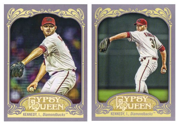
Unfortunately, the SPs this year are photo variations instead of just high-numbers at the end of the set. Right now, the problem is you only know you have an SP if you happen to pull two of the same card number but different images, like I did up there with Ian Kennedy. I'm sure eventually it'll be common knowledge which is standard and which is short-printed, but it's kind of annoying at the moment. Not only that, there are now 50 less players with a card than there should be.
A couple of parallels here are the Framed Paper. There are also a
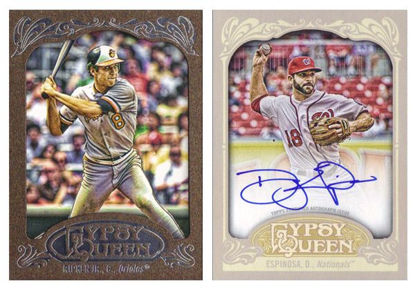
blue version and a retail-only brown version, like the Ripken here. Also a black 1/1 version for some reason. It's up in the air whether these are any nicer than last year's
copper/bronze and
green. There are also a lot of on-card autos which look really nice on this card stock and design. The white fade on these is the least noticeable on any auto card I've seen lately.
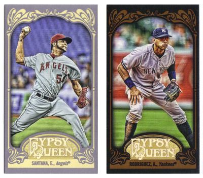
Minis this year come in regular (gray), black,
green, and
sepia. The black look really nice with the leather brown flourishes. The sepias also work better than the
2011 version.
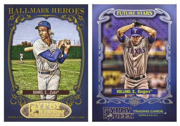
The Hallmark Heroes insert features all-time greats while Future Stars returns with up-and-coming players with bright futures. Both have blue borders, which is kind of a strange choice. Also, the logo situation on both bugs me. For the Hallmark Heroes, that shade of gold on the logo is way too light compared to the darker gold around the photo frame and the text on top. And on the Future Stars cards, not having the GQ logo centered at the bottom is really distracting since everything else is symmetrical but that.
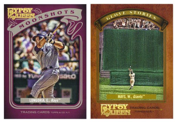
The homerun insert this year is called Moonshots.
(Hey, that sounds familiar...) The purple border is surprising and works pretty well. I like the asymmetry, especially compared to the centered-ness of every single other card in GQ. The Glove Stories design is really plain and boring. There's just not a lot going on with the photo frame, especially compared to every single other card in GQ. Maybe its the fact that leather color is too similar to the gold used for that frame. Something closer to the gold on the GQ logo here would work a little better. And what's with the cropping on this image of Mays? Why they felt it necessary to show the outfield wall and keep him so small is beyond me.

The last insert is Sliding Stars, which is kind of like this year's Sticky Fingers in that it focuses on a part of the game that doesn't get a lot of attention on cards. Also, they're both the only horizontal design in both their respective sets. This is a pretty cool design that leaves a lot of space for some great photography. The elements that do enter into the frame don't impose too much, so there isn't much obstruction on display.
Last year, we saw the Gypsy Queen inserts. This time around, they've featured the
Gypsy Kings, a mythical baseball squad. Again, they have auto variations, though I don't really get why they have fictional characters sign autographs. Oh well. It's a fun little bit of A&G without going overboard.
Rounding out the set are the hits like the
Indian Head Penny and
Relics that do a really nice job of adjusting the base design to incorporate the memorbilia. There are also the framed mini Relics and Autos that are exactly the same design as their full-size counterparts, only smaller.
All in all, the 2012 version of Gypsy Queen isn't all that different from the 2011 version. They seemed to have made some improvements here and there without really downgrading anything, so I'd consider that a success. It definitely feels less like a rehash of A&G like I was thinking last year.
Base cards: 4/5
Parallels: 4/5
Photography: 4/5
Hallmark Heroes: 3/5
Future Stars: 3.5/5
Moonshots: 4/5
Glove Stories: 2/5
Sliding Stars: 4.5/5
Gypsy Kings: 4/5
Indian Head Penny & Relic: 4/5
Minis: 4/5
OVERALL: 3.73/5