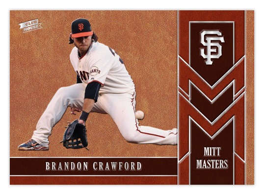
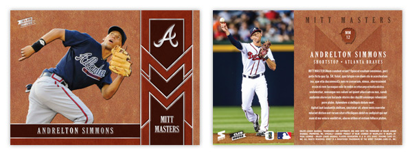
After tackling the heavy hitters of the league, let's shine a little light on some guys that flash the leather. The Mitt Masters insert features some of the league's best fielders that might not put up the offensive numbers to garner a lot of attention. Being a Giants fan, I'm keenly aware of Brandon Crawford's glovework at short. The rest of the baseball world, however, I'm not so sure. The card is almost top-to-bottom leather, or in this case cardboard with a leather texture. By adding some thickness to the stock, we're able to give all the elements a visual and tactile embossed appearance. Gloves come in all shades of leather so we' have 3 tones represented here.
The raised surfaces of all the leather spots makes way for some stamp silver foil to be pressed down. In person, these cards would be a pleasure to hold, running your fingertips across all the bumps of the images and valleys of the foil. The big cap logo in the upper right corner really stands out to my eyes.
The back may have a level surface but the full color photo on the left and the richness of the leather pattern keep things from getting dull. It's a little hard to make out here but the card number (MMxx) is found inside a mitt silhouette with an embossed look, along with the Mitt Masters logo subtly pressed below the text.
I don't know how feasible it would be, but if these cards were produced it would be nice if they could somehow be infused with a leather scent. I guess that would probably make it easy for pack searchers to sniff them out, though. I think the combination of the embossing and the leather texture along with this hypothetical odor would fit in perfectly with the Clubhouse target market.
Showing posts with label 2013. Show all posts
Thursday, August 29, 2013
2013 Clubhouse Mitt Masters
Labels:
2013,
andrelton,
brandon crawford,
Clubhouse,
concept,
defense,
emboss,
fielding,
glove,
leather
Friday, August 23, 2013
Gint-A-Cuffs V: Packs 17-24
We're heading into the final third of the box with a running score of 148. I wonder if my lucky streak will stretch another year?
PACK 17
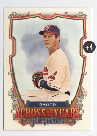
FP/ATY Trevor Bauer +4
PACK TOTAL +4
ROLLING TOTAL +152
PACK 18
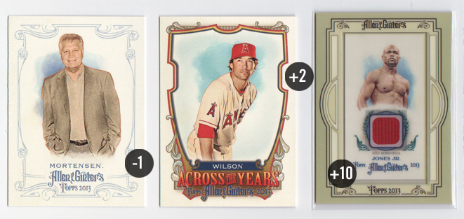
164 Chris Mortensen -1
ATY C.J. Wilson +2
Mini Relic: Roy Jones, Jr. +10
PACK TOTAL +11
ROLLING TOTAL +163
Well this is interesting. All 3 of my hits were relics but none of them came in the same format. The Roy Jones, Jr. here has a different colored frame around it. I think the light blue on the Belle is a lot more flattering. This mauve color is just way to drab here. Plus the plain borders are so far away from the ornate borders on pretty much every other card in the set. I guess the red fabric swatch is cool, though. Really makes me wonder what article of clothing it's from since boxer trunks are usually all silky and shiny, no?
PACK 19
128 Joe Mauer (FP) +2
344 Nolan Ryan (SP) +2
Martial Mastery: Zulu +3
A&G Mini: 288 Chris Davis +2
PACK TOTAL +9
ROLLING TOTAL +172
It's crazy how some packs have 4 scoring cards in them while others only offer 1. Here's my first look at the Martial Mastery cards. I like how the lack of hard borders helps the card breathe. The little logo up top is well done, too. Can't say I'm a fan of the subject matter, though. They just had a military leaders set in A&G a couple years ago.
PACK 20
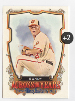
ATY Dylan Bundy +2
PACK TOTAL +2
ROLLING TOTAL +174
This doesn't look like a strong finish...
PACK 21
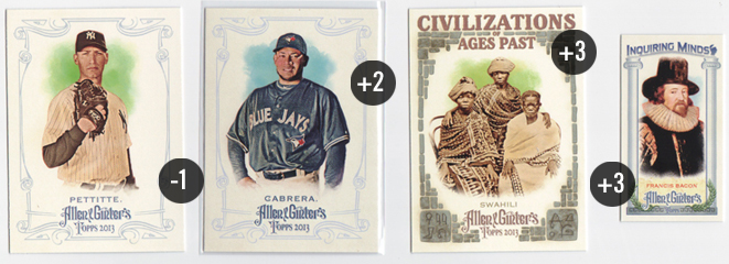
186 Andy Pettitte -1
345 Melky Cabrera (SP) +2
Civilizations: Swahili +3
Inquiring Minds: Francis Bacon +3
PACK TOTAL +7
ROLLING TOTAL +181
I tried to keep it out of my mind and avoid the jinx but there were more than a few times opening this box where I thought "man, I haven't pulled me Yankees so far." I don't know if the checklist was lighter or if I just got a lucky box but the Pettitte here was the first Yankee base card I pulled.
PACK 22
96 Jason Heyward (FP) +2
316 Hal Newhouser (SP) +2
Martial Mastery: Romans +3
SP Mini: 346 Josh Johnson +3
PACK TOTAL +10
ROLLING TOTAL +191
Hey hey, we're picking up some steam here. I feel a strong finish in the works.
PACK 23
300 Bud Selig -1
327 Yogi Berra (SP) +2 / -1 NYY = +1 total
Martial Mastery: Knights +3
PACK TOTAL +3
ROLLING TOTAL +194
Damnit, Selig!
PACK 24
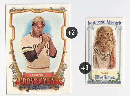
ATY Willie Stargell +2
Inquiring Minds: Plato +3
PACK TOTAL +5
GRAND TOTAL +199
And an embarrassing stagger across the finish line. Actually, 199 is basically 200 and I told myself beforehand if I get to 200, I'll be pleased. It's always fun opening a box but adding the weird scoring into the mix cranks it up exponentially. As always, thanks to Mark for organizing/running this whole crazy thing and also getting Dave & Adam's Card World on board with a Gint-A-Cuffs discount. I can't imagine all the work that goes into overseeing this year after year.
Overall, I like the 2013 Allen & Ginter designs a bit less than last year's. The whole 'theme' seems a little too loosely applied resulting in a mix of carnival and ren faire that I'm not a big fan of. I suppose there are only so many 'yesteryear' eras to cull from. It seems a bit like A&G and Gypsy Queen are on a track to meet each other head on in a few years. A lot of these ornate storybook elements are found in each, along with things that used to be A&G signatures like the minis and such. About the only distinction that remains is GQ is baseball only (minus the gypsies) and A&G is a balls-out quirkfest. The products may be built differently but the looks of each are starting to converge.
PACK 17
FP/ATY Trevor Bauer +4
PACK TOTAL +4
ROLLING TOTAL +152
PACK 18
164 Chris Mortensen -1
ATY C.J. Wilson +2
Mini Relic: Roy Jones, Jr. +10
PACK TOTAL +11
ROLLING TOTAL +163
Well this is interesting. All 3 of my hits were relics but none of them came in the same format. The Roy Jones, Jr. here has a different colored frame around it. I think the light blue on the Belle is a lot more flattering. This mauve color is just way to drab here. Plus the plain borders are so far away from the ornate borders on pretty much every other card in the set. I guess the red fabric swatch is cool, though. Really makes me wonder what article of clothing it's from since boxer trunks are usually all silky and shiny, no?
PACK 19
128 Joe Mauer (FP) +2
344 Nolan Ryan (SP) +2
Martial Mastery: Zulu +3
A&G Mini: 288 Chris Davis +2
PACK TOTAL +9
ROLLING TOTAL +172
It's crazy how some packs have 4 scoring cards in them while others only offer 1. Here's my first look at the Martial Mastery cards. I like how the lack of hard borders helps the card breathe. The little logo up top is well done, too. Can't say I'm a fan of the subject matter, though. They just had a military leaders set in A&G a couple years ago.
PACK 20
ATY Dylan Bundy +2
PACK TOTAL +2
ROLLING TOTAL +174
This doesn't look like a strong finish...
PACK 21
186 Andy Pettitte -1
345 Melky Cabrera (SP) +2
Civilizations: Swahili +3
Inquiring Minds: Francis Bacon +3
PACK TOTAL +7
ROLLING TOTAL +181
I tried to keep it out of my mind and avoid the jinx but there were more than a few times opening this box where I thought "man, I haven't pulled me Yankees so far." I don't know if the checklist was lighter or if I just got a lucky box but the Pettitte here was the first Yankee base card I pulled.
PACK 22
96 Jason Heyward (FP) +2
316 Hal Newhouser (SP) +2
Martial Mastery: Romans +3
SP Mini: 346 Josh Johnson +3
PACK TOTAL +10
ROLLING TOTAL +191
Hey hey, we're picking up some steam here. I feel a strong finish in the works.
PACK 23
300 Bud Selig -1
327 Yogi Berra (SP) +2 / -1 NYY = +1 total
Martial Mastery: Knights +3
PACK TOTAL +3
ROLLING TOTAL +194
Damnit, Selig!
PACK 24
ATY Willie Stargell +2
Inquiring Minds: Plato +3
PACK TOTAL +5
GRAND TOTAL +199
And an embarrassing stagger across the finish line. Actually, 199 is basically 200 and I told myself beforehand if I get to 200, I'll be pleased. It's always fun opening a box but adding the weird scoring into the mix cranks it up exponentially. As always, thanks to Mark for organizing/running this whole crazy thing and also getting Dave & Adam's Card World on board with a Gint-A-Cuffs discount. I can't imagine all the work that goes into overseeing this year after year.
Overall, I like the 2013 Allen & Ginter designs a bit less than last year's. The whole 'theme' seems a little too loosely applied resulting in a mix of carnival and ren faire that I'm not a big fan of. I suppose there are only so many 'yesteryear' eras to cull from. It seems a bit like A&G and Gypsy Queen are on a track to meet each other head on in a few years. A lot of these ornate storybook elements are found in each, along with things that used to be A&G signatures like the minis and such. About the only distinction that remains is GQ is baseball only (minus the gypsies) and A&G is a balls-out quirkfest. The products may be built differently but the looks of each are starting to converge.
Labels:
2013,
a and g,
Allen Ginter,
Gint-a-cuffs,
review
Thursday, August 22, 2013
Gint-A-Cuffs V: Packs 9-16
Let's get round 2 started. To recap, after the first 8 packs yielded 2 of my hits, my running total is +91.
PACK 9
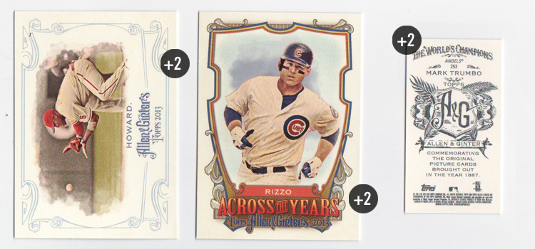
247 Ryan Howard (FP) +2
ATY Anthony Rizzo +2
A&G Mini: 253 Mark Trumbo +2
PACK TOTAL +6
RUNNING TOTAL +97
PACK 10
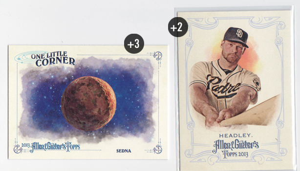
336 Chase Headley (SP) +2
One Little Corner: Sedna +3
PACK TOTAL +5
ROLLING TOTAL +102
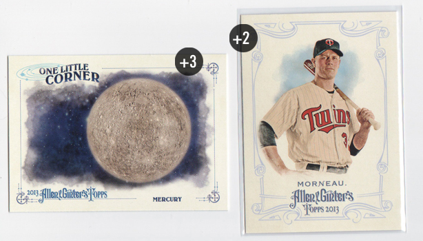
The One Little Corner cards feature 'one little corner' of universe, depicting either a particular planet, star or other celestial object. The design is nice and all but it's hard to get excited about these drawings of homogenous spheres. I think maybe constellations would be a bit more interesting. Maybe next year...
PACK 11
324 Justin Morneau (SP) +2
One Little Corner: Mercury +3
PACK TOTAL +5
ROLLING TOTAL +107
PACK 12
282 Tim Lincecum (MFP) +4
ATY David Ortiz +2
First Americans: Sioux +3
PACK TOTAL +9
ROLLING TOTAL +116
Hello, Timmy. Even after the ups and downs of his last season and a half, I still get excited when I pull a Timmy from a pack. Even a base card like this. I also got my first look at the First Americans minis. I really like these cards. The design is clean and solemn yet still has an organic feel. Living in Oklahoma, this might be a set I try putting together.
PACK 13
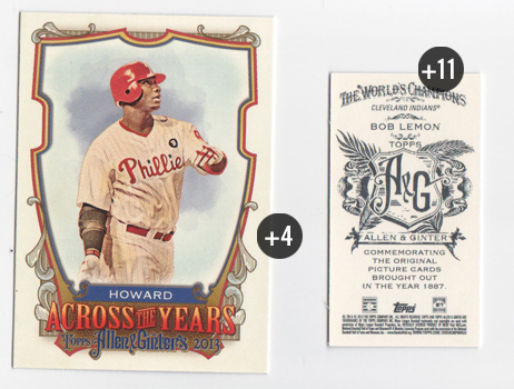
ATY Ryan Howard (FP) +4
A&G NNO: Bob Lemon +11
PACK TOTAL +15
ROLLING TOTAL +131
I wonder how many people have these no-numbers in their possession but have no clue.
PACK 14
332 Cole Hamels (SP) +2
One Little Corner: Eris +3
Black Mini: 291 Edwin Encarnacion +3
PACK TOTAL +8
ROLLING TOTAL +139
PACK 15
ATY Jayson Werth +2
PACK TOTAL +2
ROLLING TOTAL +141
And now we're feeling the affects of pulling 2 hits in the first 8 packs...
PACK 16
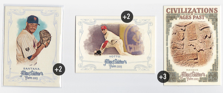
59 Joey Votto (FP) +2
325 Johan Santana (SP) +2
Civilizations: Mayans +3
PACK TOTAL +7
ROLLING TOTAL +148
After 16 packs, I'm 8 points off my pace from last year's contest. Who knows what's in store? (I do)
PACK 9
247 Ryan Howard (FP) +2
ATY Anthony Rizzo +2
A&G Mini: 253 Mark Trumbo +2
PACK TOTAL +6
RUNNING TOTAL +97
PACK 10
336 Chase Headley (SP) +2
One Little Corner: Sedna +3
PACK TOTAL +5
ROLLING TOTAL +102
The One Little Corner cards feature 'one little corner' of universe, depicting either a particular planet, star or other celestial object. The design is nice and all but it's hard to get excited about these drawings of homogenous spheres. I think maybe constellations would be a bit more interesting. Maybe next year...
PACK 11
324 Justin Morneau (SP) +2
One Little Corner: Mercury +3
PACK TOTAL +5
ROLLING TOTAL +107
PACK 12
282 Tim Lincecum (MFP) +4
ATY David Ortiz +2
First Americans: Sioux +3
PACK TOTAL +9
ROLLING TOTAL +116
Hello, Timmy. Even after the ups and downs of his last season and a half, I still get excited when I pull a Timmy from a pack. Even a base card like this. I also got my first look at the First Americans minis. I really like these cards. The design is clean and solemn yet still has an organic feel. Living in Oklahoma, this might be a set I try putting together.
PACK 13
ATY Ryan Howard (FP) +4
A&G NNO: Bob Lemon +11
PACK TOTAL +15
ROLLING TOTAL +131
I wonder how many people have these no-numbers in their possession but have no clue.
PACK 14
332 Cole Hamels (SP) +2
One Little Corner: Eris +3
Black Mini: 291 Edwin Encarnacion +3
PACK TOTAL +8
ROLLING TOTAL +139
PACK 15
ATY Jayson Werth +2
PACK TOTAL +2
ROLLING TOTAL +141
And now we're feeling the affects of pulling 2 hits in the first 8 packs...
PACK 16
59 Joey Votto (FP) +2
325 Johan Santana (SP) +2
Civilizations: Mayans +3
PACK TOTAL +7
ROLLING TOTAL +148
After 16 packs, I'm 8 points off my pace from last year's contest. Who knows what's in store? (I do)
Labels:
2013,
a and g,
Allen Ginter,
Gint-a-cuffs,
review
Wednesday, August 21, 2013
Gint-A-Cuffs V: Packs 1-8
BOXTOPPER
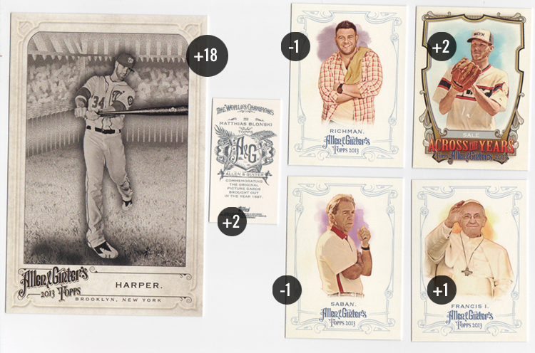
OBBH: Bryce Harper (FP) +18
PACK 1
119 Adam Richman -1
217 Pope Francis +1
244 Nick Saban -1
ATY Chris Sale +2
A&G Mini: 259 Matthias Blonski +2
PACK TOTAL +3
RUNNING TOTAL +21
I got off to hot start with last year's boxtopper. This year's didn't quite match it but pulling Harper from the Favorite Player list is a nice bonus. These are nicer than the N43s from 2012 though the checklist is a bit small.
I was definitely a bigger fan of last year's Art Deco look than 2013's medieval bigtop feel. The Allen & Ginter's logo is a tad too large and all the light, scroll-y borders take a up a little too much focus. The two combined scream 'college-town head shop' to me. The pictures and paint daubs look the same as ever but don't really fit in with the rest of the elements.
PACK 2
122 John Jay (FP) +2
333 John Kruk (SP) +2
A&G Mini: 239 Craig Kimbrel +2
Civilizations: Olmecs +3
PACK TOTAL +9
RUNNING TOTAL +30
The Civilizations of Ages Past really sticks out here around the rest of set. If the cobbled border were a lot lighter and the typeface was a bit more subtle, I'd probably really dig the cards. As is, those elements really jump out and not in a good way.
PACK 3
341 Ozzie Smith (SP) +2
307 Darwin Barney (SP) +2
Palaces: Mysore +3
A&G Mini: 129 Miguel Montero +2
PACK TOTAL +9
RUNNING TOTAL +39
Huh, can't say I've ever pulled 2 SPs in the same pack before. Hopefully they behaved themselves in the wrapper.
PACK 4
99 Barry Zito (FT) +1
Black Mini: 18 Matt Harrison +3
ATY: Robinson Cano +2 / -1 NYY = +1 total
PACK TOTAL +5
RUNNING TOTAL +44
I do like the black-bordered mini's this year. 2012's didn't really stand out as much so it's nice to see Topps return to more ink coverage. The expansive insert set this year is Across the Year's which features some historical trivia as it relates to the players' birthdays. I really like the concept here since so much of A&G is about history. One complaint, though, is the numbering system. I understand when they throw the players' initials onto relic and auto numbers but I really don't get the reasoning here. They always have a 100-card insert set. What's wrong with ATY1-100? Or even a chronological numbering system since each card has its own unique date? As far as the design goes, it's definitely bold and the shield looks like something Topps would love to die-cut. All the text at the bottom gets a little muddled, especially the blue A&G logo on that gold color.
PACK 5
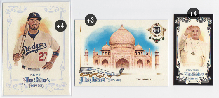
319 Matt Kemp (FP/SP) +4
Black Mini: 217 Pope Francis +4
Palaces: Taj Mahal +3
PACK TOTAL +11
RUNNING TOTAL +55
Hey look, Black Francis! The Palaces & Strongholds design matches the base design much better. The asymmetry is really nice.
PACK 6
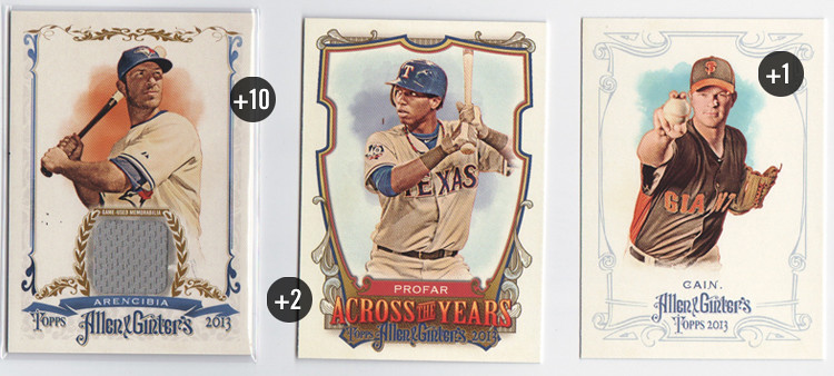
241 Matt Cain (FT) +1
ATY Jurickson Profar +2
Full-Size Relic: J.P. Arencibia +10
PACK TOTAL +13
RUNNING TOTAL +68
Okay, here's my first hit of the box. New this year are full-size relic cards. You get a little more 'relic' size-wise but I think the penalty is a card that doesn't look as good. I'm still on the fence as to whether or not a different design than the base design is necessary. The elements are pretty similar between the two. In fact, if you remove the relic portion, I could see this as the runner-up design from their brainstorming sessions.
PACK 7
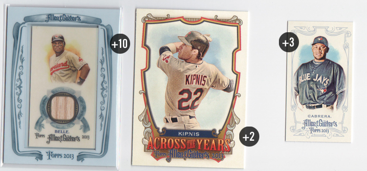
ATY Jason Kipnis +2
SP Mini: 345 Melky Cabrera +3
Mini Relic: Albert Belle +10
PACK TOTAL +15
RUNNING TOTAL +83
And the hits keep coming. This Albert Belle bat relic is in the traditional A&G mini format with the big honkin' frame. The frames this year aren't the kaleidoscopic wonders from years past but I do think they're nicer than the black borders from last year. I would've been soooo excited to pull this card 20 years ago.
PACK 8
347 Steven Strasburg (SP) +2
Palaces: Forbidden City +3
Inquiring Minds Mini: Sun Tzu +3
PACK TOTAL +8
RUNNING TOTAL +91
My first mini insert comes from the Inquiring Minds collection. The ionic columns and olive leaves work for Greek thinkers but look off for Sun Tzu here. I guess if you have to represent a singular age of great thinking from history, the Greeks probably have the most recognizable imagery. All in all, I like the design just fine.
A third of the way through the box and I'm ahead of last year's pace. Unfortunately, I've pulled 2 of my 3 hits so I anticipate these numbers to trend down a bit. Also, I forgot to track my non-scoring cards from each pack so I hope I don't get docked for that. *SPOILER ALERT: it won't matter*
Labels:
2013,
a and g,
Allen Ginter,
boxtopper,
Gint-a-cuffs,
review
Monday, August 5, 2013
REVIEW: 2013 Bowman Platinum
I've been kind of partial to Bowman Platinum the last few years of my collecting resurgence. It does a much better job of balancing prospects and veterans than the standard Bowman set. Design-wise, it's a pretty good entry as something that's not really high-end but much nicer than the cheaper standard Bowman.
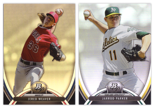
There are some similarities though when it comes to the 2013 product. Much like this year's Bowman comes across as 2012 v.2, Bowman Platinum dances on similar ground as last year's. The foilboard is back, along with the player cutouts over rainbow-y backgrounds, though this year it looks like they've screened those back a bit so they're lighter and less busy. Then there's the BP pendant in the middle on top of some abstract, swooshy shapes. Last year was more about straight lines with curved corners. This year we get the Gateway Arch. Throw in some team-color slivers and the player & team names spelled out and it, once again, looks like a leftover from last year's design brainstorming session.
I do like that there's more room devoted to the player image and the name being smaller seems to keep things a little tighter. Added points for having both team colors in there as well. And the fake mesh texture at the bottom is definitely an upgrade from 2012's candy stripes.
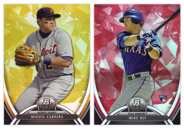
I am pretty happy with the color parallels this year. We have the gold and ruby pictured here along with a blue sapphire which seems to have replaced the green emerald from years past. The main difference here is they've added the atomic/ice/diamond-like texture to the colors so they are easily distinguishable from the base cards.
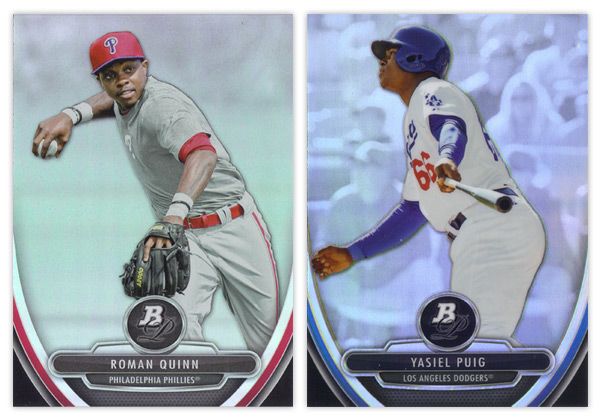
Since it's pretty much standard procedure for all Bowman products the last couple years, the prospect card design is very very similar to the veteran cards. Stick the BP monogram in circle, tear down the arch, flip the player/team names and stick them on top of an overstuffed metal hamburger and we've got ourselves a 'new' design. My other big complaint with the prospect cards is the refractor situation. Can you tell which of the two above is the refractor? I sure as hell couldn't until bending my neck down lower and lower until I caught the glossy sheen on the Puig. If you're going to make every card appear refractor-y and still include a standard 'refractor' parallel, do a little extra work to differentiate them so collectors don't have to. Last year's concrete block worked great. No need to abandon it when you're so keen on repeating elements year after year.
Oh yeah, there are also a lot of prospect parallels that I didn't get in either of my 2 blasters so I'll just add they are the same as above, only colorified.
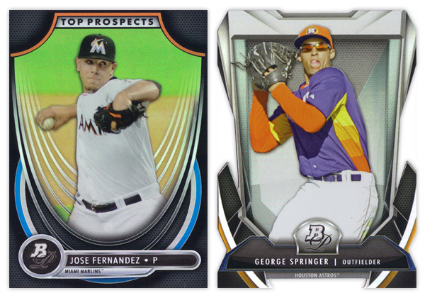
Unfortunately, I wasn't lucky enough to pull any autographs from said blasters so we're finishing up here with the inserts. The Top Prospects design is actually pretty different from 2012's and the rest of the 2013 cards. I don't have a problem with too much here other than the wispy white curves behind the player cutout. It's waaaay too much. It looks like they're sinking in a really loose hammock. The rounded inverted corner in the top are a little too big for my tastes but far from the biggest eyesore.
Last and certainly least is the Cutting Edge Stars diecut. I've mentioned before how I'm not a fan of Topps' over-the-top, random die-cutting they've employed excessively over the last 2 years. Most of my distaste is aesthetically motivated, which still applies here. I don't understand what all of these design elements are supposed to be. Some torture device from Michael Bay's next Transformers movie? But my biggest problem with this particular die-cut is the little barbed teeth in the center at the bottom. I can't remember the last time I had so much trouble sliding a card into a penny sleeve. Honestly, it was a torturous test of my will and patience. If I happen to get my hands on any more of these, hopefully they'll already be toploaded for me.
I know this may have come across as mostly negative, but since Bowman Platinum starts off pretty high in my mind, most of these little dings I put on the set don't really bring it down that much. Really, if this was the 2012 design and last year's was coming out now, I'm not sure if the 2 reviews would be that much different. Hopefully the 2014 edition will have a few more differences while keeping up the Bowman Platinum brand.
Base cards: 8/10
Parallels: 8/10
Prospects: 6.5/10
Inserts: 6/10
OVERALL: 7/10
Monday, July 22, 2013
2013 Pennant Throwdown
Just like a most trends, I'm finally "down" with something just as it seems to be fizzling out. I'm talking, of course, about Puigmania. Even though we all knew his first month or so in the majors was pretty unsustainable for a whole season, the rest of the league does seem to be "figuring him out" of late. I'm sure he'll make the adjustments and stuff, but probably not late enough to help the Giants out. I imagine Topps' second half products will have no trouble selling.
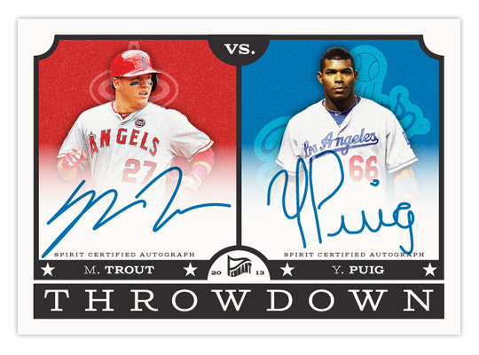
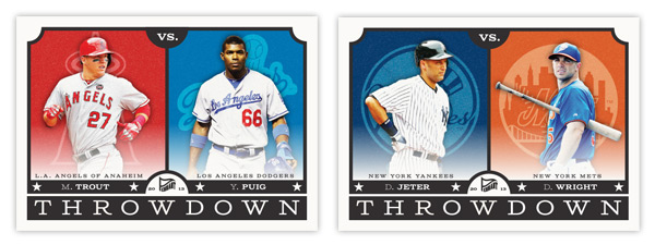
With what would be the most highly sought-after card of 2013 up there, let's take a look at Pennant's next insert — Throwdown. These feature a pair of players on rival clubs. I know this is a lot like Topps' Legendary Lineage and Diamond Duos from a few years ago, but with only 15 subjects (all of which are actual rival teams), the connection is a lot less tenuous. Here's the checklist:
1. NYY v BOS: Rivera/Ortiz
2. NYY v NYM: Jeter/Wright
3. NYM v PHI: Harvey/Lee
4. STL v CHC: Beltran/Rizzo
5. SF v LAD: Cain/Kershaw
6. SF v OAK: Posey/Cespedes
7. LAD v LAA: Puig/Trout
8. TEX v HOU: Kinsler/Altuve
9. BAL v WAS: Machado/Harper
10. CLE v CIN: Jimenez/Votto
11. STL v KC: Wainwright/Butler
12. CHC v CHW: Castro/Sale
13. STL v CIN: Carpenter/Phillips
14. PIT v PHI: McCutchen/Howard
15. ATL v PHI: Hudson/Utley
A few teams have a couple of cards here but they're represented by different players. It would be nice to have all 30 squads featured but as you can tell from MLB's interleague scheduling, you can't force rivalries.
Design-wise, the front of the cards have a little vintage flavor to them like the rest of the Pennant cards but still look clean and modern. Embellishments like the rounded inset corners and the classic typography help add some age, along with the less-than-bright cardstock. The space is split down the middle with grainy team-color boxes housing single-color team logos behind player cut-outs. There's a faint white gradient billowing up over the photos to make room for the team name. It can also fade up a little farther to make room for the signatures on the autograph cards.
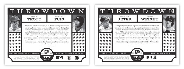
For the back, I kept it black & white while recreating similar design elements from the front. Black & white photos on the opposite edges leaves plenty of room in the middle for a brief history of the players' and teams' rivalry stories. The lines of stars can be removed for the authenticity statements on the auto versions.
I tend to shy away from horizontal cards due to format issues for the blog but I'm really pleased with these. They're bright but not too bright, retro but not too retro. It's always nice to feature more than one team on a card so you can have 2 fanbases chasing after them. And it helps take the sting out of pulling a Dodgers card if it features Matt Cain or Mike Trout. (Okay, I'll stop with the Dodgers jokes.)
Tuesday, July 9, 2013
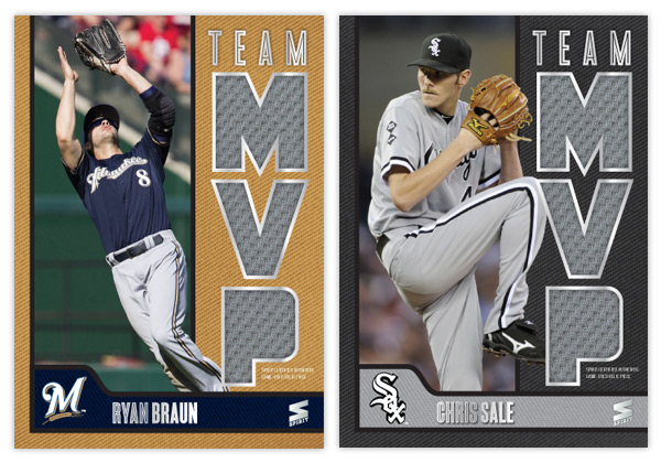
2013 Spirit Team MVPs
Just like with Award Winners, every year will see a return of the Spirit Team MVP insert. To me, it's a no-brainer. A 30-card set with every team represented by their best player. Why Topps hasn't embraced this idea is beyond me. Maybe since it was Donruss' thing they want to keep their distance.
Let's start off with the checklist.
MVP1: Mike Trout (Angels)
MVP2: Jose Altuve (Astros)
MVP3: Yoennis Cespedes (A's)
MVP4: Jose Bautista (Blue Jays)
MVP5: Brian McCann (Braves)
MVP6: Ryan Braun (Brewers)
MVP7: Yadier Molina (Cardinals)
MVP8: Starlin Castro (Cubs)
MVP9: Paul Goldschmidt (Diamondbacks)
MVP10: Clayton Kershaw (Dodgers)
MVP11: Buster Posey (Giants)
MVP12: Asdrubal Cabrera (Indians)
MVP13: Felix Hernandex (Mariners)
MVP14: Giancarlo Stanton (Marlins)
MVP15: David Wright (Mets)
MVP16: Bryce Harper (Nationals)
MVP17: Chris Davis (Orioles)
MVP18: Chase Headley (Padres)
MVP19: Cliff Lee (Phillies)
MVP20: Andrew McCutchen (Pirates)
MVP21: Adrian Beltre (Rangers)
MVP22: Evan Longoria (Rays)
MVP23: David Ortiz (Red Sox)
MVP24: Joey Votto (Reds)
MVP25: Troy Tulowitzki (Rockies)
MVP26: Billy Butler (Royals)
MVP27: Miguel Cabrera (Tigers)
MVP28: Joe Mauer (Twins)
MVP29: Chris Sale (White Sox)
MVP30: Derek Jeter (Yankees)
Some of these selections were tough. The Braves have a handful of guys that are good but none that really rise above the rest. I went with McCann because he's been there the longest. Castro has had a down year so Anthony Rizzo could possibly replace him. The Rays' pick could've been David Price or even Ben Zobrist. Carlos Gonzalez has a good case for the Rockies since Tulo is always hurt. The Royals guy could easily be Alex Gordon or James Shields. And since Jeter has been out all year, it would probably make sense to put Cano in there, too.
Anyway, onto the design.
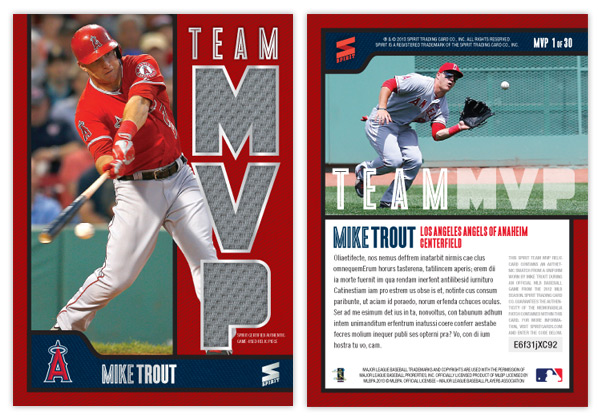
Like last year, the biggest feature here is the MVP relic windows. I figured the easiest way to differentiate from 2012 would be to make them vertical instead of horizontal. So the M-V-P letters are stacked on the right side leaving a vertical window for a player photo. To add some depth, I had part of the guys overlap into the team color section. Below is a the secondary team color section to house the player name along with the cap logo. The square-ish space for the logo helps balance things along with keeping it from looking to symmetrical (which I have a habit of doing.) There's some silver foil along the relic windows and all the text, minus the "Spirit Certified Game-Used Relic" small print below the P.
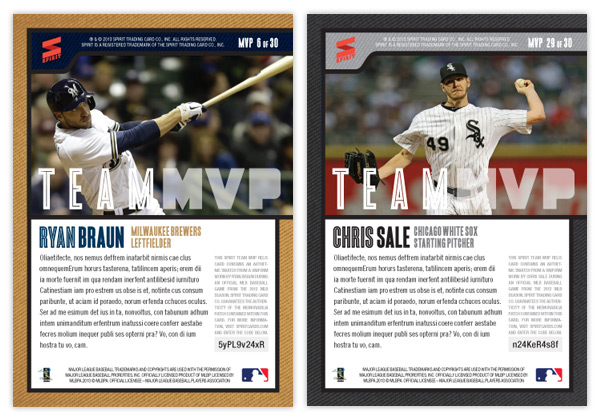
The elements make a 90° turn for the back side while the secondary bar moves to the top. Below a horizontal player photo is a brief bit of text. To the left is a block of copy about the relic authentication along with a code to enter online for more info about this particular swatch. And I'm looking out for everyone with having the numbers in the upper right corner so they're easy to see when stored in a cardboard box.
Friday, June 21, 2013
Keepin' It Clean
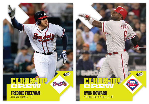
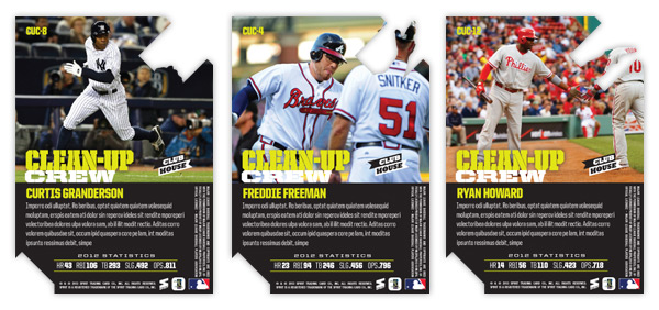
One of my personal favorite designs from Spirit in 2012 was the Clubhouse Moonshots insert. Homerun hitters, die-cut, big ol' moon. What's not to love? This time around, I kept the subject the same but changed the name to Clean-Up Crew. The die-cut is also back again though in a much different shape.
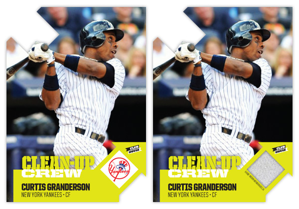
The arrows are a play on the 'up' part of 'clean-up' and helped me get the design rolling. The one on the right leaves a nice tidy space for the team logo or a memorabilia swatch. I wanted to make sure all arrows pointed up so the upper left corner was the natural choice for the other die-cut location. Having some part of the player cut into the arrow keeps things from getting stale.
As the arrows take care of the latter half of the insert name, the bright neon green/yellow color on the bottom handles the 'clean' half. Something about the color makes me think of a super-intense household cleaner that would almost scrub the skin off your finger. I imagine the ink would be almost plastic-like on the finished product.
On the back side, we have the reverse die-cut shape to deal with but luckily plenty of space is left for another big player portrait. The neon is turned down a bit with black being the most prominent color. Below a brief write-up is the 2012 stat line with categories relevant to clean-up hitters (HR, RBI, total bases, slugging % and OPS.)
All in all, the bright colors, special shape and big batters seem to fit right in with the Clubhouse line.
Labels:
2013,
clean-up,
Clubhouse,
concept,
die-cut,
freddie freeman,
granderson,
homerun,
insert,
relic,
ryan howard
Thursday, June 6, 2013
2013 Spirit Artistry
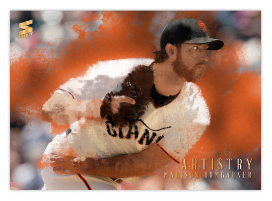
One of the earlier inserts from last year was Artistry, which focused on some of the top pitchers in the majors. I decided to revisit it this year with a different technique. Where the previous design was basically a filter-y and layered photo composite, I spent quite a bit more time this go 'round.
I did begin with a photo once again, only this time it was mostly for reference and not manipulation. I spent hours in Photoshop, layering different brushes to build up colors into objects. Basically, it was just like I was creating an oil painting, only with a mouse instead of actual brushes and paint. Different grungy and abstract brushes helped keep things looking organic and a bit impressionistic. You can tell it more on the Bumgarner below than the Rivera above.
Once I had the painting where I liked it, I took the original photo and laid it over the painting. Using some of those artistic brushes, I masked out parts of the photo to let the underpainting show through. Overall, it gives it that half photo/half paint look. I'm pretty happy with how they turned out. That's why the gold foil text is so minimal and unimposing.
On the back, I kind of replicated last year's picture frame idea but went with a more ornate frame that you'd likely see on some 19th century Impressionist paintings.
This is by far the most labor-intensive concept I've done to this point. It was pretty fun to click back and forth between the photo and painting and bask in my progress. I do wish I had gone with a non-pinstriped player in Rivera's place. THAT was a pain, let me tell ya.
Thursday, May 30, 2013
2013 Spirit Rookie Round-Up
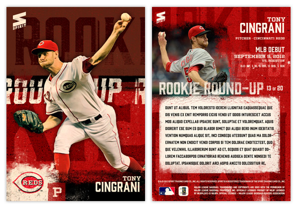
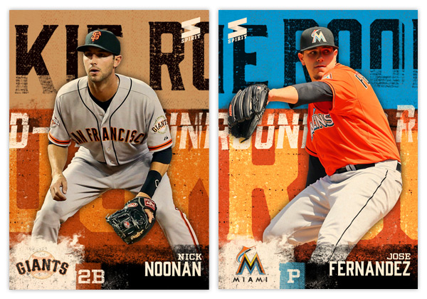
It's been a while since I posted anything for the Spirit flagship series. Time for a new insert. This one features 20 rookies that have gotten off to a good start in 2013. I figured it would be nice to have some MLB inserts of these guys instead of so many minor league cards.
The design is a bit 'in your face,' a little reminiscent of some of the early 90s inserts with player cutouts on top of a busy background. I enjoy grunging things up so I went with that for the look. Big, bold letters roughed up and running across the background set on top of vintage team colors. The idea is that if you had all 20 cards lined up left-to-right, the 'ROOKIE' and 'ROUND-UP' text would stretch across multiple times. As it is now, each card has a slightly different cut of those letters. At the bottom, we find the player name along with position and the weathered team logo in the corner.
The back has a solid team-color background instead of the two-tone from the front. On the left is another player photo with some soft, grungy edges. To the right is the N/P/T along with a little tidbit of his MLB debut. Some may be more impressive than others (note Noonan's 0 for 1, pinch hit debut.) In the middle is a block for a brief write-up (greeked text here since I was too lazy to "write.")
This is one of the few cards I've done without any shiny foil or die-cut or other bells and whistles. The finish would be matte to fit the design rather than glossy. The edginess fits with the subject of rookies so I thought I'd let it stand on its own.
Tuesday, May 28, 2013
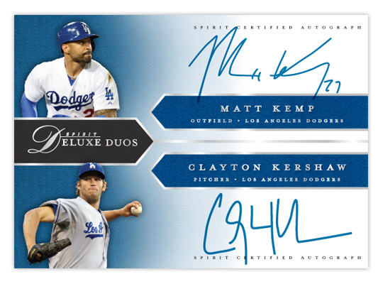
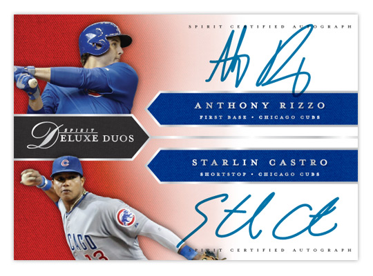
2013 Spirit Deluxe Duos
With Deluxe being Spirit's "high-end" product, I figured the dual-autograph Deluxe Duos would be a good place to start with 2013's inserts. These wouldn't be as prevalent as the auto and relic parallels from the base set, maybe about a 1:20 hit.
Like last year's version, the design is right in step with the base cards. We have the pointed tabs shooting in from the edges, filled with a team-color twill texture. All of the text (minus the certification small-print) is in shiny silver foil to jump off the glossy finish. It's bisected horizontally with each half of the duo on the top or bottom. A small cutout of the players sits in the left corners on top of another team-color twill texture that fades to white moving to the right, leaving room for the player signatures.
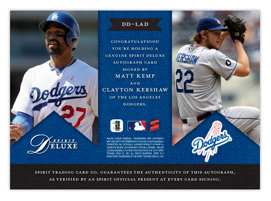
On the back, the tabs are inverted and filled with some bigger action shots. The team-color twill makes an appearance again as a background for the small print and authentication copy. The team logo also finds its way into the mix.
While not every club may have a duo on the level of Kemp/Kershaw here, most would have at least one player of note get excited about. Especially at the SRP of $10-$15 a pack.
Sunday, May 19, 2013
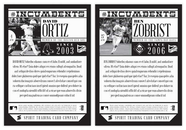
2013 Pennant Incumbents
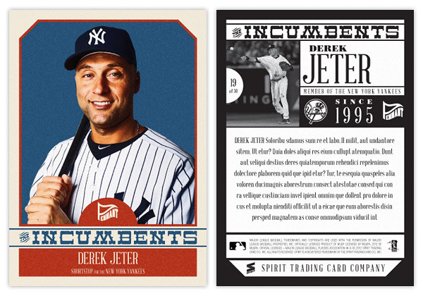
Free agency has become such a big part of the MLB landscape, I thought it would fun to make an insert that shows the impact it's had on all current rosters. The Incumbents features the 30 players that have been on each team the longest. While you have guys like Jeter here who have been around the same place since the previous century, most clubs have a higher turnover rate than that.
The design echoes the 2013 Pennant base design with the beveled top corners, simple team colors and the half-circle tab to house the Pennant logo. The borders here are a little more cream than white, though. Each player is cut out from an personal-type portrait and placed over a solid background. The Incumbents text stretches across the width of the card and separates the color boxes along with the player name & info. With Pennant being a retro set, the photo color levels are altered and some grain is added to the whole front along with the typography meant to evoke some past era.
The backs are kept to one-color and have a black beveled border. The top is packed with the insert title, action photo, player name, card number and team logo as well as a bit of text that reads how long the player has been a part of his big league clube. I left plenty of space for a sizable write-up highlighting the team's successes/failures in the time the player has been around.
Here's a checklist of the players featured.
ARI - Miguel Montero
ATL - Tim Hudson
BAL - Nick Markakis
BOS - David Ortiz
CHC - Alfonso Soriano
CHW - Paul Konerko
CIN - Brandon Phillips
CLE - Asdrubal Cabrera
COL - Todd Helton
DET - Justin Verlander
HOU - Wesley Wright
KCR - Alex Gordon
LAA - Jered Weaver
LAD - Andre Ethier
MIA - Ricky Nolasco
MIL - Ryan Braun
MIN - Justin Morneau
NYM - David Wright
NYY - Derek Jeter
OAK - Daric Barton
PHI - Jimmy Rollins
PIT - Andrew McCutchen
SDP - Chase Headley
SFG - Matt Cain
SEA - Felix Hernandez
STL - Yadier Molina
TBR - Ben Zobrist
TEX - Ian Kinsler
TOR - Adam Lind
WAS - Ryan Zimmerman
It's interesting but I suppose not all that surprising that most of the guys here are kind of no-brainers. They have obviously been good performers or else they wouldn't have stuck around so long. But you also have a few rebuilding teams (Houston and Miami) and others that construct their rosters differently (Oakland, Arizona) where the representative isn't necessarily the marquee guy on the squad. Personally, I think it's nice mixing up the checklists from set to set just to keep things from getting stale. That said, I can't imagine being too excited if I pulled a Wesley Wright insert card, though I have had to suffer with plenty of Ricky Nolasco cards.
Subscribe to:
Posts (Atom)