Showing posts with label parallel. Show all posts

Tuesday, April 7, 2015

2015 Pennant


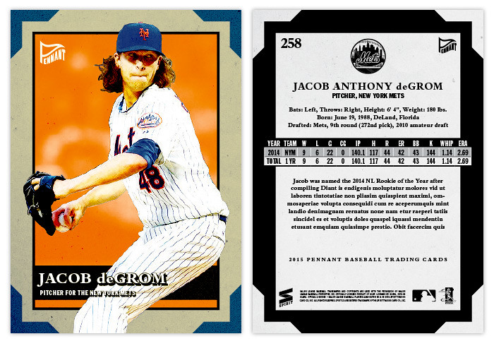
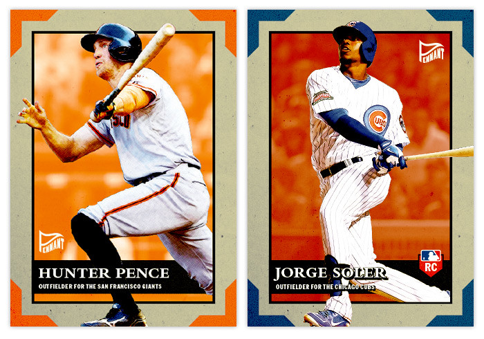
Time for the old-timey set. Again, the Pennant brand isn't modeled after a particular set from the past like some of Topps' retro sets have been. The designs basically just contain elements that are reminiscent of an older era. So here's the 2015 version.


The card stock here is of the dull variety, meaning the colors are a little muted and there's definitely not a glossy finish. I've also added a little faux texture to the borders to help make it a little bit aged. In each corner is a little team color shape mean to look like those old photo frame edges you may have seen in photo albums from the past. Inset from the margins is another team color box with the player photo busting out from the edges. Along the bottom is a black bar to house their name, position and team. For the places where their white pants overlap the box, I had to add a black drop box behind the white text to keep things readable. I usually hate to add any kind of stroke or background to the text but I think it kinda fits the rest of the design here so I guess you can call it a happy little accident.


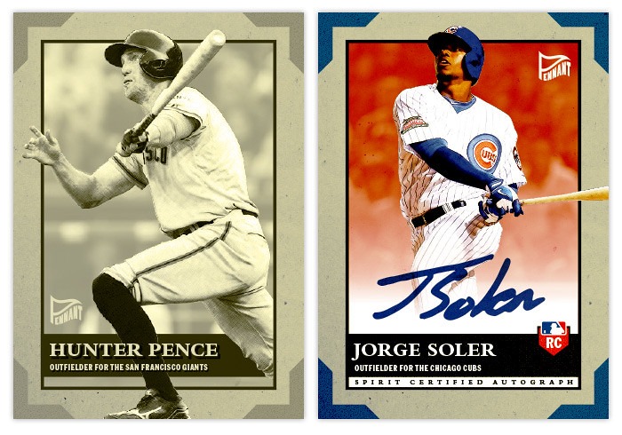
I decided to add a parallel into the mix this year almost strictly because of the design. The sepia parallel here fits perfectly since there are so many different frames and layers to keep thing interesting even when monochromatic. And since the card stock is perfect for autos, I decided to show an autograph version of the Soler card. I just removed the overlap from the bottom of the card and added a white fade spot to keep the signature nice and clean.


The backs are kind of inversed from the front with the corner edges being white and the thick margins being black. A couple things of note here are the full player name and also full career stat box. For the guys fairly new to the majors, there's room for a brief write-up. Overall, I'm really happy with the design, especially the sepia parallels. If I were to ever test-out getting some of my cards printed, this would definitely be at the top of the list.

Wednesday, May 15, 2013

REVIEW: 2013 Bowman


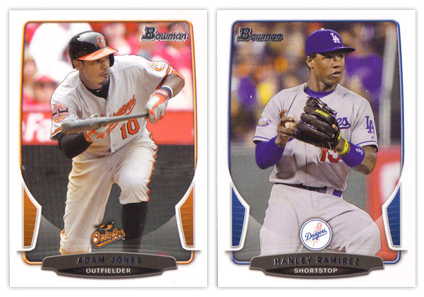
The biggest takeaway from the 2012 Bowman design was how it was a big departure from what Bowman had been putting out for many years past. As we review the 2013 version, it looks like that big year-to-year jump was merely aberration and not a new gameplan heading forward. Just like the 2012 version, this year we have white borders, not-quite rectangular frames in team colors, silver foil names, subtle drop shadows around the players, team logos centered above the name block. Honestly, you could be looking at last year's cards while reading that description and it would be 100% accurate. About the only distinguishing features here are the little tabs folding in on the left and right sides and the soft white overlay to finish out that curve. If we didn't have 2012 to compare this to, I'd really like the base design here. But as a follow up, it looks more like a rehash and suffers a bit.


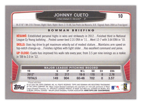
For the backside, the similarities are even more....similar. The layout is identical to 2012 with a little tinkering to fit this year's look. The colored tabs on the bottom and the black nameplate are pretty much where those embellishments are made. I mentioned a couple things on last year's review that I thought were easy improvements to make. I suggested that the last section of the Bowman Briefing be changed from EVOLUTION to UP CLOSE (like it is/was on the prospect cards.) I doubt that any eyeballs at Topps saw my recommendation but somehow it was magically changed for this year. My other suggestion, however, seems to have gone without notice. The card numbers are still in the upper right corner, which means if you store these upright in a cardboard box, the numbers won't be visible. So once I again, I propose this amendment to the Baseball Card Constitution: horizontal backs have to be numbered in the upper left corner to help for storage box sorting.


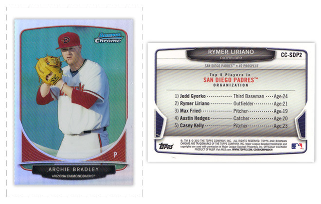
Now on to what is basically Bowman's reason to exist: prospect cards. For 2012, I preferred the veteran design to the prospect design but I'm flipping it around for this year. The prospect design is a lot easier to distinguish here thanks to the solid team-color wedges above the name. There are some subtle shape differences to the frame and nameplates that also help them stick out. The team logos are removed to help save space for the autographs (I assume.) That means the team names are found below the player name and the position is moved to the right color wedge. 


Like every other Topps release, there are plenty of parallels again. Gold, blue, purple, orange, silver ice, etc., etc. The international cards are a little different this year. The flags have some texture to them so they aren't as glaringly obvious as prior years. Also, for American-born players, they have the flag of their home state up here instead of the Stars & Stripes. I'm all for anything that helps distinguish them from previous years. 


The Top 100 Prospects cards are actually pretty nice. They have a smooth, cool finish to them with some silver, black and blue/red colors around the border. There appears to be a die-cut version as well but, as I've mentioned before, I'm not a big fan of random-shaped die-cuts. I do like how the numbers are nice and big to help drive home the fact that there is a list they're referencing. And keeping with the blue, we have Bowman reprints with blue refractor borders. I'm so tired of reprints that I can't even bother to say any more about them.


Finally, we've come to what's probably the worst development so far this collecting season. Topps has decided to introduce minis into the Bowman line. Their reasoning is obviously... who knows, but here they are. They're an odd size, they're chrome, they're refractory, they're prospect-ory. I wish somebody with power at Topps could exercise some willpower and stop spreading things across every release like this. It's really getting old.

Overall, I'd feel better about the 2013 release if it all weren't so simliar to 2012. The base and prospect designs look like comps that didn't get picked up last year or were just saved away for a future release. I understand keeping some things consistent but this comes across as a little too lazy.

Base cards: 7/10
Parallels: 6.5/10
Prospects: 8/10
Inserts: 6/10
Minis:4/10
OVERALL: 6.3/10

Thursday, August 30, 2012

No license? No problem.


This post comes thanks to a suggestion by way of Kyle from Juuust A Bit Outside. He challenged me to put together a design tackling the same restrictions as Panini and Upper Deck face regarding baseball cards. Without a license from MLBA, they're not allowed to have any depictions of MLB logos on their cards. Even with a licensing agreement with MLBPA, the players themselves can be featured without any problems, but any type of MLB franchise logo has to go. That means either some less-than-exciting airbrushing or some less-than-exciting wardrobe choices.

Rather than go to the trouble of making the unnatural seem natural, I thought the best method to work around this restriction is to use photos of the players before/during/after the actual games where they happen to not be wearing a hat or helmet bearing a team logo. The most frequent setting for such a photo is the dugout. In between at-bats or after climbing off the pitcher's mound, you'll find a lot of players letting their hair down so to speak.

So that's how the Dugout line was birthed. With these on-field or 'in-the-dugout' portraits, you still feel some attachment to the diamond and these guys a players. It's not too far off from the bat-on-shoulder portraits we see from 40-50 years ago. If anything, they're more candid.


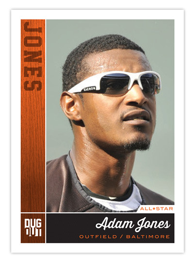
As for the design, we've got the team color boxes to the left and below the photo. The one on the left has a wood/bat texture with the player's last name branded into it. Below is the full player name in a baseball-y script with position and team underneath. It kinda sucks you have to go with the team city instead of team name but oh well.

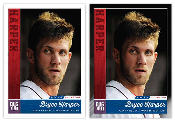
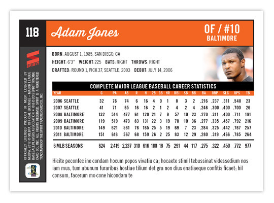
For one of the first times on this blog, I'm actually offering a parallel. Instead of just changing the border color, I'm removing the border altogether! It helps to put the player into the baseball environment with just a little bit more photo showing. Another feature here are the little designation tabs just above the name box. For Adam Jones above, he gets an all-star tab while Harper gets that along with his rookie tag. 
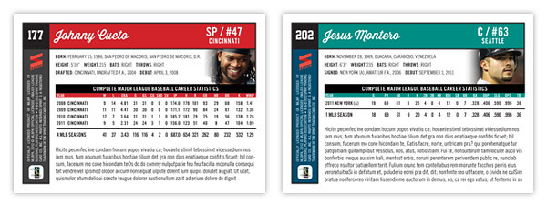
The back side is packed with information like a base card should be. The team color boxes are here again along the top and left edges. There's plenty of white space to keep things nice and readable.

Just above the stat block, we get an additional player portrait. Though small, this location helps keep them de-logo-fied. And below the stat box is plenty of room for a brief writeup about the card subject. Things are pretty clear and orderly. The front and back really match up for a cohesive design.

Though this started out as a set to get around the logo restrictions, I think it would actually be a good concept if Topps were to grab onto it and add some logos. As thrilling as it can be to see some outstanding on-field photography of players doing amazingly athletic things, a set like this that focused on catching players in those candid moments would be refreshing. The more connected a collector feels to the players depicted on these cardboard creations, the better for baseball.

Saturday, May 19, 2012

REVIEW - 2012 Bowman

A full week after it hit shelves, 2012 Bowman finally made its way to the Walmart in my town, so this is the first chance I've had to take a look that the set.

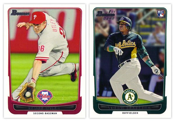
Starting off with the base card design, the first thing you'll notice is the familiar black borders are gone. I'm a little torn on this one. For the last decade or so, Topps did a great job of branding Bowman with something as simple as having a consistent black border on the base design every year. Looking at these all-white borders, I'm kind of missing that Bowman feel. But on the bright side, the black borders are notorious for showing every little imperfection along the edges, so their absence here helps rectify that.

Another change of pace is the introduction of team-specific colors into the design. In years past, the only colors to go along with the black borders were a small bit of red for veterans or green for rookies. Now you'll find blue and purple and a whole host of other colors.  The team logos return in full color after showing up in gold foil last year.

There are a few things I'm not crazy about. The names being in silver foil on top of black is just as hard to read here as the the gold on black was on the flagship design. I'm also not a big fan of all the unnecessary bevels around some of the frame elements. Those are, however, small quibbles. Something that's subtle but really helps the players shine here is the light drop shadow you'll see around the guys. It more noticeable on lighter backgrounds, like the Utley one up there, but helps to add focus to subject of the card. If it were any heavier, I'd probably be bitching about it forever, but they got it about perfect here.
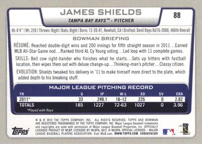

The back side of the base cards continue the same feel as the front, only the border here is gray instead of white. Can't figure that one out. Only having stats from the 2011 season seems like a trade-off they had to make for the veteran cards since Bowman's primary focus is prospects. The 'RESUME' 'SKILLS' and 'EVOLUTION' things are fine, though I prefer the 'UP CLOSE' section on the backs of the prospect cards, which replaces 'EVOLUTION.' One thing they kind of messed up on is having the card number in the right corner instead of the left. BASEBALL CARD LAW: horizontal backs have to be numbered in the upper left corner to help for storage box sorting.


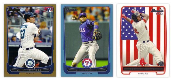
The design for the prospect "inserts" is really, really similar to the base design. In fact, it's almost problematically similar. For the 2011 set, the prospect cards had a white border to differentiate from the black bordered-base, so it didn't really matter if the designs were similar or not. This year, though, the made the designs almost identical on top of having the same colored borders. Not sure what the thinking was there unless they're really trying to test the MLB's patience with the whole Bowman prospect worship thing. Regardless, I think it was a dumb decision.

There are parts where the designs differ, though: prospect has a symmetrically convex border compared to trapezoidally-shaped base border with the little weird notches on each side; the cutout for the position on the bottom is wider and rounder for the prospect design; the base set doesn't have those weird wing things on each side of the logo. I think if the base design didn't have those notches or if the prospect set didn't have the wings, you'd have an all-around better design for one or the other. But holy hell, they shouldn't look this similar.

I'll give them credit regarding the autographs, though. They did away with the facsimile autos on the 'base' prospect cards, which really helps the make the actual auto cards more unique.


Just like every other Topps product, this one comes with lots of parallels. Gold, blue, red, orange, green, blue, international, blue, red ice, silver ice, Dentyne ice, blue. I think the flags on the international is kinda neat. The silver and red ice versions are basically just atomic refractors. Really, they have at least twice as many parallels as they should, if not more. But in honor of the Preakness today, I'll refrain from beating that dead horse.


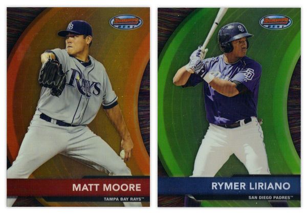
Finishing up here is this year's edition of the Bowman's Best insert. Again, they have the red version for veterans and blue for prospects. There are also die-cut versions, which have all kinds of crazy refractor parallels themselves. Design-wise, I like the different textures on the swoosh and the background. Along with the type and name bar, I appreciate the simplicity of the design.

Overall, I think there's some pretty good, modern design here even if it's not completely "Bowman."

Base cards: 4.25/5
Parallels: 3.5/5
Prospects: 4.25/5
Inserts: 4/5
OVERALL: 4/5

Friday, May 18, 2012

Pennant Throwbacks


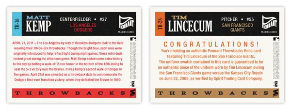
So one of the things that really jumps out at me when thumbing through retro sets like Gypsy Queen is when you see a card like this next to a card like this. No matter how many filters you run on photos of current-day players, they'll never quite match that historic feeling you get from old photos of retired players. One way to help bridge the gap would be to feature today's guys wearing throwback uniforms.

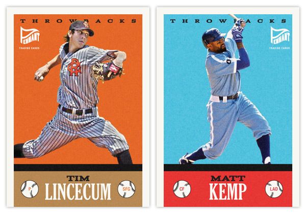
Here's the first insert set for the Pennant brand. The design for Throwbacks isn't specific to a certain era, just a bit of an amalgamation of a handful of characteristics you'll find in various retro sets. It kind of follows the philosophy of the base set, combining a feel for the old and contemporary.

The hard part here is finding the right images in a somewhat shallow pool. There aren't a whole lot of throwback games on the schedule so the odds of finding an actual star wearing these duds in a good photo are a bit smaller than usual. The Lincecum image here is from a 2008 game while the Kemp one is from last season. The color boxes aren't the exact shades you'll find in the teams' styleguides, but they're in the right neighborhood to allow for the sometimes funky colors of the throwback unis.


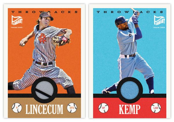
Another wrinkle to add to the set is a relic parallel. With a round cutout just above the last name, it's a perfect place to house a sliver of these throwbacks. And, luckily, since the uniforms depicted are so singularly unique, you know that the swatch is from the actual uniform depicted. Even though it's the Dodgers, you have to love that baby blue relic.

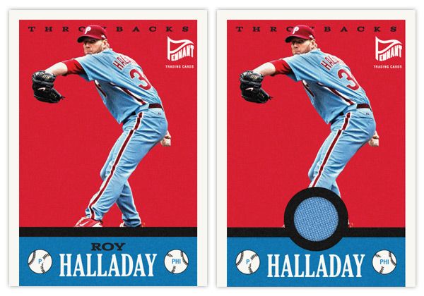
Here's what the base and relic look like side by side.


On the backside, you'll see the write-up is specific to the game in each throwback uniform is involved. The base has a game recap along with a little bit of info regarding the throwback worn. For the relic version, it includes the fine print of the swatch being authentic and unique to the player and uniform depicted.

Monday, May 7, 2012

Spirit Deluxe Portraits


Trying to come up with 'new' or 'innovative' ideas for cards isn't as easy as I thought it was going to be. Even though there are plenty of complaints to levy at Topps for some of their product choices, they actually do quite a few things that are pretty successful and cool. At this point, most of their missteps come from constructing releases and not so much the actual cards themselves. People like autographs and minis and parallels and short prints and die-cuts and memorabilia and just about every other 'gimmick' out there to varying degrees. But all in all, these are basic elements that go into constructing a set.

This blog has basically been me just rearranging some or all of these elements into what I think would be fun to manufacture. If there were another licensee out there releasing product in 2012, these are things I could see fitting into the marketplace, acting as either a supplement or an alternative to Topps.

That brings us to the cards in this post. I was looking for another 'insert' or whatever you'd like to call it for the Deluxe set. I didn't feel like doing one of those triple swatch, nickname cutout sticker autos that you find in Triple Threads. Even though Deluxe is Spirit's 'high-end' product, it's probably more in tune with something like Finest (which is definitely the very top of my own personal price range.) I see that Topps plans on having some die-cuts in Finest this year, but hopefully this doesn't come across as copy-catting.

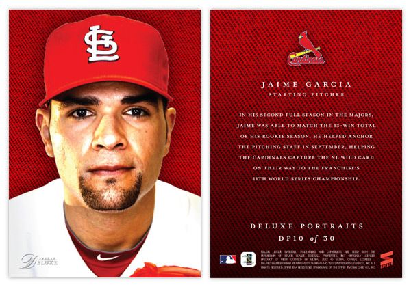
So for the Deluxe Portraits insert, there are 3 different versions you could get your hands on. The first would be the standard Deluxe Portraits insert base, seen here with Jaime Garcia. The design features a tightly cropped portrait with the Deluxe-familiar team-color cloth background. The only other thing adorning the front of the card is the Spirit Deluxe logo in silver foil. Somehow, these seem to come across as more personal and intimate without the player name cluttering the front. The back continues the team-color cloth with a brief write-up.


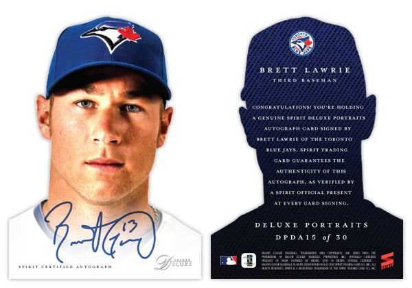
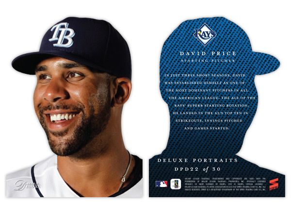
The second version is the die-cut parallel, here with David Price. The design is basically the same except the obvious die cut edges around the player. And finishing off the trio is the die-cut auto version, seen at the top with Brett Lawrie.

Even though parallels can sometimes be redundant and annoying, I feel like this insert captures the best aspects of paralleling a design. Each version offers something different other than just a different color border or refraction. The whole 'cut-out head' thing may seem a little hokey for a 'high-end' set, but I think it's fun. And if you ask me, fun is definitely something we could all use more of in card design these days.

Thursday, January 12, 2012

The Who's on first, Mike Watt's on second: 2012 Spirit Headliners


I have 3 main passions in life: sports, design and music. (If I had a fourth, it would probably be fast food... I've said too much.)

Since you're reading this blog, it should be pretty obvious where the first 2 merge. Baseball card design is exciting for me. Even as a kid I would scribble out new card designs with a box of Crayola thin-tipped markers and some 3x5 index cards. The black would always go out first so I'd have to make some bold color choices after that. I assume this is how the 1990 Topps and 1991 Donruss designs were mocked up.

As for the latter, there's no better synergy of design and music than the gig poster. From their humble beginnings as xeroxed flyers on colored paper stapled to everything in sight, gig posters are now beautifully artistic receipts for those rock shows you won't be able to replay in your head once the ringing in your ears is gone. Or, more accurately, they're works of art that help to visually explain the music, if not literally then figuratively.

My wife got me a few gig posters for Christmas (the Avett Brothers, Superchunk and the Decemberists) and it planted an idea in my head. 'Wouldn't it be cool if I could combine all 3 of my passions into a singular product?' Just as gig posters commemorate the date of sometimes transcendental rock shows, why not give transcendental baseball performances a similar treatment?

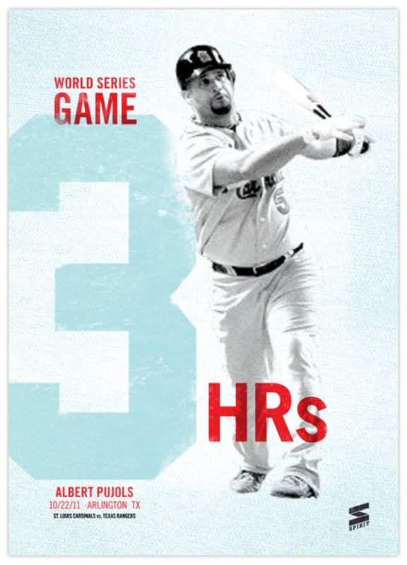
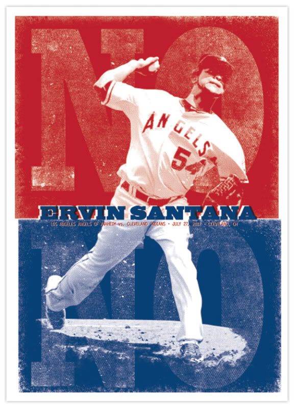
Hence the birth the Headliners insert set. There are a couple attributes to this set that are very unique and potentially revolutionary. First of all is the artists. Within the gig poster world, there are quite a few remarkable designers. Mikey Burton, Aesthetic Apparatus, A. Micah Smith, Rob Jones and the Heads of State are a few of the all-stars and some of my personal favorites. The idea would be to get 15 different artists on board and have each of them design an original screenprint commemorating one of 15 different notable baseball performances like Thome's 600th homerun, Jeter's 3,000th hit or Verlander and Liriano's no-hitters. Things that made 'headlines' during the 2011 MLB season.

The set would be one of the most unique in memory, with 15 different artists and their 15 different styles on 15 different designs for 15 different events while all being cohesive in concept. As popular as Dick Perez's Diamond Kings cards were in the 80s & 90s, they got pretty stale. This would inject some new life into the baseball card illustration platform.

For proof of concept, I went with the two designs you see above: Pujols' 3-homerun display in Game 3 of the World Series and Ervin Santana's no-hitter. While the designs are different, they each incorporate some of the elements you'll see in a lot of gig posters. Hallmarks such as 2- or 3-color inks, intentional mis-registration (ink overlap), halftone patterns, and grainy ink coverage. While you won't find those on every gig poster, they're definitely oft-occurring characteristics that scream 'gig poster.'

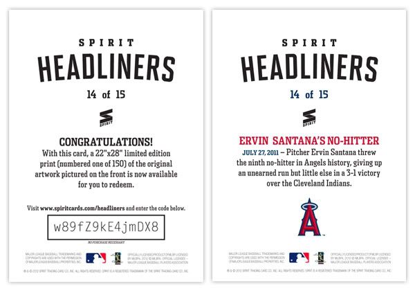
What I think puts this set over the top into awesome sauce is my next idea: a redemption parallel. That's right, two of the most loathed things in current card collecting world. But hear me out. For the parallel part, it's not just the same card with 5 different colored borders and shrinking print runs. There are only 2 versions: the standard card and the redemption card.


Most people hate redemptions because it takes forever before you get the actual card in-hand and a lot of times, it ends up being something different than what you were supposed to get. Those are two things you don't have to worry about with this set. The redemptions are for one of 150 screenprints of each design. Those will be delivered by each artist before the cards can even go to print. So basically, you get the card and redeem the code on back and get a 22x28 screenprint (/150) of the same design, signed by the artist.


What do you think? Good idea or great idea? Unique card designs, redemptions for full-size works of art, expanding the market for baseball card collectors. I'd love for Topps to steal this idea from me.
Well, maybe not steal. I'd be willing to trade the idea for a job with them.