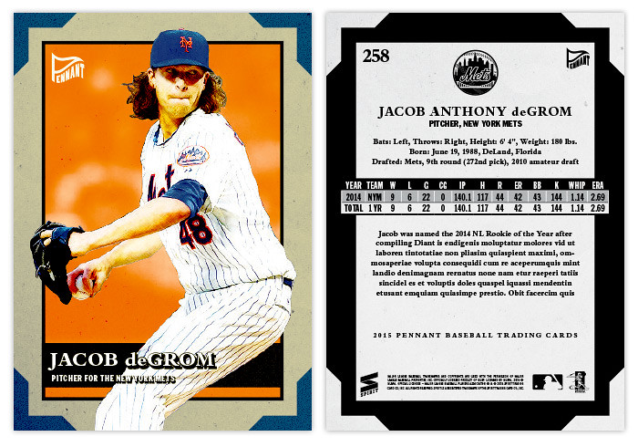
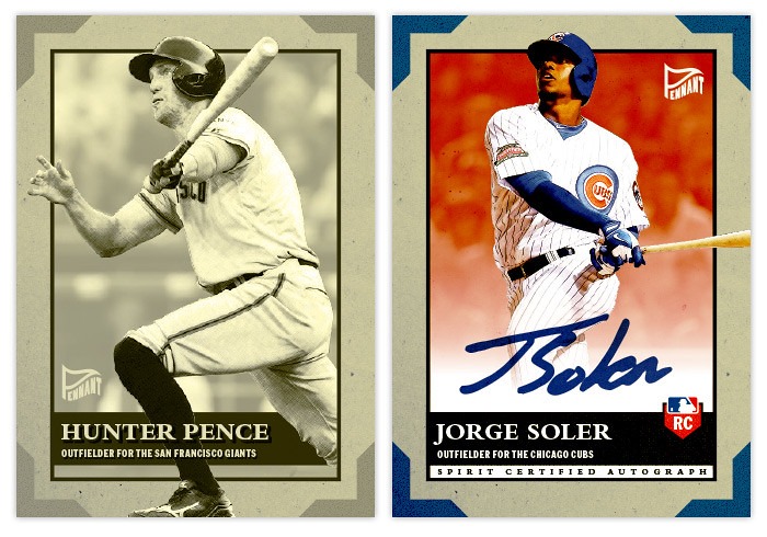
The card stock here is of the dull variety, meaning the colors are a little muted and there's definitely not a glossy finish. I've also added a little faux texture to the borders to help make it a little bit aged. In each corner is a little team color shape mean to look like those old photo frame edges you may have seen in photo albums from the past. Inset from the margins is another team color box with the player photo busting out from the edges. Along the bottom is a black bar to house their name, position and team. For the places where their white pants overlap the box, I had to add a black drop box behind the white text to keep things readable. I usually hate to add any kind of stroke or background to the text but I think it kinda fits the rest of the design here so I guess you can call it a happy little accident.
I decided to add a parallel into the mix this year almost strictly because of the design. The sepia parallel here fits perfectly since there are so many different frames and layers to keep thing interesting even when monochromatic. And since the card stock is perfect for autos, I decided to show an autograph version of the Soler card. I just removed the overlap from the bottom of the card and added a white fade spot to keep the signature nice and clean.
The backs are kind of inversed from the front with the corner edges being white and the thick margins being black. A couple things of note here are the full player name and also full career stat box. For the guys fairly new to the majors, there's room for a brief write-up. Overall, I'm really happy with the design, especially the sepia parallels. If I were to ever test-out getting some of my cards printed, this would definitely be at the top of the list.


No comments:
Post a Comment