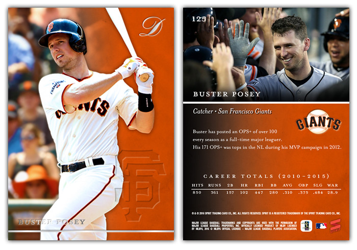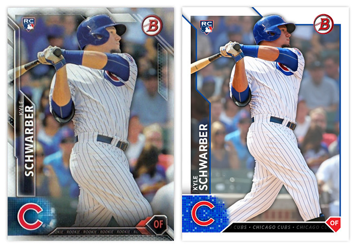
I thought I'd take the occasion of 2016 Bowman hitting the shelves to post a remix I did a few months ago. My overall impression of Topps' design is mostly positive. I like the angular elements and appreciate that everything is (mostly) readable The biggest issue I have is just the overall busy-ness, with all the shines and fades and bevels. The lack of a solid border was the first thing I changed while keeping a few of the overlaps along the top. Next, I changed the name so both the first and last are aligned on the left and just made the tab a solid transparent tab. The Bowman and RC logos are in the same spot. I decided to make the shape holding the player position into an actual home plate instead of just the "sorta" home plate they used. The little tab thing between that and the logo has the team name repeating over and over like a ticker, like the original design. (The Schwarber here says "ROOKIE" over and over.) Then I added the drop shadow to the player cutout and faded the background image a bit to help the player stand out.
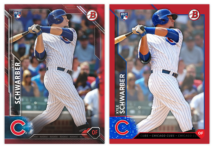
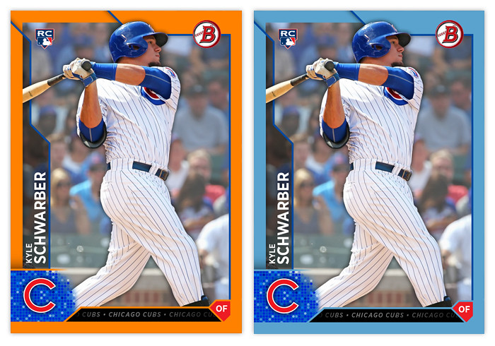
You can see here how the solid border looks with the parallels in comparison to the Topps' design. It's definitely easier to spot on your initial view. The fade on the borderless right side of the card in the original really bugs me. The solid border fixes that. I did a few more below though I don't know if these are included in 2016.

The changes aren't too drastic but they definitely fit my own personal style more than all the over-texturing that Topps is so smitten with currently. In my mind, they're about 5-7 years behind design trends with all of the beveling and whatnot. The remix would definitely age a lot better down the line than the original design.