
So first I did the flagship with a few inserts. Then it was the low-end with an insert. I guess now it's time for some high-end stuff. Topps and Panini have done a good job scouring the thesaurus, locking up every suitable synonym for "best" or "expensive," but luckily they seem to have overlooked "deluxe." So I'm gonna claim that now while I have the chance.
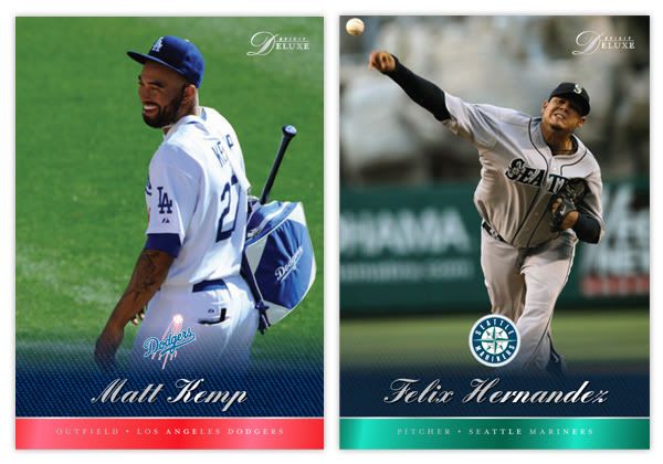
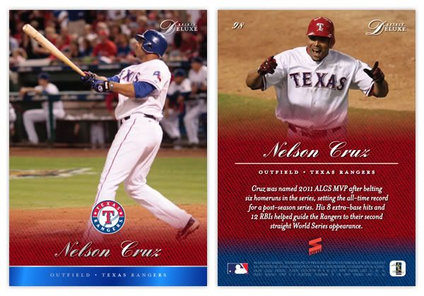
I'm gonna start off with the base card design here. Much like Marquee, the full-bleed photography takes center stage here, though the bottom of the card is ceded for some color. We've continued the colored knit texture that's shown up on a few other Spirit designs. Here, it softly fades into the photograph with the team logo just above. Below the logo is the player name in an elegant script font and stamped with silver foil. The bottom edge of the card is a shiny stripe of the alternate team color and the player position/team stamped in silver foil.
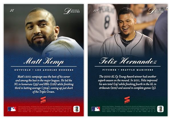
On the back side, the player photo takes up most of the top half with a soft fade into the team color knit. This time, the alternate team color shows up at the bottom in the knit texture instead of a solid block. Player name and position/team are found in the middle with a brief player write-up found below.
I'd say the major characteristics of the Deluxe set are the team colors, soft fade, great photography, and sophisticated typography in a simple design. These elements will continue onto upcoming inserts (auto, relic.)
Trying to keep the Spirit line from getting bogged down into too many different-but-the-same sets like Topps has done, I'll start bouncing back and forth by introducing new inserts for each of the sets. I'm still looking for some innovative ideas to keep from just redesigning what's already out there, so if you have any, feel free to share.
No comments:
Post a Comment