Monday, November 21, 2011

2012 Spirit - Artistry


Time for another insert! This round focuses on the elite pitchers of MLB, nine each from the NL and AL. Pitchers are often referred to as being 'artists' on the mound so I figured they'd be a great subject for a painting-like design. I know we've had UD Masterpieces and various iterations of Diamond Kings and National Chicle, but these seem to be a little bit different.

They're strictly digital 'paintings' so they retain a portion of photographic clarity. Through various blending modes, filters, image adjustments and plain old 'painting' in Photoshop, I arrived at what you see up there. I'm pretty happy with the results but mostly because I stopped at two. The card stock would be a matte-like feel, maybe even similar to UD Masterpieces but without the canvas texture. Player name and Spirit Artistry logo have a gold foil stamp.


For the backside of the card, the painting theme is applied via a picture frame border. Above some weathered-looking canvas is brief write-up about each player and their 'artistry,' I'm not much of a writer, so the copy is pretty standard stuff.

Here's the checklist for all 18 cards in the set:
1    Matt Cain
2    Chris Carpenter
3    Roy Hallady
4    Cole Hamels
5    Tim Hudson
6    Ian Kennedy
7    Clayton Kershaw
8    Cliff Lee
9    Tim Lincecum
10    Josh Beckett
11    Mark Buerhle
12    Felix Hernandez
13    Mariano Rivera
14    CC Sabathia
15    James Shields
16    Jose Valverde
17    Justin Verlander
18    Jered Weaver

Quite a few teams doubled-up (or even tripled-up) but I think it's pretty unavoidable when looking at the league's pitching staffs.

Saturday, November 19, 2011

2012 Spirit - Team MVP


Here is the first insert to the 2012 Spirit set. Team MVP inserts were common in the late 80s and early 90s. Donruss would traditionally mimic their base card design but include some sort of 'MVP' designation in the design. I remember the 1990 set as the first inserts that I recognized as being 'special' with the 'BC-' numbering on the back. "Bonus Cards" as they were known back then. Upper Deck started including Team MVP inserts in the baseball, football, and basketball sets. The designs were different than the base and usually included some sort of flashy printing technology such as holograms or foil.

I always liked the idea of a Team MVP set as it would traditionally depict the team's most popular and sought-after player but also make way for some debate on teams that were stacked with talent. Or in the case of teams like the Twins, the players with the best production get traded or become free agents while the 'Franchise' guys are on the DL. For the most part, there are clear-cut winners.

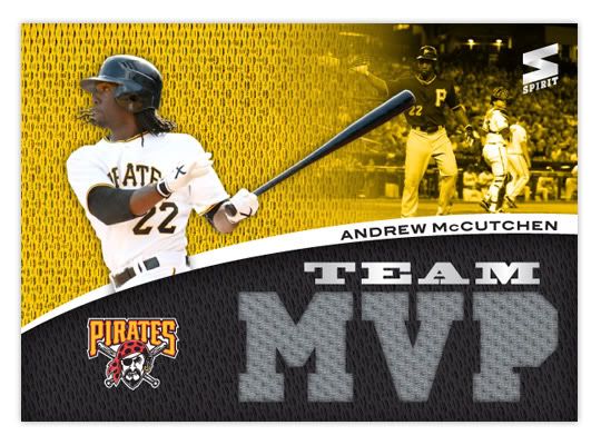
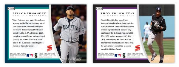
Now on to the design. As you can see, the team color sections from the base set make it onto these cards as well. You HAVE TO have the team colors prominently featured on TEAM MVP cards, right? There are 2 images of each player; a smaller black & white action shot in the corner and also a larger, full-color cutout layered between the 2 color shapes. There's room for the team logo in the corner as well as the player's name in thick curved line. The Spirit logo and 'TEAM' are both in a silver foil because why not?


Oh yeah, I forgot the most prominent feature on the front: the letters M-V-P cut out to reveal a game-used relic. Personally, I really like uniform swatches, whether they're 'game-used,' 'event-worn,' or 'player-gazed-upon.' I think they add depth to the card and make them more than just 'a piece of cardboard.' Now, I do prefer when the swatches are more than just a solid white or solid gray, but I had a hard time finding more interesting swatches big enough to use here so gray is what we get. If these cards were really produced, they'd be full of a variety of colors and such.


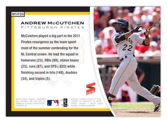
The back of the card features another full-color player photo as well as a small write-up about their 2011 season. The team logo is screen behind the text but the team colors are represented in the 3-sided border.


Below, you'll find my checklist for who I think the 30 Team MVPs are after the 2011 season. What do YOU think?

Angels - Jered Weaver
Astros - Carlos Lee
A's - Gio Gonzalez
Blue Jays - Jose Bautista
Braves - Brian McCann
Brewers - Ryan Braun
Cardinals - Albert Pujols
Cubs - Starlin Castro
Diamondbacks - Justin Upton
Dodgers - Matt Kemp
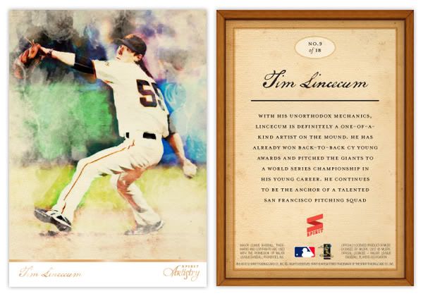
Giants - Tim Lincecum
Indians - Asdrubal Cabrera
Mariners - Felix Hernandex
Marlins - Mike Stanton
Mets - Jose Reyes
Nationals - Michael Morse
Orioles - Adam Jones
Padres - Matt Latos
Phillies - Roy Halladay
Pirates - Andrew McCutchen
Rangers - Josh Hamilton
Rays - Evan Longoria
Red Sox - Adrian Gonzalez
Reds - Joey Votto
Rockies - Troy Tulowitzki
Royals - Billy Butler
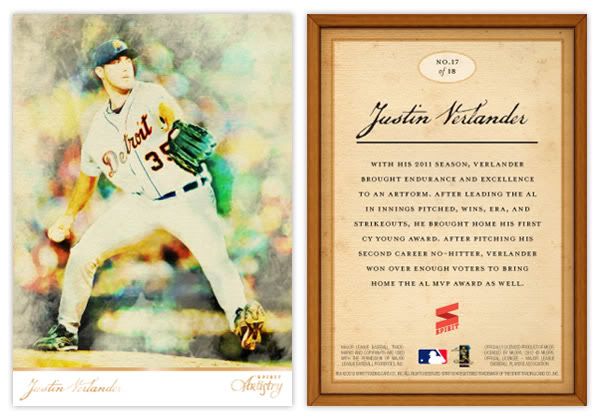
Tigers - Justin Verlander
Twins - Joe Mauer
White Sox - Mark Buerhle
Yankees - Robinson Cano

Monday, November 14, 2011

2012 Spirit Series I


Welcome to Design On Deck's first entry with actual baseball card content. This post will set the format I hope to follow for all future 'concept' posts. But first, a bit of an introduction.

I didn't really want to just slap the Topps logo onto every design I come up with here so I decided I needed to create a completely separate yet totally fake manufacturer. Trying to find a name that wasn't already used at some point by Topps, Panini or Upper Deck, I settled on Spirit. That name obviously has connotations to the sports arena and also allowed me to create a simple yet somewhat believable logo for the cards. Hopefully you'll agree that it's at least better than Panini's fast food logo. As you can see from the card above there, MLB was totally blown away by what we can offer and awarded us a complete (and fake) publishing license! That means you'll see MLB club names and logos on these designs. Our licensing agreement was a little vague on the number of sets per year and any restrictions within those sets, so it's basically anything goes until we get caught.

Okay, now onto Spirit's first MLB set. 2012 Spirit Series I is the flagship, much like Topps Series I, II and Update. This is where you'll see a good chunk of major league rosters along with a few odds and ends. Series I and II each contain 360 cards while a late-season Series III featuring 180 cards brings the total to 900.  That's a nice even fill of 100 binder pages for set collectors.


The design on front features full-color, full bleed photographs and a gloss coating similar to Topps. At the bottom are two shapes filled with team color swatches made to look like jersey material. Player names, positions, and teams are all listed here and printed with gold foil (along with the Spirit logo). There's also room the for the club logo to find its way onto the front of the card. The whole thing looks very colorful and efficiently packed with information.


On the back of the card, you'll see the jersey color swatches set as a background for each players personal info, such as birthdate and birthplace, height & weight, college, and MLB debut. Next to the name is a candid photo of the players cropped a little closer and more intimately. Beneath another colorful curve is and expanse of white marked for player stats. The statistical categories are mostly old guard stuff there isn't enough room for all the sabermetric stuff. There's pretty much room for only 7 previous seasons and career MLB totals. More room could be made for more in-depth statistics if the orientation was horizontal but I personally prefer the look of a vertical card back. I hate when the backs are horizontal and the card number is in the right corner, therefore being in the bottom corner when you're thumbing through your card boxes. Anyway, the club logo is found on the back, screened behind so the stats are still readable.

Overall, I think this is a pretty solid base card design for a flagship product. It's vibrant and colorful with plenty of details make it a contemporary success. I know there aren't any borders that lend themselves to a half dozen parallels, but I kinda like it that way. I plan on making some inserts that would fit along with the set. So look forward to that post some time in the future. As for now, what do YOU think of the inaugural release from Spirit??

Friday, November 11, 2011

Here Go Hell Come

Trying to get my ducks in a row here before I start posting content, but 'hello' to you. My intention is for this blog to be a place where I can share my baseball card design projects and also share my thoughts on general baseball card set designs. This is my first attempt at blogging ever so if you're willing to hang with me during my growing pains I'll be very impressed and grateful.