
Welcome to Design On Deck's first entry with actual baseball card content. This post will set the format I hope to follow for all future 'concept' posts. But first, a bit of an introduction.
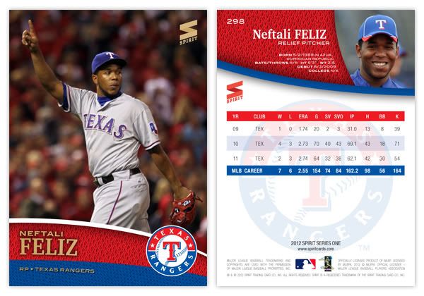
I didn't really want to just slap the Topps logo onto every design I come up with here so I decided I needed to create a completely separate yet totally fake manufacturer. Trying to find a name that wasn't already used at some point by Topps, Panini or Upper Deck, I settled on Spirit. That name obviously has connotations to the sports arena and also allowed me to create a simple yet somewhat believable logo for the cards. Hopefully you'll agree that it's at least better than Panini's fast food logo. As you can see from the card above there, MLB was totally blown away by what we can offer and awarded us a complete (and fake) publishing license! That means you'll see MLB club names and logos on these designs. Our licensing agreement was a little vague on the number of sets per year and any restrictions within those sets, so it's basically anything goes until we get caught.
Okay, now onto Spirit's first MLB set. 2012 Spirit Series I is the flagship, much like Topps Series I, II and Update. This is where you'll see a good chunk of major league rosters along with a few odds and ends. Series I and II each contain 360 cards while a late-season Series III featuring 180 cards brings the total to 900. That's a nice even fill of 100 binder pages for set collectors.
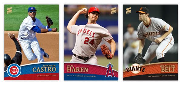
The design on front features full-color, full bleed photographs and a gloss coating similar to Topps. At the bottom are two shapes filled with team color swatches made to look like jersey material. Player names, positions, and teams are all listed here and printed with gold foil (along with the Spirit logo). There's also room the for the club logo to find its way onto the front of the card. The whole thing looks very colorful and efficiently packed with information.
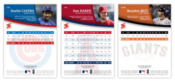
On the back of the card, you'll see the jersey color swatches set as a background for each players personal info, such as birthdate and birthplace, height & weight, college, and MLB debut. Next to the name is a candid photo of the players cropped a little closer and more intimately. Beneath another colorful curve is and expanse of white marked for player stats. The statistical categories are mostly old guard stuff there isn't enough room for all the sabermetric stuff. There's pretty much room for only 7 previous seasons and career MLB totals. More room could be made for more in-depth statistics if the orientation was horizontal but I personally prefer the look of a vertical card back. I hate when the backs are horizontal and the card number is in the right corner, therefore being in the bottom corner when you're thumbing through your card boxes. Anyway, the club logo is found on the back, screened behind so the stats are still readable.
Overall, I think this is a pretty solid base card design for a flagship product. It's vibrant and colorful with plenty of details make it a contemporary success. I know there aren't any borders that lend themselves to a half dozen parallels, but I kinda like it that way. I plan on making some inserts that would fit along with the set. So look forward to that post some time in the future. As for now, what do YOU think of the inaugural release from Spirit??
The design for 2012 Spirit looks better than what Topps has for next year. Have you seriously considered sending a resumé/portfolio to them?
ReplyDeleteSincerely,
JayBee Anama
bdj610
P.S. Oh yeah, I'm adding your site to the Sports Card Blogroll. jba
Thanks for the add! As far as sending my stuff to Topps, I'm a little intimidated starting out. I had someone contact me that was a 'friend' of someone at Topps and he tried to show them some of my designs. Nothing ever came of it but I'm not sure anybody at Topps ever got their eyes on anything. With this blog, I'm hoping things will go well enough to attract some readers and maybe make a bit of a name for myself. And if nothing ever comes of it, I know I'll still have fun just the same.
ReplyDelete