Showing posts with label trout. Show all posts

Wednesday, July 26, 2017

2017 PENNANT BOX BREAK - PACK 1

260. George Springer

59. Russell Martin

101. Trevor Story

29. David Dahl (RC)

214. Yulieski Gurriel (RC)


276. Andrew Benintendi (RC)

71. Jacob deGrom


35. Garrett Richards

169. Todd Frazier

TI13. Mike Trout - The Incumbents

Here’s pack one with the unveiling of the base design. As I’ve designed the Pennant brand through the years, I’ve tried to make it “retro” without being tied down to a specific era. That keeps me from having to find a way to put a new coat of paint on the same basic design, a la Topps’ Allen & Ginter. 
This year’s design has a few elements that callback to some classic card designs without outright aping a specific set. Homages to the 1960 and 1963 Topps designs are the most apparent. There are also some nods to the 1983 and 1984 sets as well. Mashing together those two decades creates something distinct from those particular areas.
I added a bit of grain along with a dull gray to mimic the pre-90s cardboard most of us grew up with. The Trout insert is a brilliant white, though, with a nicer paper stock used to make the insert cards a bit more “premium.”
It’s funny that I’ve been doing The Incumbents insert sets long enough that Mike Trout is now the longest-tenured member of the Angels. That’s pretty crazy. Almost as crazy as pulling three rookie cards in the first pack. I’m sure that won’t be the norm going forward. There will be some other surprises, though…

Tuesday, July 25, 2017

2017 Pennant Box Break


Coming soon— our next box break. 2017 Pennant, the retro set from Spirit Trading Cards. The wrapper design here gives you a bit of a preview of the base card design. Stay tuned…

Sunday, April 23, 2017

2017 SPIRIT BOX BREAK - PACK 13

147. Melky Cabrera

84. Tommy Joseph

6. Domingo Santana

184. Felix Hernandez

41. Kirk Nieuwenhuis

226. Zack Cozart

44. Carlos Martinez

58. Justin Smoak

29. Luke Weaver (RC)

G136. Didi Gregorius

TL48. Mike Trout - Team Leader (ANA-Hits)


Lots of cool shots in this pack. Joseph sliding, Felix in the shadows, Nieuwenhuis going all out, Smoak in BP, Didi taking the field (with no glove apparently?). That said, the Trout insert is probably the best card “value”-wise.

Sunday, October 16, 2016

2016 Spirit Deluxe Portraits


Well, the postseason is upon us and my interest in the 2016 collecting year is dwindling. I've started looking ahead to 2017 and already have base design in the works. I'll be trying something new when it comes time to roll out the 2017 Spirit releases. Hopefully I'll plan it well enough to not fall on my face like I've done in the past. All of this is to preface the fact that this will probably be the final 2016 Spirit design post. I may have a remix post or two following the World Series, but I'm calling it quits on "new" designs for 2016. And since the Deluxe line has received the least attention this year, I figured it was only right to at least offer up one "insert" design.


If you've been reading this blog long enough, you may remember the Deluxe Portraits design from four years ago. The concept there was just a zoomed in portrait of a guy, cut out and placed on top of the team-colored texture and nothing more. I also had die-cut variations there but I've since come to loathe extreme die-cuts. For 2016, I decided to make them more Studio-esque—a bit more refined and interesting. Incorporating the color fade from the 2016 Deluxe base design, the portraits are less stark and the overall card is less "in-your-face" than before. The only embellishments are the player name and a baseline stamped in silver foil along with the Deluxe "D" logo in the corner.


The backs are even more simple than the front. Just a logo, player and team name and a few brief lines filling you in on the player's impact. Sometimes less is more.

And with that, the 2016 Spirit Trading Cards year comes to a close. Reflecting on the year of this blog, I realize that the gaps in posts can be explained by my disinterest in actually writing about the cards. That's partly due to the fact I'm not a writer. There are only so many ways I can describe what you can just as easily see by looking at the cards themselves. So looking ahead to 2017, I anticipate a lot less of me describing what's on the cards themselves and perhaps more of me explaining my decisions. Or I might just shut up and let the designs speak for themselves. Either way, I hope I post more often.

Friday, February 26, 2016

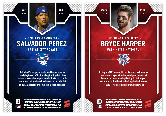
2016 Spirit Award Winners

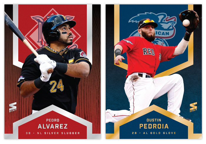
Now that the base design has been unveiled, I'm keeping with tradition and presenting the Spirit Award Winners as the first insert design of the season. You know the drill by now — 18 Gold Glovers (9 AL/9 NL) with gold foil and 18 Silver Sluggers (9 AL/9 NL) with shiny, shiny silver. After starting out super gaudy like disco balls and gold bars, the foil has been a little more subdued in the past couple years. That's also meant a little bit more actual designing on my part.


The gold and silver is mostly found in the four corners with a little bit of deckled texture added in. These make for a nice way to frame the player cutouts. The backgrounds are once again blue and red, respective to each league. The texture is just stormy/grungy enough to keep things interesting without going overboard. It's a good match for all the clean, modernistic lines everywhere else.


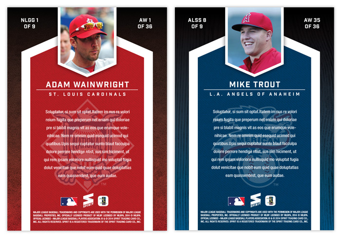
The backs are basically the same design as the front, only flipped vertically with text replacing the cutouts. The small mug shot along the top gives you another chance to see these superstar honorees up close. Overall it's a pretty efficient design with just enough ornamentation to add interest without overwhelming you.

Wednesday, September 17, 2014

2014 Spirit Base: 341-350


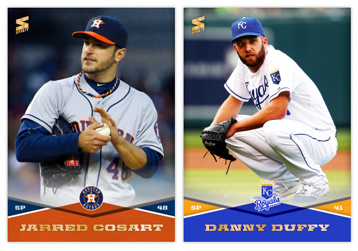
#341 - Jarred Cosart
Cosart was decent with the Astros but he's been great since being traded to the Marlins. (And I was worried about having enough cards for Series 3...)

#342 - Danny Duffy
What an great name.


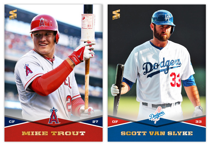
#343 - Mike Trout
It's funny how Trout's 2014 batting average is under .300 and OBP is under .400 yet this will be the year he finally wins MVP.

#344 - Scott Van Slyke
Really good lighting for this photo.


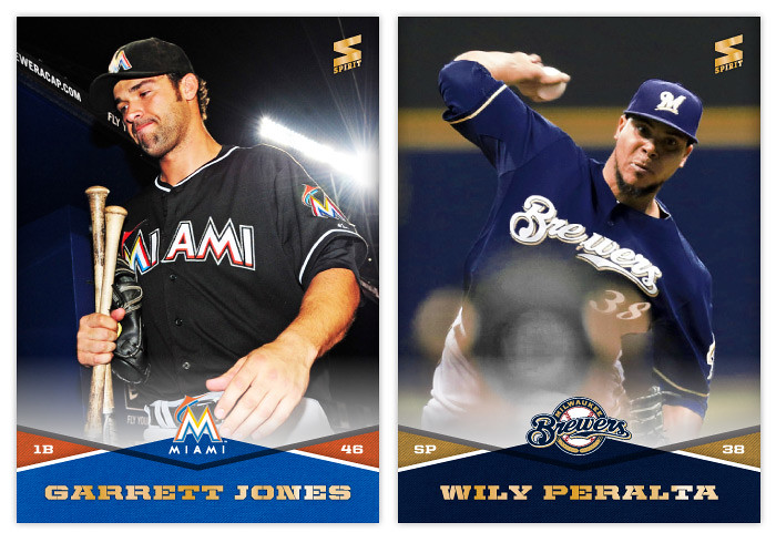
#345 - Garrett Jones
Thus concludes the "men holding bats" portion of the checklist.

#346 - Wily Peralta
I know Wily's not pronounced how it looks but I really hope he starts getting called "The Coyote."


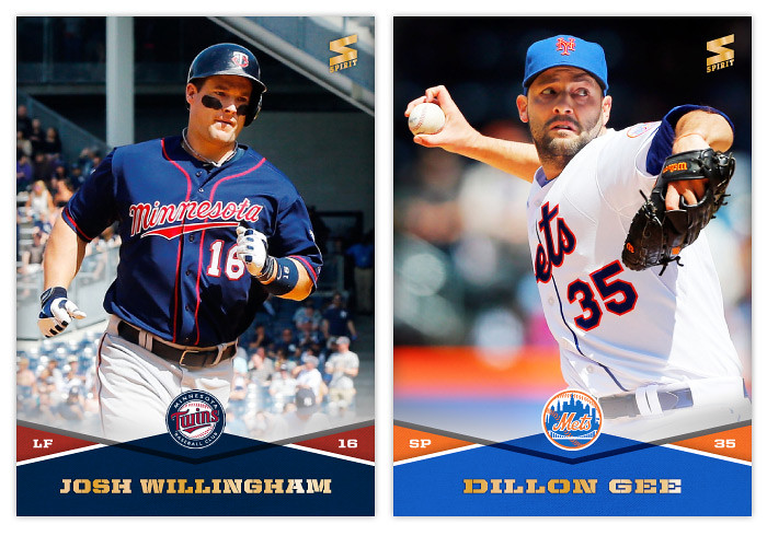
#347 - Josh Willingham
Former Twin, current Royal.

#348 - Dillon Gee
Sifting through all his photos, Gee has that scared "oh my god, please don't hit it" look on his face for every pitch.


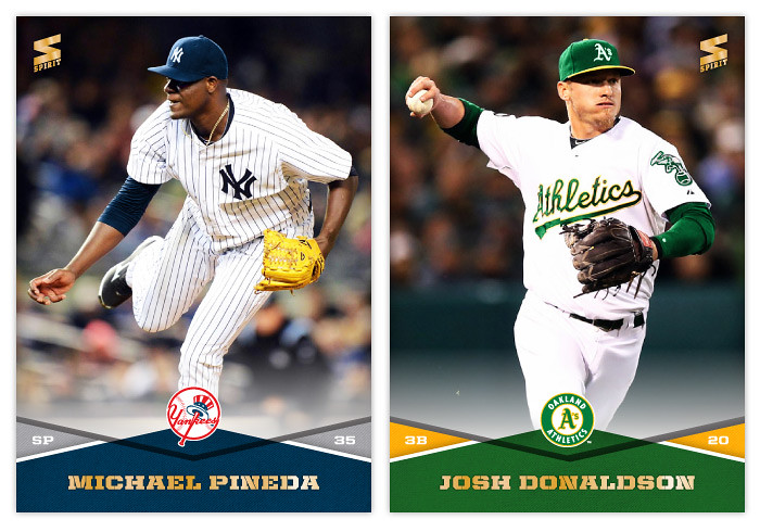
#349 - Michael Pineda
Hmm, that palm looks awfully clean there...

#350 - Josh Donaldson
Every single A's photo needs recolored since I want the greens to match. I don't mind it though since that kelly green looks so damn good.

Wednesday, February 19, 2014

2014 Spirit Award Winners


After hitting the halfway mark of the base set project, let's take a break and check in with some Series 1 inserts. For the third year in a row, the inaugural insert design is the Award Winners set. This year brings some familiar motifs along with some changes. We're still alternating between gold and silver foil for the Silver Slugger and Gold Glove winners, though I decided to subdue the blinginess a bit. Now there are just a few strips of foil instead of a huge shiny background.


The NL cards feature red again and the AL guys are blue. With this system, you can easily distinguish which award each player won just by glancing at the foil color and background. Just to be safe, I added another visual cue with the Gold Glovers having a leather background and the Sluggers a wooden bat. And to make things even more clear cut, the NL and AL logos are screened on upper fabric swatch thing.


The back of the card has the same elements from the front repeated, other than the foil of course. They actually look pretty similar to the 2012 ones I did, though the overall composition fits this design better.

Monday, July 22, 2013

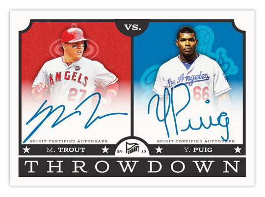
2013 Pennant Throwdown


Just like a most trends, I'm finally "down" with something just as it seems to be fizzling out. I'm talking, of course, about Puigmania. Even though we all knew his first month or so in the majors was pretty unsustainable for a whole season, the rest of the league does seem to be "figuring him out" of late. I'm sure he'll make the adjustments and stuff, but probably not late enough to help the Giants out. I imagine Topps' second half products will have no trouble selling.

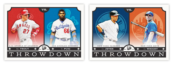
With what would be the most highly sought-after card of 2013 up there, let's take a look at Pennant's next insert — Throwdown. These feature a pair of players on rival clubs. I know this is a lot like Topps' Legendary Lineage and Diamond Duos from a few years ago, but with only 15 subjects (all of which are actual rival teams), the connection is a lot less tenuous. Here's the checklist:

1. NYY v BOS: Rivera/Ortiz
2. NYY v NYM: Jeter/Wright
3. NYM v PHI: Harvey/Lee
4. STL v CHC: Beltran/Rizzo
5. SF v LAD: Cain/Kershaw
6. SF v OAK: Posey/Cespedes
7. LAD v LAA: Puig/Trout
8. TEX v HOU: Kinsler/Altuve
9. BAL v WAS: Machado/Harper
10. CLE v CIN: Jimenez/Votto
11. STL v KC: Wainwright/Butler
12. CHC v CHW: Castro/Sale
13. STL v CIN: Carpenter/Phillips
14. PIT v PHI: McCutchen/Howard

15. ATL v PHI: Hudson/Utley

A few teams have a couple of cards here but they're represented by different players. It would be nice to have all 30 squads featured but as you can tell from MLB's interleague scheduling, you can't force rivalries.


Design-wise, the front of the cards have a little vintage flavor to them like the rest of the Pennant cards but still look clean and modern. Embellishments like the rounded inset corners and the classic typography help add some age, along with the less-than-bright cardstock. The space is split down the middle with grainy team-color boxes housing single-color team logos behind player cut-outs. There's a faint white gradient billowing up over the photos to make room for the team name. It can also fade up a little farther to make room for the signatures on the autograph cards.


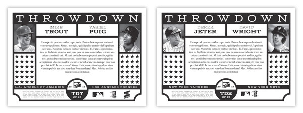
For the back, I kept it black & white while recreating similar design elements from the front. Black & white photos on the opposite edges leaves plenty of room in the middle for a brief history of the players' and teams' rivalry stories. The lines of stars can be removed for the authenticity statements on the auto versions.

I tend to shy away from horizontal cards due to format issues for the blog but I'm really pleased with these. They're bright but not too bright, retro but not too retro. It's always nice to feature more than one team on a card so you can have 2 fanbases chasing after them. And it helps take the sting out of pulling a Dodgers card if it features Matt Cain or Mike Trout. (Okay, I'll stop with the Dodgers jokes.)

Tuesday, July 9, 2013

2013 Spirit Team MVPs


Just like with Award Winners, every year will see a return of the Spirit Team MVP insert. To me, it's a no-brainer. A 30-card set with every team represented by their best player. Why Topps hasn't embraced this idea is beyond me. Maybe since it was Donruss' thing they want to keep their distance.

Let's start off with the checklist.

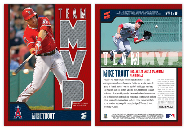
MVP1: Mike Trout (Angels)
MVP2: Jose Altuve (Astros)
MVP3: Yoennis Cespedes (A's)
MVP4: Jose Bautista (Blue Jays)
MVP5: Brian McCann (Braves)
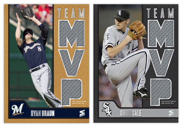
MVP6: Ryan Braun (Brewers)
MVP7: Yadier Molina (Cardinals)
MVP8: Starlin Castro (Cubs)
MVP9: Paul Goldschmidt (Diamondbacks)
MVP10: Clayton Kershaw (Dodgers)
MVP11: Buster Posey (Giants)
MVP12: Asdrubal Cabrera (Indians)
MVP13: Felix Hernandex (Mariners)
MVP14: Giancarlo Stanton (Marlins)
MVP15: David Wright (Mets)
MVP16: Bryce Harper (Nationals)
MVP17: Chris Davis (Orioles)
MVP18: Chase Headley (Padres)
MVP19: Cliff Lee (Phillies)
MVP20: Andrew McCutchen (Pirates)
MVP21: Adrian Beltre (Rangers)
MVP22: Evan Longoria (Rays)
MVP23: David Ortiz (Red Sox)
MVP24: Joey Votto (Reds)
MVP25: Troy Tulowitzki (Rockies)
MVP26: Billy Butler (Royals)
MVP27: Miguel Cabrera (Tigers)
MVP28: Joe Mauer (Twins)
MVP29: Chris Sale (White Sox)
MVP30: Derek Jeter (Yankees)

Some of these selections were tough. The Braves have a handful of guys that are good but none that really rise above the rest. I went with McCann because he's been there the longest. Castro has had a down year so Anthony Rizzo could possibly replace him. The Rays' pick could've been David Price or even Ben Zobrist. Carlos Gonzalez has a good case for the Rockies since Tulo is always hurt. The Royals guy could easily be Alex Gordon or James Shields. And since Jeter has been out all year, it would probably make sense to put Cano in there, too.

Anyway, onto the design.


Like last year, the biggest feature here is the MVP relic windows. I figured the easiest way to differentiate from 2012 would be to make them vertical instead of horizontal. So the M-V-P letters are stacked on the right side leaving a vertical window for a player photo. To add some depth, I had part of the guys overlap into the team color section. Below is a the secondary team color section to house the player name along with the cap logo. The square-ish space for the logo helps balance things along with keeping it from looking to symmetrical (which I have a habit of doing.) There's some silver foil along the relic windows and all the text, minus the "Spirit Certified Game-Used Relic" small print below the P.
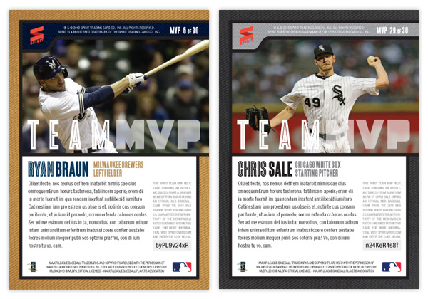


The elements make a 90° turn for the back side while the secondary bar moves to the top. Below a horizontal player photo is a brief bit of text. To the left is a block of copy about the relic authentication along with a code to enter online for more info about this particular swatch. And I'm looking out for everyone with having the numbers in the upper right corner so they're easy to see when stored in a cardboard box.


Monday, July 9, 2012

Spirit Deluxe Duos


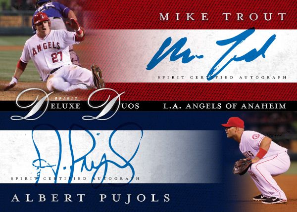
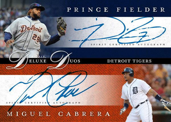
No, not Diamond Duos or Dueling Duos. Deluxe Duos. Two guys on the same team that are among the MLB elite. It may not be the most original concept, but I bet there are lots of people that'd be very excited to pull a Mike Trout/Albert Pujols dual auto. Every good turn deserves another or something like that.

These carry the same hallmarks as the other Spirit Deluxe cards so far. Team color textured backgrounds, sophisticated fonts, silver foil, dynamic fade photos. Hopefully the consistency isn't too boring.


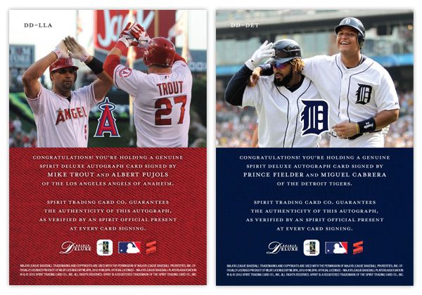
The back features a candid shot of the two featured players together. I really like the Fielder/Cabrera photo. It's nice to see teammates interact with each other like little leaguers do. And for these cards, it keeps the front side from looking like arbitrary pairings of guys who just happen to wear the same uniform.

Some of the other duos in the series would probably be Harper/Strasburg, Kemp/Kershaw, Lincecum/Posey, Halladay/Lee, Pedroia/Ellsbury, Mauer/Morneau.