Sunday, October 16, 2016
2016 Spirit Deluxe Portraits
Well, the postseason is upon us and my interest in the 2016 collecting year is dwindling. I've started looking ahead to 2017 and already have base design in the works. I'll be trying something new when it comes time to roll out the 2017 Spirit releases. Hopefully I'll plan it well enough to not fall on my face like I've done in the past. All of this is to preface the fact that this will probably be the final 2016 Spirit design post. I may have a remix post or two following the World Series, but I'm calling it quits on "new" designs for 2016. And since the Deluxe line has received the least attention this year, I figured it was only right to at least offer up one "insert" design.
If you've been reading this blog long enough, you may remember the Deluxe Portraits design from four years ago. The concept there was just a zoomed in portrait of a guy, cut out and placed on top of the team-colored texture and nothing more. I also had die-cut variations there but I've since come to loathe extreme die-cuts. For 2016, I decided to make them more Studio-esque—a bit more refined and interesting. Incorporating the color fade from the 2016 Deluxe base design, the portraits are less stark and the overall card is less "in-your-face" than before. The only embellishments are the player name and a baseline stamped in silver foil along with the Deluxe "D" logo in the corner.
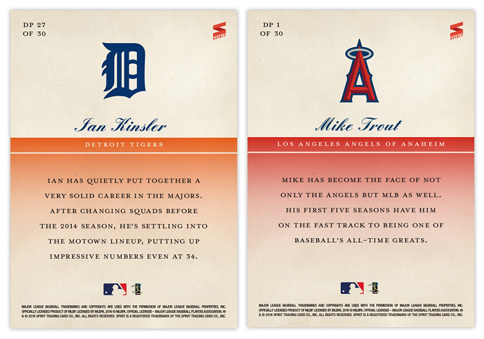
The backs are even more simple than the front. Just a logo, player and team name and a few brief lines filling you in on the player's impact. Sometimes less is more.
And with that, the 2016 Spirit Trading Cards year comes to a close. Reflecting on the year of this blog, I realize that the gaps in posts can be explained by my disinterest in actually writing about the cards. That's partly due to the fact I'm not a writer. There are only so many ways I can describe what you can just as easily see by looking at the cards themselves. So looking ahead to 2017, I anticipate a lot less of me describing what's on the cards themselves and perhaps more of me explaining my decisions. Or I might just shut up and let the designs speak for themselves. Either way, I hope I post more often.
Subscribe to:
Post Comments (Atom)


Nice finish to the season.
ReplyDeleteLove the attention to detail (as always) and I like the way the back of the card compliments the front.
You've got a real talent for design. Looking forward to what you have up your sleeve next year.