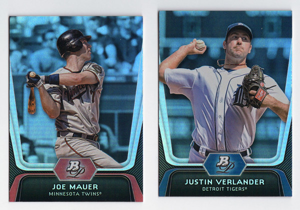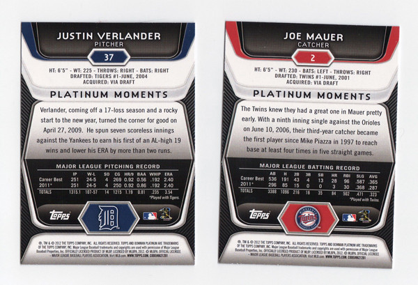
I've been kind of partial to Bowman Platinum the last few years of my collecting resurgence. It does a much better job of balancing prospects and veterans than the standard Bowman set. Design-wise, it's a pretty good entry as something that's not really high-end but much nicer than the cheaper standard Bowman.
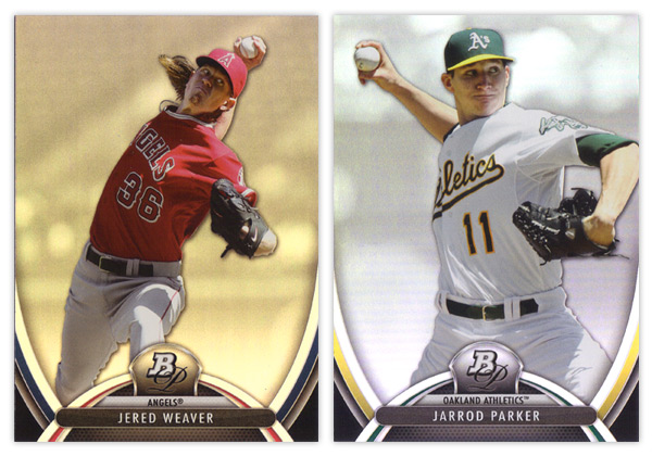
There are some similarities though when it comes to the 2013 product. Much like this year's Bowman comes across as 2012 v.2, Bowman Platinum dances on similar ground as last year's. The foilboard is back, along with the player cutouts over rainbow-y backgrounds, though this year it looks like they've screened those back a bit so they're lighter and less busy. Then there's the BP pendant in the middle on top of some abstract, swooshy shapes. Last year was more about straight lines with curved corners. This year we get the Gateway Arch. Throw in some team-color slivers and the player & team names spelled out and it, once again, looks like a leftover from last year's design brainstorming session.
I do like that there's more room devoted to the player image and the name being smaller seems to keep things a little tighter. Added points for having both team colors in there as well. And the fake mesh texture at the bottom is definitely an upgrade from 2012's candy stripes.
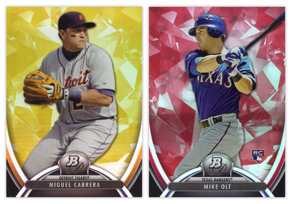
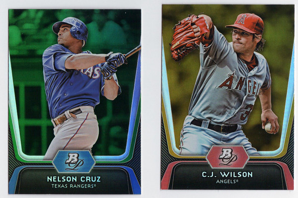
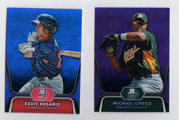
I am pretty happy with the color parallels this year. We have the gold and ruby pictured here along with a blue sapphire which seems to have replaced the green emerald from years past. The main difference here is they've added the atomic/ice/diamond-like texture to the colors so they are easily distinguishable from the base cards.
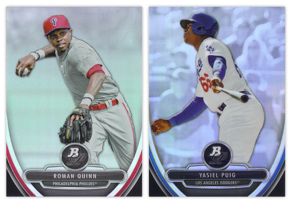
Since it's pretty much standard procedure for all Bowman products the last couple years, the prospect card design is very very similar to the veteran cards. Stick the BP monogram in circle, tear down the arch, flip the player/team names and stick them on top of an overstuffed metal hamburger and we've got ourselves a 'new' design. My other big complaint with the prospect cards is the refractor situation. Can you tell which of the two above is the refractor? I sure as hell couldn't until bending my neck down lower and lower until I caught the glossy sheen on the Puig. If you're going to make every card appear refractor-y and still include a standard 'refractor' parallel, do a little extra work to differentiate them so collectors don't have to. Last year's concrete block worked great. No need to abandon it when you're so keen on repeating elements year after year.
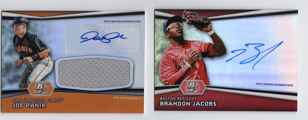
Oh yeah, there are also a lot of prospect parallels that I didn't get in either of my 2 blasters so I'll just add they are the same as above, only colorified.
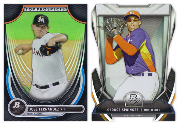
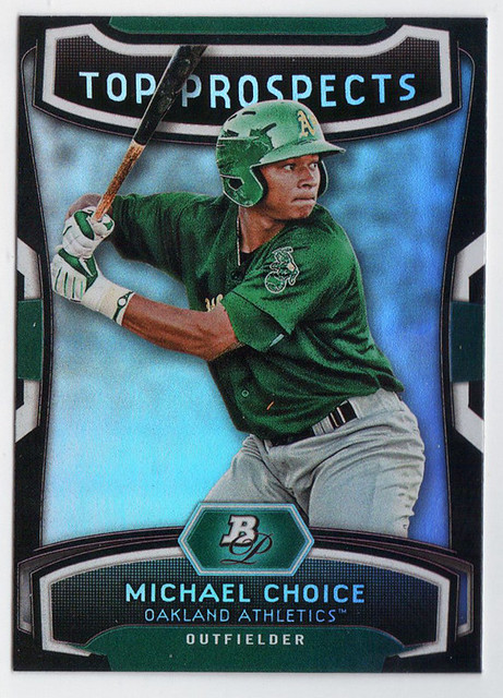
Unfortunately, I wasn't lucky enough to pull any autographs from said blasters so we're finishing up here with the inserts. The Top Prospects design is actually pretty different from 2012's and the rest of the 2013 cards. I don't have a problem with too much here other than the wispy white curves behind the player cutout. It's waaaay too much. It looks like they're sinking in a really loose hammock. The rounded inverted corner in the top are a little too big for my tastes but far from the biggest eyesore.
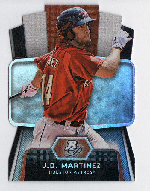
Last and certainly least is the Cutting Edge Stars diecut. I've mentioned before how I'm not a fan of Topps' over-the-top, random die-cutting they've employed excessively over the last 2 years. Most of my distaste is aesthetically motivated, which still applies here. I don't understand what all of these design elements are supposed to be. Some torture device from Michael Bay's next Transformers movie? But my biggest problem with this particular die-cut is the little barbed teeth in the center at the bottom. I can't remember the last time I had so much trouble sliding a card into a penny sleeve. Honestly, it was a torturous test of my will and patience. If I happen to get my hands on any more of these, hopefully they'll already be toploaded for me.
I know this may have come across as mostly negative, but since Bowman Platinum starts off pretty high in my mind, most of these little dings I put on the set don't really bring it down that much. Really, if this was the 2012 design and last year's was coming out now, I'm not sure if the 2 reviews would be that much different. Hopefully the 2014 edition will have a few more differences while keeping up the Bowman Platinum brand.
Base cards: 8/10
Parallels: 8/10
Prospects: 6.5/10
Inserts: 6/10
OVERALL: 7/10