Now's the time, the time is now. Time for Gint-A-Cuffs! As you may recall, I participated for the first time last year and somehow
won the durn thing. I'm still amazed at my good fortune. And since it's a no-brainer that I have to defend my title, here's my first post for Gint-A-Cuffs V. I've decided to split the box into 3 posts rather than 4 to help keep you all from growing weary. Let's get going.
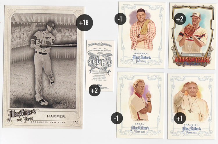
BOXTOPPER
OBBH: Bryce Harper (FP) +18
PACK 1
119 Adam Richman -1
217 Pope Francis +1
244 Nick Saban -1
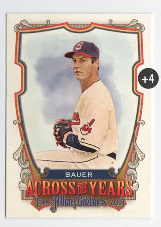
ATY Chris Sale +2
A&G Mini: 259 Matthias Blonski +2
PACK TOTAL +3
RUNNING TOTAL +21
I got off to hot start with
last year's boxtopper. This year's didn't quite match it but pulling Harper from the Favorite Player list is a nice bonus. These are nicer than the N43s from 2012 though the checklist is a bit small.
I was definitely a bigger fan of last year's Art Deco look than 2013's medieval bigtop feel. The Allen & Ginter's logo is a tad too large and all the light, scroll-y borders take a up a little too much focus. The two combined scream 'college-town head shop' to me. The pictures and paint daubs look the same as ever but don't really fit in with the rest of the elements.
PACK 2
122 John Jay (FP) +2
333 John Kruk (SP) +2
A&G Mini: 239 Craig Kimbrel +2
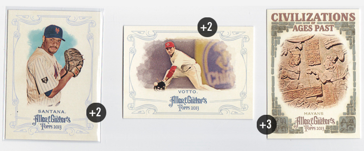
Civilizations: Olmecs +3
PACK TOTAL +9
RUNNING TOTAL +30
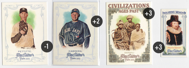
The Civilizations of Ages Past really sticks out here around the rest of set. If the cobbled border were a lot lighter and the typeface was a bit more subtle, I'd probably really dig the cards. As is, those elements really jump out and not in a good way.
PACK 3
341 Ozzie Smith (SP) +2
307 Darwin Barney (SP) +2
Palaces: Mysore +3
A&G Mini: 129 Miguel Montero +2
PACK TOTAL +9
RUNNING TOTAL +39
Huh, can't say I've ever pulled 2 SPs in the same pack before. Hopefully they behaved themselves in the wrapper.
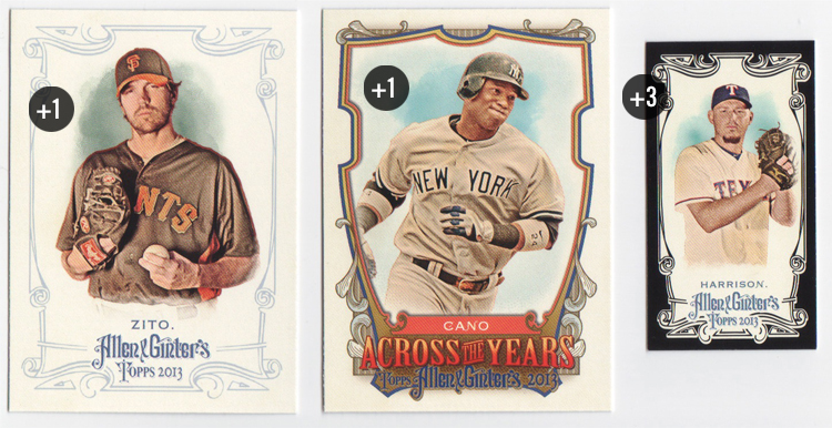
PACK 4
99 Barry Zito (FT) +1
Black Mini: 18 Matt Harrison +3
ATY: Robinson Cano +2 / -1 NYY = +1 total
PACK TOTAL +5
RUNNING TOTAL +44
I do like the black-bordered mini's this year.
2012's didn't really stand out as much so it's nice to see Topps return to more ink coverage.
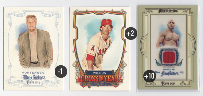
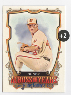
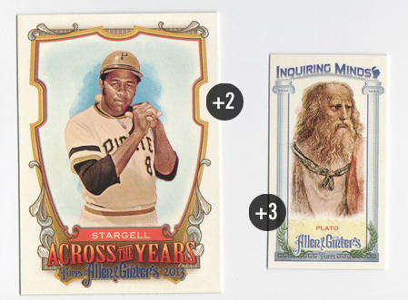
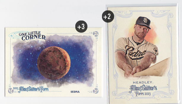
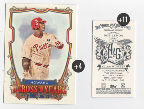
The expansive insert set this year is Across the Year's which features some historical trivia as it relates to the players' birthdays. I really like the concept here since so much of A&G is about history. One complaint, though, is the numbering system. I understand when they throw the players' initials onto relic and auto numbers but I really don't get the reasoning here. They always have a 100-card insert set. What's wrong with ATY1-100? Or even a chronological numbering system since each card has its own unique date? As far as the design goes, it's definitely bold and the shield looks like something Topps would love to die-cut. All the text at the bottom gets a little muddled, especially the blue A&G logo on that gold color.
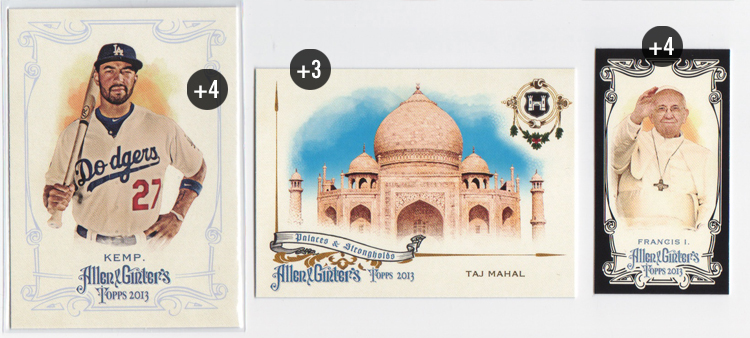
PACK 5
319 Matt Kemp (FP/SP) +4
Black Mini: 217 Pope Francis +4
Palaces: Taj Mahal +3
PACK TOTAL +11
RUNNING TOTAL +55
Hey look,
Black Francis! The Palaces & Strongholds design matches the base design much better. The asymmetry is really nice.
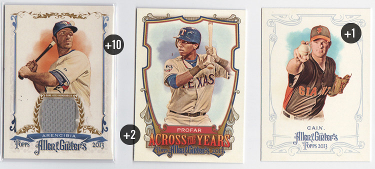
PACK 6
241 Matt Cain (FT) +1
ATY Jurickson Profar +2
Full-Size Relic: J.P. Arencibia +10
PACK TOTAL +13
RUNNING TOTAL +68
Okay, here's my first hit of the box. New this year are full-size relic cards. You get a little more 'relic' size-wise but I think the penalty is a card that doesn't look as good. I'm still on the fence as to whether or not a different design than the base design is necessary. The elements are pretty similar between the two. In fact, if you remove the relic portion, I could see this as the runner-up design from their brainstorming sessions.
PACK 7
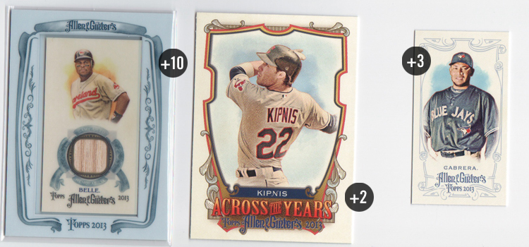
ATY Jason Kipnis +2
SP Mini: 345 Melky Cabrera +3
Mini Relic: Albert Belle +10
PACK TOTAL +15
RUNNING TOTAL +83
And the hits keep coming. This Albert Belle bat relic is in the traditional A&G mini format with the big honkin' frame. The frames this year aren't the kaleidoscopic wonders from years past but I do think they're nicer than the
black borders from last year. I would've been soooo excited to pull this card 20 years ago.
PACK 8
347 Steven Strasburg (SP) +2
Palaces: Forbidden City +3
Inquiring Minds Mini: Sun Tzu +3
PACK TOTAL +8
RUNNING TOTAL +91
My first mini insert comes from the Inquiring Minds collection. The ionic columns and olive leaves work for Greek thinkers but look off for Sun Tzu here. I guess if you have to represent a singular age of great thinking from history, the Greeks probably have the most recognizable imagery. All in all, I like the design just fine.
A third of the way through the box and I'm ahead of last year's pace. Unfortunately, I've pulled 2 of my 3 hits so I anticipate these numbers to trend down a bit. Also, I forgot to track my non-scoring cards from each pack so I hope I don't get docked for that. *SPOILER ALERT: it won't matter*


