

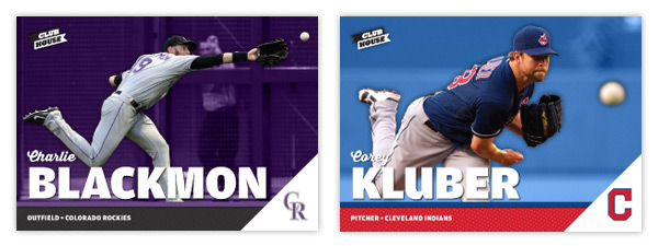
With the horizontal format we'll see more dynamic action shots, different from those on the vertical Spirit base design. There's a full-color action cut-out on top of a team-color shaded background. Just above the secondary color bar with the player position/team name is a big, bold last name. Tucked just above that is the player's first name in a nice script font. In the bottom right corner is a white triangle leaving just enough room for the team cap logo.
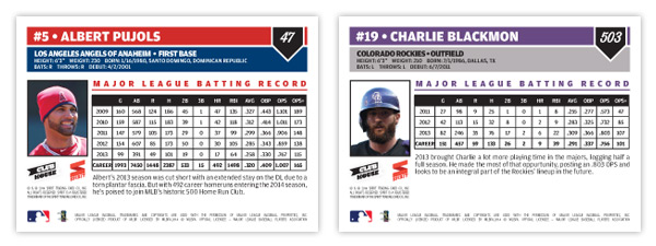
On the back are a couple of color boxes for all the pertinent player bio information. Next to a small portrait is a stat block with the player's five most-recent seasons along with their career totals, leaving room for a few sentences about them. As you can see from the numbering in the upper right, the set is a lot bigger than most non-flagship releases. A 600-card, no-foil low-end set would definitely fill a hole in the current baseball card landscape.
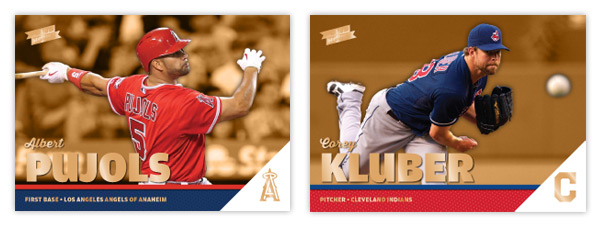
I'm adding a single parallel to the set, Clubhouse Gold seen here. Just like the original Topps Gold parallels, these are strictly the same cards but with gold foil embellishing a few areas. I also made the background color gold, too, to help set them off in case the foil gets overlooked.