Friday, January 27, 2012

Welcome to the Clubhouse


First off, I want to welcome all of you new readers out there. I'm sure a lot of you came here thanks to Robert over at $30 a Week Habit, so thanks again to Robert. I really enjoy your blog and marvel at your restraint to stay within your budget. You are much stronger than I.

Now onto the card design. I was looking to create a 'low-end' set for Spirit, along the lines of Collector's Choice from the 90s or Topps Total from the early 00s. I think having a product come in at $1 a pack is important to keep growing new collectors in their youth. I know we have Opening Day but I don't like the idea of a product being tied to a single day early in the season, especially since Topps Series I is still somewhat fresh at that point. The Clubhouse set would hit the shelves right around Memorial Weekend, which, to me, always signifies the start of summer.


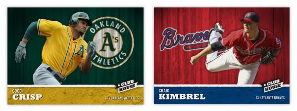
The base set consists of 810 cards total: 25-man roster + manager + team checklist x 30. The front of the card features the player cut out and placed in front of an old wooden fence in team colors with the team logo 'painted' on. At the bottom is the player name, position and team name placed on top of a team color dirt patch. The two sections are separated by a white chalk line and the Clubhouse logo. I think this is a pretty good 'kid-targeted' design with the solid colors and player cut out. It has a bit of a 'Sandlot' feel to it.


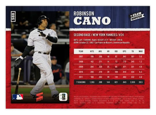
The back of the card features the same team color sections but with the proportions flipped. A full-frame picture of the player is found on the left with the stats & info on the right. The stat lines only cover 5 seasons and a small selection of statistical categories. They're a blend of traditional and sabermetric stats, whichever floats your boat. The card numbers in the upper left hand corner, rotated 90° counterclockwise. This makes them easier for sorting when stored vertically in /ct boxes and also keeps from covering up too much of the photo.


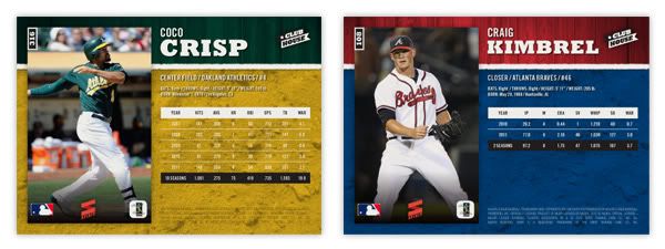
The production is pretty no-frills, with no foil stamping, crazy shiny patterns, parallels or any other gimmicks. Just full-color printing on a coated card stock with a semi-glossy coating. There will be a few inserts coming up later and maybe even something like a relic or die-cut. This would be a simple, fun, colorful release for set-builders on a budget or kids spending their lemonade money or whatever kids do to earn money during summer break.

Thursday, January 12, 2012

The Who's on first, Mike Watt's on second: 2012 Spirit Headliners


I have 3 main passions in life: sports, design and music. (If I had a fourth, it would probably be fast food... I've said too much.)

Since you're reading this blog, it should be pretty obvious where the first 2 merge. Baseball card design is exciting for me. Even as a kid I would scribble out new card designs with a box of Crayola thin-tipped markers and some 3x5 index cards. The black would always go out first so I'd have to make some bold color choices after that. I assume this is how the 1990 Topps and 1991 Donruss designs were mocked up.

As for the latter, there's no better synergy of design and music than the gig poster. From their humble beginnings as xeroxed flyers on colored paper stapled to everything in sight, gig posters are now beautifully artistic receipts for those rock shows you won't be able to replay in your head once the ringing in your ears is gone. Or, more accurately, they're works of art that help to visually explain the music, if not literally then figuratively.

My wife got me a few gig posters for Christmas (the Avett Brothers, Superchunk and the Decemberists) and it planted an idea in my head. 'Wouldn't it be cool if I could combine all 3 of my passions into a singular product?' Just as gig posters commemorate the date of sometimes transcendental rock shows, why not give transcendental baseball performances a similar treatment?

Hence the birth the Headliners insert set. There are a couple attributes to this set that are very unique and potentially revolutionary. First of all is the artists. Within the gig poster world, there are quite a few remarkable designers. Mikey Burton, Aesthetic Apparatus, A. Micah Smith, Rob Jones and the Heads of State are a few of the all-stars and some of my personal favorites. The idea would be to get 15 different artists on board and have each of them design an original screenprint commemorating one of 15 different notable baseball performances like Thome's 600th homerun, Jeter's 3,000th hit or Verlander and Liriano's no-hitters. Things that made 'headlines' during the 2011 MLB season.

The set would be one of the most unique in memory, with 15 different artists and their 15 different styles on 15 different designs for 15 different events while all being cohesive in concept. As popular as Dick Perez's Diamond Kings cards were in the 80s & 90s, they got pretty stale. This would inject some new life into the baseball card illustration platform.

For proof of concept, I went with the two designs you see above: Pujols' 3-homerun display in Game 3 of the World Series and Ervin Santana's no-hitter. While the designs are different, they each incorporate some of the elements you'll see in a lot of gig posters. Hallmarks such as 2- or 3-color inks, intentional mis-registration (ink overlap), halftone patterns, and grainy ink coverage. While you won't find those on every gig poster, they're definitely oft-occurring characteristics that scream 'gig poster.'

What I think puts this set over the top into awesome sauce is my next idea: a redemption parallel. That's right, two of the most loathed things in current card collecting world. But hear me out. For the parallel part, it's not just the same card with 5 different colored borders and shrinking print runs. There are only 2 versions: the standard card and the redemption card.


Most people hate redemptions because it takes forever before you get the actual card in-hand and a lot of times, it ends up being something different than what you were supposed to get. Those are two things you don't have to worry about with this set. The redemptions are for one of 150 screenprints of each design. Those will be delivered by each artist before the cards can even go to print. So basically, you get the card and redeem the code on back and get a 22x28 screenprint (/150) of the same design, signed by the artist.


What do you think? Good idea or great idea? Unique card designs, redemptions for full-size works of art, expanding the market for baseball card collectors. I'd love for Topps to steal this idea from me.
Well, maybe not steal. I'd be willing to trade the idea for a job with them.

Monday, January 9, 2012

2012 Spirit FanFare Autos


It's 2012 and time to reactive the blog here. We're less than month from the release of 2012 Topps Series I so hopefully we'll have some product review posts shortly. As for now...

Here's my first autograph insert set for Spirit. The 'FanFare' theme here highlights the players that are 'fan favorites' on each club. Sometimes they're the superstars, sometimes they're the local favorites. I know it'd probably be nearly impossible to have an auto checklist that wasn't littered with pinch hitters or bottom of the lineup guys, but you know that's what everybody wants.


The card design is pretty basic with team-color swatches in the bottom and also behind a full-action cutout.  The player name and Spirit logo are in a silver foil along with a thin frame inset around the edge. Peeking up just above the player name is a soft white gradient for the player's autograph. A nice touch to the autos would be having them sign them with a team-color ink.

The back of the card has team colors as well, but with a new 'wooden fence' texture to supplement the mesh fabric texture standard on most Spirit cards. With player names on the left and a candid portrait to the right, the next most prominent feature is the FanFare pennant with the team logos. Below the Spirit logo is the 'official' COA for each individual card.

My intentions were to have a 30-card set but I'm leaving the checklist open since I'm not 'in the know' for every fanbase as to which player would be the crowd favorite. Some would be obvious (Braun-Brewers; Hamilton-Rangers; Votto-Reds) while I wouldn't know where to begin with teams like Arizona or Houston or Baltimore.