I remember in 1992 when Pinnacle had the Team 2000 insert set. The first guy I pulled was Jim Thome. At that point, I had no idea who Jim Thome was. This was of course the time before a prospect would show up in 2 or 3 different MLB releases before getting called up into the bigs, so it was weird to get an insert card of some "nobody." But this was a forecasting insert, featuring players who many thought would be league leaders in the year 2000. In hindsight, they did a decent job, picking guys like Thome along with your Griffeys, Madduxes, Bagwells and the like. But then again, there were plenty of Cuylers, Naehrings and Plantiers. I believe that's called 'baseball.'
Since it's 2012 and there's not a nice round-numbered year to look towards (I believe 2020 has been covered somewhere,) I decided to just call this the All Future Team. It's comprised of 22 players (2 at each position along with a 5-man starting rotation and 2-man bullpen) that each come in at 25 years old or younger. That extends the prognosticating window about 10 years. Here are the 22 guys I decided fit best.
1B • Mark TrumboAs you can see, we have some players that already have some accolades accumulated and are among the league's elite, regardless of age. Then there are quite a few that are already achieving beyond what most players their age traditionally do. Whittling the number down to 22 also helps minimize the probability of potential busts.
1B • Freddie Freeman
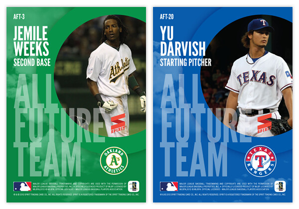
2B • Jemile Weeks
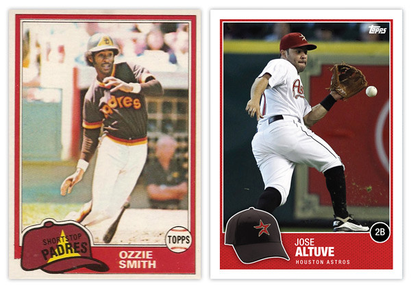
2B • Jose Altuve
3B • Pablo Sandoval
3B • Brett Lawrie
SS • Starlin Castro
SS • Elvis Andrus
OF • Mike Trout
OF • Bryce Harper
OF • Andrew McCutchen
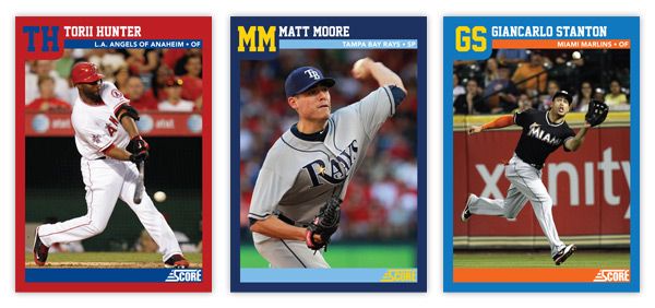
OF • Giancarlo Stanton
OF • Justin Upton
C • Buster Posey
C • Jesus Montero
SP • Stephen Strasburg
SP • Chris Sale
SP • Madison Bumgarner
SP • Clayton Kershaw
SP • Yu Darvish
CL • Craig Kimbrel
CL • Aroldis Chapman

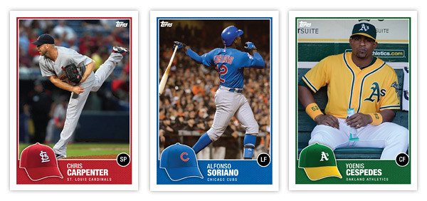
For the front design, I decided to go with a high-contrast, monochromatic image with a dynamic crop. Behind each cut-out is a big "ALL FUTURE TEAM" screened over some nice cloudscapes. I think this shows 'future' without going the high-tech route that would end up looking cheesy and dated a few years from now. The player position is set in a big silver foil circle in the bottom left-hand corner with the player name in silver foil just to the right of that.
On the back side, we have the cloudscape screened back a bit and the circle from enlarged and moved to the upper right to house another player photo, this time in full-color. The "ALL FUTURE TEAM" text is scaled down a bit and moved to the bottom left, leaving room for the player name/position above and team logo to the right.
Are there any glaring snubs to the 22-man roster? I'm sure there's a starting pitcher or two that could make a very good case for inclusion. What say you?