Thursday, July 5, 2012
THIS IS THE REMIX: '91 Score
Trying out a new feature here on the old design blog. I'll take a look at a previous card design and do a little remixin' to try and freshen them up a bit for today. This will be a cross between what I normally do and customs that other guys out there do.
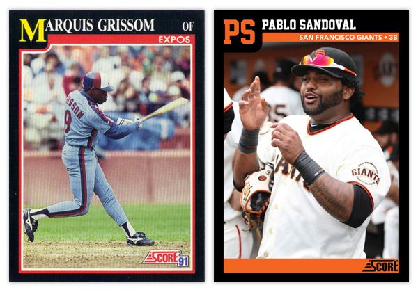
First up is '91 Score. I've always thought this was a vastly underrated design, especially compared to some other designs from 1991. It has a bit of understated dignity to its benefit.
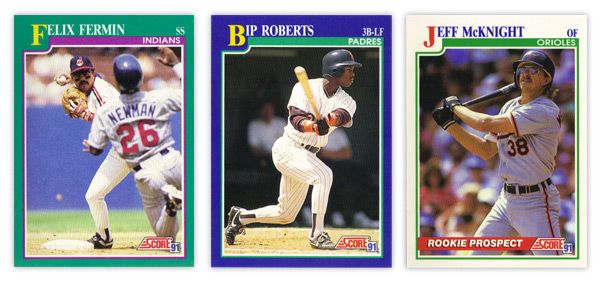
There aren't a lot of elements to the design, so its simplicity is big virtue. The solid color borders add some personality, though I'm not sure the color combinations are the prettiest. That teal & purple combo on Felix Fermin's card just doesn't sit right. In the upper left corner, the first letter in the first name is big and yellow, pushing the colored border down into the frame a bit. This kind of reminds me of playing cards, like a big K or Q in the corner for a king or queen card. It's definitely one of the most prominent and successful features. The rest of the name is spelled out in white at the top, along with team name and player position inside a secondary color bar. There were also some 'Rookie Prospect' cards in the set with white borders and a "ROOKIE PROSPECT" flash across a red streak towards the bottom. Paired with the green inset border, these cards look a little Christmas for a summer sport such as baseball.
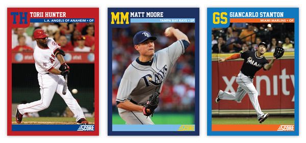
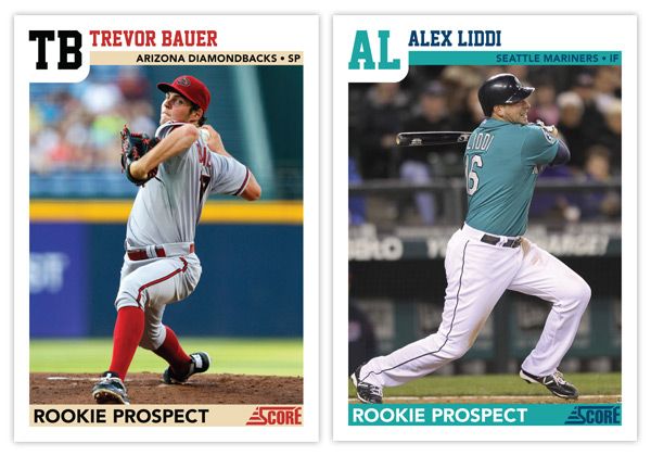
For the remix, I pretty much tweaked every element ever so slightly. The colored borders now reflect the featured player's team, as does the inset stripe. I also removed the strokes around the frame to help clean up the clutter. And instead of having the first letter in the first name biggified, we now have a monogram of the first and last name. This helps with the spacing of the initials and little frame bump. The position has moved from the corner down into the inset bar along with the full team name (city/state and name.) That helps to accommodate some of the longer player names. The one thing that's an addition and not just a tweak is the secondary inset bar I added at the bottom. I though this just helped to balance the top of the card out. Plus...
it makes for a great little spot for the 'ROOKIE PROSPECT' notation to rest, along with the Score logo.
Overall, I think I kept with the tone and feel of the original set but made some minor adjustments to enhance the design a bit. The introduction of the team colors spruces it up along with some different font choices. Hopefully these Remix posts will be sprinkled in alongside some of my original Spirit designs.
What are some sets you think could use a 'remix?'
Labels:
bauer,
design,
giancarlo stanton,
liddi,
Matt Moore,
Pablo Sandoval,
remix,
score,
torii hunter
Subscribe to:
Post Comments (Atom)


The one set that comes to mind is 1981 Topps. That set had the potential for being an absolute classic, but a few mistakes (color, Topps logo placement) just made it not work all that well.
ReplyDeleteI may try that. The floppy hats could stand to be updated.
DeleteAbsolutely love this. Improvement many times over the original. Well done. First I'd heard of your blog! Shows you how long I've been out of it.
ReplyDeleteThanks for stopping by!
Delete