Friday, June 21, 2013

Keepin' It Clean


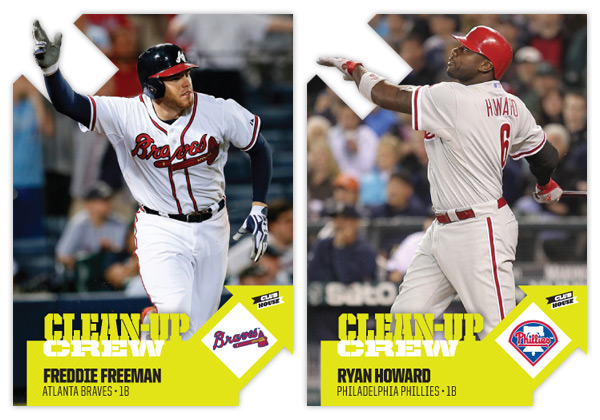
One of my personal favorite designs from Spirit in 2012 was the Clubhouse Moonshots insert. Homerun hitters, die-cut, big ol' moon. What's not to love? This time around, I kept the subject the same but changed the name to Clean-Up Crew. The die-cut is also back again though in a much different shape.


The arrows are a play on the 'up' part of 'clean-up' and helped me get the design rolling. The one on the right leaves a nice tidy space for the team logo or a memorabilia swatch. I wanted to make sure all arrows pointed up so the upper left corner was the natural choice for the other die-cut location. Having some part of the player cut into the arrow keeps things from getting stale.

As the arrows take care of the latter half of the insert name, the bright neon green/yellow color on the bottom handles the 'clean' half. Something about the color makes me think of a super-intense household cleaner that would almost scrub the skin off your finger. I imagine the ink would be almost plastic-like on the finished product.


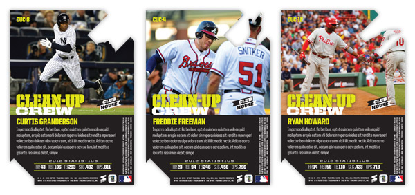
On the back side, we have the reverse die-cut shape to deal with but luckily plenty of space is left for another big player portrait. The neon is turned down a bit with black being the most prominent color. Below a brief write-up is the 2012 stat line with categories relevant to clean-up hitters (HR, RBI, total bases, slugging % and OPS.)

All in all, the bright colors, special shape and big batters seem to fit right in with the Clubhouse line.

Thursday, June 6, 2013

2013 Spirit Artistry


One of the earlier inserts from last year was Artistry, which focused on some of the top pitchers in the majors. I decided to revisit it this year with a different technique. Where the previous design was basically a filter-y and layered photo composite, I spent quite a bit more time this go 'round.


I did begin with a photo once again, only this time it was mostly for reference and not manipulation. I spent hours in Photoshop, layering different brushes to build up colors into objects. Basically, it was just like I was creating an oil painting, only with a mouse instead of actual brushes and paint. Different grungy and abstract brushes helped keep things looking organic and a bit impressionistic. You can tell it more on the Bumgarner below than the Rivera above.


Once I had the painting where I liked it, I took the original photo and laid it over the painting. Using some of those artistic brushes, I masked out parts of the photo to let the underpainting show through. Overall, it gives it that half photo/half paint look. I'm pretty happy with how they turned out. That's why the gold foil text is so minimal and unimposing.


On the back, I kind of replicated last year's picture frame idea but went with a more ornate frame that you'd likely see on some 19th century Impressionist paintings.

This is by far the most labor-intensive concept I've done to this point. It was pretty fun to click back and  forth between the photo and painting and bask in my progress. I do wish I had gone with a non-pinstriped player in Rivera's place. THAT was a pain, let me tell ya.