Friday, June 21, 2013
Keepin' It Clean
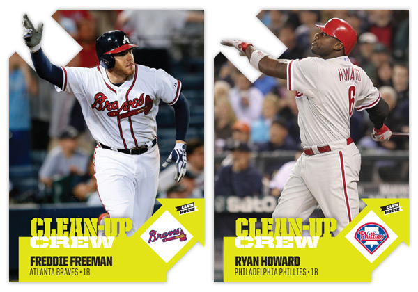
One of my personal favorite designs from Spirit in 2012 was the Clubhouse Moonshots insert. Homerun hitters, die-cut, big ol' moon. What's not to love? This time around, I kept the subject the same but changed the name to Clean-Up Crew. The die-cut is also back again though in a much different shape.
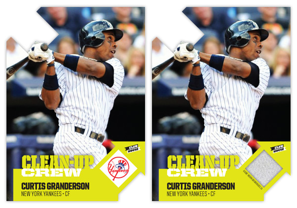
The arrows are a play on the 'up' part of 'clean-up' and helped me get the design rolling. The one on the right leaves a nice tidy space for the team logo or a memorabilia swatch. I wanted to make sure all arrows pointed up so the upper left corner was the natural choice for the other die-cut location. Having some part of the player cut into the arrow keeps things from getting stale.
As the arrows take care of the latter half of the insert name, the bright neon green/yellow color on the bottom handles the 'clean' half. Something about the color makes me think of a super-intense household cleaner that would almost scrub the skin off your finger. I imagine the ink would be almost plastic-like on the finished product.
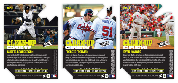
On the back side, we have the reverse die-cut shape to deal with but luckily plenty of space is left for another big player portrait. The neon is turned down a bit with black being the most prominent color. Below a brief write-up is the 2012 stat line with categories relevant to clean-up hitters (HR, RBI, total bases, slugging % and OPS.)
All in all, the bright colors, special shape and big batters seem to fit right in with the Clubhouse line.
Labels:
2013,
clean-up,
Clubhouse,
concept,
die-cut,
freddie freeman,
granderson,
homerun,
insert,
relic,
ryan howard
Subscribe to:
Post Comments (Atom)


No comments:
Post a Comment