This offseason seemed longer than most for some reason. I imagine it was even longer for you non-Giants fans out there (sorry.) Personally, I blame my dwindling interest in the NFL and the distraction it usually provided us baseball-starved fans. Perhaps it was due to the anticipation of the 2015 Topps release. Well it's finally February and the curtains have been raised. Hopefully you're all not already tired of all the 2015 Topps talk and pictures. Even if you are, I need to get my review on the books...
The early consensus is that the 2015 design is a homerun and I'm not here to say any nays.
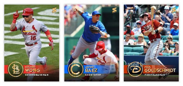
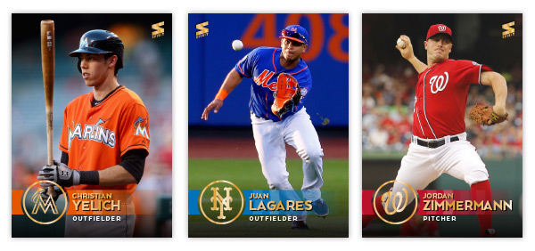
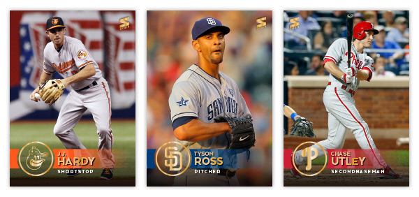
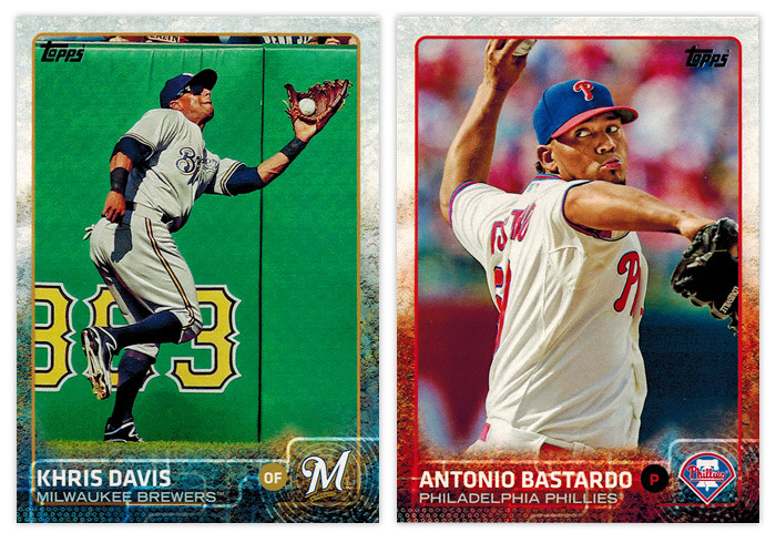
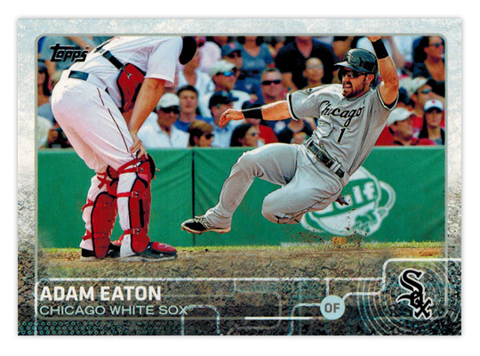
Last year's design was so ugly that Topps didn't have a very high bar to clear. Lucky for them (and us), they decided to break (a bit) from the modern traditions they've set in the past half-decade. The most obvious change is the absence of the sterile white borders. They've decided to integrate each team's colors into the design, which I'm sure you faithful readers have noticed is pretty standard for most Spirit designs. When the previews for the set came out last fall, I kinda rolled my eyes at the grunginess of the background but seeing it in-person, it's less noticeable, which is a plus. All the little lines and dots and stuff kind of just multiply into each other to make a colorful background for all the player info.
The second obvious break from the usual is the absence of foil. The only foil on these cards is the Topps logo. All these years of us collectors/bloggers bitching about how hard it is to read foil type on a non-white background have finally paid off. I'm guessing that the busy backgrounds also helped usher that change but go ahead and take credit, y'all. Team logos are easy to make out in the corners above the ripple-prints and the player position dot is perfectly executed as well.
The horizontal cards look just as good as the vertical ones. There's more open space on the bottom for the squiggly tech-y lines so if those aren't your cup of tea then I guess that may be a detriment.
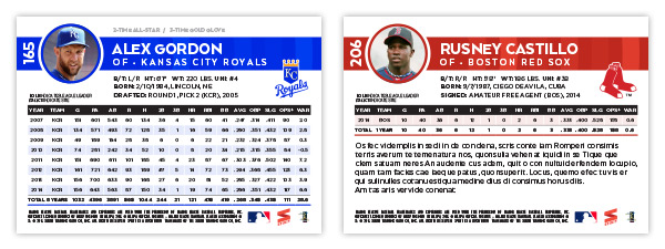
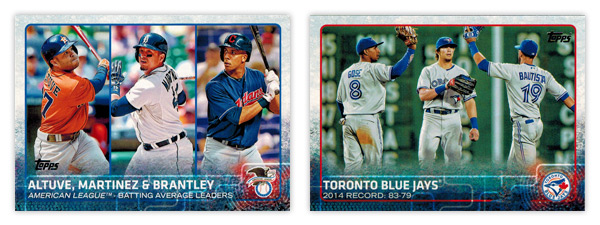
In addition to the usual stat leaders cards Topps has been doing for a while, they brought back team cards for 2015. You may have noticed that the checklist goes to 350(351) this year but with 30 team cards spread across Series 1 and two, that means there are just 5 more players per series than usual. Still, a bigger checklist means fewer duplicates – in theory.
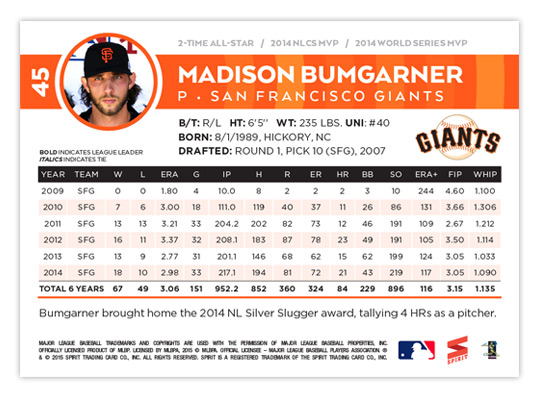
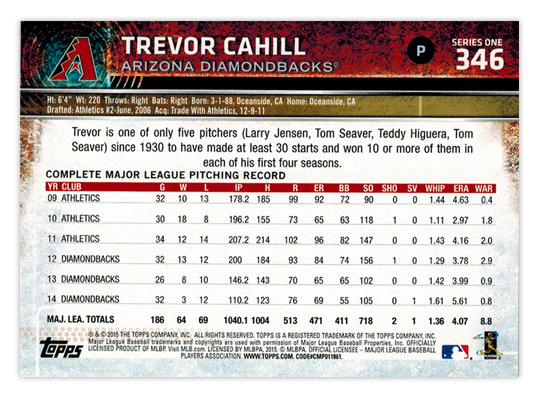
For as much praise as the front design has received, the card backs are just as popular. There's even more continuity between the sides than normal for flagship. The colorful grunge is there as well as the ripple/print behind the logos. The big, easy-to-read numbers are nice, though I wish they were on the left side so they'd be towards the top of when you place the cards in monster boxes. I guess having the logo on the left helps keep the player and team names left-aligned.
The other complaint for the backs is the spacing of the write-ups and stat boxes.
As Night Owl mentioned, the line-spacing, or "leading," of the paragraph text is too loose. The last line comes waaay to close to the "COMPLETE MAJOR LEAGUE PITCHING RECORD" header above the stat box. There's actually more space between lines two and three than there is between line 3 and the header. It's not something everybody would notice or pay attention to, but as a designer it drives me insane. My irritation is compounded when you see how much space there is between each year or stats in the stat box as well. Really, the write-up should be the same width as the stat box, which would probably reduce the 3 lines to 2 lines and avoid the whole crowding issue. Sorry if this is getting really dry to read about. I just have to get it out of my system since I have to deal with these kind of issues on a daily basis at my real-life job.
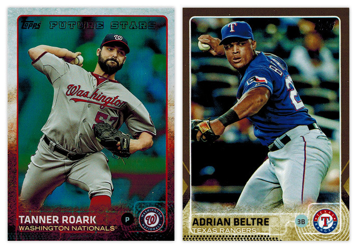
Now that I have that out of my system, let's move onto the parallels. For the first time in forever, Topps decided to make fewer parallels than the year before. There are still, like, a half-dozen or so but they seem to have tidied things up and trimmed some of the fat like the retail-only green and yellows from 2014. Also absent are the red, and blue borders from Target and Walmart, respectively. Most of what you'll be seeing are the non-numbered foils (Roark, above) and the /2015 golds (Beltre.) The scans above are very representative of how they look in-hand but the foils are, basically, a shiny foil background inside the border and behind the player. Essentially they're non-chrome refractors. The golds are big step-up from the usual Topps golds. The borders are actually shimmery gold and not just a flat gold-ish color like years past. The player name is also gold foil but they've lightened up the background at the bottom so it's easy to read no matter how the light hits it. I've only busted retail so far so I don't have any of the black, pink or snow camo to review but the black (/65) and pink (/50) seem to follow the same look as the gold but with their respective colors. The snow camo (/99) just have a light camo look to them without the shininess. There's also the clear (/10) and framed (/20) versions but I'll never have one in-hand so they barely exist to me.

Next to parallels, the other two things Topps flagship is know for are SP photo variations and sparkles. The sparkles are just as hard to find as ever so the only thing I have to say about them is ignore the fronts and check the codes in the fine print on the back. If the last three digits are 903, you have a sparkle. Congrats. The photo variations are a lot easier to spot. Somehow, I managed to pull this George Springer (right) and the Yu Darvish variations in the small bit of retail buying I've done. Chances are, if the photo is really cool and doesn't look like a "standard" action photo, it's a variation.
Here's a guide if you want to double-check at home. For the Springer here it's also detectable if you notice the absence of the FUTURE STARS foil at the top and the Rookie Cup at the bottom. (This is also a good time to point out how better they handled the Future Stars designation this year than last. Much less intrusive and it fits the rest of the design very well.)
Moving onto the inserts, here are two that I'm a bit iffy on. The Free Agent 40 design is kinda nice though I'm not really sold on the concept. There are only 15 subjects in Series 1 so it I guess it's premature to pinpoint the flaws just yet. Part of me thinks they should have gone with green instead of blue since free agency's all about cash these days. The Archetypes design looks like a
mid-90s Skybox card. Concept-wise, I'm guessing it's supposed to feature players that "break the mold" but if this is an insert they stretch across Series 2 and Update, they'll be watering down that distinction a bit I'm afraid.
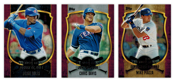
Next up is the First Home Run insert. Design-wise, this looks like a holdover from 2013 or something. These are and look every bit retail-only. The thing that bugs me the most is that all three items of text are basically the same size. There needs to be some sort of hierarchy so you know where to look first. My vote would be for the date to arc from bat to bat at a smaller point size and maybe make the "1st Home Run" text larger. That and doing away with the fuzzy black circle that renders most of it unreadable. You'll also notice three different colorways above — blackish/bluish, silver and gold. I'm guessing one comes from the rack packs, one from blasters and the other from the hanger boxes. I didn't pay attention to which was which, not that it matters. I do like the concept, though. It's a justifiable idea that lets Topps put a wide variety of players into packs, whether it's rookies like Soler or older guys like Victor Martinez or Chris Davis. I'm not even bothered by the inclusion of retired guys.
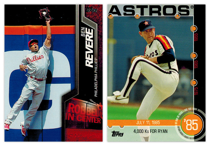
Here's probably my favorite insert design of Series 1. From the photography to the design, these Robbed cards are, ironically, home runs. The shapes on the right are dynamic and fit the great action shots very well. And the "Robbed In..." graphic in the bottom right corner is executed flawlessly, including the detail of it reflecting where in the outfield each guy plays. Throw in the fact that it's colored by team and I have zero complaints. As for the Baseball History insert, I can't say I'm a fan. The biggest problem I have is that it totally sounds like an insert destined for Heritage, not flagship. There are 15 baseball moments that happened within a few days of 15 other general historical moments. For example, the 4,000 Ks for Ryan card here pairs with a card for the 1985 Live Aid concert. I guess that's kinda cool but it just seems so out of place here since Topps has a release every year that caters to concepts exactly like these. I guess since Heritage focuses on a specific year it might not be a perfect fit but there's definitely some static there when I try to associate this with Series 1. Honestly, though, I think the design is what irks me the most. Too many dots, too many restricting lines. And the big text across the top looks too much like an homage to
1971 Topps. If it's intentional, it makes zero sense. If it's unintentional, that's a pretty big oversight. The design looks like a starting point, not a finished idea.
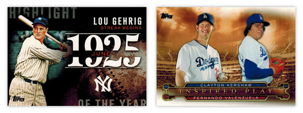
Here's another disparate pair of inserts. The Highlight of the Year insert is a great idea and good design but comes up a little short on being perfect. Instead of a 30-card checklist, it would've been even better to have a card with the biggest storyline for each of the past, say, 75 years — 25 each for Series 1, 2 and update. They could sprinkle them around so the it wouldn't just be 25 consecutive years in each series. It would be a great opportunity to fill in the gaps of some of the forgotten stories of baseball instead of just rehashing things that get beaten to death (Gehrig's streak.) I don't really have any big issues with the design. I guess the year may be a little big but I suppose it's fitting for the concept. On the other end of the spectrum is the same tired idea, this year named "Inspired Play." You may remember its previous aliases:
Legendary Lineage, Timeless Talents, Diamond Duos. Basically it's current team player on one side, former team player on the other. Usually they play the same position. It's not that I hate the concept, I'm just tired of it. I will say that they do look good this year. They're not all boxed up like they've been in past so I guess it's a step in the right direction.
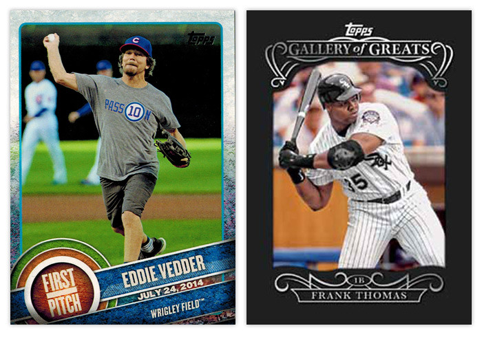
Let's finish things up on a positive note. The First Pitch cards have been getting a lot of good coverage and rightfully so. Unlike the with the Baseball History cards I mentioned above, I welcome Topps bringing over some of the DNA from one of their other sets (Allen & Ginter) into the flagship release here. Mostly because there's an actual link to baseball. Featuring celebrities whom throw out the ceremonial first pitch is a great way to a little extra ink for the hobby. There's enough of a link to the base design to help connect things should a non-collector become interested. I'd really like to see these return in Series 2 with a wider range of teams represented. (3 Dodgers? Really?) The Gallery of Great card on the right is a hobby-only thing so, again, I don't have one in-hand. But from what I've seen, they're a bit different than the preview image up there. Inside the black paper frame, the background behind the player is rainbow foil-y, kinda like the non-chrome refactors above. Again, Topps has made a slight variation from a previous year's insert. From what I can tell they're pretty basic but not gaudy so that's a plus in my book.
Overall, this is a pretty good showing for Topps. The base design sets the tone for a solid year with only minor quibbles on the design. The inserts, like every year, are hit or miss but the misses aren't nearly as bad as they've been in the past. But the general feeling Series 1 gives me is definitely positive. I hope it's a sign of things to come and not just an anomaly. If they can continue delivering nice designs while tidying up some of the flaws, I'll continue to give them good marks.
TLDR REVIEW
WHAT I LIKE:
• Base design is a break from routine; colorful, tidy without being boring
• Parallels pared down, more than just different colored borders
• Card backs match the fronts perfectly
• 350-card checklist
• "Future Stars" designation less obnoxious
• "Robbed" insert one of the best
• "Highlight of the Year" idea solid, with improvement
• "First Pitch" bridges baseball and non-baseball
• Absence of weirdly-shaped die cuts
WHAT I DON'T LIKE:
• Write-ups on back need tightened up
• Sparkles again
• "1st Home Run" design looks like holdover from the past
• "Archetypes" too Skybox-esque for 2015
• "Baseball History" design and concept
• "Highlight of the Year" execution
• Current/Retired player insert resurrected ("Inspired Play")