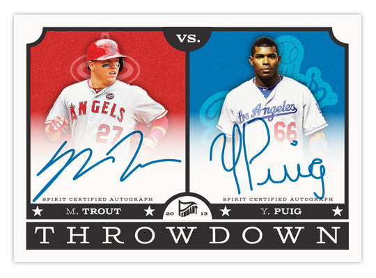
Just like a most trends, I'm finally "down" with something just as it seems to be fizzling out. I'm talking, of course, about Puigmania. Even though we all knew his first month or so in the majors was pretty unsustainable for a whole season, the rest of the league does seem to be "figuring him out" of late. I'm sure he'll make the adjustments and stuff, but probably not late enough to help the Giants out. I imagine Topps' second half products will have no trouble selling.
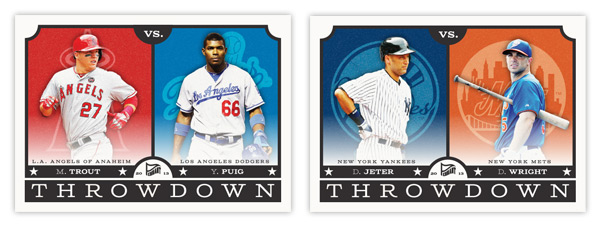
With what would be the most highly sought-after card of 2013 up there, let's take a look at Pennant's next insert — Throwdown. These feature a pair of players on rival clubs. I know this is a lot like Topps' Legendary Lineage and Diamond Duos from a few years ago, but with only 15 subjects (all of which are actual rival teams), the connection is a lot less tenuous. Here's the checklist:
1. NYY v BOS: Rivera/Ortiz
2. NYY v NYM: Jeter/Wright
3. NYM v PHI: Harvey/Lee
4. STL v CHC: Beltran/Rizzo
5. SF v LAD: Cain/Kershaw
6. SF v OAK: Posey/Cespedes
7. LAD v LAA: Puig/Trout
8. TEX v HOU: Kinsler/Altuve
9. BAL v WAS: Machado/Harper
10. CLE v CIN: Jimenez/Votto
11. STL v KC: Wainwright/Butler
12. CHC v CHW: Castro/Sale
13. STL v CIN: Carpenter/Phillips
14. PIT v PHI: McCutchen/Howard
15. ATL v PHI: Hudson/Utley
A few teams have a couple of cards here but they're represented by different players. It would be nice to have all 30 squads featured but as you can tell from MLB's interleague scheduling, you can't force rivalries.
Design-wise, the front of the cards have a little vintage flavor to them like the rest of the Pennant cards but still look clean and modern. Embellishments like the rounded inset corners and the classic typography help add some age, along with the less-than-bright cardstock. The space is split down the middle with grainy team-color boxes housing single-color team logos behind player cut-outs. There's a faint white gradient billowing up over the photos to make room for the team name. It can also fade up a little farther to make room for the signatures on the autograph cards.
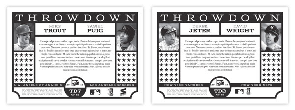
For the back, I kept it black & white while recreating similar design elements from the front. Black & white photos on the opposite edges leaves plenty of room in the middle for a brief history of the players' and teams' rivalry stories. The lines of stars can be removed for the authenticity statements on the auto versions.
I tend to shy away from horizontal cards due to format issues for the blog but I'm really pleased with these. They're bright but not too bright, retro but not too retro. It's always nice to feature more than one team on a card so you can have 2 fanbases chasing after them. And it helps take the sting out of pulling a Dodgers card if it features Matt Cain or Mike Trout. (Okay, I'll stop with the Dodgers jokes.)