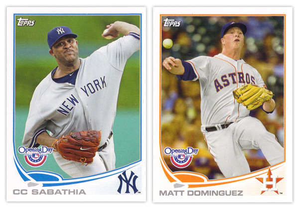
It may be a few weeks into the season but I'm just not getting around to reviewing some cards again. Opening Day is Topps' lowest-end release geared towards getting younger collectors excited for the start of the new MLB season. I'm gonna pass over the base design since it's the same as the flagship series with only the silver foil subtracted and the MLB Opening Day logo added (plus some nice derp-face.) So let's move onto some of the inserts.

The blue-border inserts are a little different this year. Topps must have decided that the Emerald Sparkle from Series 1 was so nice they should try it in blue. I really like this decision as the blue they chose is really vibrant and pretty. Plus, it keeps us from getting them mixed up with the Walmart exclusive blue-bordered parallels. The Ballpark Fun insert features a lot of smiling and/or pie-covered faces which is best-suited for a release like this. We have a swirly team-color section at the bottom with a familiar mowed-grass pattern. Two complaints about this design: I've seen this free cursive font a lot of places so it kind of bugs me that Topps couldn't find a more refined alternative; secondly, the white grunge-feather border seems really unnecessary since the rest of the elements are decidedly clean (minus the pie face.) They've also updated the 3-D Opening Day Stars insert. Returning are the round edges and lenticular surface, but the rest of the design has been refreshed. I think it's an improvement from last year's design with more room for the photo and fewer unnecessary flourishes.
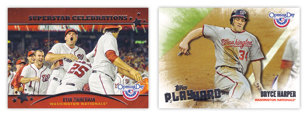
Next we have the Superstar Celebrations cards, which were included in last year's set. These are basically team-wide mobbings of players following what I presume to be walk-off hits. Design-wise, they're pretty standard with red bars across the top and bottom with some silver foil to add some sparkle. Topps decided to keep the fun elements to the photographs and play the rest pretty standard with works I suppose. Compare that to the Play Hard inserts which feature guys in the middle of some 'gritty' baseball moments such as sliding home, stealing bases or laying out to make a catch. The edges have been grunge-feathered which helps with the theme and stays away from a standard design.
I know the target for this set is a lot different than the rest of Topps releases and not all collectors even bother with it, but I usually enjoy spending $10 to take a look at something different like this. Design-wise, Opening Day seems to have a better rate of non-misses than even Topps' flagship. Everything is from decent-to-good and decidedly non-stuffy. In other words, it's fun.
Base cards: 4/5
Blue Parallels: 5/5
Ballpark Fun: 3/5
Blue Parallels: 5/5
Ballpark Fun: 3/5
Opening Day Stars: 4/5
Superstar Celebrations: 3/5
Play Hard: 3.5/5
OVERALL: 3.75/5
OVERALL: 3.75/5