Sunday, March 3, 2013
2013 Clubhouse
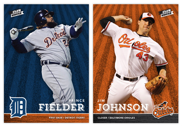
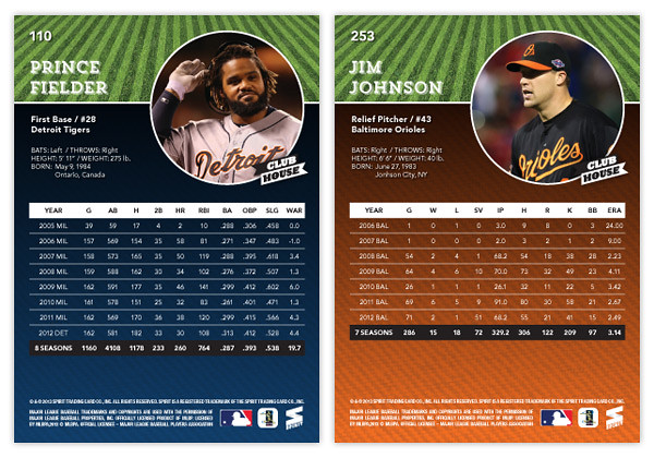
With spring training and the World Baseball Classic in full swing, my mind is definitely focused on baseball again, which hopefully means more frequent design posts. It'll be interesting to see if I have any fresh ideas after a year or if I'll fall into the same patterns like Topps does on occasion. Anyway, here's a look at the 2013 Clubhouse series. This is meant to be the low-end, Topps Opening-Day-esque product in the Spirit line. Like last year's design, it's a bright and colorful, no-frills design.
The front of the cards feature an action shot cutout of the player on top of a team-colored background with an outfield grass pattern. On the bottom is a bar with the secondary team color and a wood pattern. With the player's last name big, their first name and position/team are found above and below. I always find it important to include team/position on base designs, especially for a product marketed towards those learning the game. Alternating corners from card to card, the team's primary logo is the final element of the front design.
For the back, we've got a full-color player photo to the right and the player name/bio on the left. The grass pattern from the front makes it way to the back, this time in its natural green state. The bottom portion sees a big block of team color with a big chunk of career stats on top.
Keep an eye out for a few Clubhouse inserts coming up. I'll probably do another All-Stars design but hopefully I'll find some inspiration for some new and different insert ideas.
Labels:
2013,
base,
Clubhouse,
concept,
jim johnson,
kids,
low-end,
prince fielder,
pujols
Subscribe to:
Post Comments (Atom)


Dang! Nice start to the season.
ReplyDeleteGreat looking layouts.
Very nice looking cards, Ross. Nice to have you back in the game!
ReplyDeleteBest,
Michael Jawitz
AKA: Grubby Glove