Saturday, February 25, 2012

Summer Standouts


Time to switch gears a bit and introduce another insert for the Clubhouse set. This one is called Summer Standouts. Every team is represented here but by a player who may not necessarily be the #1 player on their squad.

As you can tell from the design, we're really playing up the 'kid-friendly' angle here. We've got a bright, sunny sky and a nice patch of grass framing the top and bottom. The player photos here are the standard stand-and-smile shots from the team photo days at the start of the season. These are very friendly and just give a nice, welcoming feel to the cards. The team-color fence from the base design also made its way over here, though its space has been reduced to make room for the other elements. The player name is in a big, chunky sans-serif with their position in all lowercase beneath.

On the backside, the grass patch has extended upward a bit and the player photos are action shots during day games to keep that sunny feeling going. Player name, position and team are laid over the fences, which fade out for a brief write-up.

Pretty simple insert set. No foil or diecuts or sparkliness. Checklist is below. This may not look like the most appealing set to most collectors since there won't be anybody like Jeter or Braun, but there are still some pretty popular guys from stacked teams.
SS1 - Wandy Rodriguez (HOU)
SS2 - Torii Hunter (LAA)
SS3 - Clayton Kershaw (LAD)
SS4 - Matt Cain (SF)
SS5 - Mark Teixeira (NYY)
SS6 - Alex Avila (DET)
SS7 - Yadier Molina (STL)
SS8 - J.P. Arencibia (TOR)
SS9 - Brian McCann (ATL)
SS10 - Franklin Gutierrez (SEA)
SS11 - Justin Morneau (MIN)
SS12 - Kevin Youkilis (BOS)
SS13 - Jay Bruce (CIN)
SS14 - Jayson Werth (WAS)
SS15 - Carlos Gonzalez (COL)
SS16 - David Price (TB)
SS17 - Daniel Hudson (ARZ)
SS18 - Michael Young (TEX)
SS19 - Billy Butler (KC)
SS20 - Chase Utley (PHI)
SS21 - Logan Morrison (MIA)
SS22 - Rickie Weeks (MIL)
SS23 - Darwin Barney (CHC)
SS24 - Neil Walker (PIT)
SS25 - Gordon Beckham (CWS)
SS26 - Daniel Murphy (NYM)
SS27 - J.J. Hardy (BAL)
SS28 - Coco Crisp (OAK)
SS29 - Asdrubal Cabrera (CLE)
SS30 - Clayton Richard (SD)

Thursday, February 23, 2012

Spirit Deluxe Autos

Following the Members Only post, I looked back and tallied up all the cards I've done so far and realized I've really loaded up the Spirit flagship and neglected Clubhouse and Deluxe. That brings us to the first inserts from the Deluxe set, Deluxe Autos.

The design on these is very simple but goes along with the Deluxe base. We've got the team-color knit fading into the player photograph. The horizontal orientation lends itself to a bigger autograph, with the team logo below. The player name is in a nice silver foil-stamped serif font above with position/team below the signature, which would be on-card and not stickers.

On the back is more of the team-color swatch along with a more intimate player photo. These would be considered the 'base' autos for the set with future inserts being dual autos or auto/relic combos. The 30 cards in the set would be made up of one player from each team.

Monday, February 20, 2012

Members Only


Time for another merit-based insert set for Spirit. This one focuses on the top 10 performing players over the last 5 seasons in 6 different statistical categories: hits, home runs, RBIs, wins, saves and ERA. These 6 subsets make up the 60-card "Members Only" insert set. Each 'Club' has its own logo displaying their respective statistic.

The look of this set is like a old, secret book passed down generation after generation to the incoming members. Each logo looks embossed into the canvas books cover while gold leaf pops off the edges. We have a team color swatch at the bottom to house the player name & team in gold foil. On the right side is the gold foil 'club' logo with the player's respective total below.

On the back side you'll find the color swatch moved to the top along with the player name/position/team flanked on either side by the card number and team logo. Below is leaderboard for each club which also serves as a checklist of sorts. On each individual player's card, their name and leaderboard position are highlighted.

After I finished with this design, I realized it looks a bit like the first Upper Deck SP set from 1993 and Panini had a baby.

Thursday, February 16, 2012

Diamond Market - Part 2

Yesterday I introduced Spirit's answer to Topps' annual web-code-giveaway-thing, called the Diamond Market. Basically, you pull code cards that look like credit cards and redeem the codes on the back for credits, which can be used to 'buy' exclusive cards of players you might actually collect. Fairly simple. Today, we're unveiling the actual 'buying' structure along with the kind of cards you can get your hands on.

Like I mentioned yesterday, the credit values you unlock with a code are 25, 50 and 100. There are 4 tiers of cards:
  • Base cards: 100-player checklist, numbered of 249, purchased for 10 credits
  • Relic cards: same 100-player checklist, numbered of 149, purchased for 40 credits
  • Jumbo Relic cards: same 100-player checklist, numbered to 99, purchased for 80 credits
  • Autograph cards: same 100-player checklist, numbered to 49, purchased for 150 credits


As you may have noticed, the code credit values don't correspond to the card purchase values. Here's where the Diamond Market gets fun. Say you get a 25 credit code. Do you use it up immediately buying 2 base cards of players you like? Or do you let that balance sit while you try to find another code to add in hopes of getting enough for a jumbo relic or auto? Or say you're later into the collecting season and a lot of the cards are no longer available. Do you take the last auto of guy you're not too crazy about or do you snatch up 15 different base cards?

Maybe at the end of it, if you have unused credits and you can't really find anything left of interest, you can turn those credits into packs of other Spirit products. Or maybe they could partially carry over to next year's contest.

I'm not sure if the numbers for the print runs or checklists are right. Right now they add up to just under 55,000 total cards. But those could be manipulated to fit logistically. We could add another tier with a refractor or something, number it at 149. For now, this is a good start.

So what do you think of this concept? Anywhere you could see improvements? How does it stack up to Topps' apparatus? More fun than collecting virtual rings?

Wednesday, February 15, 2012

Diamond Market - Part 1

Well, it looks like Topps finally opened the Golden Giveaway gates yesterday. I'm still on the fence as to whether I'm going to redeem my codes or just sell/auction them off on eBay. I'll probably wait a few weeks to hear people's thoughts on the GG before deciding either way. But this seems like the perfect time to introduce something similar to Topps' online endeavors but potentially better.

Say hello to Spirit's Diamond Market. It's similar to the MCG, DG, and GG in that you get a card with a code, entered said code online and unlock 'stuff.' Where it's different starts with the code cards themselves. Instead of just some flimsy, over-crowded card that you throw away once the code has been redeemed, these Diamond Market Code Cards are worth keeping in your collection. They're shaped like credit/debit cards with the round edges and printed on a similar plastic-like stock. There are 20 different players depicted in the 'set' so it's worth collecting even after the codes have been redeemed.

The credit/debit card motif isn't just for looks, though the hologram Spirit logo and player name embossing does look neat. The Diamond Market itself uses the concept of accruing credits into your account and then using them to 'buy' exclusive cards available only through the Diamond Market. When you enter a code, it adds a value of 10, 25, 50, or 100 credits to your account.

Instead of just randomly getting whatever card you happen to 'unlock,' the choice is yours as to which cards to add to your collection. No more 1988 Chris Bosios or 1980 Ed Halickis languishing in your 'portfolio' for perpetuity because they aren't worth the $10+ it takes to ship the batch of junk to you. These are brand new cards of players that people actively collect.

These cards are inserted into Spirit Series 1 packs at a rate somewhere between conventional inserts and relic cards. Something like 1:16 or so. They won't be as easy to pull as Topps' code cards but they won't be so rare that you have to buy box after box just to rack up enough credits to broaden your options. Because, as Part 2 of this post will show, you might want to save up some credits to really splurge.

Thursday, February 9, 2012

2012 Spirit Deluxe


So first I did the flagship with a few inserts. Then it was the low-end with an insert. I guess now it's time for some high-end stuff. Topps and Panini have done a good job scouring the thesaurus, locking up every suitable synonym for "best" or "expensive," but luckily they seem to have overlooked "deluxe." So I'm gonna claim that now while I have the chance.


 I'm gonna start off with the base card design here. Much like Marquee, the full-bleed photography takes center stage here, though the bottom of the card is ceded for some color. We've continued the colored knit texture that's shown up on a few other Spirit designs. Here, it softly fades into the photograph with the team logo just above. Below the logo is the player name in an elegant script font and stamped with silver foil. The bottom edge of the card is a shiny stripe of the alternate team color and the player position/team stamped in silver foil.


On the back side, the player photo takes up most of the top half with a soft fade into the team color knit. This time, the alternate team color shows up at the bottom in the knit texture instead of a solid block. Player name and position/team are found in the middle with a brief player write-up found below.


I'd say the major characteristics of the Deluxe set are the team colors, soft fade, great photography, and sophisticated typography in a simple design. These elements will continue onto upcoming inserts (auto, relic.)

Trying to keep the Spirit line from getting bogged down into too many different-but-the-same sets like Topps has done, I'll start bouncing back and forth by introducing new inserts for each of the sets. I'm still looking for some innovative ideas to keep from just redesigning what's already out there, so if you have any, feel free to share.

Sunday, February 5, 2012

REVIEW - Topps Series 1

I'm sure you've all been nearly Topps-ed to death in the blogosphere this week, but hopefully you still have some patience left for my first of (hopefully) many product reviews. I'll try to keep my review strictly design-related but we'll see how it goes.


Let's start with the base card. First off, I was really big fan of the 2011 design. Topps did a good job of making it look classy yet contemporary. They didn't over think things and didn't have anything 'trendy' that'll we'll be giggling about 10 years from now. As for the 2012 design, I think it's a step back. The amorphous blob in the corner screams late 90's, as does the font choice, Bank Gothic. I've seen quite a few other complaining about the readability of the last name in foil on black and I agree, it's hard to make out in scans and low light.

I like that they team logos are included but they should definitely be moved to the right corner of the card. As it is now, the left corner is really crowded while the right is empty, leaving the card to be imbalanced overall. Also, it's always nice to see the player position on the front.


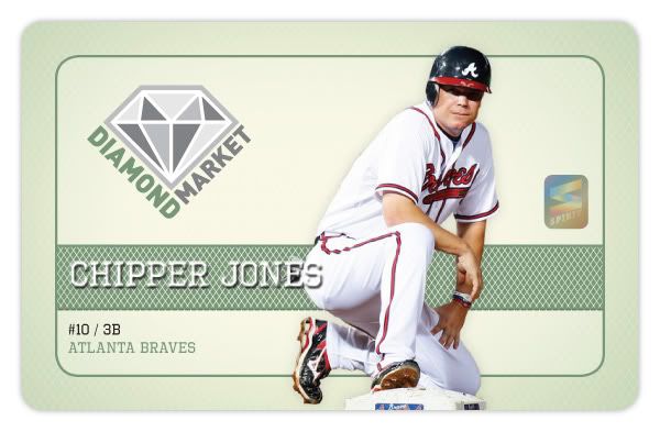
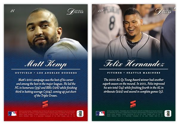
I do give Topps credit for the photo quality throughout Series 1. There seems to be a lot more fielding shots than normal, with tighter crops for better use of the card real estate. The Arencibia and Revere ones above are a couple of my favorites so far.


The back of the base set is successfully simple. The round curve thing fits well into the top with the name and team/position section. I like that the numbers are big and just sitting inside the black box, nice and readable. The stats are always concise and thorough, though it seems like someone made some goofs and/or bad decisions. I'm sure a lot of you have noticed that doubles show up as 3B instead of 2B on some cards. That's just something that got overlooked in the proofing process. But substituting W for BB when it comes to walks, I think that was intentional. And dumb. Either way, I hope they fix it for Series 2. It's really embarrassing.


Now on to the gold 'rush,' and by rush I mean 'overkill.'  It looks like they consolidated the gold and Diamond Anniversary parallels from last year into a single "Golden Moments" parallel (which happens to be the name of a completely different insert set for some inexplicable reason.) I like that golds are actually shiny instead of just a dull gold border like they've been doing. There's a warmth to the set that's inviting. As for the Golden Greats insert, these are just....I don't know. When they released the comps a few months ago, I assumed that the gold medallion things would be actual gold foil. Instead, it's just a big yellow gradient-filled circle. The layout's actually not bad with the home-plate frame and the standard 'old-timey-ness' Topps loves. But the fake gold medallion is just too much to overlook, especially when they went to the trouble of foil-stamping the text directly to the left of it. Also, why they needed to make a 75-card set featuring only 15 players is beyond me.


The Gold Standard insert set has a decent concept behind it but the execution falls a little short. The design is a little off balance with the empty space below the medallion. The '3000 HITS' on the card above are just a little too faint. Darken that up a little more and you'd have a winner. For the Classic Walk-Offs, if the bottom right photo was full-color for the non-auto cards, it would really help balance out the design. Everything else works fine and that's the only problem spot. Not terribly exciting but it gets the job done.


The Golden Moments card here is a relic version I was lucky enough to pull in from my box break (if it didn't happen to be a Giant, I'd be kinda bummed.) I like the design idea but there are a few things that bug me. First, the home plate shape (which usually houses the team logo) needs to be moved over to the right a bit. There's no reason it for it to not be centered between the player cutout and the Golden Moments bar. The other issue is the white fade along the bottom. I know the reason it's like this is for the signature on the Autograph variations, but I don't understand why it has to be on the non-auto version. It's not like they just pull the random non-auto prints out and hand them over for guys to sign. The auto variations always include that 'TOPPS CERTIFIED AUTO' text, so there's definitely at least one design distinction there. To me, it just comes across as laziness.

This year's version of the player-comparison insert is called Timeless Talents. I like these better than the Diamond Duos of last year. First off, the design is better since it fits in as both traditional and contemporary. That means it's a little boring but it'll do. But where it really beats last year is the player thread. This is obviously a retired legend on the left and the current player with the similar game on the right. These combinations were found in the Diamond Duos set too, but there were also combos made of current teammates or current players from different teams. Hopefully if they bust this set out again for Series 2, they don't start mixing up those up again.

Inside the retail blasters this year are 2 different kinds of manufacture relics. The first is a Retired Number Patch which is basically their number embroidered in a block font onto some kind of fabric. These aren't as visually exciting as the old manufactured logo patches from last year, but I think they fit the space better and it's nice having a consistent shape from card to card. The other one is a Historical Stitches card which is basically the player's last name stitched onto a heavy flannel. This is supposed to replicate the old names being stitched into player jerseys from the past, which isn't something I knew about. These are pretty cool though a little drab with such a big 'swatch.' Still, these are both pretty cool to go along with the Retired Rings and Coin cards that I don't have any scans of. I give Topps credit for being innovative here. We all bitch about the plain colored jersey swatches and how they aren't really 'special' any more since they're all basically the same year to year. I think they've done a good job replicated the old 'feel' of getting a memorabilia card by introduce these new, specialized items into the hobby. I just hope they're able to keep coming up with new things in the future.

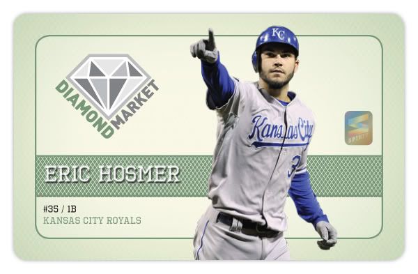
 Next is the Gold Futures set, which is basically just a way for them to make another Eric Hosmer card. My Hosmer fatigue is picking up speed early this season. As for the design, I've heard others say this looks like an Upper Deck card. Some meant it as a compliment, others as an insult. I'm somewhere in the middle on that. I will say, this is Topps best effort at making a design that can work just as well for a relic and non-relic version. The relics have the space in the middle where the team logo is cut-out for the swatch. I think maybe a gold border would be nicer than the black border here, but that's a small quibble. But the block box where the name is has to go. Unreadable.


Finishing up the inserts is the '87 Mini set. These seem to be a big hit with everyone and rightfully so. I'm sure most of it is nostalgia for when most of us were kids in the middle of the junk wax era, but there's just something about this old cardboard and that wood border. I thought that coming off of last year's Heritage set, the whole wood thing would seem old hat by now, but there's something different here that makes this set really shine. It could be the cartoony font, team logo in that white circle, but I'm guessing a lot of it is the photography and the card size. They're just so darn cute, ya know? And look at that card back. How could you not love that card back?

Okay, finally time reel in this tome. Overall, this is pretty much the same thing Topps does year in, year out. This isn't the major suckfest that some are saying, but there are some things that could definitely be better.

Base cards: 3/5
Parallels: 3.5/5
Photography: 4.5/5
Golden Greats: 2.5/5
Gold Standard: 3.5/5
Classic Walkoffs: 3.5/5
Golden Moments: 3/5
Timeless Talents: 3.5/5
Retired Number Patch: 4/5
Historical Stitches: 4/5
Golden Futures: 4/5
'87 Minis: 4.5/5
OVERALL: 3.625/5

Saturday, February 4, 2012

Clubhouse All-Stars


The first insert for the Clubhouse set is kind of a no-brainer. As early as 1958, all-star cards were showing up in the flagship base set. Back then it was maybe a couple dozen, usually just the starters. But with the bloated rosters of today's All-Star Game, there's just no room for an 80+ card subset. For an insert set, however, that sounds just about right. The 2011 MLB all-star squads were 41 (NL) and 43 (AL) players deep, making an 84-card set. That means you'll get the superstars like Pujols, Jeter and Halladay but also guys like Ryan Vogelsong up there.

The design carries the wooden fence motif from the Clubhouse base card, but with the NL and AL logos instead of team logos. The colors are blue and white with each league alternating the dominant hue. We have player cutouts once again, but what really sets these apart from the base design (other than the vertical layout) is the shininess. In addition to the player name and 'all-star' in silver foil, the 4 stars shooting off the edges of each corner have a solid, colorful sheen to them as well (think 2011 Topps Town.)


For the back, we have a player portrait and name centered at the top and a brief write-up of their all-star season below. The background has the alternating red and blue as well with another explosion of stars. The numbering is similar to the Spirit Award Winners inserts, with a _of_ for each league and _of_ for the whole set.

There's nothing wrong with shininess if done in moderation. Finding these inserts between the no-frills base will be a great charge for those busting wax. I'd like for them to not be a 1-per pack thing since that kind of chips away the 'specialness.' I know any time I pull a Topps Town or Hometown Heroes card, it feels like getting Tootsie Roll in your Halloween bag. It's better than those orange and black taffies, but not as exciting as a Snickers or Reese's Cup.