Friday, November 30, 2012

2012 Post-postseason Odds & End Review Roundup Roulette

Here's my final look back at the designs produced by Topps in 2012. There aren't a whole lot to cover here since everything Topps has released since July is just a chromified version of their base design. I'm also not spending any time on the high-end releases since I don't have the money to personally accrue a wide swath for reviewing. Also because they're all basically just a place to stick a uni swatch and/or auto. But in brief, they all look nice.

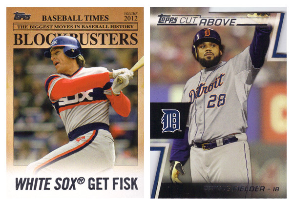
This space is saved for the new inserts found in Series 2 and Update along with whatever random things happened to fall out of my Topps Chrome & Bowman Chrome blasters (so not a lot).
First up is the Blockbusters insert from Update. In a way it was nice to have a little reminder what Update used to be about before it was bloated with all-stars, rookie debuts and yet even more SPs and SSPs. As for the design itself, there's not really a lot to it. It mimics an old newspaper with some of the laziest headline writing. I guess its okay even though the paper color is a little too aged for color photos. My other complaints are the huge ® after the team names as well as some odd player selections. I understand there are only so many trades that happen, but when Joey Bats was traded to Toronto, it probably didn't even a garner a line in transaction box in most papers, let alone get the front-page treatment.

The Cut Above insert set is probably the best design from Topps flagship in 2012. The diagonal die cut notches in the corners are pretty cool and fit into the 'cut above' theme. They left plenty of room for a full photo and also space for a relic and/or auto that don't impede too much onto the design. It's clean and modern with all the angular elements adding some dynamics.

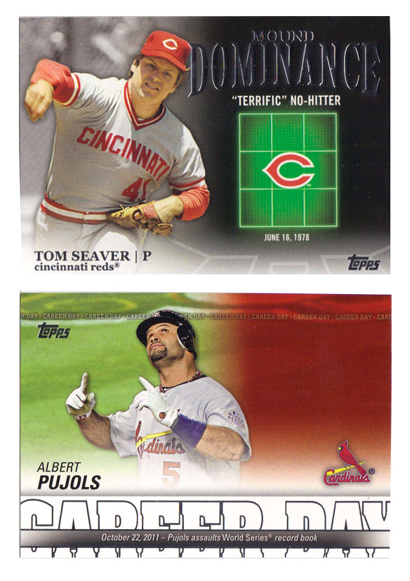
Following that up is probably the ugliest design of 2012. The Mound Dominance insert just looks cheesy as hell with the glowing green strike zone. It's like Ghostbusters meets Battleship. There's really no reason that so much of the card real estate is devoted to something like that. The Career Day design is decent with plenty of info packed into the bottom, leaving plenty of space for a nice photo. Unfortunately, they leave so much of it empty for relics and autos, making the plain jane version especially bare. I really don't understand why Topps can't change up the auto / non-auto design to accommodate each version. They still have to add the "certification" statement for autos and relics, so it's not like the design is exactly the same for each. I suppose there's possibly a reason other than laziness but I can't think of one at the moment.


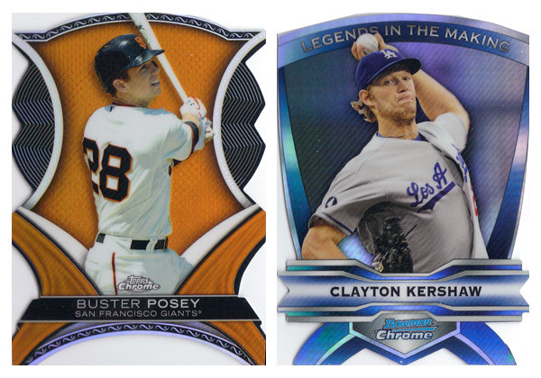
2012 was the year of the diecut apparently. Both the Chrome sets dabbled in some really weird and bizarrely shaped cards. The Dynamic Diecuts from TC are a little more colorful so I give them a slight edge though there are way too many little cutesy design elements for my tastes. I do appreciate that they have 2 actual corners on the bottom, unlike the Legends In the Making cards. These really are a bitch to get into penny sleeves.

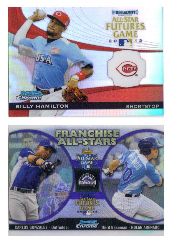
These two inserts from Bowman Chrome finished out the year on a good note. The Futures Game cards have a nice blend of elements that make them not too gaudy but also somewhat exciting. The odd holding shape for the logo should bother me more than it does but I think it actually works well here. Of course, it's there for the relic/auto version but it works well without it.

The Franchise All-Stars insert is a pretty neat idea for a set like Bowman Chrome that features both big leaguers and prospects from the minors. It's also pretty well executed here with so much information included without looking crowded. The big circle frames for the player photos is much nicer than the standard double-player designs Topps has been doing lately. The only thing that really bothers me is the font choice for the "Franchise All-Stars" text. Gill Sans Ultra Bold is used in way too many crappy movie posters. I can't get past it here.

Well that should close the book on 2012, unless my wife gets me a box of Five-Star Baseball or something. So, again, that closes the book on 2012.

Wednesday, November 28, 2012

2013 Spirit Award Winners


Hello to all out there in blogland. As you can tell things have slowed down a bit here with the off season in full swing. Baseball has been so far from my mind that I even overlooked my one year blogiversary. Oh well. I've got a few things planned for upcoming posts but don't expect the pace to really pick up until late January or so. In the meantime, here's a look at the 2013 edition of the Award Winners insert set.

For those that remember, I did this set last year with a similar set up: 9 AL Silver Sluggers, 9 NL Silver Sluggers, 9 AL Gold Gloves and 9 NL Gold Gloves for a total of 36-cards. The main distinguishing factor is the Silver Sluggers are bright and shiny silver and the Gold Gloves are bright and shiny gold. Horizontal stacks of each color are found in the background with the respective award names lined inside. These would have a kind of x-fractor feel with a smooth surface but the light refracting in different ways to make out the letters and such. The next layer features a player cutout (sluggers slugging and glovers gloving) with a colored band in the foreground to house the name and award info. Again, the AL guys have a blue bar with red found on the NL ones.

On the back side, we have the same horizontal stacks but this time screen back in black. To the left and right of the player portrait is their team logo and the Spirit logo. The colored bar has moved towards the top and houses the player name, team and position. A brief write-up of their respective award-winning seasons finishes out the design.

After two years, I'm not sure if this insert set will make its way into the 2014 product or if a break is in order. If it does make an appearance, I'll probably need to make sure the design take a 180-degree turn as this year's design plays kind of a like a sequel to the 2012 look. There's something to be said for subtle changes and evolutions of a standby insert, though. I suppose I have a year to figure that one out.