Tuesday, August 30, 2016

2016 Spirit Rookie Round-Up


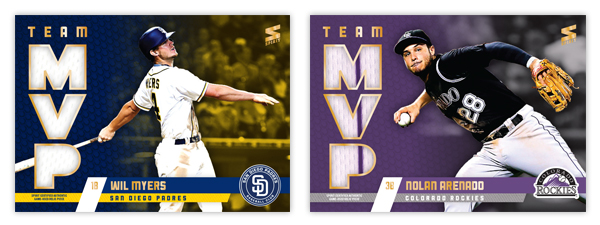
The 2016 rookie class has been pretty solid this season, from prospects with high expectations like Corey Seager to guys that seemingly came out of nowhere, like Aledmys Diaz. While it may not be as stacked as the 2015 class, it's definitely not full of slouches. Regardless, I thought this was a good time to reintroduce the Rookie Round-Up insert from 2013.


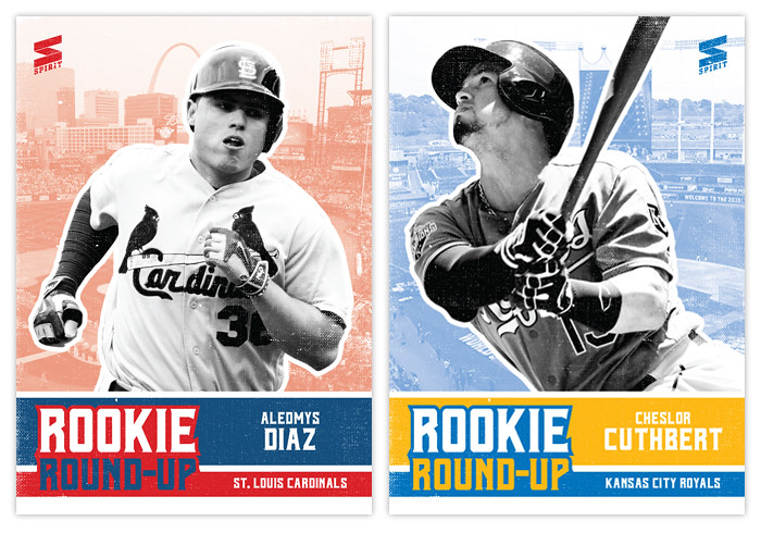
The 'grunginess' from last time is turned down a bit, with the design elements being mostly clean with a bit of grain to keep things from being too sterile. The high-contrast, black & white cutouts look like something you'd see on a DIY gig flyer, fitting with the "youthful" concept of the set. The rest of the elements are colorful to represent the team, with a lighter picture of the player's home stadium in the background.


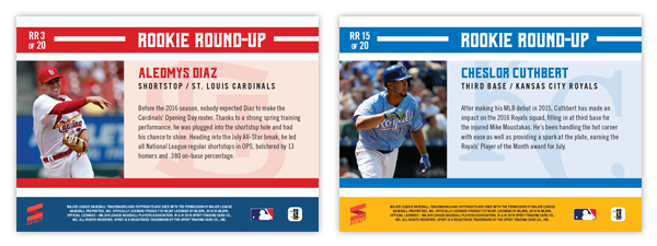
The back side is brighter and cleaner, with a full-color photo and the grain from the front removed. There's a brief write-up about the player's brief MLB career, highlighting the half-seasons that have led to their inclusion in the rookie round-up here.


I kept the checklist at 20 players like in 2013, and had to enforce a cut-off since the idea would be for these to be released in a series 2-like set. So that means guys like Aaron Judge and Gary Sanchez didn't make the cut. I'm sure they'll be represented in some rookie review insert for 2017 Spirit.

Thursday, August 18, 2016

2016 Spirit Team MVP


One of the first inserts I created was the 2012 Spirit Team MVP set, featuring the best player from every club that included a relic swatch in every single card. Here's the 2016 version which follows the footsteps of the original entry 4 years ago. Design-wise, this is an extension of the 2016 Spirit base design, much like the 2012 version mirrored the base set as well.


The team color bars come in from opposite sides to house the player and team names with the logo tucked in the corner. Big block MVP letters on the left are filled with the relic swatch, leaving a big chunk of card real estate for the player image. The background fades from a tech-y looking texture to some background stadium action, both parts washed in a gradient from one team color to the other.


On the back, the elements shift a little bit as the logo moves from the right side to the left and the MVP letters take a hike to make room for a brief write up. The player photos are a little more candid/casual instead of action shots like the front.


I really like the balance of these cards, which are probably the best looking of all four Team MVP designs over the years. Let's see if I have any other ideas for the MVP-relic box next year.

Tuesday, August 2, 2016

2016 Pennant Throwbacks


Time to throw it back to an insert from my first year of blogging, Pennant Throwbacks. Being the "retro" product of the Spirit line makes it a no-brainer.


Like the 2016 Pennant base design, these are more "modern retro" and don't call back to the reeeeeally old eras like Allen & Ginter and Gypsy Queen do. The design is simple with just a grainy solid color background and player cutouts with them in their throwback duds. The team logos are of the era captured by the uniforms. The Choo is an example of the relic parallel, here featuring the Rangers' baby blues.


The back keeps the elements from the front with a brief write-up of the throwback game depicted. I tried to replicate the toothy feel that the printed cards would have, diluting the colors a bit and making them less vibrant than a modern glossy card would show.