Monday, March 21, 2016
2016 Pennant
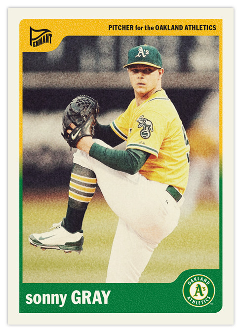
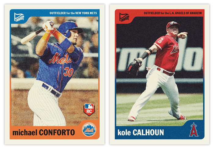
I've posted the flagship and the "low-end" sets, so now it's time for the retro set. The Pennant designs of the past haven't necessarily tried to emulate a particular era. Basically what I try to do is keep them simple while incorporating design elements and trends that are decidedly un-modern. I think it's a good strategy for me so I don't run into a situation like Topps has with Allen & Ginter and Gypsy Queen designs that are hard to differentiate year after year.
The 2016 version harkens back to the late-'60s, with simple colors and a no-frills typeface (Franklin Gothic Condensed). As I tend to do, the color palette is dictated by the team logos instead of some arbitrary system like you would have found back then. The whites are dulled to represent the old uncoated stock and I added grain to the photos and the color boxes to imitate the look of cards from the era as well.
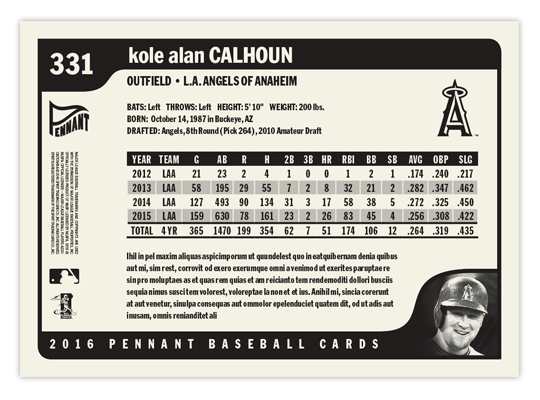
On the back, I went with a horizontal format for the first time with Pennant. All elements are black & white. The little corner tabs which housed the team and Pennant logos on the front are used for card number and a small player portrait on the back. These are definitely my favorite card backs I've designed for the Pennant brand.
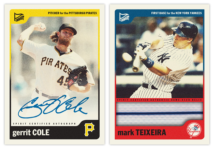
Last year I had a "sepia" parallel but this year's design didn't really lend itself to it. If Spirit ever decided to go the "Chrome/Prizm" route, though, this would definitely be a candidate for it. The autograph parallels are still in existence, as well as the addition of a "jumbo" relic. There probably wouldn't be a parallel of each for every card in the set but the design changes so minimally that calling them parallels works for me.
Of all the designs I've posted here, this is probably the one I'd be most tempted to actually print samples of, especially for in-person autograph purposes. If anybody feels so inclined to do the legwork, I'd be up for the designing.
Labels:
2016,
auto,
conforto,
gerrit cole,
kole calhoun,
pennant,
relic,
sonny gray,
teixeira
Subscribe to:
Post Comments (Atom)


A cartoon on the card back instead of a headshot and I'm completely sold.
ReplyDeleteGreat stuff.....as always.