Monday, April 23, 2012
Pennant: Chasing That Old Time Feeling
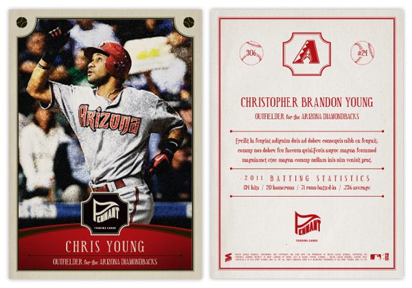
I've been able to resist it up to this point, but with Heritage and Gypsy Queen being the last two baseball releases, I couldn't help but work on an 'old-timey' set design. Instead of combing through the encyclopedia of trading cards, looking to resurrect the zombie of something 50-100 years old, I decided to just make something up. This is kind of a hybrid between the styles of the old and the current.
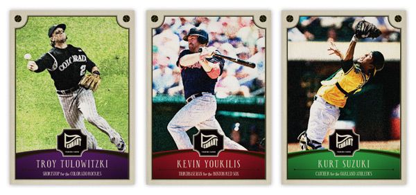
Say hi the Pennant line of Spirit trading cards. You'll notice some of the characteristics of other retro sets: photos doctored to look old and weathered, typefaces from decades past, not-quite-white borders. There's a team-color curve on the bottom to house the player name, team and position. I've used some similar curvilinear shapes throughout the other Spirit designs, so this helps keep them in the family. Another point of 'modernization' is the fact the player name is more than just their last name and first initial and it's actually bigger than the set name/logo.
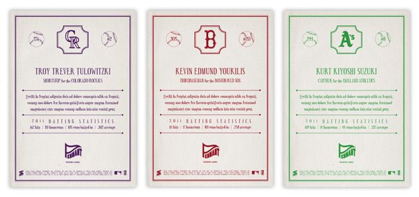
The backside is pretty similar to retro sets of today: 1-color, vertical, a lot of non-informational elements, simple team logos. These here may be printed in a single color, but instead of just black, the ink is the same as their team color. I decided to include players' full names on the back since I really miss that from my youth. Also, there's a simple line of the previous season's stats (hits, homers, rbi, and average) that has numbers instead of 'two thousand and eleven' and such.
I may do some inserts for the Pennant line coming up in the future. I can see myself getting the itch after A&G hits the shelves.
Labels:
2012,
a and g,
chris young,
concept,
design,
gypsy queen,
heritage,
kurt suzuki,
old,
pennant,
retro,
Tulowitzki,
youkilis
Subscribe to:
Post Comments (Atom)


I like it. You know the Gypsy this year is lacking in the texture of the photos. Last year's felt like you were looking at fabric or a painting. This year's are just flat. Pennant seems to have that texture to it. A little gritty but vintage.
ReplyDeleteYeah, I had a hard time finding the right order of steps to make them look vintage. After some effort, though, I'm pretty happy with the result. Also, it was nice not having to cut them out for once.
DeleteReally nice card designs.
ReplyDelete