Saturday, December 22, 2012

WARriors...Come out and pla-ay...


First off, and admission: I've never actually seen The Warriors movie but have heard it referenced so many times I don't really feel the need.

One of the big topics of discussion this off-season has been the whole Cabrera vs. Trout debate which is really a microcosm of the bigger "old school/new school"divide. One side relies on gut feelings and eye tests, the other on statistics and analysis. Personally, I fall somewhere in the middle, probably leaning more towards the sabermetric side. I feel I'm still in the process of rewiring myself. It's hard to unlearn being impressed by a .300+ average or 20+ wins since those numbers where instilled in me at an early age to be benchmarks of success. I still have to pause and process my thoughts when I see .320 referred to as bad (in the case of on-base percentage.) Hopefully in time I'll grow accustomed to whatever new numbers become the dividing line for bad/average/good.

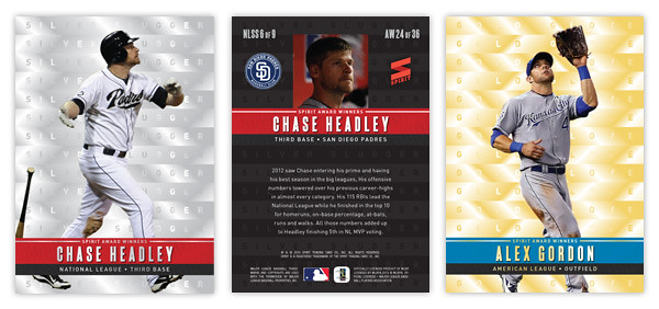
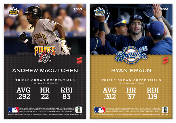
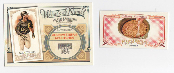
A few months ago I did a Triple Crown Contenders insert design. As the MVP debate proceeded and I found myself siding with the Trout lobby, I kept feeling these waves of embarrassment that I had posted such a thing. Even though the influences for the idea were previous Triple Crown sets and the fact that such 'contenders' are pretty popular collecting subjects, I felt like I was propagating the "old school" agenda that I no longer identify with. So I decided it would be good to show the other side of debate.

I'm going to assume that you all know about WAR and are as sick of all the "WAR: what is it good for?" references as I am. I know that sabermetrics goes way beyond this singular stat but it really is the best entry point to thinking differently about statistics. So obviously, this set is about WAR.

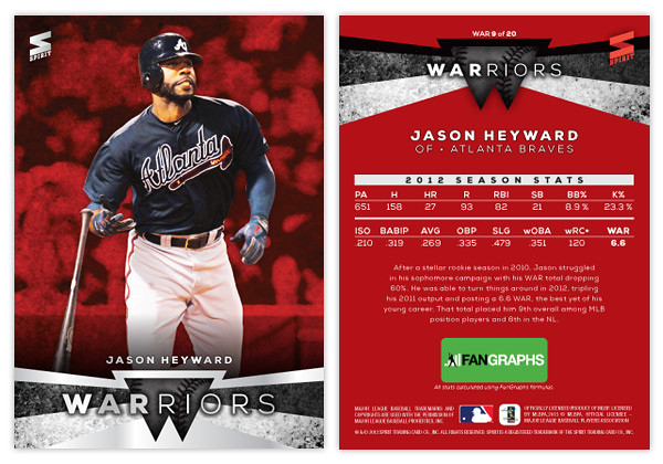
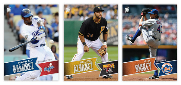
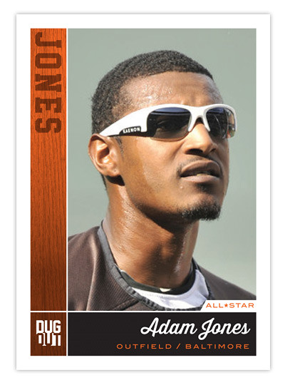
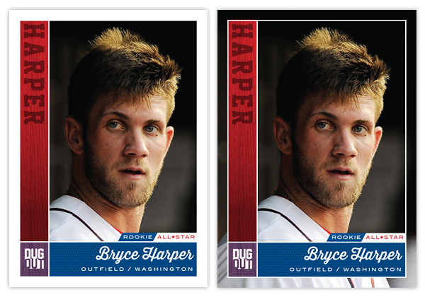
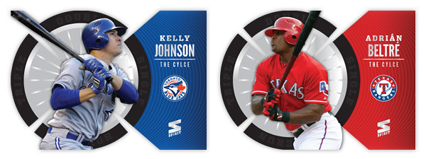
It features 20 players: the top-10 position players and top-10 pitchers according to WAR totals. I think the WARRIORS name is kind of clever since so many find WAR proponents to be frail, nerdy little fellows. Also, when "old schooler" refer to intangibles like "gritty" and gutsy" it drives sabermetricians nuts so this kind of pisses in both sides' Cheerios.


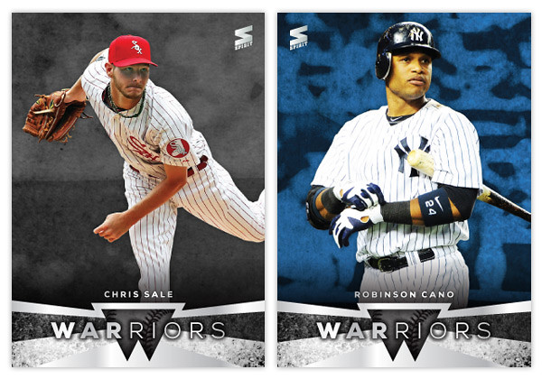
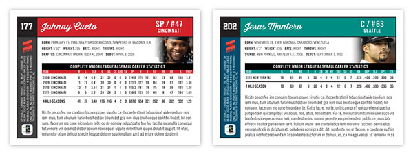
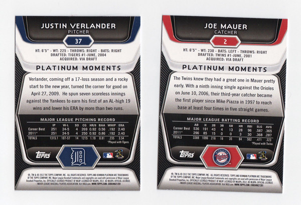
The front design features a full-color player cut-out over a grungy, color-soaked background. At the bottom we have a little abstract W shape in the center with some grungy angular bars shooting out behind and around. There are a couple of silver foil shapes along with the WARRIORS text and the player name.


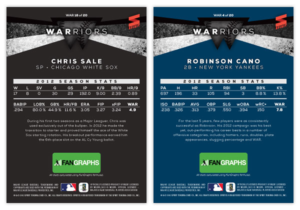
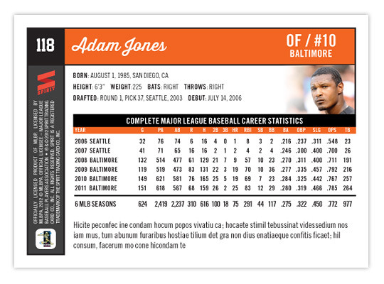
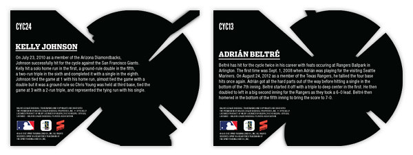
On the back side, the WARRIORS shape moves to the top and the background is set in a solid team color. The player's 2012 stats are split into 2 lines below. These are the advanced stat lines from Fangraphs and I've included their logo below since they'd probably have to be in on this. There are 3 different versions of WAR so I thought it would be necessary to single out one source and Fangraphs was my first choice.

Hopefully not too many of you out there are grinding your teeth while reading through this.

Friday, November 30, 2012

2012 Post-postseason Odds & End Review Roundup Roulette

Here's my final look back at the designs produced by Topps in 2012. There aren't a whole lot to cover here since everything Topps has released since July is just a chromified version of their base design. I'm also not spending any time on the high-end releases since I don't have the money to personally accrue a wide swath for reviewing. Also because they're all basically just a place to stick a uni swatch and/or auto. But in brief, they all look nice.

This space is saved for the new inserts found in Series 2 and Update along with whatever random things happened to fall out of my Topps Chrome & Bowman Chrome blasters (so not a lot).
First up is the Blockbusters insert from Update. In a way it was nice to have a little reminder what Update used to be about before it was bloated with all-stars, rookie debuts and yet even more SPs and SSPs. As for the design itself, there's not really a lot to it. It mimics an old newspaper with some of the laziest headline writing. I guess its okay even though the paper color is a little too aged for color photos. My other complaints are the huge ® after the team names as well as some odd player selections. I understand there are only so many trades that happen, but when Joey Bats was traded to Toronto, it probably didn't even a garner a line in transaction box in most papers, let alone get the front-page treatment.

The Cut Above insert set is probably the best design from Topps flagship in 2012. The diagonal die cut notches in the corners are pretty cool and fit into the 'cut above' theme. They left plenty of room for a full photo and also space for a relic and/or auto that don't impede too much onto the design. It's clean and modern with all the angular elements adding some dynamics.

Following that up is probably the ugliest design of 2012. The Mound Dominance insert just looks cheesy as hell with the glowing green strike zone. It's like Ghostbusters meets Battleship. There's really no reason that so much of the card real estate is devoted to something like that. The Career Day design is decent with plenty of info packed into the bottom, leaving plenty of space for a nice photo. Unfortunately, they leave so much of it empty for relics and autos, making the plain jane version especially bare. I really don't understand why Topps can't change up the auto / non-auto design to accommodate each version. They still have to add the "certification" statement for autos and relics, so it's not like the design is exactly the same for each. I suppose there's possibly a reason other than laziness but I can't think of one at the moment.


2012 was the year of the diecut apparently. Both the Chrome sets dabbled in some really weird and bizarrely shaped cards. The Dynamic Diecuts from TC are a little more colorful so I give them a slight edge though there are way too many little cutesy design elements for my tastes. I do appreciate that they have 2 actual corners on the bottom, unlike the Legends In the Making cards. These really are a bitch to get into penny sleeves.

These two inserts from Bowman Chrome finished out the year on a good note. The Futures Game cards have a nice blend of elements that make them not too gaudy but also somewhat exciting. The odd holding shape for the logo should bother me more than it does but I think it actually works well here. Of course, it's there for the relic/auto version but it works well without it.

The Franchise All-Stars insert is a pretty neat idea for a set like Bowman Chrome that features both big leaguers and prospects from the minors. It's also pretty well executed here with so much information included without looking crowded. The big circle frames for the player photos is much nicer than the standard double-player designs Topps has been doing lately. The only thing that really bothers me is the font choice for the "Franchise All-Stars" text. Gill Sans Ultra Bold is used in way too many crappy movie posters. I can't get past it here.

Well that should close the book on 2012, unless my wife gets me a box of Five-Star Baseball or something. So, again, that closes the book on 2012.

Wednesday, November 28, 2012

2013 Spirit Award Winners


Hello to all out there in blogland. As you can tell things have slowed down a bit here with the off season in full swing. Baseball has been so far from my mind that I even overlooked my one year blogiversary. Oh well. I've got a few things planned for upcoming posts but don't expect the pace to really pick up until late January or so. In the meantime, here's a look at the 2013 edition of the Award Winners insert set.

For those that remember, I did this set last year with a similar set up: 9 AL Silver Sluggers, 9 NL Silver Sluggers, 9 AL Gold Gloves and 9 NL Gold Gloves for a total of 36-cards. The main distinguishing factor is the Silver Sluggers are bright and shiny silver and the Gold Gloves are bright and shiny gold. Horizontal stacks of each color are found in the background with the respective award names lined inside. These would have a kind of x-fractor feel with a smooth surface but the light refracting in different ways to make out the letters and such. The next layer features a player cutout (sluggers slugging and glovers gloving) with a colored band in the foreground to house the name and award info. Again, the AL guys have a blue bar with red found on the NL ones.

On the back side, we have the same horizontal stacks but this time screen back in black. To the left and right of the player portrait is their team logo and the Spirit logo. The colored bar has moved towards the top and houses the player name, team and position. A brief write-up of their respective award-winning seasons finishes out the design.

After two years, I'm not sure if this insert set will make its way into the 2014 product or if a break is in order. If it does make an appearance, I'll probably need to make sure the design take a 180-degree turn as this year's design plays kind of a like a sequel to the 2012 look. There's something to be said for subtle changes and evolutions of a standby insert, though. I suppose I have a year to figure that one out.

Wednesday, October 31, 2012

THIS IS THE REMIX: 1986 Topps


As per Rod's request, here's my stab at remixing the 1986 Topps design. And since this is my first chance to brag a bit about the Giants' World Series victory, I figured I'd feature some of the standout players from the 4 teams that made it to the LCSs this season.
Let's take a look at the original 1986 design. This is probably one of the most iconic sets for collectors of my era so I hope I'm not treading on sacred ground here. The most prominent feature is the big, funky team name over the black border. The big team name in team color is really effective but my goodness, that font... Those As and Es are from another planet. That quirkiness is probably a reason why some love this design while it's likely the reason some might hate it. No matter which side of the fence you reside, it's way past its prime here in 2012.

The rest of the design is refreshingly simple. The black border extends down the edges just a little bit more before giving way to the white border around the rest of the photo. At the bottom, the player name is set in all caps and loosely spaced to fill up the horizontal real estate. The last element is the player position tucked inside a colored circle tucked into the bottom left corner of the photo.
Now let's take a look at the updates. First up is the font up top. I went with Dispatch Black once again since it comes in a variety of widths. That flexibility helps when you have team names of varying length. The Cardinals is the condensed width while the other 3 are the standard width. It has enough personality to help it balance between boring and obnoxious. It hits the sweet spot right in the middle.

Next up is the player name found at the bottom. I wanted to add a little more color to the design so I made a rectangle at the bottom of the photo to house the player name. There's also room in there for the player position so it isn't hanging out by itself in the corner like before. There are also some minor tweaks to the border widths to help with the centering issues that plague the 1986 set.

This is probably the most subtle of my remixes so far but that's partly due to the success and simplicity of the original design. The biggest change is definitely the font up top, the most iconic feature of almost any card design from the 80s. So what's up next?

Friday, October 12, 2012

First Class


With the 2012 season winding down, we continue looking ahead to 2013. On top of having a triple crown winner, 3 perfect games thrown and 4 other no-hitters, 2012 will probably be remembered for one of the best class of rookies. We all know Mike Trout had an MVP-caliber season and Bryce Harper took some of the steps to justify all the hype. But moving even further down, there were lots of guys that put up good-to-great rookie campaigns. So how about an insert to commemorate this class?
The design is horizontal with the most prominent feature probably being the box on the right with a big 1 cut out to display a relic. Just to add some variety, the position players have bat swatches while the pitchers have jersey swatches. The rest of the design is bathed in team colors with the player cutout overlapping a colored wood background. The 'FIRST CLASS' text has a 1 hiding in 'first' to really play up the number aspect of the design. There's also some silver foil to add a bit of flash.
Onto the backside where we have team colors filling the majority of space with plenty of room for a summary of each player's rookie season. On the right side, we have another 1 cut out but this time housing another action shot. To the left we have the team logo along with the authenticity statement for each relic. It's less vague than what you see on Topps relic cards these days and there's even a unique code for each card that you could enter to find out specifically when each memorabilia relic was used in-game.
Along with these 3 here and Trout and Harper that were mentioned above, this set would have guys like Todd Frazier, Jesus Montero, pretty much any of the A's starting pitchers, Will Middlebrooks, Yu Darvish, Anthony Rizzo and more.

Tuesday, September 25, 2012

BASE IN YR FACE: 2013 Spirit Base

Moving forward with our 2013 preview, here's the base design for the 2013 Spirit flagship. For reference sake, this is comparable to Topps Series 1 if, ya know, someone other than Topps had an MLB license.
Just like last year's design, 2013 features the full-bleed, full-color photo fronts. There's also a team-color banner to house the player names. The fonts here in silver foil are Blair Medium for the first name and position and Enamel Inline for the big, bold last name. In the opposite banner is the secondary color along with the team logo. All of these elements are on a ten-degree angle that helps make the whole a little more dynamic. Also, it conveniently mimics the angle of the Spirit logo in the corner.
On the opposite side, the angled banner is enlarge and filled with a more intimate player photo with the team logo appearing once again to its left. I'm really taking advantage of this MLB license and smearing their property all over this set. Offset from the team-color background, there's a white box for player info. Instead of doing the full-career stat box, I went with the previous season and career totals. That helps keep the design consistent from card to card since there can be quite a variation from player to player. Below the stats are 5 lines for a write-up.

This year is definitely from the same family as the 2012 Spirit design, but it's more like a second or third cousin than sibling. Lots of the DNA is there but rearranged. I love how bright and colorful the backs are and also how the front design doesn't get in the way of the photo, even enhancing it.

What do you think? How does this compare to the Topps 2013 flagship design?

Monday, September 24, 2012

UPDATE: Gint-A-Cuffs Spoils

After spending the last few days frustrated by some sort of Blogger snafu that was keeping me from logging in, the bug was serendipitously fixed the same day my Gint-A-Cuffs prize arrived at my door. I was so excited to see the return address from "Mark, Gint-A-Cuffs Commissioner."


Opening the box, I was shocked, SHOCKED to find an N43 boxtopper instead of the cool cabinet card from my last box. Still, Griffey's a decent one to get I guess. But I could tell this box would be different.

As I moved onto the packs, I was pulling the usually variety of base cards, SPs, inserts, etc. I thumbed through them and flipped each card around to check out the back. One of my early minis was a Tim Lincecum, who, as you may recall, is my favorite player. I flipped the back to see if it was a regular or A&G back since I already have the regular.

"Oh, cool," I thought as I peered the A&G logo. Well what I didn't notice until after I was done with the box and sorting everything is that I had pulled a no-number mini. Needless to say I was pretty excited. The no-numbers are tough pulls to begin with (1:111 packs I believe.) But what are the odds I'd pull one of my favorite player?

Actually, they seem to be pretty good. I don't buy a whole lot of boxes since I don't have an LCS around and don't really like paying for shipping too often. But for some strange reason, I'm like 50/50 at pulling Lincecum 'hits.' My 2012 Heritage box that comes with one color-swap variation per box? Lincecum. My box of 2012 Topps Chrome with one Dynamic Diecut? Lincecum.  I bought two boxes of 2011 Update about 4 months apart and got a Lincecum All-Star Stitches relic in both. Unfortunately, I don't have the kind of dough to really test out the odds on something like Triple Threads or Tribute. If I ever do, though, don't be surprised if I get a nice Timmy card to add to my collection.

Among the assortment of minis were a couple of SPs and a Jesus Montero 'rookie' mini.


I did pretty well not getting too many dupes this time around. I'd say about a third of the base were cards I already had, so that means I'd probably be somewhat close to completing the set if I were to attempt such a thing. But I'm not. I still have a way to go on the SPs even though I pulled some of the higher value ones here, like Ripken and Ozzie and Nolan Ryan

Now onto the hits. So far, I've done decently on relics. My first box yielded me a Pujols and Bobby Knight relic (though Bobby K. cost me some G-A-C points.) This time around, it was a little off.


The Kinsler will actually go in my PC and is a pretty nice with the blue swatch. Unfortunately, there's an imperfection along the bottom that's kind of a bummer. The Lowrie, on the other hand, is probably joining my pile of journeyman relics that probably won't find a loving home elsewhere. It's kinda sad, actually.

My final hit of the box wasn't a relic. It was actually an autograph. I've never pulled an auto from A&G so this was pretty exciting. And I must say, if I had to pull an autograph from someone other than one of my favorite players or a Hall-Of-Famer like Mays or Aaron, I can't think of a more fitting subject to come from the Gint-A-Cuffs IV Victory Box. BEHOLD!!


I GOT GUMBEL'D.

Boy, that was a lot of fun. Again, I want to thank Mark for all his hard work overseeing Gint-A-Cuffs. I'm already looking forward to the 2013 contest, anticipating my last-place finish. If you're even thinking about it, you should definitely participate. Believe me, anybody can win.

Monday, September 17, 2012

2013 Pennant

Even though there are a handful of amazing pennant/wild card races still going, apparently it's already time to look ahead to 2013 releases. Instead of starting with the Spirit 'flagship' again, I thought the Pennant line would be a good introduction to 2013.
The design is a lot simpler than what I did for last year's version. Since these designs are revisiting specific releases from the past like Heritage or Goudey or 206 do, I thought I'd turn the clock ahead a little bit, closer to something around the '60s or so. We start with an off-white border with beveled edges at the top and a team-color stroke around the frame. At the bottom, there's a half-circle team-color tab to house the Pennant logo. Then extending from that tab is another team-color tab creeping into the picture. The player name (typeset in Cheltenham Condensed Bold) arches around the tab. Moving further, there's a smaller team-color tab multiplied over the photo and housing the team name and player position. The photos have a little bit of grain and aged added to them but nothing too drastic. Altogether, it kind of resembles bunting you'd see on opening day or during the playoffs.

The back side of the card is one-color black and packed with a lot more information than the previous year. We have the player name and background info at the top with room for a black & white team logo. Below, we have the complete career statistics. For those whose careers don't fill the entire space, we have room for a few lines of highlights and/or other information.

I may be a tad impartial, but I think this design has the potential to be timeless. Replace the Pennant logo with a Topps logo, print the name in silver foil and you could have the 2014 Topps flagship design. Or remove the border and airbrush the photos, you could have Upper Deck's next baseball offering. It's definitely and upgrade from what I did for the 2012 version of Pennant. Here's to hoping the rest of my 2013 designs can make the same claim.

Wednesday, September 12, 2012

Triple Crown Candidates

There was quite a disparity between the National League and American League MVP races last season. The NL was a 2-man race between a two all-around studs, one on a playoff team and the other on an also-ran. Over in the AL, there wasn't really a dominant enough everyday player to overtake Justin Verlander and he became the first Cy Young/MVP since Dennis Eckersley in 1992.

This season, there are probably a half-dozen players between the 2 leagues that could lay legitimate claim to being the MVP and almost all of them are putting up strong triple crown numbers (AVG, HR, RBI.) So that brings us to this Triple Crown Candidates insert, featuring those players that put up big numbers in these traditional categories.
Design-wise, we're starting out with a big, full-bleed photo of the subject at the plate. Towards the bottom, we have a team-color arc with some secondary color notches to house the player position and their respective league. In the middle is the player and team name set on a subtle rhombus pattern to represent a bit of 'royalty.' To finish off, we have some textured silver lines leading to the shiny-shiny Triple Crown Candidate crown logo.
On the back, we have a closer cropped photo up top with the team logo separating it from the bottom team color field. Below the player name is their 'triple crown credentials.' I took these from their Baseball References pages that show their career 162-game averages. Part of me thinks this isn't the best way since McCutchen is having a much better season in 2012 than his previous three, so the numbers are a little dulled. Perhaps after this season is over, their 2012 numbers would be the best representation.

The other guys in the set would be names like Miguel Cabrera, Matt Kemp, Mike Trout, Albert Pujols and the like. I'm sure there would be some others to pop up in upcoming seasons that would work their way onto the list.

Tuesday, September 11, 2012

Beginner's Luck

If you've been reading this blog for a while, you already know I participated in this year's Gint-A-Cuffs extravaganza for the first time. Well turns out I went and won the darn thing. Luckily, I have my humility intact considering that there was initially a tie between myself and at Play At the Plate. Sensing I may not have all my shit together (probably,) Mark checked my posts to find I had a scoring error. Fortunately, it was an error in my favor and Mark did not institute a stupidity penalty, adding 2 points to my overall score and inching just past Play At the Plate.

This was my first hobby box of Allen & Ginter and I must say I really enjoyed it (and not just because I managed to win the competition.) I look forward to the 2013 edition and urge any and everybody to give it a shot. Take it from me, any idiot can win.

Thanks again to Mark for overseeing the whole thing and doing it so thoroughly. I can't wait to see what box #2 will hold. Hopefully not too many dupes.

Thursday, August 30, 2012

No license? No problem.


This post comes thanks to a suggestion by way of Kyle from Juuust A Bit Outside. He challenged me to put together a design tackling the same restrictions as Panini and Upper Deck face regarding baseball cards. Without a license from MLBA, they're not allowed to have any depictions of MLB logos on their cards. Even with a licensing agreement with MLBPA, the players themselves can be featured without any problems, but any type of MLB franchise logo has to go. That means either some less-than-exciting airbrushing or some less-than-exciting wardrobe choices.

Rather than go to the trouble of making the unnatural seem natural, I thought the best method to work around this restriction is to use photos of the players before/during/after the actual games where they happen to not be wearing a hat or helmet bearing a team logo. The most frequent setting for such a photo is the dugout. In between at-bats or after climbing off the pitcher's mound, you'll find a lot of players letting their hair down so to speak.

So that's how the Dugout line was birthed. With these on-field or 'in-the-dugout' portraits, you still feel some attachment to the diamond and these guys a players. It's not too far off from the bat-on-shoulder portraits we see from 40-50 years ago. If anything, they're more candid.


As for the design, we've got the team color boxes to the left and below the photo. The one on the left has a wood/bat texture with the player's last name branded into it. Below is the full player name in a baseball-y script with position and team underneath. It kinda sucks you have to go with the team city instead of team name but oh well.

For one of the first times on this blog, I'm actually offering a parallel. Instead of just changing the border color, I'm removing the border altogether! It helps to put the player into the baseball environment with just a little bit more photo showing. Another feature here are the little designation tabs just above the name box. For Adam Jones above, he gets an all-star tab while Harper gets that along with his rookie tag. 
The back side is packed with information like a base card should be. The team color boxes are here again along the top and left edges. There's plenty of white space to keep things nice and readable.

Just above the stat block, we get an additional player portrait. Though small, this location helps keep them de-logo-fied. And below the stat box is plenty of room for a brief writeup about the card subject. Things are pretty clear and orderly. The front and back really match up for a cohesive design.

Though this started out as a set to get around the logo restrictions, I think it would actually be a good concept if Topps were to grab onto it and add some logos. As thrilling as it can be to see some outstanding on-field photography of players doing amazingly athletic things, a set like this that focused on catching players in those candid moments would be refreshing. The more connected a collector feels to the players depicted on these cardboard creations, the better for baseball.

Saturday, August 25, 2012

It just goes 'round and 'round


I was already working on this design when Mr. Beltre hit for the cycle last night. I figured it was probably a sign for me to finish and post it. As you can probably guess, this is an insert set featuring those active MLB players who have hit for the cycle. I checked the list and found that there are quite a few more than I remember. There are plenty of stars like Carlos Gonzalez, Jose Reyes and Pablo Sandoval, but there are also lots of guys like Kelly Johnson here or Aaron Hill, who has managed to accomplish the feat already twice this season.

The biggest design feature here is obviously the die-cut. In trying to differentiate it from the Moonshots die-cut I did a while back, I decided to change the orientation to horizontal. But since I have to go with a circle—I mean, it's for hitting the cycle—I thought adding some little slivers between the 'stages' of the cycle (single, double, triple homerun) would distinguish it a little more.

There's also lots of shininess here with the inside of the circle all shimmering along with silver foil on the names and Spirit logo.


On the back side, things get a little wonky with the non-uniform die-cut shapes. I think I figured out why they don't make a lot of non-uniform die-cuts now. But with a brief write-up of each player's cycle exploits, they should be interesting to read.

Monday, August 20, 2012

REVIEW: 2012 Bowman Platinum

I know it's been out for like 2 months already, but better late than never...


Starting off with the base design, with a note that these look less blue in real life (sad scanner I guess.) They kept the super shiny refractor-y foil board for another year. I like it well enough, though it doesn't have the same impact as last year's did. I'm sure the returns will diminish if they go the same route next year. The design itself is rather futuristic and minimalistic. No team logo (name only), no player position. The Bowman Platinum logo only shows up as a monogram. I think it works for this as a way to differentiate it from the regular Bowman set. The feel is pretty similar but this comes across a little more 'upscale' I suppose.


On the back, we get the same glossy-techy elements as the front but with a little more information. I don't necessarily advocate for full-career stats on the back of every base card, but surely someone should have noticed how squirrely it is to have Verlander's 2011 season stats on their twice.


There are green, gold, and ruby parallels again this year with the golds being, once again, the hardest to differentiate from the regular base cards. I'm a little partial to green, but damn if they don't stand out the best.


Since Topps has gone die-cut crazy this year, we have a die-cut insert in Bowman Platinum as well.
These are called Cutting Edge Stars. They look nice enough, keeping with the same design elements as the other cards in the set, except for that huge TV-looking shape in the middle. That paired with those movie ticket things cut out at the top make this insert look oddly kitschy. It's strange how off these look from the rest of the set even though they used the same basic elements.


Now onto Bowman's bread and butter—prospects. These were really frustrating to pull out of the pack. First off, the design is exactly the same as the regular base only the negative spaces on the left and right edges are white with dark stripes instead of dark with light gray stripes. The background seem to be feathered out even more on these, probably due to some of the less-than-flattering spring training settings of these photos. And to clarify, the cards in this scan are left-to-right an x-fractor, regular refractor and regular 'base' prospect. The x-fractors are the easiest to make out, but the differences between the refractor and the 'base' take some investigation. The refractors has this rectangular stone-like background, which would be easier to notice if it went to the edges. I say, if you're going to make the base look refractor-y then DO AWAY WITH A REFRACTOR PARALLEL. It's not like they don't have others to fall back on.


Like these blue and purple ones, and also gold. Why they can't just pick an additional color is beyond me.


The prospect version of the Cutting Edge Stars insert is called (drumroll please...) Top Prospects. These aren't die cut but still somehow have some cheesiness going on. I think it's the 'TOP PROSPECTS' text. Why they decided to include that but leave 'Cutting Edge Stars' off the front is puzzling.


And since I had some to scan, here are a couple of prospect autos. These actually look pretty good, due in large part to the team color bands along the bottom. I think that's what I'm missing from just about every other card in the release. They're throwing all these refractor patches and neutral grays and blacks on there and it kind of drains the life from the card.

Overall, I think these are nice cards that could be better but probably could be a lot worse. My main takeaway is that this looks like it was an option for the 2011 Bowman Platinum release that they just put in their back pocket for this year. In a way, that's pretty much every release from Topps these days I guess. Maybe it's a practical decision from a production standpoint, which I could understand. Then again, part of me thinks it's time to either evolve a bit or just completely blow things up and start anew.

Base cards: 4.5/5
Parallels: 3.25/5
Prospects: 3.25/5
Inserts: 3/5
OVERALL: 3.5/5


Sunday, August 19, 2012

Back to your regular scheduled programming

Okay, now that the Gint-A-Cuffs posts are over, I just thought I'd check in and let you know we'll be back to regular content posts very shortly. I never got around to reviewing Bowman Platinum and I have a couple new design ideas, so look forward to those. Also, I wanted to let everyone know that I've got a Twitter handle for the blog, so follow me if you want some more casual & frequent card discussion. It's definitely a lot easier getting myself to tweet than it is crafting a whole blog post. Click on this button to the right or just go here.

Thursday, August 16, 2012

Gint-A-Cuffs IV: Packs 19-24

Alright, here's the conclusion. Carrying over +167 from the last post.


PACK 19
WIN54 Juan Pierre +2
Mini39 Brad Peacock A&G +2
57 Michael Pineda (NYY) -1
153 Robinson Cano (NYY) - 1

18 Kevin Youkilis
30 Carlos Zambrano
204 Adam Dunn
216 Corey Hart
PACK TOTAL: +2
RUNNING TOTAL: +169


PACK 20
MIWC Trudy Givens +3
Mini123 Adam Lind Black +3
340 Marty Hogan SP +2

49 Jeremy Hellickson
74 Johnny Cueto
79 Yoenis Cespedes
154 Bobby Hurley, Sr.
213 Joe Nathan
PACK TOTAL: +8
RUNNING TOTAL: +177


PACK 21
WIN31 Andrew McCutchen +2
CC1 Nutria +3

28 Dustin Ackley
102 Huston Street
168 Jason Kipnis
197 Ty Cobb
264 Brian McCann
295 Drew Pomeranz
PACK TOTAL: +5
RUNNING TOTAL: +182

Mmm, nutria. Also known as rat meat. I'm not very culinarily adventurous, but this gives me yet another good reason to never eat anything in New Orleans.


PACK 22
HTP19 Sputnik +3
181 Joe Dimaggio (NYY) -1
212 Ken Griffey, Jr. (FP) +2
217 Brian Wilson (Giants) +1
301 Adron Chambers SP +2

76 Michael Bourn
108 Martin Prado
Mini89 Edwin Jackson
PACK TOTAL: +7
RUNNING TOTAL: +189


PACK 23
WIN79 Mickey Mantle (NYY) -1
ABR-BK Bobby Knight Relic  +9
200 Matt Kemp (FP) +2

9 Yonder Alonso
147 Tsuyoshi Nishioka
222 Yovani Gallardo
Mini111 Wandy Rodriguez
PACK TOTAL: +10
RUNNING TOTAL: +199

Oh boy, what a vomit-enducing pack here. If the Yankee and Dodger weren't gross enough, my final hit comes in the form of a Bobby Knight relic. What a turd.


PACK 24
BH6 Frank Thomas +3
PB11 Adam & Eve +3
311 Bob Gibson SP +2

43 Josh Johnson
69 Kurt Suzuki
149 Wilson Ramos
157 Roger Federer
234 Carlos Lee
PACK TOTAL: +8
FINAL TOTAL: +207

I guess this is a good palate cleanser. I think these Highlight Sketches are may favorite cards of the set. Other than Jesus, Adam & Eve are probably the big hitters of the Bible minis. Extra thankful Adam wasn't slapped with the non-baseball Yankee tag, though he probably should be.

So 207 is my final tally. From what I've seen of the other scores, that's nothing to be ashamed of. I had a lot of fun tallying all of these up. This was my first box of A&G and I really enjoyed it. Already looking forward to Gint-A-Cuffs V next year.