There was quite a disparity between the National League and American League MVP races last season. The NL was a 2-man race between a two all-around studs, one on a playoff team and the other on an also-ran. Over in the AL, there wasn't really a dominant enough everyday player to overtake Justin Verlander and he became the first Cy Young/MVP since Dennis Eckersley in 1992.
This season, there are probably a half-dozen players between the 2 leagues that could lay legitimate claim to being the MVP and almost all of them are putting up strong triple crown numbers (AVG, HR, RBI.) So that brings us to this Triple Crown Candidates insert, featuring those players that put up big numbers in these traditional categories.
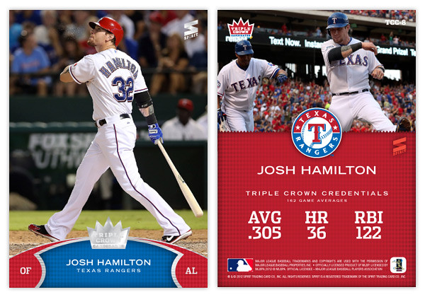
Design-wise, we're starting out with a big, full-bleed photo of the subject at the plate. Towards the bottom, we have a team-color arc with some secondary color notches to house the player position and their respective league. In the middle is the player and team name set on a subtle rhombus pattern to represent a bit of 'royalty.' To finish off, we have some textured silver lines leading to the shiny-shiny Triple Crown Candidate crown logo.
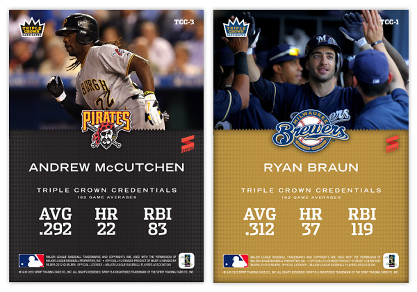
On the back, we have a closer cropped photo up top with the team logo separating it from the bottom team color field. Below the player name is their 'triple crown credentials.' I took these from their Baseball References pages that show their career 162-game averages. Part of me thinks this isn't the best way since McCutchen is having a much better season in 2012 than his previous three, so the numbers are a little dulled. Perhaps after this season is over, their 2012 numbers would be the best representation.
The other guys in the set would be names like Miguel Cabrera, Matt Kemp, Mike Trout, Albert Pujols and the like. I'm sure there would be some others to pop up in upcoming seasons that would work their way onto the list.


Nice work!
ReplyDeleteIt would be interesting to know what fonts you chose and why.
Most of the time my font choices come down to 'what do I have?' and 'what looks cool?' I'll try to remember sharing the fonts in upcoming posts. For this one, the stats are in Dispatch Condensed Bold and the name is in Trade Gothic Extended Bold.
Delete