Showing posts with label mauer. Show all posts

Monday, November 20, 2017

2017 PENNANT BOX BREAK - PACK 18

266. Neil Walker


200. Brett Gardner

47. Ian Desmond

100. Billy Hamilton

125. Miguel Cabrera

102. Cameron Maybin

73. Joe Mauer

233. Corey Kluber

176. Wade Davis

TI24S. Kevin Quackenbush - The Incumbents (shimmer parallel)


The obvious card to discuss here is the Kevin Quackenbush insert. It’s basically the Pennant version of a Topps Chrome Refractor. It’s hard to show the difference between “chrome” and regular stock with just digital cards like this, but I figured the rainbow gif thing would do the trick.

Saturday, April 29, 2017

2017 SPIRIT BOX BREAK - PACK 19

90. Jedd Gyorko

260. Cory Spangenberg

276. John Lackey

225. Joe Mauer

183. Hanley Ramirez

126. Ben Gamel

197. Adam Jones

180. Raisel Iglesias

282. Braden Shipley (RC)

G269. Matt Moore

TL118. Brandon Belt - Team Leader (SFG - HRs)

It still feels weird to call Brandon Belt the Giants’ team leader in homers AND all-star but they’re both 100% accurate. Granted, 17 HRs being the team high is kind of sad...

Sunday, January 5, 2014

2014 Spirit Base Series 1: 11-20


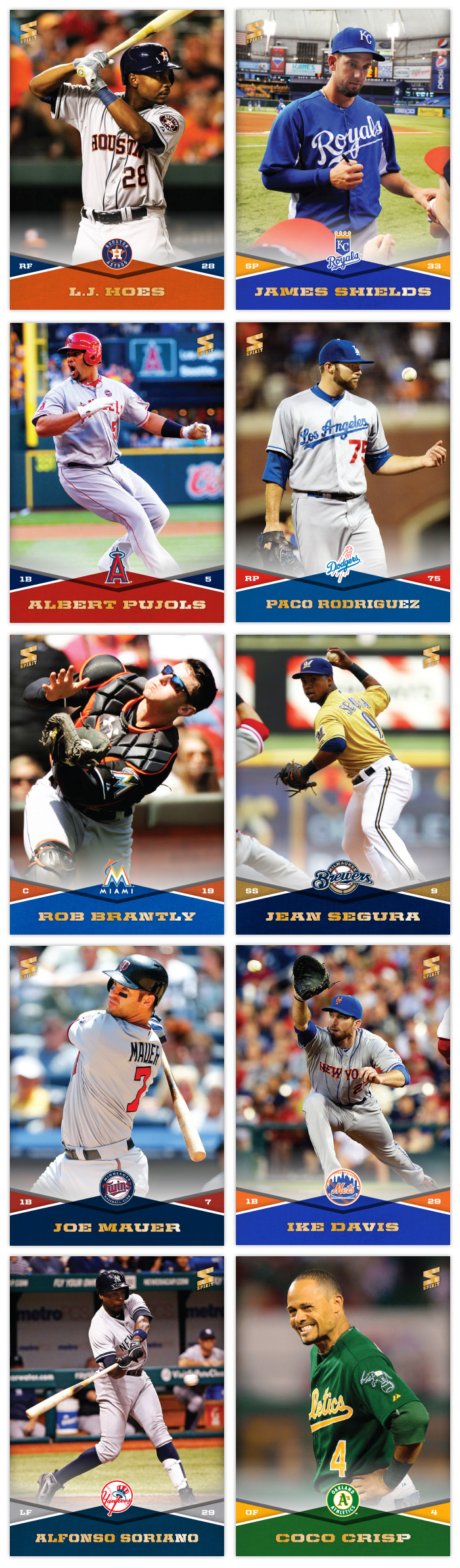
Here are cards 11 through 20, covering from the Houston Astros to the Oakland A's. There's a good variety of colors in this batch. I think my favorites would have to be the Joe Mauer and Coco Crisp. I do like the James Shields card since the photos is him signing for Rays fans on his first visit back to Tampa after being traded.

Monday, April 22, 2013

REVIEW: 2013 Topps Opening Day

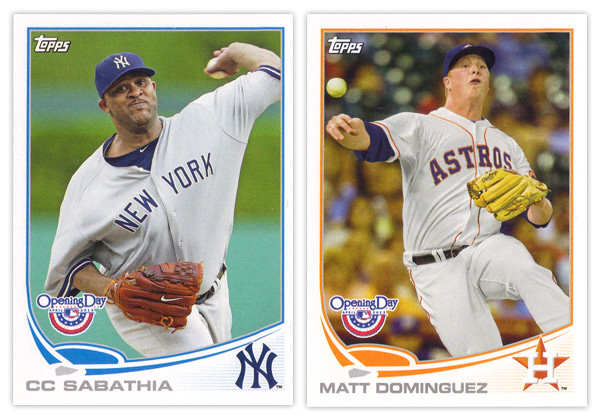
It may be a few weeks into the season but I'm just not getting around to reviewing some cards again. Opening Day is Topps' lowest-end release geared towards getting younger collectors excited for the start of the new MLB season. I'm gonna pass over the base design since it's the same as the flagship series with only the silver foil subtracted and the MLB Opening Day logo added (plus some nice derp-face.) So let's move onto some of the inserts.


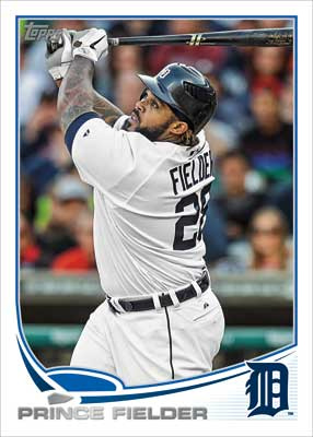
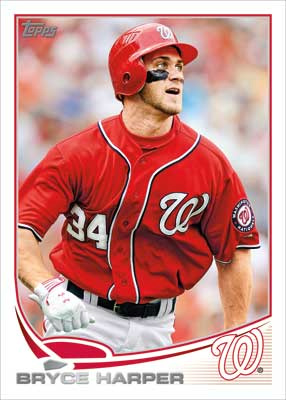
The blue-border inserts are a little different this year. Topps must have decided that the Emerald Sparkle from Series 1 was so nice they should try it in blue. I really like this decision as the blue they chose is really vibrant and pretty. Plus, it keeps us from getting them mixed up with the Walmart exclusive blue-bordered parallels. The Ballpark Fun insert features a lot of smiling and/or pie-covered faces which is best-suited for a release like this. We have a swirly team-color section at the bottom with a familiar mowed-grass pattern. Two complaints about this design: I've seen this free cursive font a lot of places so it kind of bugs me that Topps couldn't find a more refined alternative; secondly, the white grunge-feather border seems really unnecessary since the rest of the elements are decidedly clean (minus the pie face.) They've also updated the 3-D Opening Day Stars insert. Returning are the round edges and lenticular surface, but the rest of the design has been refreshed. I think it's an improvement from last year's design with more room for the photo and fewer unnecessary flourishes.


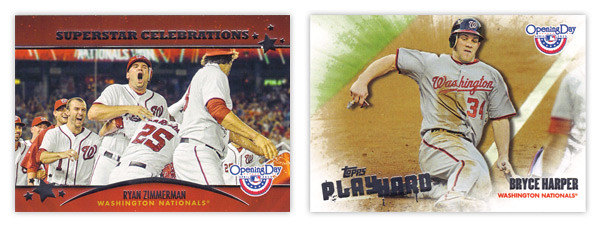
Next we have the Superstar Celebrations cards, which were included in last year's set. These are basically team-wide mobbings of players following what I presume to be walk-off hits. Design-wise, they're pretty standard with red bars across the top and bottom with some silver foil to add some sparkle. Topps decided to keep the fun elements to the photographs and play the rest pretty standard with works I suppose. Compare that to the Play Hard inserts which feature guys in the middle of some 'gritty' baseball moments such as sliding home, stealing bases or laying out to make a catch. The edges have been grunge-feathered which helps with the theme and stays away from a standard design.

I know the target for this set is a lot different than the rest of Topps releases and not all collectors even bother with it, but I usually enjoy spending $10 to take a look at something different like this. Design-wise, Opening Day seems to have a better rate of non-misses than even Topps' flagship. Everything is from decent-to-good and decidedly non-stuffy. In other words, it's fun.

Base cards: 4/5
Blue Parallels: 5/5
Ballpark Fun: 3/5
Opening Day Stars: 4/5
Superstar Celebrations: 3/5
Play Hard: 3.5/5
OVERALL: 3.75/5

Tuesday, September 25, 2012

BASE IN YR FACE: 2013 Spirit Base

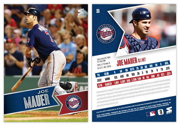
Moving forward with our 2013 preview, here's the base design for the 2013 Spirit flagship. For reference sake, this is comparable to Topps Series 1 if, ya know, someone other than Topps had an MLB license.
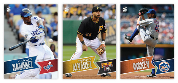
Just like last year's design, 2013 features the full-bleed, full-color photo fronts. There's also a team-color banner to house the player names. The fonts here in silver foil are Blair Medium for the first name and position and Enamel Inline for the big, bold last name. In the opposite banner is the secondary color along with the team logo. All of these elements are on a ten-degree angle that helps make the whole a little more dynamic. Also, it conveniently mimics the angle of the Spirit logo in the corner.
On the opposite side, the angled banner is enlarge and filled with a more intimate player photo with the team logo appearing once again to its left. I'm really taking advantage of this MLB license and smearing their property all over this set. Offset from the team-color background, there's a white box for player info. Instead of doing the full-career stat box, I went with the previous season and career totals. That helps keep the design consistent from card to card since there can be quite a variation from player to player. Below the stats are 5 lines for a write-up.

This year is definitely from the same family as the 2012 Spirit design, but it's more like a second or third cousin than sibling. Lots of the DNA is there but rearranged. I love how bright and colorful the backs are and also how the front design doesn't get in the way of the photo, even enhancing it.

What do you think? How does this compare to the Topps 2013 flagship design?