I've had all the base cards posted for each of the 4 Spirit releases but I was still lacking an insert design for the Deluxe set. I decided to resurrect the Deluxe Duos autograph cards after their absence in 2014. Turns out that when you design 900 individual cards in a summer, it cuts into your ability to create inserts for other releases.
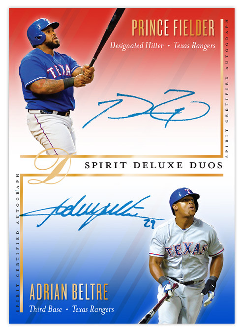
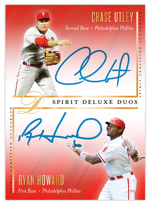
Like previous Deluxe Duos designs, this one features a pair of teammates sharing the same card while featuring autographs of both players. This is the first time the orientation has been vertical. I left more room for player images than usual since sometimes they get squeezed into a corner with maybe just their faces peeking out. Since these would be "on-card" autographs, it's up to the players themselves to decide how much of their signature should overlap their pictures. Design elements from the Deluxe base cards are present, with the team color fades and the same fonts for player name, team and position.
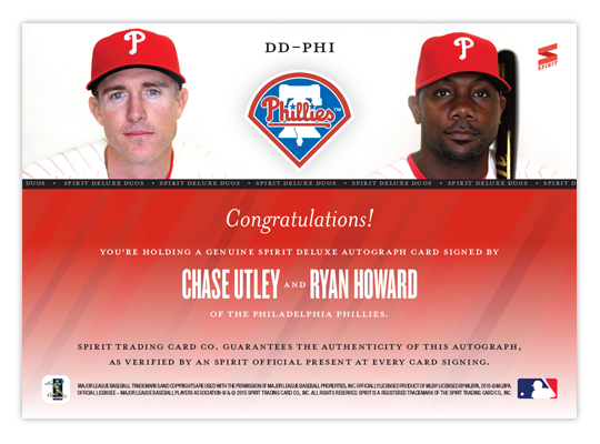
Some nice portraits anchor the design on the back with the team logo making an appearance. I like the simplicity of the back here. Ditch the senseless writeup and stick with some nice photos and lots of empty space. It makes things a little more elegant, befitting a release called "Deluxe."