Showing posts with label bowman. Show all posts

Thursday, June 2, 2016

Around the Horn Review: 2016 Early Releases


In case you didn't happen to notice, I skipped my usual full-release review of Topps Series I earlier this spring. I'd like to say it was planned but, honestly, I just never found the time for it. After a few more releases came before I got around to it, I decided to try out a new format, which you'll see here. I'm sacrificing timeliness for brevity, with the added benefit of avoiding rash judgments.
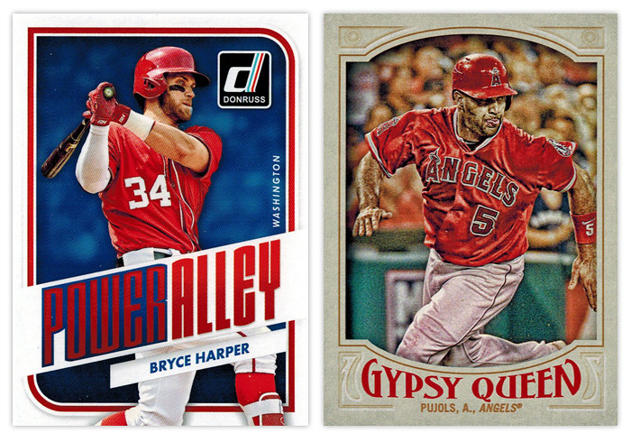

HOME RUN - All-around success. Asking for more would be greedy.

Donruss Power Alley: I was pretty impressed with this design as soon as Panini released the preview images. This is probably the best argument to be made for them to just relaunch the Donruss brand as Panini's flagship instead of all the zombie Donruss stuff they usually do with retched results. It's modern without being too modern, well-balanced and interesting with just enough interesting stuff going on.

Gypsy Queen base design: This is by far the best Gypsy Design the hobby has seen. Topps was finally able to hit that sweet spot between clean and ornate that fits the GQ brand perfectly. The wordmark has the right amount of personality without being over-the-top. The border color is neutral yet has just enough of a hue to not look boring or garish. And my favorite detail is probably the faux embossing for the elements in the corners. I can't think of a single element here that I'd change. Good job, Topps.


TRIPLE - Didn't quite get all of it but standing on third is a pretty good spot to be.

Gypsy Queen Power Alley: I'm curious what my perception of this would be if I wasn't so enthralled with the Donruss Power Alley design. Obviously the feel of GQ is quite a bit different, but it's still a pretty good design. The color scheme of blue, red and gold is really appealing on the lighter border and helps add some nice contrast to all the elements, especially the home run number total front and center. The wood grain on the bats is another nice detail. The only knock I have is the style of the blue flourishes along the top and bottom of the photo frame. They look a little too '70s-mellow-mushroom for my tastes.

Topps 100 Years at Wrigley Field: The design here benefits from having all the iconic features of Wrigley to drawn upon —red brick, ivy, Wrigley marquee. I like how all of these elements are creeping up from the bottom of the card, just like the ivy creeps up the outfield walls. My only suggestion here would be to maybe have the player name in white running just over the marquee graphic to avoid the dreaded foil-on-dark-background gambit.


DOUBLE - On target for a solid knock. 

Diamond Kings Expressionists: The design here benefits from its simplicity. Playing off the whole expressionism angle, the animated player images are all paint-rendered with the gold, green and red swaths repeating on every card. This is a rare example of them not overcrowding the card with unneeded elements.

Diamond King Aficionado: The best combination of portrait and action shot I've seen in a while. The canvas-colored strips at the top and bottom do a good job of setting the smaller action shot and adding just the right amount of depth. The oil paint look would make a bigger impact here if it was used a little more sparingly in the rest of the Diamond King set.
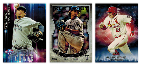

SINGLE - Success... but just barely.

Opening Day Striking Distance: Even though they don't really have anything to do with the theme of the set, the colorful aura and light beams make for interesting design elements. The "150 WINS" text is a little hard to make out in spots. It also seems like they could move the Opening Day logo down to the actual corner and have the name/goal left aligned next to it since the format of everything else is asymmetrical.

Topps MLB Debut: These came in bronze, silver and gold variations but I honestly can't tell which foil is on the Darvish card here. I probably would have moved this up to the "double" level but the photographs are all especially dark, like their HDR action missed the brightness step in Photoshop. The banner also looks  little hokey when paired with the background texture. Compositionally, it's pretty solid, though.

Topps Walk Off Wins: Kinda like the Striking Distance cards, these have some nice, colorful but irrelevant graphics. I do appreciate that they're team-color based, but there's no real connection to the theme. It would be nice if "Walk Off Wins" appeared in full somewhere on the design. As is, the full line either runs off the edge or it's obscured by something.
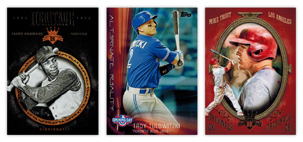

Diamond Kinds Heritage Collection: The ornamented circle frame is a nicely rendered element. I like the added depth of having the player cutout overlap it in spots. Another instance of less is more with the background, though, again, the foil on black has some issues as you can see from the scan. The team location at the bottom of circle looks nice in that same gold as the frame. Unfortunately, the player name and position flanking the DK logo towards the tops looks funky since the two lines have such varying lengths on the Frank Robinson here.

Opening Day Alternate Reality: It's very reminiscent of the Striking Distance design. Honestly, they could easily flip the designs for each set and it wouldn't make a difference either way. The "Alternate Reality" text is a little too cliché sci-fi for my tastes. The composition is a little better than its sibling though the elements aren't as nice.

Diamond Kings DK Originals: Give Panini credit for some nicely deployed irony here. This is the Diamond King set's answer to the Donruss Diamond Kings subset. And they named it "Originals" lol. Whatever you say, Panini. It has the same portrait/smaller action cutout set up you'll see in the Donruss version, though executed better here. Making the whole thing full color is a nice distinction. I'm not a fan of the text treatment up top or the "DK Originals" stamped on the bottom. Switching the image order from the Aficionado design is good move to help differentiate them a bit.
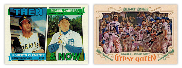

Heritage Then & Now: With the constraints of the 1967 base design, this is about as good of a solution as you could ask for. The little details like having the flags split the photos and then wrap around are well done.

Gypsy Queen Walk-Off Winners: Wait, this again? I will say the photo choices here are a lot better than the regular Topps WOW cards. But the horizontal layout means there's less room the image itself since they have to allow for all the typical GQ flourishes to circle in from the borders. My biggest gripes are how the text is handled for both. The "Walk-Off Winners" text up top looks a little to groovy for the rest of the design. And the way Gypsy Queen wordmark arches down along the top really bothers me with the player/team name running above it on a straight baseline. That's a gnarly negative space.


WALK - Mostly good but left a little power in the bat.

Topps base: I'm a fan of the basic look and layout here but it's littered with things I'd change. The "smoke" on the edges, the fake shininess, cut off logos. Has anybody noticed how the colors on the diagonal bars are different? Look at the Eickhoff card. The one on top matches the red from the Phillies logo but the bottom one is on its way to purple. And why is blue the predominant color for the Phillies cards instead of red? Or why are the Pirates cards mostly red with just a smidgen of yellow and zero black? There are too many little things like that for me to be complete sold.

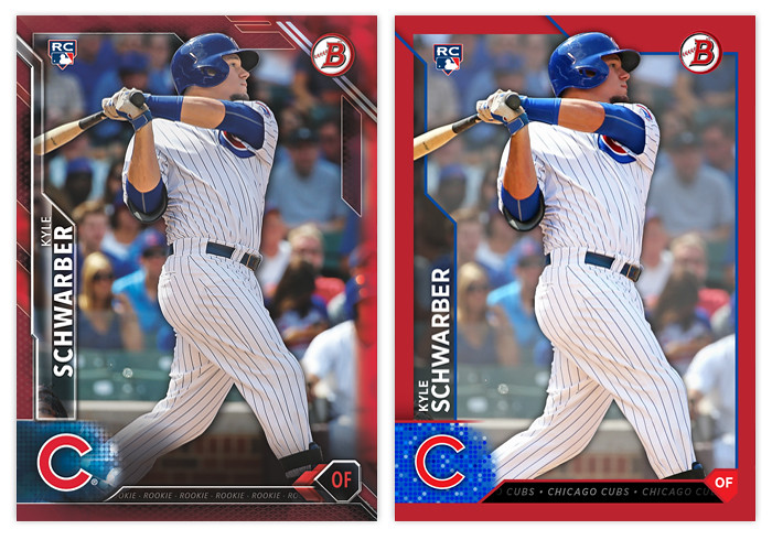
Bowman base: If you saw my previous post, you know exactly where I think the Bowman design can be improved. To sum it up, make the border solid and get rid of all the shiny textures and this would really round the bases.

REACHED ON ERROR - Somehow standing on first despite your best efforts to make an out.

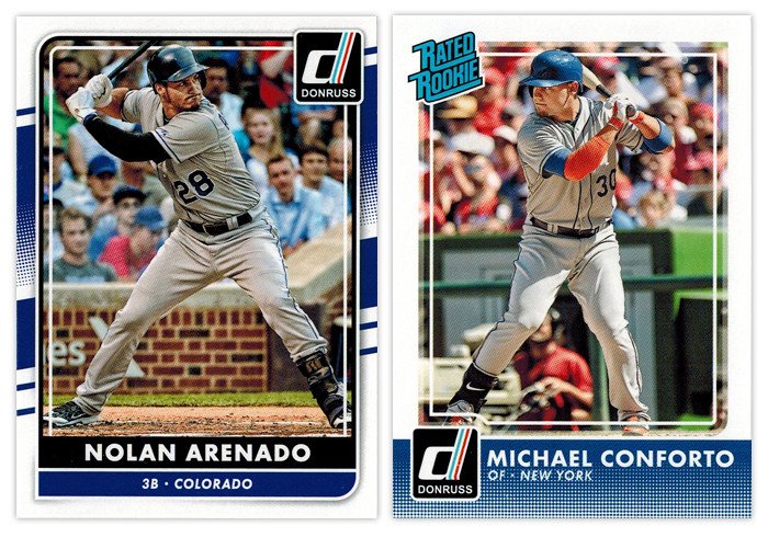
Donruss base: I don't know why Panini is still doing what they're doing with Donruss. Take a few different elements from different Donruss designs of the past, throw lock yourself in a cell with a laptop and see if you can earn your parole (or something). As an evolution from the 2015 design, it's actually an improvement. But they seemed to have incorporated one Topps' least popular design elements into the Frankenstein design here, for some reason. Somehow, though, I don't hate it. Objectively, it's not a bad design per sé. I just can't endorse the way it came to exist.

Donruss Rated Rookie: Hello, halftone gradient. Not so nice to see you again. Having it run across the bottom unencumbered like that is not a good decision. It's teetering on obnoxious. The only saving grace for the rest of the design is the absence of anything else. Just a solid white border and plain white text with the iconic Rated Rookie logo in the corner. So congrats for knowing how to not make things worse (for this design at least).


GROUND OUT - A trip to the plate with nothing to show for it.

Bowman Prospects: While this is almost completely interchangeable with the Bowman base design, it takes a few extra dings here. The issues with border and texture still appear. Without the player name running vertically, it loses some of the dynamism that Bowman has. Also, the team logo sitting in the circle, there's a little too much negative space on the left border that throws things off balance.

Bowman Sophomore Standouts: All the leftover diagonals converge here into...nothing really. The text is boring and too similar for anything to standout. The absence of a primary element other than the player image drags this to snoozeville.

Bowman International Ink: These were doomed once they decided to feature players wearing jerseys over dress shirts in front of the busiest backdrop ever. The team and Bowman logos would be better off if they switched places, letting the team logo be a little bigger. All the fades and shines could stand be toned down as well. The design isn't beyond salvaging but it's probably a more effort than it looks like they were willing to put in.

INFIELD FLY - Took a big cut but ended up not making a positive difference.

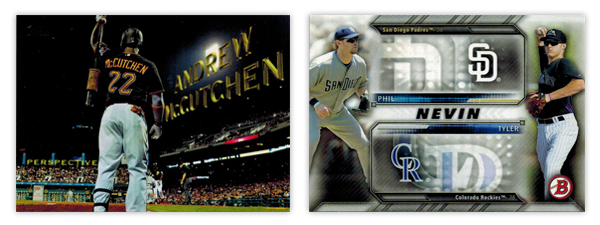
Topps Perspectives: I know I'm in the minority here but I'm not a fan of this insert. And it's all because it's completely based off the opening credits of a 14-year old movie. It seems like Topps was attempting to inject some Stadium Club-ness into the flagship set here but it just comes across as a little limp.

Bowman Family Tree: I've never been a fan of when Topps designs insert sets around the auto or relic parallels included. This is a pretty egregious example. All of that wasted space next to the logos just so they can accommodate the autographs. While, the autographed cards are pretty cool, there's no reason to saddle the non-auto versions with such a design obstacle.


STRIKEOUT - Walk back to the dugout in shame.

Donruss Diamond Kings: Why are the "paintings" gray? Why couldn't they edit out the background noise like the NetSuite logo? Why is the player name/team location so prominent? This whole thing screams minimal effort and thought. I can't think of a single positive to mention.

Topps Pressed Into Service: With such a novel concept for an insert, it's a shame the execution is so poorly done. You'd think they would use a picture of the players' pitching, no? The ball stitching is pretty cheesy in the background and I'm not sure why there's a little blip of the photograph fading around the cutout. The swooshes look pretty dated as well. My overall sense is this was a design they've had sitting in the cabinet for a few years now and finally got around to using it to clear out space.
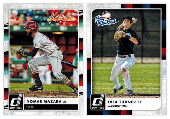

Donruss The Prospects & Donruss The Rookies: Ooh boy. Of all the elements for Panini to pick from the Donruss carcasses, I think the tubes from the 1988 set is very, very far down the list of desirability. Mix in the grungy white texture and it's a match made in hell.

Thursday, April 28, 2016

THIS IS THE REMIX: 2016 Bowman


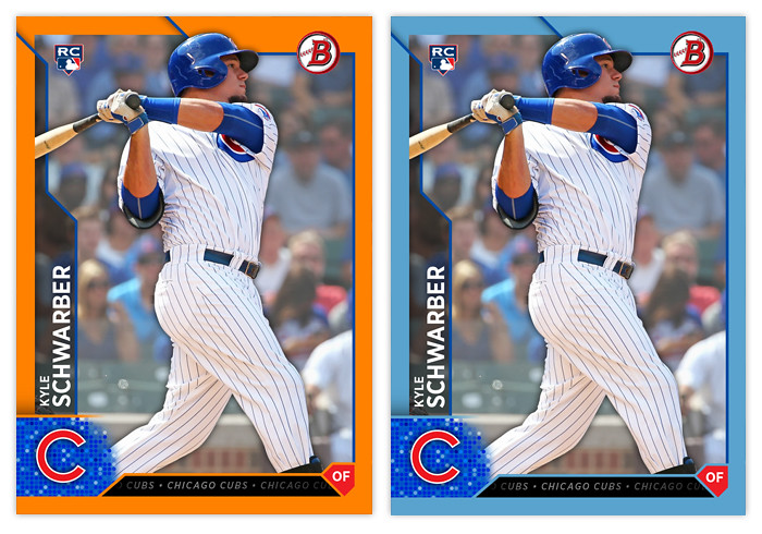
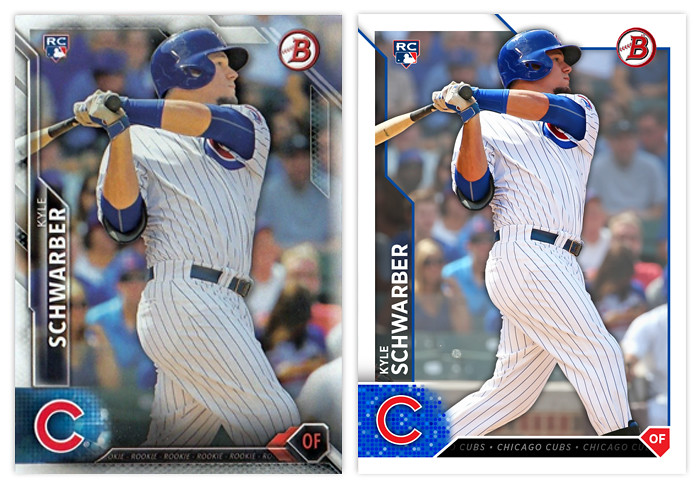
I thought I'd take the occasion of 2016 Bowman hitting the shelves to post a remix I did a few months ago. My overall impression of Topps' design is mostly positive. I like the angular elements and appreciate that everything is (mostly) readable The biggest issue I have is just the overall busy-ness, with all the shines and fades and bevels. The lack of a solid border was the first thing I changed while keeping a few of the overlaps along the top. Next, I changed the name so both the first and last are aligned on the left and just made the tab a solid transparent tab. The Bowman and RC logos are in the same spot. I decided to make the shape holding the player position into an actual home plate instead of just the "sorta" home plate they used. The little tab thing between that and the logo has the team name repeating over and over like a ticker, like the original design. (The Schwarber here says "ROOKIE" over and over.) Then I added the drop shadow to the player cutout and faded the background image a bit to help the player stand out.


You can see here how the solid border looks with the parallels in comparison to the Topps' design. It's definitely easier to spot on your initial view. The fade on the borderless right side of the card in the original really bugs me. The solid border fixes that. I did a few more below though I don't know if these are included in 2016.


The changes aren't too drastic but they definitely fit my own personal style more than all the over-texturing that Topps is so smitten with currently. In my mind, they're about 5-7 years behind design trends with all of the beveling and whatnot. The remix would definitely age a lot better down the line than the original design.

Monday, August 5, 2013

REVIEW: 2013 Bowman Platinum


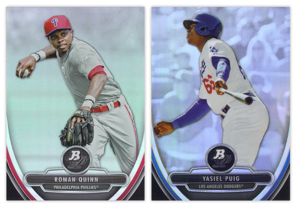
I've been kind of partial to Bowman Platinum the last few years of my collecting resurgence. It does a much better job of balancing prospects and veterans than the standard Bowman set. Design-wise, it's a pretty good entry as something that's not really high-end but much nicer than the cheaper standard Bowman.

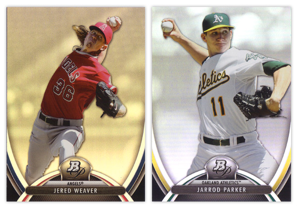
There are some similarities though when it comes to the 2013 product. Much like this year's Bowman comes across as 2012 v.2, Bowman Platinum dances on similar ground as last year's. The foilboard is back, along with the player cutouts over rainbow-y backgrounds, though this year it looks like they've screened those back a bit so they're lighter and less busy. Then there's the BP pendant in the middle on top of some abstract, swooshy shapes. Last year was more about straight lines with curved corners. This year we get the Gateway Arch. Throw in some team-color slivers and the player & team names spelled out and it, once again, looks like a leftover from last year's design brainstorming session.

I do like that there's more room devoted to the player image and the name being smaller seems to keep things a little tighter. Added points for having both team colors in there as well. And the fake mesh texture at the bottom is definitely an upgrade from 2012's candy stripes.


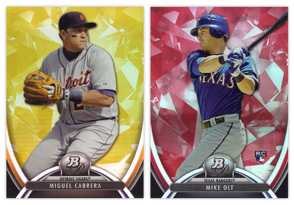
I am pretty happy with the color parallels this year. We have the gold and ruby pictured here along with a blue sapphire which seems to have replaced the green emerald from years past. The main difference here is they've added the atomic/ice/diamond-like texture to the colors so they are easily distinguishable from the base cards.


Since it's pretty much standard procedure for all Bowman products the last couple years, the prospect card design is very very similar to the veteran cards. Stick the BP monogram in circle, tear down the arch, flip the player/team names and stick them on top of an overstuffed metal hamburger and we've got ourselves a 'new' design. My other big complaint with the prospect cards is the refractor situation. Can you tell which of the two above is the refractor? I sure as hell couldn't until bending my neck down lower and lower until I caught the glossy sheen on the Puig. If you're going to make every card appear refractor-y and still include a standard 'refractor' parallel, do a little extra work to differentiate them so collectors don't have to. Last year's concrete block worked great. No need to abandon it when you're so keen on repeating elements year after year.

Oh yeah, there are also a lot of prospect parallels that I didn't get in either of my 2 blasters so I'll just add they are the same as above, only colorified.


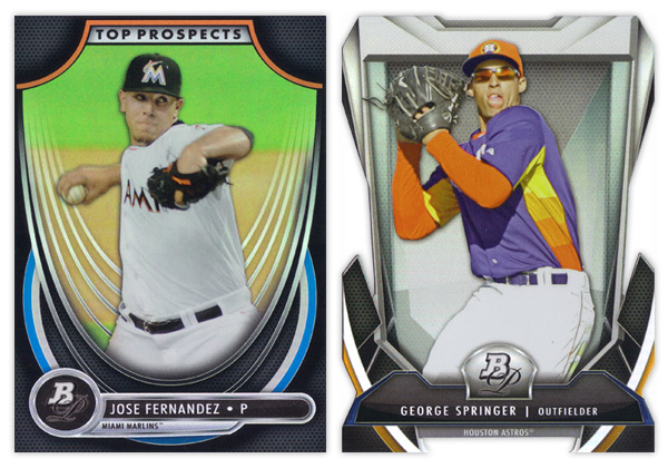
Unfortunately, I wasn't lucky enough to pull any autographs from said blasters so we're finishing up here with the inserts. The Top Prospects design is actually pretty different from 2012's and the rest of the 2013 cards. I don't have a problem with too much here other than the wispy white curves behind the player cutout. It's waaaay too much. It looks like they're sinking in a really loose hammock. The rounded inverted corner in the top are a little too big for my tastes but far from the biggest eyesore.

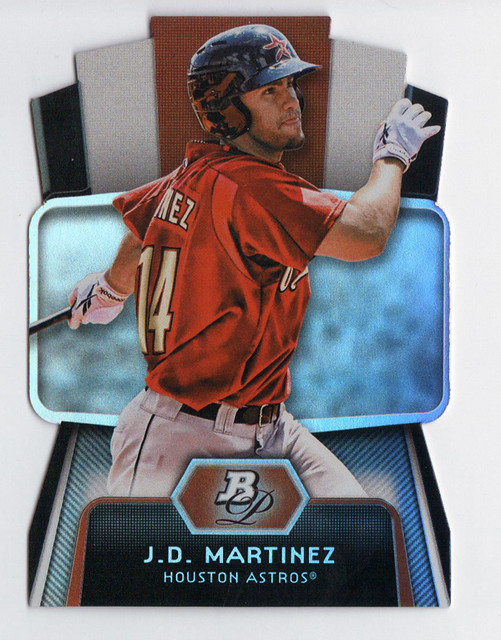
Last and certainly least is the Cutting Edge Stars diecut. I've mentioned before how I'm not a fan of Topps' over-the-top, random die-cutting they've employed excessively over the last 2 years. Most of my distaste is aesthetically motivated, which still applies here. I don't understand what all of these design elements are supposed to be. Some torture device from Michael Bay's next Transformers movie? But my biggest problem with this particular die-cut is the little barbed teeth in the center at the bottom. I can't remember the last time I had so much trouble sliding a card into a penny sleeve. Honestly, it was a torturous test of my will and patience. If I happen to get my hands on any more of these, hopefully they'll already be toploaded for me.

I know this may have come across as mostly negative, but since Bowman Platinum starts off pretty high in my mind, most of these little dings I put on the set don't really bring it down that much. Really, if this was the 2012 design and last year's was coming out now, I'm not sure if the 2 reviews would be that much different. Hopefully the 2014 edition will have a few more differences while keeping up the Bowman Platinum brand.

Base cards: 8/10
Parallels: 8/10
Prospects: 6.5/10
Inserts: 6/10
OVERALL: 7/10

Wednesday, May 15, 2013

REVIEW: 2013 Bowman


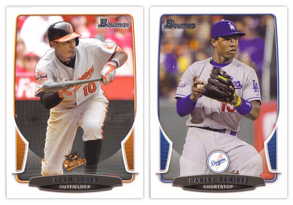
The biggest takeaway from the 2012 Bowman design was how it was a big departure from what Bowman had been putting out for many years past. As we review the 2013 version, it looks like that big year-to-year jump was merely aberration and not a new gameplan heading forward. Just like the 2012 version, this year we have white borders, not-quite rectangular frames in team colors, silver foil names, subtle drop shadows around the players, team logos centered above the name block. Honestly, you could be looking at last year's cards while reading that description and it would be 100% accurate. About the only distinguishing features here are the little tabs folding in on the left and right sides and the soft white overlay to finish out that curve. If we didn't have 2012 to compare this to, I'd really like the base design here. But as a follow up, it looks more like a rehash and suffers a bit.


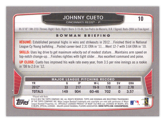
For the backside, the similarities are even more....similar. The layout is identical to 2012 with a little tinkering to fit this year's look. The colored tabs on the bottom and the black nameplate are pretty much where those embellishments are made. I mentioned a couple things on last year's review that I thought were easy improvements to make. I suggested that the last section of the Bowman Briefing be changed from EVOLUTION to UP CLOSE (like it is/was on the prospect cards.) I doubt that any eyeballs at Topps saw my recommendation but somehow it was magically changed for this year. My other suggestion, however, seems to have gone without notice. The card numbers are still in the upper right corner, which means if you store these upright in a cardboard box, the numbers won't be visible. So once I again, I propose this amendment to the Baseball Card Constitution: horizontal backs have to be numbered in the upper left corner to help for storage box sorting.


Now on to what is basically Bowman's reason to exist: prospect cards. For 2012, I preferred the veteran design to the prospect design but I'm flipping it around for this year. The prospect design is a lot easier to distinguish here thanks to the solid team-color wedges above the name. There are some subtle shape differences to the frame and nameplates that also help them stick out. The team logos are removed to help save space for the autographs (I assume.) That means the team names are found below the player name and the position is moved to the right color wedge. 


Like every other Topps release, there are plenty of parallels again. Gold, blue, purple, orange, silver ice, etc., etc. The international cards are a little different this year. The flags have some texture to them so they aren't as glaringly obvious as prior years. Also, for American-born players, they have the flag of their home state up here instead of the Stars & Stripes. I'm all for anything that helps distinguish them from previous years. 


The Top 100 Prospects cards are actually pretty nice. They have a smooth, cool finish to them with some silver, black and blue/red colors around the border. There appears to be a die-cut version as well but, as I've mentioned before, I'm not a big fan of random-shaped die-cuts. I do like how the numbers are nice and big to help drive home the fact that there is a list they're referencing. And keeping with the blue, we have Bowman reprints with blue refractor borders. I'm so tired of reprints that I can't even bother to say any more about them.


Finally, we've come to what's probably the worst development so far this collecting season. Topps has decided to introduce minis into the Bowman line. Their reasoning is obviously... who knows, but here they are. They're an odd size, they're chrome, they're refractory, they're prospect-ory. I wish somebody with power at Topps could exercise some willpower and stop spreading things across every release like this. It's really getting old.

Overall, I'd feel better about the 2013 release if it all weren't so simliar to 2012. The base and prospect designs look like comps that didn't get picked up last year or were just saved away for a future release. I understand keeping some things consistent but this comes across as a little too lazy.

Base cards: 7/10
Parallels: 6.5/10
Prospects: 8/10
Inserts: 6/10
Minis:4/10
OVERALL: 6.3/10

Friday, November 30, 2012

2012 Post-postseason Odds & End Review Roundup Roulette

Here's my final look back at the designs produced by Topps in 2012. There aren't a whole lot to cover here since everything Topps has released since July is just a chromified version of their base design. I'm also not spending any time on the high-end releases since I don't have the money to personally accrue a wide swath for reviewing. Also because they're all basically just a place to stick a uni swatch and/or auto. But in brief, they all look nice.

This space is saved for the new inserts found in Series 2 and Update along with whatever random things happened to fall out of my Topps Chrome & Bowman Chrome blasters (so not a lot).
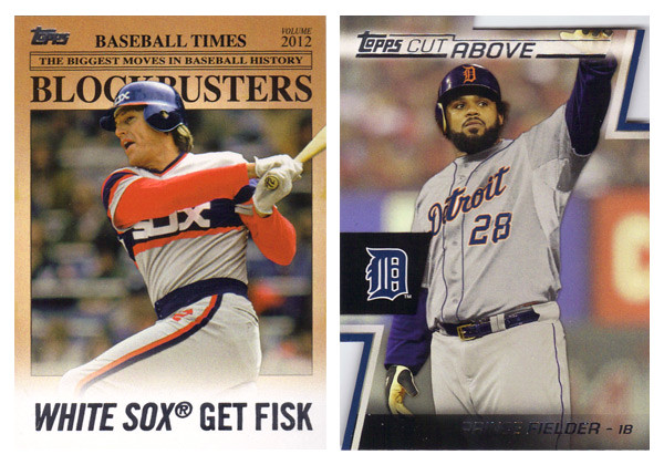
First up is the Blockbusters insert from Update. In a way it was nice to have a little reminder what Update used to be about before it was bloated with all-stars, rookie debuts and yet even more SPs and SSPs. As for the design itself, there's not really a lot to it. It mimics an old newspaper with some of the laziest headline writing. I guess its okay even though the paper color is a little too aged for color photos. My other complaints are the huge ® after the team names as well as some odd player selections. I understand there are only so many trades that happen, but when Joey Bats was traded to Toronto, it probably didn't even a garner a line in transaction box in most papers, let alone get the front-page treatment.

The Cut Above insert set is probably the best design from Topps flagship in 2012. The diagonal die cut notches in the corners are pretty cool and fit into the 'cut above' theme. They left plenty of room for a full photo and also space for a relic and/or auto that don't impede too much onto the design. It's clean and modern with all the angular elements adding some dynamics.

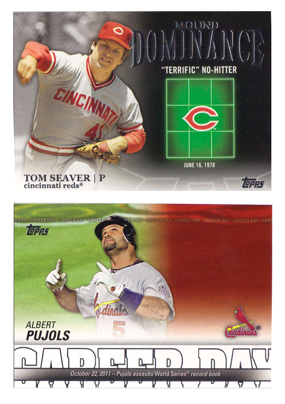
Following that up is probably the ugliest design of 2012. The Mound Dominance insert just looks cheesy as hell with the glowing green strike zone. It's like Ghostbusters meets Battleship. There's really no reason that so much of the card real estate is devoted to something like that. The Career Day design is decent with plenty of info packed into the bottom, leaving plenty of space for a nice photo. Unfortunately, they leave so much of it empty for relics and autos, making the plain jane version especially bare. I really don't understand why Topps can't change up the auto / non-auto design to accommodate each version. They still have to add the "certification" statement for autos and relics, so it's not like the design is exactly the same for each. I suppose there's possibly a reason other than laziness but I can't think of one at the moment.


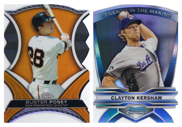
2012 was the year of the diecut apparently. Both the Chrome sets dabbled in some really weird and bizarrely shaped cards. The Dynamic Diecuts from TC are a little more colorful so I give them a slight edge though there are way too many little cutesy design elements for my tastes. I do appreciate that they have 2 actual corners on the bottom, unlike the Legends In the Making cards. These really are a bitch to get into penny sleeves.

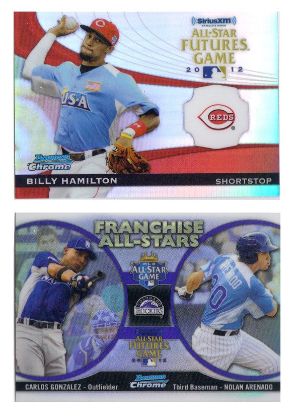
These two inserts from Bowman Chrome finished out the year on a good note. The Futures Game cards have a nice blend of elements that make them not too gaudy but also somewhat exciting. The odd holding shape for the logo should bother me more than it does but I think it actually works well here. Of course, it's there for the relic/auto version but it works well without it.

The Franchise All-Stars insert is a pretty neat idea for a set like Bowman Chrome that features both big leaguers and prospects from the minors. It's also pretty well executed here with so much information included without looking crowded. The big circle frames for the player photos is much nicer than the standard double-player designs Topps has been doing lately. The only thing that really bothers me is the font choice for the "Franchise All-Stars" text. Gill Sans Ultra Bold is used in way too many crappy movie posters. I can't get past it here.

Well that should close the book on 2012, unless my wife gets me a box of Five-Star Baseball or something. So, again, that closes the book on 2012.

Monday, August 20, 2012

REVIEW: 2012 Bowman Platinum

I know it's been out for like 2 months already, but better late than never...


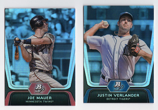
Starting off with the base design, with a note that these look less blue in real life (sad scanner I guess.) They kept the super shiny refractor-y foil board for another year. I like it well enough, though it doesn't have the same impact as last year's did. I'm sure the returns will diminish if they go the same route next year. The design itself is rather futuristic and minimalistic. No team logo (name only), no player position. The Bowman Platinum logo only shows up as a monogram. I think it works for this as a way to differentiate it from the regular Bowman set. The feel is pretty similar but this comes across a little more 'upscale' I suppose.


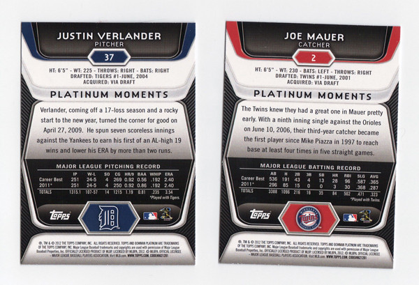
On the back, we get the same glossy-techy elements as the front but with a little more information. I don't necessarily advocate for full-career stats on the back of every base card, but surely someone should have noticed how squirrely it is to have Verlander's 2011 season stats on their twice.


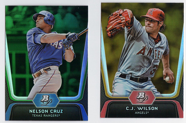
There are green, gold, and ruby parallels again this year with the golds being, once again, the hardest to differentiate from the regular base cards. I'm a little partial to green, but damn if they don't stand out the best.


Since Topps has gone die-cut crazy this year, we have a die-cut insert in Bowman Platinum as well.
These are called Cutting Edge Stars. They look nice enough, keeping with the same design elements as the other cards in the set, except for that huge TV-looking shape in the middle. That paired with those movie ticket things cut out at the top make this insert look oddly kitschy. It's strange how off these look from the rest of the set even though they used the same basic elements.


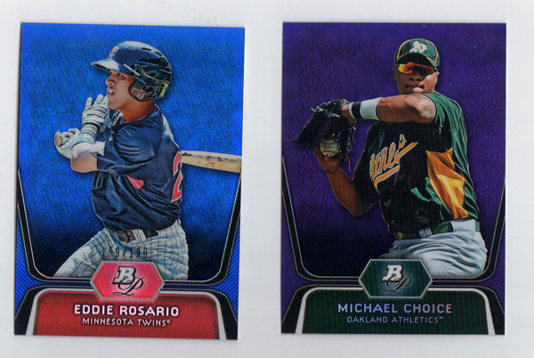
Now onto Bowman's bread and butter—prospects. These were really frustrating to pull out of the pack. First off, the design is exactly the same as the regular base only the negative spaces on the left and right edges are white with dark stripes instead of dark with light gray stripes. The background seem to be feathered out even more on these, probably due to some of the less-than-flattering spring training settings of these photos. And to clarify, the cards in this scan are left-to-right an x-fractor, regular refractor and regular 'base' prospect. The x-fractors are the easiest to make out, but the differences between the refractor and the 'base' take some investigation. The refractors has this rectangular stone-like background, which would be easier to notice if it went to the edges. I say, if you're going to make the base look refractor-y then DO AWAY WITH A REFRACTOR PARALLEL. It's not like they don't have others to fall back on.


Like these blue and purple ones, and also gold. Why they can't just pick an additional color is beyond me.


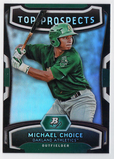
The prospect version of the Cutting Edge Stars insert is called (drumroll please...) Top Prospects. These aren't die cut but still somehow have some cheesiness going on. I think it's the 'TOP PROSPECTS' text. Why they decided to include that but leave 'Cutting Edge Stars' off the front is puzzling.


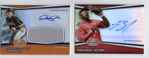
And since I had some to scan, here are a couple of prospect autos. These actually look pretty good, due in large part to the team color bands along the bottom. I think that's what I'm missing from just about every other card in the release. They're throwing all these refractor patches and neutral grays and blacks on there and it kind of drains the life from the card.

Overall, I think these are nice cards that could be better but probably could be a lot worse. My main takeaway is that this looks like it was an option for the 2011 Bowman Platinum release that they just put in their back pocket for this year. In a way, that's pretty much every release from Topps these days I guess. Maybe it's a practical decision from a production standpoint, which I could understand. Then again, part of me thinks it's time to either evolve a bit or just completely blow things up and start anew.

Base cards: 4.5/5
Parallels: 3.25/5
Prospects: 3.25/5
Inserts: 3/5
OVERALL: 3.5/5


Saturday, May 19, 2012

REVIEW - 2012 Bowman

A full week after it hit shelves, 2012 Bowman finally made its way to the Walmart in my town, so this is the first chance I've had to take a look that the set.

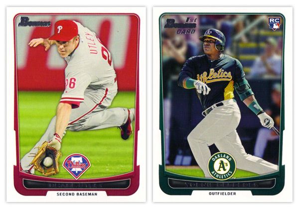
Starting off with the base card design, the first thing you'll notice is the familiar black borders are gone. I'm a little torn on this one. For the last decade or so, Topps did a great job of branding Bowman with something as simple as having a consistent black border on the base design every year. Looking at these all-white borders, I'm kind of missing that Bowman feel. But on the bright side, the black borders are notorious for showing every little imperfection along the edges, so their absence here helps rectify that.

Another change of pace is the introduction of team-specific colors into the design. In years past, the only colors to go along with the black borders were a small bit of red for veterans or green for rookies. Now you'll find blue and purple and a whole host of other colors.  The team logos return in full color after showing up in gold foil last year.

There are a few things I'm not crazy about. The names being in silver foil on top of black is just as hard to read here as the the gold on black was on the flagship design. I'm also not a big fan of all the unnecessary bevels around some of the frame elements. Those are, however, small quibbles. Something that's subtle but really helps the players shine here is the light drop shadow you'll see around the guys. It more noticeable on lighter backgrounds, like the Utley one up there, but helps to add focus to subject of the card. If it were any heavier, I'd probably be bitching about it forever, but they got it about perfect here.


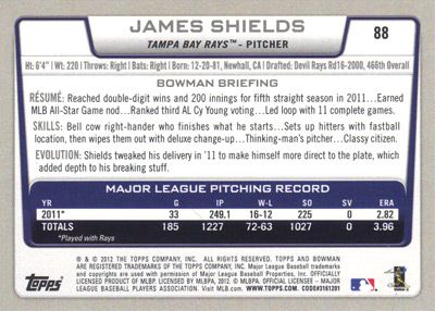
The back side of the base cards continue the same feel as the front, only the border here is gray instead of white. Can't figure that one out. Only having stats from the 2011 season seems like a trade-off they had to make for the veteran cards since Bowman's primary focus is prospects. The 'RESUME' 'SKILLS' and 'EVOLUTION' things are fine, though I prefer the 'UP CLOSE' section on the backs of the prospect cards, which replaces 'EVOLUTION.' One thing they kind of messed up on is having the card number in the right corner instead of the left. BASEBALL CARD LAW: horizontal backs have to be numbered in the upper left corner to help for storage box sorting.


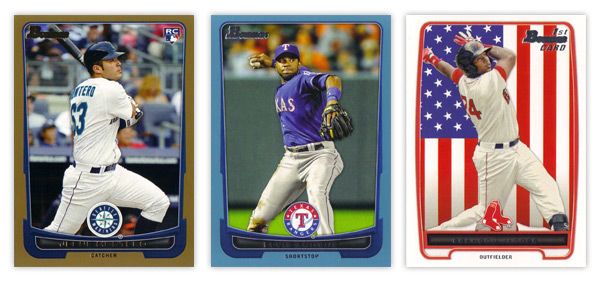
The design for the prospect "inserts" is really, really similar to the base design. In fact, it's almost problematically similar. For the 2011 set, the prospect cards had a white border to differentiate from the black bordered-base, so it didn't really matter if the designs were similar or not. This year, though, the made the designs almost identical on top of having the same colored borders. Not sure what the thinking was there unless they're really trying to test the MLB's patience with the whole Bowman prospect worship thing. Regardless, I think it was a dumb decision.

There are parts where the designs differ, though: prospect has a symmetrically convex border compared to trapezoidally-shaped base border with the little weird notches on each side; the cutout for the position on the bottom is wider and rounder for the prospect design; the base set doesn't have those weird wing things on each side of the logo. I think if the base design didn't have those notches or if the prospect set didn't have the wings, you'd have an all-around better design for one or the other. But holy hell, they shouldn't look this similar.

I'll give them credit regarding the autographs, though. They did away with the facsimile autos on the 'base' prospect cards, which really helps the make the actual auto cards more unique.


Just like every other Topps product, this one comes with lots of parallels. Gold, blue, red, orange, green, blue, international, blue, red ice, silver ice, Dentyne ice, blue. I think the flags on the international is kinda neat. The silver and red ice versions are basically just atomic refractors. Really, they have at least twice as many parallels as they should, if not more. But in honor of the Preakness today, I'll refrain from beating that dead horse.


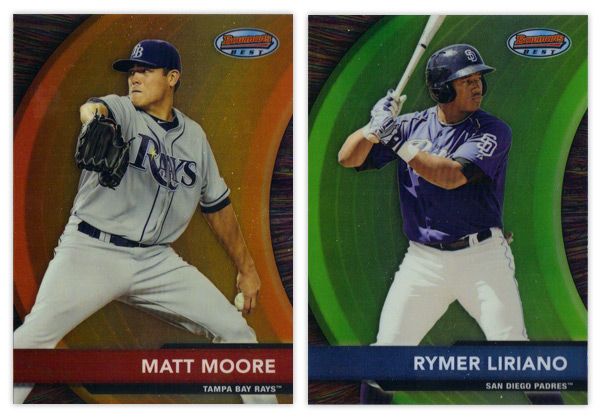
Finishing up here is this year's edition of the Bowman's Best insert. Again, they have the red version for veterans and blue for prospects. There are also die-cut versions, which have all kinds of crazy refractor parallels themselves. Design-wise, I like the different textures on the swoosh and the background. Along with the type and name bar, I appreciate the simplicity of the design.

Overall, I think there's some pretty good, modern design here even if it's not completely "Bowman."

Base cards: 4.25/5
Parallels: 3.5/5
Prospects: 4.25/5
Inserts: 4/5
OVERALL: 4/5