A full week after it hit shelves, 2012 Bowman finally made its way to the Walmart in my town, so this is the first chance I've had to take a look that the set.
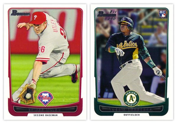
Starting off with the base card design, the first thing you'll notice is the familiar black borders are gone. I'm a little torn on this one. For the last decade or so, Topps did a great job of branding Bowman with something as simple as having a consistent black border on the base design every year. Looking at these all-white borders, I'm kind of missing that Bowman feel. But on the bright side, the black borders are notorious for showing every little imperfection along the edges, so their absence here helps rectify that.
Another change of pace is the introduction of team-specific colors into the design. In years past, the only colors to go along with the black borders were a small bit of red for veterans or green for rookies. Now you'll find blue and purple and a whole host of other colors. The team logos return in full color after showing up in gold foil last year.
There are a few things I'm not crazy about. The names being in silver foil on top of black is just as hard to read here as the the gold on black was on the flagship design. I'm also not a big fan of all the unnecessary bevels around some of the frame elements. Those are, however, small quibbles. Something that's subtle but really helps the players shine here is the light drop shadow you'll see around the guys. It more noticeable on lighter backgrounds, like the Utley one up there, but helps to add focus to subject of the card. If it were any heavier, I'd probably be bitching about it forever, but they got it about perfect here.
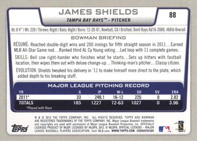
The back side of the base cards continue the same feel as the front, only the border here is gray instead of white. Can't figure that one out. Only having stats from the 2011 season seems like a trade-off they had to make for the veteran cards since Bowman's primary focus is prospects. The 'RESUME' 'SKILLS' and 'EVOLUTION' things are fine, though I prefer the 'UP CLOSE' section on the backs of the prospect cards, which replaces 'EVOLUTION.' One thing they kind of messed up on is having the card number in the right corner instead of the left. BASEBALL CARD LAW: horizontal backs have to be numbered in the upper left corner to help for storage box sorting.
The design for the prospect "inserts" is really, really similar to the base design. In fact, it's almost problematically similar. For the 2011 set, the prospect cards had a white border to differentiate from the black bordered-base, so it didn't really matter if the designs were similar or not. This year, though, the made the designs almost identical on top of having the same colored borders. Not sure what the thinking was there unless they're really trying to test the MLB's patience with the whole Bowman prospect worship thing. Regardless, I think it was a dumb decision.
There are parts where the designs differ, though: prospect has a symmetrically convex border compared to trapezoidally-shaped base border with the little weird notches on each side; the cutout for the position on the bottom is wider and rounder for the prospect design; the base set doesn't have those weird wing things on each side of the logo. I think if the base design didn't have those notches or if the prospect set didn't have the wings, you'd have an all-around better design for one or the other. But holy hell, they shouldn't look this similar.
I'll give them credit regarding the autographs, though. They did away with the facsimile autos on the 'base' prospect cards, which really helps the make the actual auto cards more unique.
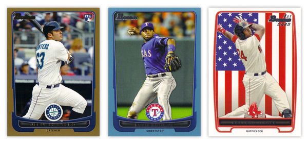
Just like every other Topps product, this one comes with lots of parallels. Gold, blue, red, orange, green, blue, international, blue, red ice, silver ice, Dentyne ice, blue. I think the flags on the international is kinda neat. The silver and red ice versions are basically just atomic refractors. Really, they have at least twice as many parallels as they should, if not more. But in honor of the Preakness today, I'll refrain from beating that dead horse.
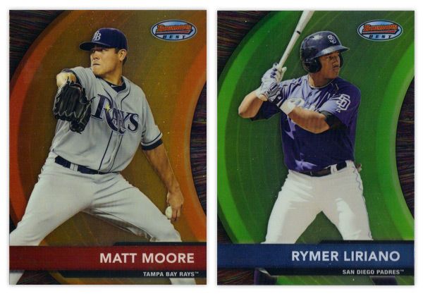
Finishing up here is this year's edition of the Bowman's Best insert. Again, they have the red version for veterans and blue for prospects. There are also die-cut versions, which have all kinds of crazy refractor parallels themselves. Design-wise, I like the different textures on the swoosh and the background. Along with the type and name bar, I appreciate the simplicity of the design.
Overall, I think there's some pretty good, modern design here even if it's not completely "Bowman."
Base cards: 4.25/5
Parallels: 3.5/5
Prospects: 4.25/5
Inserts: 4/5
OVERALL: 4/5


No comments:
Post a Comment