
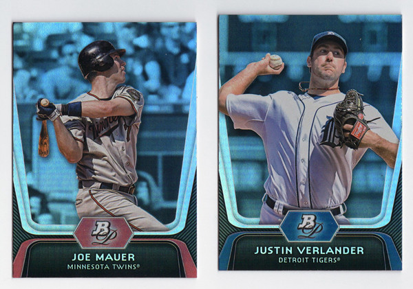
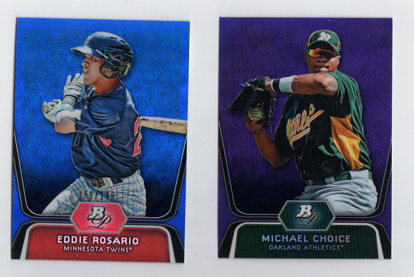
Starting off with the base design, with a note that these look less blue in real life (sad scanner I guess.) They kept the super shiny refractor-y foil board for another year. I like it well enough, though it doesn't have the same impact as last year's did. I'm sure the returns will diminish if they go the same route next year. The design itself is rather futuristic and minimalistic. No team logo (name only), no player position. The Bowman Platinum logo only shows up as a monogram. I think it works for this as a way to differentiate it from the regular Bowman set. The feel is pretty similar but this comes across a little more 'upscale' I suppose.
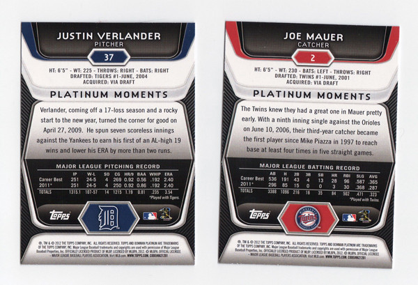
On the back, we get the same glossy-techy elements as the front but with a little more information. I don't necessarily advocate for full-career stats on the back of every base card, but surely someone should have noticed how squirrely it is to have Verlander's 2011 season stats on their twice.
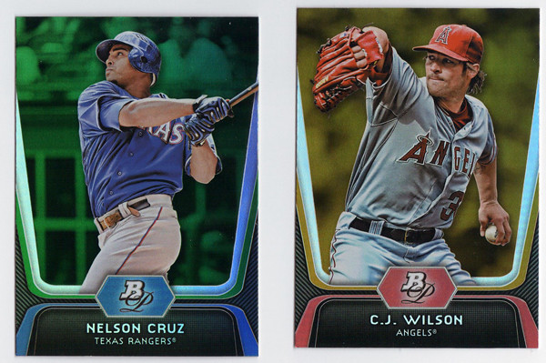
There are green, gold, and ruby parallels again this year with the golds being, once again, the hardest to differentiate from the regular base cards. I'm a little partial to green, but damn if they don't stand out the best.
Since Topps has gone die-cut crazy this year, we have a die-cut insert in Bowman Platinum as well.
These are called Cutting Edge Stars. They look nice enough, keeping with the same design elements as the other cards in the set, except for that huge TV-looking shape in the middle. That paired with those movie ticket things cut out at the top make this insert look oddly kitschy. It's strange how off these look from the rest of the set even though they used the same basic elements.

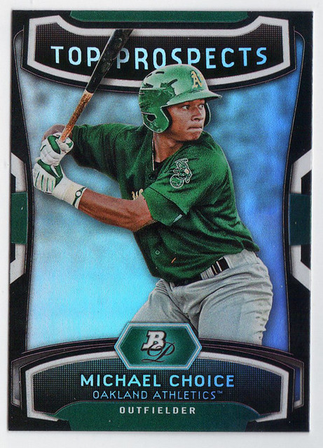
Now onto Bowman's bread and butter—prospects. These were really frustrating to pull out of the pack. First off, the design is exactly the same as the regular base only the negative spaces on the left and right edges are white with dark stripes instead of dark with light gray stripes. The background seem to be feathered out even more on these, probably due to some of the less-than-flattering spring training settings of these photos. And to clarify, the cards in this scan are left-to-right an x-fractor, regular refractor and regular 'base' prospect. The x-fractors are the easiest to make out, but the differences between the refractor and the 'base' take some investigation. The refractors has this rectangular stone-like background, which would be easier to notice if it went to the edges. I say, if you're going to make the base look refractor-y then DO AWAY WITH A REFRACTOR PARALLEL. It's not like they don't have others to fall back on.
Like these blue and purple ones, and also gold. Why they can't just pick an additional color is beyond me.
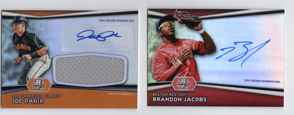
And since I had some to scan, here are a couple of prospect autos. These actually look pretty good, due in large part to the team color bands along the bottom. I think that's what I'm missing from just about every other card in the release. They're throwing all these refractor patches and neutral grays and blacks on there and it kind of drains the life from the card.
Overall, I think these are nice cards that could be better but probably could be a lot worse. My main takeaway is that this looks like it was an option for the 2011 Bowman Platinum release that they just put in their back pocket for this year. In a way, that's pretty much every release from Topps these days I guess. Maybe it's a practical decision from a production standpoint, which I could understand. Then again, part of me thinks it's time to either evolve a bit or just completely blow things up and start anew.
Base cards: 4.5/5
Parallels: 3.25/5
Prospects: 3.25/5
Inserts: 3/5
OVERALL: 3.5/5
No comments:
Post a Comment