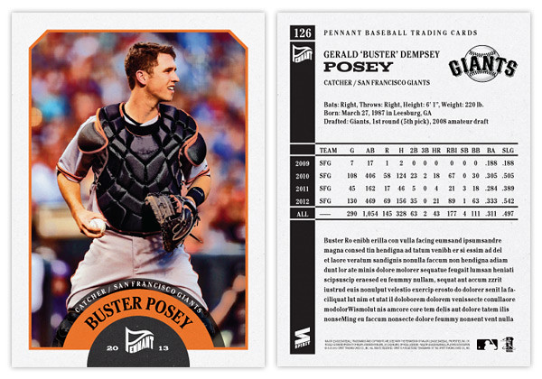
Even though there are a handful of amazing pennant/wild card races still going, apparently it's already time to look ahead to 2013 releases. Instead of starting with the Spirit 'flagship' again, I thought the Pennant line would be a good introduction to 2013.
The design is a lot simpler than what I did for last year's version. Since these designs are revisiting specific releases from the past like Heritage or Goudey or 206 do, I thought I'd turn the clock ahead a little bit, closer to something around the '60s or so. We start with an off-white border with beveled edges at the top and a team-color stroke around the frame. At the bottom, there's a half-circle team-color tab to house the Pennant logo. Then extending from that tab is another team-color tab creeping into the picture. The player name (typeset in Cheltenham Condensed Bold) arches around the tab. Moving further, there's a smaller team-color tab multiplied over the photo and housing the team name and player position. The photos have a little bit of grain and aged added to them but nothing too drastic. Altogether, it kind of resembles bunting you'd see on opening day or during the playoffs.
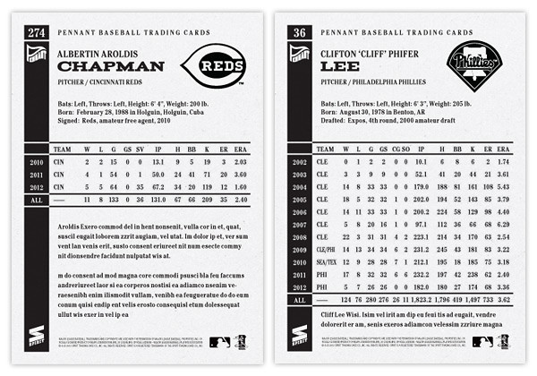
The back side of the card is one-color black and packed with a lot more information than the previous year. We have the player name and background info at the top with room for a black & white team logo. Below, we have the complete career statistics. For those whose careers don't fill the entire space, we have room for a few lines of highlights and/or other information.
I may be a tad impartial, but I think this design has the potential to be timeless. Replace the Pennant logo with a Topps logo, print the name in silver foil and you could have the 2014 Topps flagship design. Or remove the border and airbrush the photos, you could have Upper Deck's next baseball offering. It's definitely and upgrade from what I did for the 2012 version of Pennant. Here's to hoping the rest of my 2013 designs can make the same claim.


No comments:
Post a Comment