Thursday, August 18, 2016
2016 Spirit Team MVP
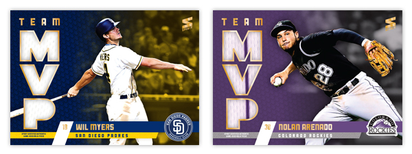
One of the first inserts I created was the 2012 Spirit Team MVP set, featuring the best player from every club that included a relic swatch in every single card. Here's the 2016 version which follows the footsteps of the original entry 4 years ago. Design-wise, this is an extension of the 2016 Spirit base design, much like the 2012 version mirrored the base set as well.
The team color bars come in from opposite sides to house the player and team names with the logo tucked in the corner. Big block MVP letters on the left are filled with the relic swatch, leaving a big chunk of card real estate for the player image. The background fades from a tech-y looking texture to some background stadium action, both parts washed in a gradient from one team color to the other.
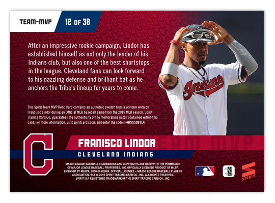
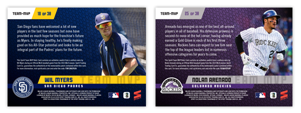
On the back, the elements shift a little bit as the logo moves from the right side to the left and the MVP letters take a hike to make room for a brief write up. The player photos are a little more candid/casual instead of action shots like the front.
I really like the balance of these cards, which are probably the best looking of all four Team MVP designs over the years. Let's see if I have any other ideas for the MVP-relic box next year.
Labels:
2016 spirit,
arenado,
francisco lindor,
insert,
relic,
team mvp,
wil myers
Subscribe to:
Post Comments (Atom)


Man, these are great looking cards!
ReplyDeleteThese look so great!
ReplyDeleteThanks!
Delete