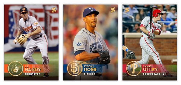
Now that the frenzy over the 2015 Topps release has subsided a bit, it's time for my formal unveiling of the 2015 Spirit base design. If you follow me on Instagram, you've already seen a card for each of the 30 teams. I'll post them here again as well as a general overview of the design.
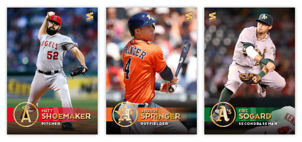
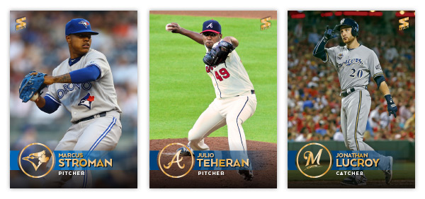
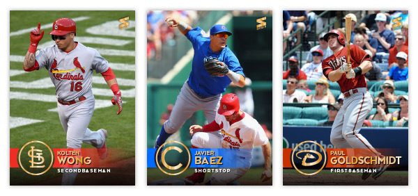
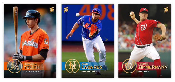
Once again, the cards are borderless with photos bleeding to the edge. I decided to change it up a bit this year and went with simple team hat logos stamped in gold foil instead of the traditional full-color primary logos. Having the photograph show through behind the circle is a nice way to keep things from getting claustrophobic. The team color bar stretches from the left edge across the logo and starts fading out as it moves across the card to the right. I made these cards before the Topps set came out and everyone (myself included) went gaga over the non-foiled names. Fortunately, I think there's enough color contrast here that they'd still be pretty readable in-hand. The positions listed below in white are definitely readable since I added a bit of a dark gradient coming up from the bottom to keep the backgrounds from being too light and unreadable. I also decided to add my own little 'rookie card' designation here on the Castillo card. Not too different from Topps' huh?
Here's a rundown of the remaining 27 teams:
As much as I liked making 900 base cards last year, I figured paring it down to 30 here would be adventurous enough.
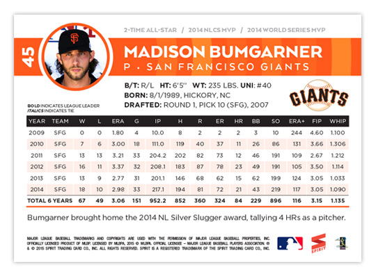
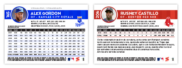
I'm really excited about the card backs. The design elements from the front move over seamlessly with a player mugshot in place for the hat logo. The color bar doesn't fade out here and stays as a nice bold contrast to all the white. Between the bar and the stat box is just enough room for the bio and the primary team logo. The stat box itself is really readable with a hint of color separating each year. I love the card numbers just to the left of the photo. They're bold and readable and having them rotated 90° makes it unbelievable easy to scan through as the sit in those cardboard boxes.
Another cool thing on the back is an accolades line just above the color bar. It's easier to read on Bumgarner's up there but you can see it on the Gordon card as well. Depending on what the player has accomplished, there's room for a few noteworthy details like number of all-star appearances, Gold Gloves or, I dunno, World Series MVPs. They're subtle enough that it doesn't stick out like a sore thumb if a guy doesn't have anything listed, like the rookie Castillo.
I'm geared up for the 2015 season and the extra time I'll have with new designs instead of devoting hours and hours on some poorly-thought-out 900 base card project. In fact, I already have two inserts designed and queued up for posting. Hopefully this summer will be a lot more active for the ol' blog. I hope you keep checking in. Thanks.





Great looking design, I am a fan!
ReplyDeleteWow, these are fantastic. Love the design elements as well as the photo choices. Great all around.
ReplyDeleteI would so buy these.
ReplyDeleteVery thouughtful blog
ReplyDelete