Thursday, June 6, 2013
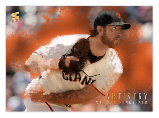
2013 Spirit Artistry
One of the earlier inserts from last year was Artistry, which focused on some of the top pitchers in the majors. I decided to revisit it this year with a different technique. Where the previous design was basically a filter-y and layered photo composite, I spent quite a bit more time this go 'round.
I did begin with a photo once again, only this time it was mostly for reference and not manipulation. I spent hours in Photoshop, layering different brushes to build up colors into objects. Basically, it was just like I was creating an oil painting, only with a mouse instead of actual brushes and paint. Different grungy and abstract brushes helped keep things looking organic and a bit impressionistic. You can tell it more on the Bumgarner below than the Rivera above.
Once I had the painting where I liked it, I took the original photo and laid it over the painting. Using some of those artistic brushes, I masked out parts of the photo to let the underpainting show through. Overall, it gives it that half photo/half paint look. I'm pretty happy with how they turned out. That's why the gold foil text is so minimal and unimposing.
On the back, I kind of replicated last year's picture frame idea but went with a more ornate frame that you'd likely see on some 19th century Impressionist paintings.
This is by far the most labor-intensive concept I've done to this point. It was pretty fun to click back and forth between the photo and painting and bask in my progress. I do wish I had gone with a non-pinstriped player in Rivera's place. THAT was a pain, let me tell ya.
Subscribe to:
Post Comments (Atom)


This looks great!
ReplyDelete