Wednesday, July 18, 2012
THIS IS THE REMIX: 1981 Topps
As per Johnny's request on the last Remix post, installment number 2 is 1981 Topps.
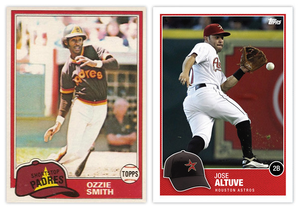
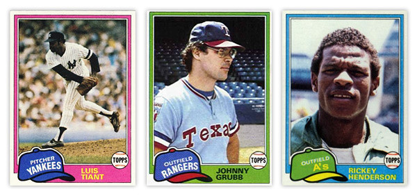
From what I've seen online, the 1981 Topps set is held in somewhat high regard. If I were to wager a guess as to why that's so after 30 years later, I'd say it's probably that floppy old hat. Personally, I think it's a little hokey but I can understand why others find it so endearing. My biggest issue is probably the team name runs arched right at the bottom while the position is on a straight diagonal right on top of it, leaving that negative space above it like it weighs a ton.
I'll give Topps credit for having the hats in the appropriate team colors even though sometimes they really clash with the border color. The Johnny Grubb above is a perfect example.
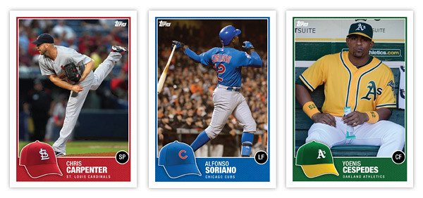
So my first order of business was bringing the hat concept into the 21st century. Instead of cartoony drawings, we have actual photographs of the actual hats. With all the alternate hats that teams wear these days, there might an issue of the logo hat being different than what the player is wearing on the photo (Altuve, Carpenter) but that doesn't really bother me. Just a reflection of current uniform trends.
Since the hat is now the official team hat, I had to find a place for the position. Some have mentioned how the Topps logo inside the baseball was kind of an odd logo treatment on the original. And since Topps' logo is different now and has a lot more flexibility, I figure that was a perfect home for the position markers. The circle is just a black circle since having a ball AND a hat is kind of overkill.
The names are in white on a team-color border so they're nice and legible. I tucked the team name smaller beneath just in case someone new to the game doesn't quite have the team logos down. All in all, the composition is pretty similar with just a few tweaks and updates made to freshen up the design, so good remix.
Be sure and let me know what other sets are begging to be remixed.
Subscribe to:
Post Comments (Atom)


The incorrect hat is THE reason I hate 1981 Topps. If they had done it your way, BINGO! I love it!
ReplyDeleteNice job!
One of my favorites has always been 83 Topps, would like to see what you can do with that. Or with one of the blandest, 86 Topps.
ReplyDeleteI really like what you did with this challenge. You fixed the two main issues I had, the color scheme and the Topps logo. It looks great. The only minor issue would be the team name placement (well that and you didn't make a Rockies card lol). Perhaps even moving the team name to the back in order to teach those new people the logos. It worked for me with 1987 Topps.
ReplyDeleteHoly F, I've always hated this set, now it looks fantastic. You sir are the Jedi Master of Card Design.
ReplyDelete