Sunday, February 24, 2013
REVIEW: 2013 Topps Series 1
The 2013 season hasn't officially begun yet but the commemorative start happened a few weeks ago with the release of Topps Series 1. Ok, I know I'm really late on this one but better late than never. Anyway, here are my thoughts on the design-related parts of the set.
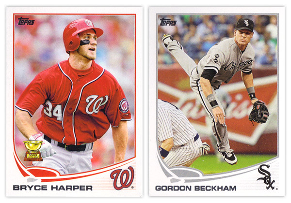
Starting off, the base card design is a nice step up from 2012's. They went with the clean white border once again, but this year it curves up past a rectangle on the bottom segment. This make the silver foil name easy to read (unlike year's past) regardless of how the light hits it. The most prominent design feature is the abstracted baseball diamond above the name. This adds the biggest pop of team color to the card but is a little whimsical for my tastes. The homeplate lingers a little to close to the name and the curves of the baselines are a little too exaggerated and unnatural. In the bottom right corner is the team cap logo. This is a good anchor for the corner even though the faded lines beneath it can be a little distracting. One thing I do miss seeing is the player position. I could easily see them finding space for this bit of info either in the white space on the left between the name and baseline or in the field shape itself.
The back of the card uses the same field and curve elements so it's a pretty good match for the front. The diamond graphic in the corner leaves room for the number which is in the correct corner again this year after being on the wrong side in 2012. The stats and player write-up look good and are easy to read. The faded lines in the bottom right corner are again unnecessary, this team creeping up into the stat box. The other item of note is the Career Chase line just below the player vitals. This is a neat little extra with some of the listings a little tongue-in-cheek but other still relevant. And I'm sure you've all heard about the whole Pete Rose thing by now. Anyway, I like the Career Chase inclusion here since it fits into the theme they have running through the whole flagship this year.
Now on to the parallels. Once again with have the standard golds serial numbered to the year (/2013) and a sparkly parallel, though this year it's green (emerald). Green has always been one of my favorite colors so I really like them. There are also the black parallels again this year along with 2 new ones: camo and pink. The camos are numbered to 99 and the pinks are to 50. Both seem to be pretty rare finds. Another thing they have in common is I guess they're supposed to be in support of something (military and breast cancer awareness). I really don't know the point of that since it's not like their inclusion somehow make a contribution to those respective causes. There's no DAV or Yellow Ribbon Fund logo on the camos and nothing about Susan G. Komen or similar entities on the pinks. In a way, I find it a little bit exploitative of Topps to do these particular parallels. And to top it off, they're actually pretty ugly to look at.
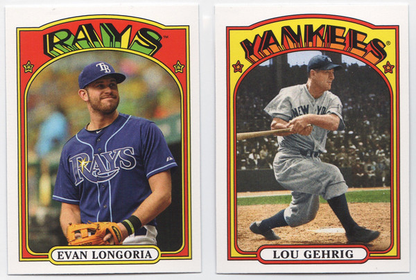
We've got more random minis this year with the 1972 design. Regardless of what you think of the 1972 design, let me say this: Topps, please stop releasing new cards with old design in anything other than Heritage. It's getting really old and you're watering down these designs. You have the Heritage line to celebrate your past so please stop injecting it into the flagship. Stop.
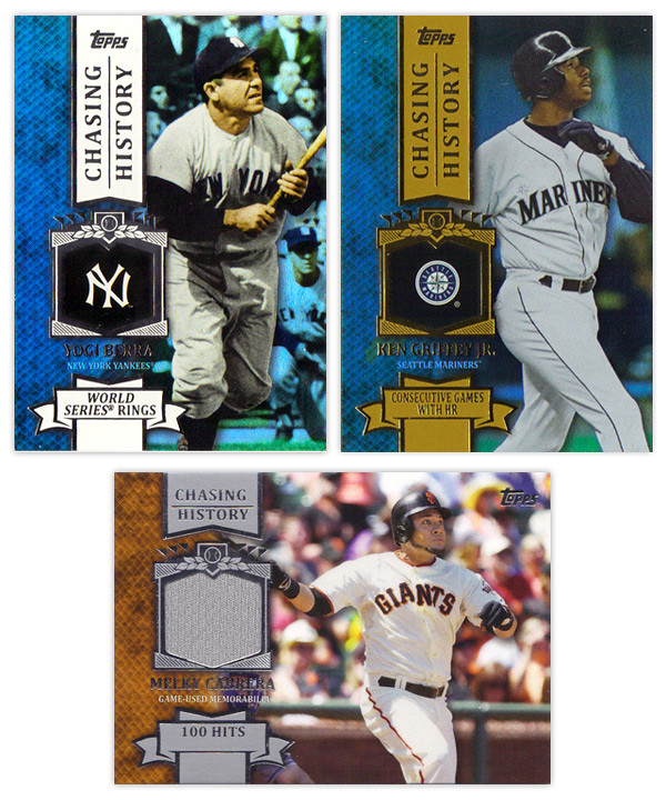
Just as last year, the inserts all follow a similar theme. The gold thing didn't have the flexibility last year that the chase seems to have this year. The big one is Chasing History, which is basically the same as last year's Golden Moments, 2011's Topps 60, and 2010's Peak Performance. The design here is a big step up from the previous efforts. They have to design these in a way they can insert the relics without changing up anything else. The holding frame for the logos kind of look like a medal hanging from a ribbon on the vertical cards. On the left is a team color knit design with an action shot on the right. It's a good balance on the horizontal cards but there seems to be too much space on the left of the vertical cards. The fonts and everything are pretty standard but do look really nice here. And in case you didn't think Topps was parallel-crazy enough already, we now have standard, non-numbered insert parallels. The Yogi card is a holofoil parallel with the team color spot on the left and the background. It's kind of shimmery like Bowman Platinum cards are. Then to top it off, there are retail-only gold parallels (Griffey). These are exactly the same but with gold foil on a gold ribbons instead of silver foil on a white ribbon.
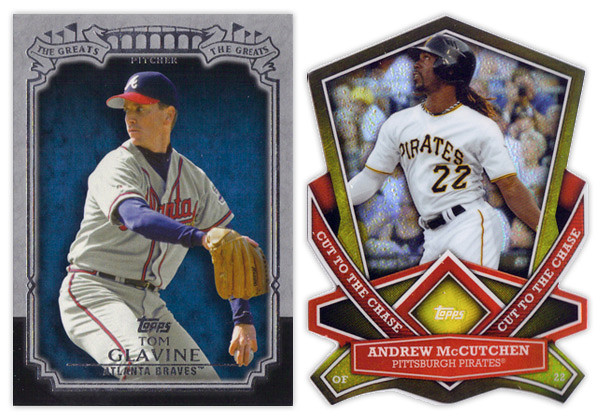
The nicest looking insert from Series 1 is The Greats. The design is actually understated with the gray and black border and some restrained foil embellishment. My only complaint would be the it seems a little top-heavy but that's a minor quibble. On the other side of that coin is the Cut to the Chase die-cut insert. These are incredibly busy with all of the weird cuts and shapes. They're also very similar to the die-cuts we've been seeing lately in the Bowman Chrome, Topps Chrome and Finest sets. I hate how not a single corner is rectangular as it makes it hard to get into holders sometimes. Bottom line, not a fan.
Chasing the Dream is this year's answer to the Gold Futures insert from last year. I like that the design featuring players of the future is decidedly more modern looking than the rest of the inserts. They're nice and colorful without any negative attributes. And finishing up is the Calling Card insert. These look to be about 4 years late in regards to design trends. I'm not really sure how the motif correlates to the subject, player trademarks or routines. The colors are pretty bland and the skinny border on the right side catches me every time. It looks like it's mis-cut.
Wrapping up, this year looks to be an improvement over 2012 across the board. The complaints have more to do with how Topps constructs a set than design decisions. There could be some tweaks here and there but for the most part it's a solid offering.
Base cards: 4/5
Photography: 4/5
Parallels: 3.5/5
'72 Minis: 3/5
Chasing History: 4.5/5
The Greats: 4.5/5
Cut to the Chase: 2.5/5
Chasing the Dream: 4.5/5
Calling Cards: 3.5/5
OVERALL: 3.7/5
Subscribe to:
Comments (Atom)


