
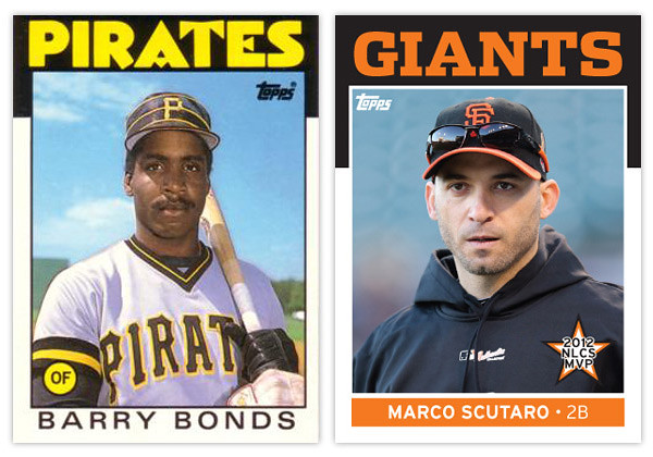
As per Rod's request, here's my stab at remixing the 1986 Topps design. And since this is my first chance to brag a bit about the Giants' World Series victory, I figured I'd feature some of the standout players from the 4 teams that made it to the LCSs this season.

The rest of the design is refreshingly simple. The black border extends down the edges just a little bit more before giving way to the white border around the rest of the photo. At the bottom, the player name is set in all caps and loosely spaced to fill up the horizontal real estate. The last element is the player position tucked inside a colored circle tucked into the bottom left corner of the photo.
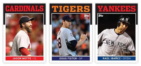
Next up is the player name found at the bottom. I wanted to add a little more color to the design so I made a rectangle at the bottom of the photo to house the player name. There's also room in there for the player position so it isn't hanging out by itself in the corner like before. There are also some minor tweaks to the border widths to help with the centering issues that plague the 1986 set.
This is probably the most subtle of my remixes so far but that's partly due to the success and simplicity of the original design. The biggest change is definitely the font up top, the most iconic feature of almost any card design from the 80s. So what's up next?
Love the design...bring on the relics/autos!!!
ReplyDelete