

Hello to all out there in blogland. As you can tell things have slowed down a bit here with the off season in full swing. Baseball has been so far from my mind that I even overlooked my one year blogiversary. Oh well. I've got a few things planned for upcoming posts but don't expect the pace to really pick up until late January or so. In the meantime, here's a look at the 2013 edition of the Award Winners insert set.
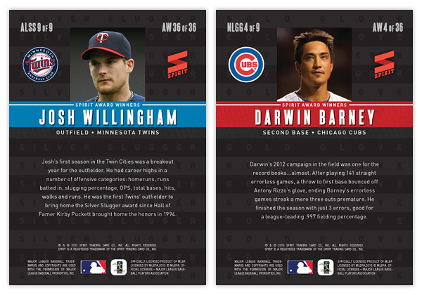
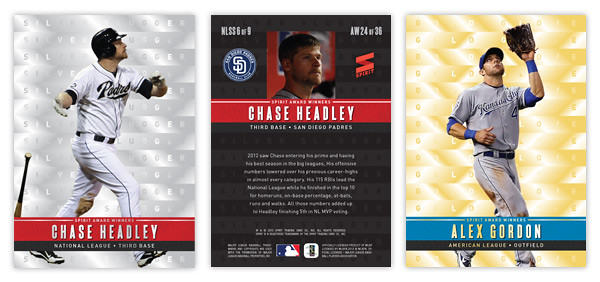
For those that remember, I did this set last year with a similar set up: 9 AL Silver Sluggers, 9 NL Silver Sluggers, 9 AL Gold Gloves and 9 NL Gold Gloves for a total of 36-cards. The main distinguishing factor is the Silver Sluggers are bright and shiny silver and the Gold Gloves are bright and shiny gold. Horizontal stacks of each color are found in the background with the respective award names lined inside. These would have a kind of x-fractor feel with a smooth surface but the light refracting in different ways to make out the letters and such. The next layer features a player cutout (sluggers slugging and glovers gloving) with a colored band in the foreground to house the name and award info. Again, the AL guys have a blue bar with red found on the NL ones.
My synesthesia is acting up again.
ReplyDeleteThe AL bars should be RED and the NL bars should be BLUE.
(Context: http://nightowlcards.blogspot.com/2009/04/color-inside-my-head.html)
I questioned that myself but apparently went with the same colors on last year's so I figured I had to be consistent. I do wish it was a little more clear cut like the AFC/NFC thing is in football.
DeleteYou know me, I'm lovin' the Twins love.
ReplyDelete