Last year I decided to copy Topps and made my own all-rookie squad. So here I am pulling another page outta Topps' playbook and recycling the same idea again with just a new design. But really, though, I think it's a sound decision to have an insert devoted to the previous year's rookies. Keeping with the whole "team" format can prove to be difficult, though, as you'll see from the checklist below.
1B: Jose Abreu
2B: Kolten Wong
SS: Danny Santana
3B: Nick Castellanos
OF: Billy Hamilton
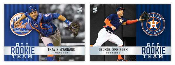
OF: George Springer
OF: Ender Inciarte
C: Travis d’Arnaud
LHP: Roenis Elias
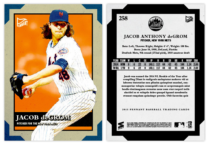
RHP: Jacob deGrom
RP: Dellin Betances
M: Matt Williams
There a no-brainers like Abreu and Hamilton, but sometimes there just isn't a stand out in one particular position. OR you have the inverse with way too many guys competing for one spot. The left-handed and right-handed pitcher situation up there is a perfect example. Last year's best newcomers on the mound were almost all righties. That means a southpaw like Roenis Elias makes the checklist while guys like Masahiro Tanaka, Marcus Stroman and Matt Shoemaker don't. Maybe I'll rectify that next year. Anyway, let's look at the design.
We're going horizontal again. There seems to be more room for the action shots this year with a sliver of the background staying on the card instead of them being complete cutouts. There are big team logos again just a layer behind the players with a subtle stripe motif behind them. A big silver foil band stretches across the bottom with the 'ALL ROOKIE TEAM' "logo" revealing some of the stripes from below. Player names & positions are in black on the foil bar so hopefully they're readable in most light.
Oh yeah, here's the autograph parallel version. Same design but with a white fade coming from beneath and the certification text below the bar.
The back mimics the front but with the bar moving to the top and turning white. The only issue with this choice would be finding photos with enough open space up top as to not have the 'ALL ROOKIE TEAM' thing overlap a guy's dome. I lucked out with Hamilton here.
Overall I think these fit in with the rest of the 2015 Spirit designs thus far. Colorful without being too ornate and utilizing negative space in some capacity. I'd like to say that's on purpose but it's probably just a happy accident.


