
This post comes thanks to a suggestion by way of Kyle from Juuust A Bit Outside. He challenged me to put together a design tackling the same restrictions as Panini and Upper Deck face regarding baseball cards. Without a license from MLBA, they're not allowed to have any depictions of MLB logos on their cards. Even with a licensing agreement with MLBPA, the players themselves can be featured without any problems, but any type of MLB franchise logo has to go. That means either some less-than-exciting airbrushing or some less-than-exciting wardrobe choices.
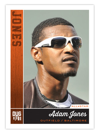
Rather than go to the trouble of making the unnatural seem natural, I thought the best method to work around this restriction is to use photos of the players before/during/after the actual games where they happen to not be wearing a hat or helmet bearing a team logo. The most frequent setting for such a photo is the dugout. In between at-bats or after climbing off the pitcher's mound, you'll find a lot of players letting their hair down so to speak.
So that's how the Dugout line was birthed. With these on-field or 'in-the-dugout' portraits, you still feel some attachment to the diamond and these guys a players. It's not too far off from the bat-on-shoulder portraits we see from 40-50 years ago. If anything, they're more candid.

As for the design, we've got the team color boxes to the left and below the photo. The one on the left has a wood/bat texture with the player's last name branded into it. Below is the full player name in a baseball-y script with position and team underneath. It kinda sucks you have to go with the team city instead of team name but oh well.
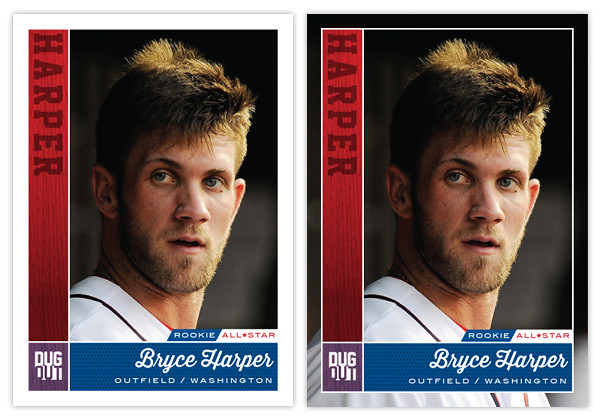
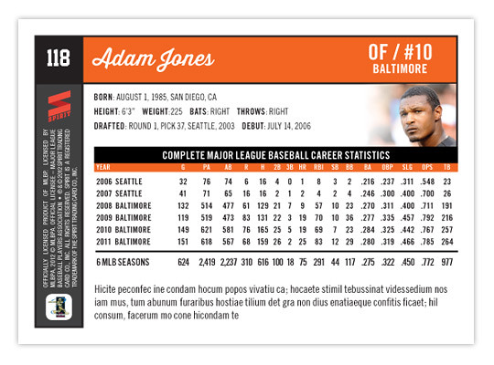
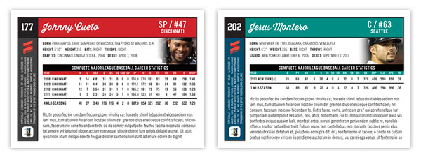
Just above the stat block, we get an additional player portrait. Though small, this location helps keep them de-logo-fied. And below the stat box is plenty of room for a brief writeup about the card subject. Things are pretty clear and orderly. The front and back really match up for a cohesive design.
Though this started out as a set to get around the logo restrictions, I think it would actually be a good concept if Topps were to grab onto it and add some logos. As thrilling as it can be to see some outstanding on-field photography of players doing amazingly athletic things, a set like this that focused on catching players in those candid moments would be refreshing. The more connected a collector feels to the players depicted on these cardboard creations, the better for baseball.
As usual, great stuff, my friend!
ReplyDeleteThanks, man.
DeleteMission accomplished! Good work!
ReplyDeleteI especially love the new parallel idea!
Thanks! I guess it's a bit like the old Stadium Club Artist's Proofs but a little more practical.
DeleteThe parallel is really cool.
ReplyDeleteAlso like the parallel. This is sort of like a candid camera Studio set.
ReplyDelete