
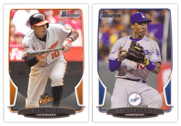
The biggest takeaway from the 2012 Bowman design was how it was a big departure from what Bowman had been putting out for many years past. As we review the 2013 version, it looks like that big year-to-year jump was merely aberration and not a new gameplan heading forward. Just like the 2012 version, this year we have white borders, not-quite rectangular frames in team colors, silver foil names, subtle drop shadows around the players, team logos centered above the name block. Honestly, you could be looking at last year's cards while reading that description and it would be 100% accurate. About the only distinguishing features here are the little tabs folding in on the left and right sides and the soft white overlay to finish out that curve. If we didn't have 2012 to compare this to, I'd really like the base design here. But as a follow up, it looks more like a rehash and suffers a bit.
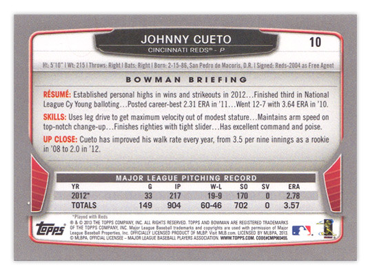
For the backside, the similarities are even more....similar. The layout is identical to 2012 with a little tinkering to fit this year's look. The colored tabs on the bottom and the black nameplate are pretty much where those embellishments are made. I mentioned a couple things on last year's review that I thought were easy improvements to make. I suggested that the last section of the Bowman Briefing be changed from EVOLUTION to UP CLOSE (like it is/was on the prospect cards.) I doubt that any eyeballs at Topps saw my recommendation but somehow it was magically changed for this year. My other suggestion, however, seems to have gone without notice. The card numbers are still in the upper right corner, which means if you store these upright in a cardboard box, the numbers won't be visible. So once I again, I propose this amendment to the Baseball Card Constitution: horizontal backs have to be numbered in the upper left corner to help for storage box sorting.

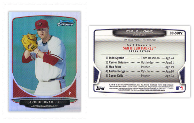
Now on to what is basically Bowman's reason to exist: prospect cards. For 2012, I preferred the veteran design to the prospect design but I'm flipping it around for this year. The prospect design is a lot easier to distinguish here thanks to the solid team-color wedges above the name. There are some subtle shape differences to the frame and nameplates that also help them stick out. The team logos are removed to help save space for the autographs (I assume.) That means the team names are found below the player name and the position is moved to the right color wedge.

Like every other Topps release, there are plenty of parallels again. Gold, blue, purple, orange, silver ice, etc., etc. The international cards are a little different this year. The flags have some texture to them so they aren't as glaringly obvious as prior years. Also, for American-born players, they have the flag of their home state up here instead of the Stars & Stripes. I'm all for anything that helps distinguish them from previous years.

The Top 100 Prospects cards are actually pretty nice. They have a smooth, cool finish to them with some silver, black and blue/red colors around the border. There appears to be a die-cut version as well but, as I've mentioned before, I'm not a big fan of random-shaped die-cuts. I do like how the numbers are nice and big to help drive home the fact that there is a list they're referencing. And keeping with the blue, we have Bowman reprints with blue refractor borders. I'm so tired of reprints that I can't even bother to say any more about them.
Finally, we've come to what's probably the worst development so far this collecting season. Topps has decided to introduce minis into the Bowman line. Their reasoning is obviously... who knows, but here they are. They're an odd size, they're chrome, they're refractory, they're prospect-ory. I wish somebody with power at Topps could exercise some willpower and stop spreading things across every release like this. It's really getting old.
Overall, I'd feel better about the 2013 release if it all weren't so simliar to 2012. The base and prospect designs look like comps that didn't get picked up last year or were just saved away for a future release. I understand keeping some things consistent but this comes across as a little too lazy.
Base cards: 7/10
Parallels: 6.5/10
Prospects: 8/10
Inserts: 6/10
Minis:4/10
OVERALL: 6.3/10
Pretty much spot on again, sir. Although, I'll take these designs over plain square borders any day--but that's just me. Also, these minis kinda irk me. They shouldn't, tho. Ya know... because I'm not collecting them. lol
ReplyDeleteOne thing I dislike is the placement of the team logo on some of the cards. It reminds me of the awful 1996 Donruss design in that the logo acts as a loin cloth (of sorts) on several cards that I have seen including HanRam above. Other than that, I am well aware that Bowman is not bought for the design but for the prospects anyway.
ReplyDelete