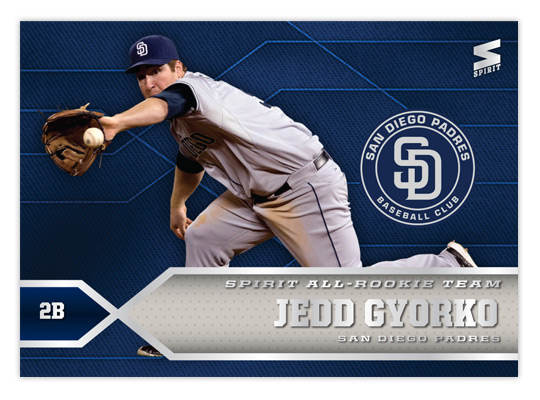
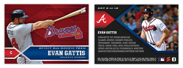
The 2013 rookie crop was one of the strongest in recent years. Here's an insert to feature the most accomplished player from each position. I know this basically sounds like Topps' Rookie Cup Team but I figured it'd make more sense to turn it into an insert set instead of padding the Series 1 base set. Before I go over the design, here's the checklist I put together:
1: Matt Adams (1B)
2: Jedd Gyorko (2B)
3: Jose Iglesias (SS)
4: Nolan Arenado (3B)
5: Yasiel Puig (OF)
6: Wil Myers (OF)
7: Khris Davis (OF)
8: Evan Gattis (C)
9: Tony Cingrani (LHP)
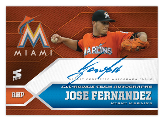
10: Jose Fernandez (RHP)
11: Danny Farquhar (RP)
12: Walt Weiss (M)
Some of the names are no-brainers but the rest are a good chance to shine a light on some players that might not get all the attention they deserve yet. Really, though, there are a lot of guys that deserve consideration that just couldn't overtake the guys that made the cut. Also, I threw in a manager spot just because you never know who's gonna be taking the reins for the first time. With so many former players becoming skippers, there's probably a good chance there'll be someone out there who collects them. Now onto the design.
The front continues the geometric motif that's been present in all the 2014 Spirit designs so far. The two team-color bars coming in from opposite edges house all of the player information as well as the set name. Behind the player cutout is a team-color fabric with shaded polygons to add some depth. The team logo fills whatever negative space is left from the cutout. On the back, the criss-cross tabs are enlarged and reoriented to house the player photo and team cap logo. Then there's a brief write-up in the remaining negative space.
Also, since rookie/young player autos are so highly sought-after, I figured it'd be a good place to through some ink into the mix. The design is the same with only the addition of another polygon made big and white for the player to sign. Fernandez's signature isn't as wide as most but hopefully the other guys would spread out to fill the space a bit more.
Monday, February 24, 2014
Wednesday, February 19, 2014
2014 Spirit Award Winners
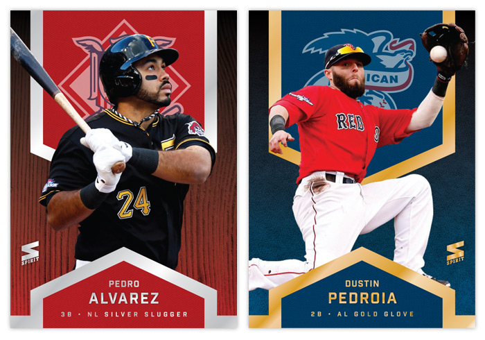
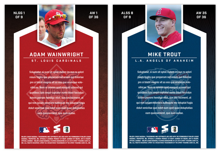
After hitting the halfway mark of the base set project, let's take a break and check in with some Series 1 inserts. For the third year in a row, the inaugural insert design is the Award Winners set. This year brings some familiar motifs along with some changes. We're still alternating between gold and silver foil for the Silver Slugger and Gold Glove winners, though I decided to subdue the blinginess a bit. Now there are just a few strips of foil instead of a huge shiny background.
The NL cards feature red again and the AL guys are blue. With this system, you can easily distinguish which award each player won just by glancing at the foil color and background. Just to be safe, I added another visual cue with the Gold Glovers having a leather background and the Sluggers a wooden bat. And to make things even more clear cut, the NL and AL logos are screened on upper fabric swatch thing.
The back of the card has the same elements from the front repeated, other than the foil of course. They actually look pretty similar to the 2012 ones I did, though the overall composition fits this design better.
Labels:
2014,
award winners,
concept,
design,
insert,
pedro alvarez,
pedroia,
trout,
wainwright
Thursday, February 6, 2014
REVIEW: 2014 Topps Series 1
Pitchers and catchers haven't reported yet but we can pretty much say baseball season has arrived as the first release of the year has made its way onto the shelves. Thanks to my wife bringing home a blaster for me the other night, I finally have some to scan and digest. Let's take a look at the 2014 Topps Series 1 design offerings.
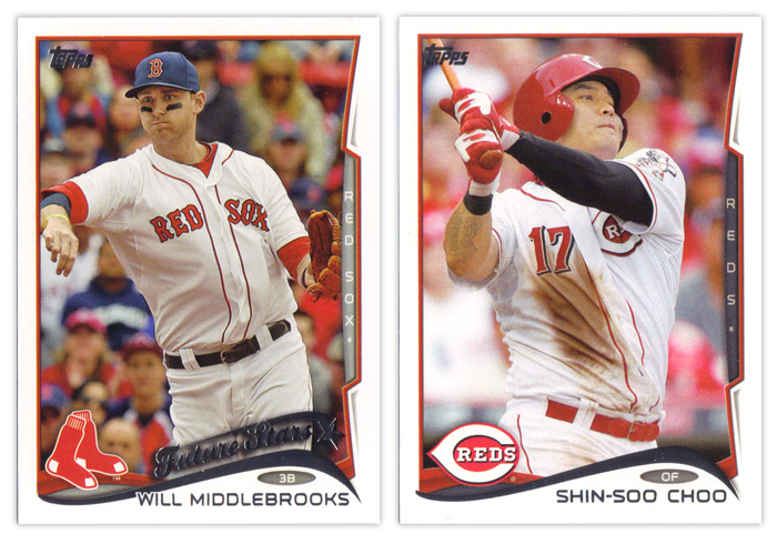
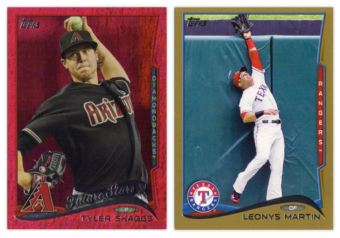
I've mentioned it before but I'll reiterate that I'm not a fan of the base design. The white borders are back. Even though I know it's only so Topps can go parallel-crazy like they always do, I don't have a problem with the white borders. When you move onto to basically every other design element, that's where the problems start to pop up. The biggest offender here is the foil wave at the bottom. Outside of Nike, swooshes need to leave the visual landscape. They've been overused for the last 5-10 years.
Even worse than the wave's existence is its execution. The tapering of the curves on each end are unbalanced. Plus the angles themselves are all wonky. Look at the Middlebrooks card above. His name is so long that it overlaps the foil wave since they didn't allow enough room for it to run across unfettered. Then squeezed between the name and the swoosh is a little oval to house the player position. I think it's nice that they included the position again this year but it looks sooo cramped between these two elements. Behind the foil wave is a team-color wave that's an extension of the photo border around the rest of card. It's a nice way to add some more color to the design but I think it could stand to stick out a bit more. On top of that is the team logo.
Another thing you'll notice on the Middlebrooks card is the return of the Future Stars designation. Others have chronicled its history from the 80s through 90s and I'm not that enthusiastic about seeing it back. For some reason, Topps has found it necessary to have a theme running across its flagship release for the past 3 or 4 years. This year they're really shoving the whole rookie/young player angle everywhere as you'll see in the inserts. I can't decide which irks me more: how stale it is or how much it's an obvious case of pandering. Anyway, as far as the Future Stars logo thing, I guess it's not too bad. It fits in with the rest of the design, though it's odd how the tail of the start actually indicates it's falling.
The element that seems to biggest target of most people's ire is the team name tab along the right side of the card. At first, I was like everyone else and hated it. But after seeing these cards more, I think it's actually a nice element. It's just completely out of place here with the rest of the card design and a little redundant. I think if they were to go back to the drawing board on this design, the tab would be the one thing I'd suggest they keep and work into the rest of the design.
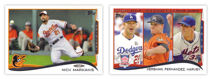
You can see on the horizontal cards that the tab doesn't encroach on the rest of the design as much and doesn't stick out in the same awkward way. There's also more space along the bottom for the player name with the wave stretched out more. It's a better overall shape, too.
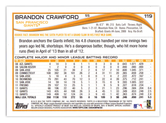
Taking a look at the back of the base cards, the format's basically the same as the last couple years have been. The card number in the upper right corner looks a little small and the player position looks like they forgot where to put it until the very last moments before going on press. About the only other things of note are the addition of WAR to the stat line (yay!) and the "Rookie Fact" tidbit (boo!).
There are plenty of parallels as usual. The sparkly color for this year is red. I guess since there are so many MLB teams with red in the color schemes they'll turn out okay. The red just seems a little dull to me. Gold cards are also back because of course. Not pictured are the standard red, blue and purples from Target, Walmart and Toys 'R' Us, mostly because there's only one of those three stores in town, but also because I'm sure you all know what they look like anyway.
The newest parallel wrinkle is the addition of two new retail-only colors. The lime green actually isn't as bad as I thought it'd be when I first saw them online but the yellow is as Fleer-tastic as you would imagine. Really not a pleasant couple of colors to feature so prominently on cards.
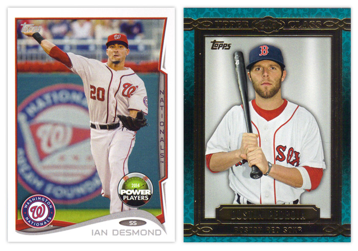
Now onto the inserts, though the Power Players cards are about half insert, half parallel. As you can see, the design is the same as the standard base cards, only the foil is just gray ink and there's a Power Players beach ball about to crest the hill. This is Topps' online component for the year. Without really knowing how the whole setup works yet, I will give them credit for at least making these somewhat collectible this year. Even after the code is redeemed, they'll still be desirable depending on the player depicted. They're less ubiquitous than the old Topps Town and Topps Attax code cards from years past, so that's another plus. The first true insert there on the right is Upper Class. This is probably the weakest insert so far this year. My first beef is with the name. I know they're nowhere near what they used to be but it seems foolish to plant even the tiniest clue to one of your competitor brands' names on your cards. I honestly have to stop myself from saying Upper Deck every time. I'm also not a fan of the design itself. The flourishes in the background are too pronounced, the colors range from teal to gray to brown without any sort of reasoning and the solid gray background is just way too plain. It makes the whole thing look rather generic. I guess the design is supposed to recall framed portraits lining a decorative wall but the drab backgrounds remove any ounce of 'class' that the rest of the design may impart. And as far as the checklist goes, pretty much every player ever is eligible to be included. Again, there's no rhyme or reason behind including anyone in particular. It's not something like the top 3 rookies from each class for the past 10 years or something like that. It's really a random crap shoot.
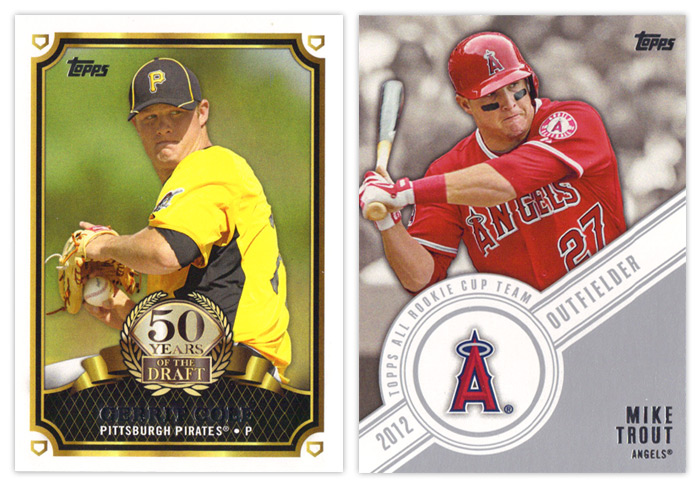
The 50 Years of the Draft insert is actually a pretty nice design. The frames are solid without being overdone, the logo part is well balanced and not too gawdy and the overall composition is nice. My only thoughts would be to make the fake gold on it actual gold foil and for the home plates in the corners to maybe be rotated so the points are all facing the corners instead of all being upright. The Topps All Rookie Cup Team design is also pretty solid but has one glaring issue. The angle of the banner should really be reduced so there's not as much wasted space above the player name. It would allow for more of the photo to be shown and not crowd the guy as much.
2012 Series 1 had a poorly conceived insert set called Golden Greats that featured multiple cards of the same handful of legends. Topps realized how bad an idea this was and stretched out the Series 2 checklist to feature 25 other guys a single time. I wonder if they'll follow the same script for Series 2 with the Future Is Now inserts here. They have multiple cards for 13 different players here, which happen to be some of the hobby's most desirable players. Funny how that happens. Design-wise, these look very similar to a Topps football Prolific Playmakers insert. You have the overlapping curves, the player cutouts over a dulled background. It's a nice looking design so I can't blame them for overusing it. I guess they've made enough alterations that the difference is noticeable. I do think they could do without the fake lens flare, though.
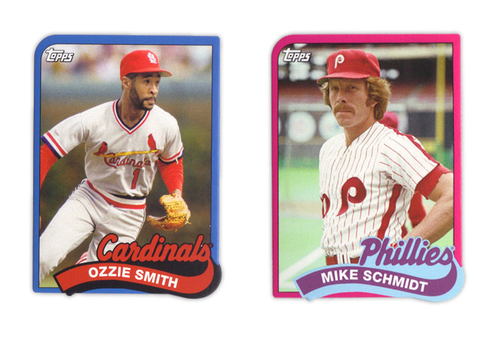
Making my blood boil are these 1989 Die-cut Minis. The 1989 Topps set was the first complete set I ever got so I'm already very protective. Somehow, Topps thought it was a good idea to cut off the margins and shrink these babies down. As I'm sure you can notice, the big issue with that is the fact that the name banner has a little notch at the bottom that hangs over the photo frame. Not only is that a problem for safely securing these while keeping the notches intact, it's just flat out ugly since the die isn't going to match up perfectly to the printing every time. That's also apparent on the bottom right corner as well. I've mentioned it before but I really hate die-cuts that don't have at least one standard corner and this is a perfect example of why. Then you add in the fact that they messed around with all the colors and the border thickness and these keep breaking my heart. Topps, please stop reusing old designs on anything other than Heritage. Please.
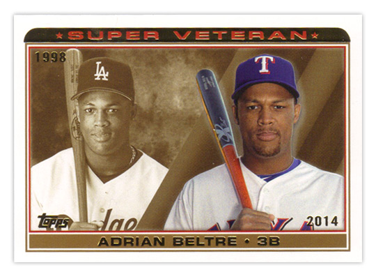
The last insert I have is the Super Veteran collection. Even though they look like a mature version of something from the 90s, I thin this is a nice simple design. Seeing how a player's looks have progressed from their rookie season to now is a kinda fun. The sepia background is nicely employed against a full-color current photo. I really have no complaints for this one.
Well that about wraps it up. I know there are more things out there than what I happened to pull in my couple retail purchases, but you can check last year's review if you wanna see my thoughts on the camo and pink parallels. I guess I'll boil this review down to what I like and what I don't like.
TLDR REVIEW
WHAT I LIKE:
• Horizontal design works less bad
• Addition of WAR stat
• Power Players cards are worth keeping
• 50 Years of the Draft design
• Topps All Rookie Cup Team design is good with a subtle change
• Future Is Now design
• Super Veteran design and execution
WHAT I DON'T LIKE:
• The Wave
• Player position egg
• Not holding free agents over until Series 2
• Green and yellow parallels (or most of them, really)
• Everything about the Upper Class insert
• Future Is Now concept
• Everything about the 89 Diecut Minis
• The gimmick of rookie/young player focus
Tuesday, February 4, 2014
2014 Spirit Base Series 1: 141-150
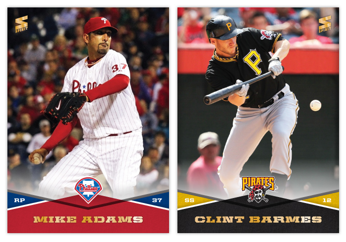
#141 - Mike Adams
I'm not super-pleased with this photo here. It's pretty grainy and dark but this was by far the best option amongst very few others.
#142 - Clint Barmes
I do believe this is the first bunting shot of the set. It's a pretty good one, too.
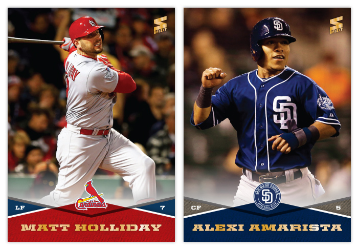
#143 - Matt Holliday
This would also make an easy Panini photo. Just airbrush the StL off his helmet and the World Series patch on his sleeve and you're good to go.
#144 - Alexi Amarista
Looking at this pic, the overwhelming thought going through my mind is "DE PLANE! DE PLANE!"
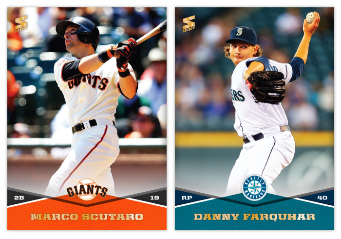
#145 - Marco Scutaro
Ah, good ol' Mallet Finger. It's weird to see the empty seats behind him at AT&T.
#146 - Danny Farquhar
Loved him in Shrek.
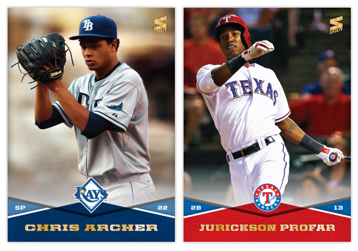
#147 - Chris Archer
If the background looks weird, it's because it's this.
#148 - Jurickson Profar
I'm still not buying into the hype, but I will say this is probably one of the best looking cards of the set thus far.
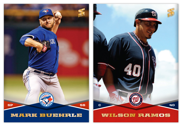
#149 - Mark Buehrle
There must be a really prolific photography in St. Petersburg because soooooo many of the images I flip through seem to have that huge red State Farm banner in the outfield. Either that or State Farm likes to smear its logo over every ballpark.
#150 - Wilson Ramos
Interesting angle here and some nice blue sky behind him.
Well, that brings us to the midway point of Series 1. Part of me is proud that I'm still going at this strong while another part of me is numbed by the fact I have so many cards left to make. I'll keep plowing ahead. But I do think this is a good point to take a break and maybe post something different for a bit. I was thinking about doing a design for the packaging. Maybe even an insert or two. Stay tuned.
Labels:
2014,
amarista,
archer,
barmes,
base,
buehrle,
concept,
design,
farquhar,
matt holliday,
mike adams,
profar,
scutaro,
spirit,
wilson ramos
Monday, February 3, 2014
2014 Spirit Base Series 1: 131-140
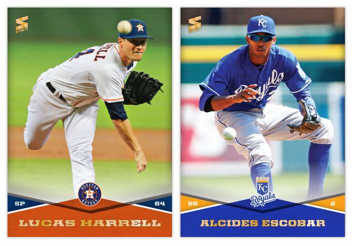
#131 - Lucas Harrell
This is a really good shot, filling the card and also keeping the ball in frame.
#132 - Alcides Escobar
Right out of the gates, I'd say the Royals are the team with the best looking cards so far. Maybe it's the colors or something.
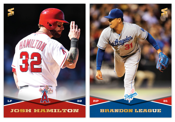
#133 - Josh Hamilton
This would be a great shot for a Panini release
#134 - Brandon League
That blue glove is kinda pretty.
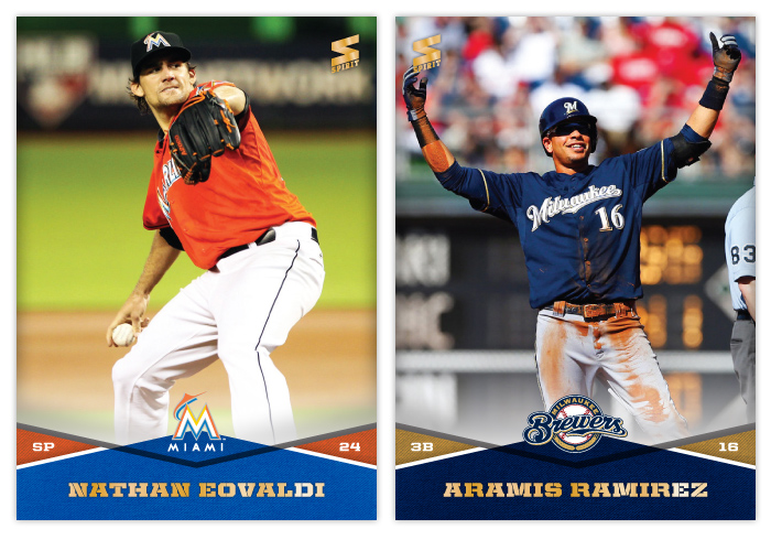
#135 - Nathan Eovaldi
There weren't a ton of options for Eovaldi.
#136 - Aramis Ramirez
I don't see a lot of Ramirez playing but I always had the impression he was very serious and gruff. So that make this picture pretty cool to dispel that notion. I wish the Spirit logo didn't have to cover up any of his hand, though.
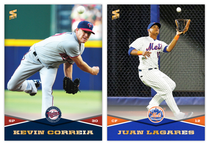
#137 - Kevin Correia
This is basically the same image as the Harrell card above just not quite as perfectly framed.
#138 - Juan Lagares
I really appreciate how quiet the fence is behind him here. There have been lots of really good photos I had to turn away just because they were plastered with some kind of inescapable corporate logo.
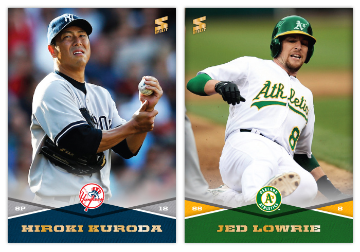
#139 - Hirko Kuroda
Great lighting on this shot. I also appreciate that you can tell he's a pitcher even though it doesn't show his windup or delivery.
#140 - Jed Lowrie
This is a nice, up close sliding shot that fits all of him in frame and shows his face. Probably one of the best so far.
Labels:
2014,
alcides escobar,
aramis,
base,
brandon league,
concept,
correia,
design,
eovaldi,
harrell,
josh hamilton,
kuroda,
lagares,
lowrie,
spirit
Saturday, February 1, 2014
2014 Spirit Base Series 1: 121-130
Before we get started on the next round of designs, I wanted to mention a group break coming up that I'm participating in that has plenty of open slots left for the taking. Chris at View From the Skybox is hosting it with all the proceeds going to support the Typhoon Haiyan relief efforts. It's for a good cause and with 19 hits from 11 boxes, so it looks to be a lot of fun. He's hoping to have half the slots filled by midnight Saturday so don't delay.
Okay, back to the Series 1 showcase...
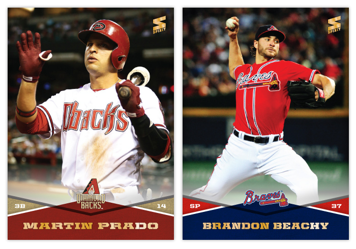
#121 - Martin Prado
I'm not sure what that thing on Prado's thumb is. Maybe a Funyun?
#122 - Brandon Beachy
Beachy didn't pitch a lot of games in 2013 so the photo options were limited. Luckily I found a pretty good one with their red alternates.
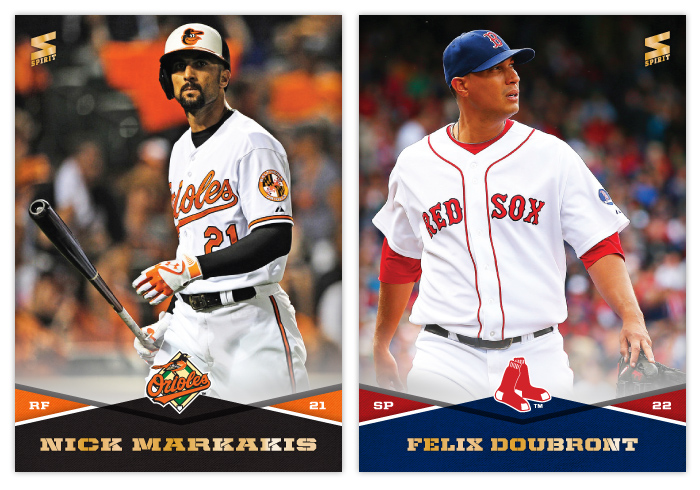
#123 - Nick Markakis
Hopefully Markakis is checking out the third base coach here and not sulking back to the dugout after whiffing. I'm trying my best to avoid strikeout shots.
#124 - Felix Doubront
The off-centering of Doubront is intentional here. Doesn't look weird I hope.
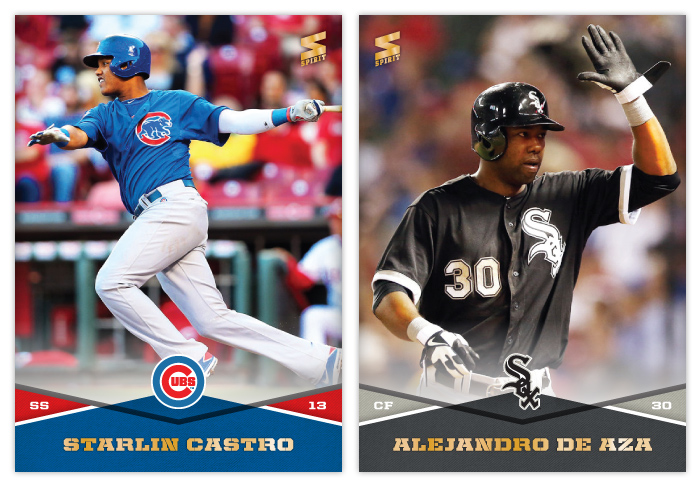
#125 - Starlin Castro
It seems weird that Castro is pretty much the Cubs' #1 guy even though he had a really horrible season in 2013. Hopefully it was just an aberration. Or at least have someone else really come to the forefront.
#126 - Alejandro De Aza
Probably one of the most fun MLB names to say out loud.
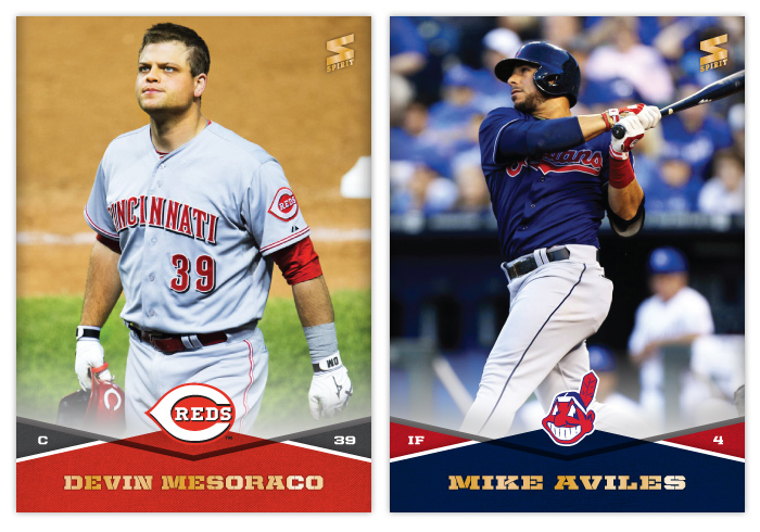
#127 - Devin Mesoraco
I never realized Mesoraco was sporting Ron Swanson/Nick Offerman eyes until now.
#128 - Mike Aviles
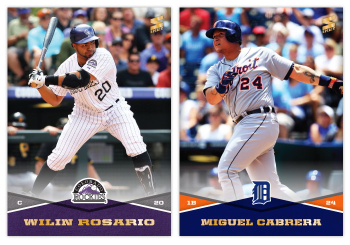
#129 - Wilin Rosario
#130 - Miguel Cabrera
It's fitting that these two would come in succession in the checklist since I knew for sure they'd both feature batting shots. I like that they're facing opposite directions even though they're both hitting righthanded. The swing and the follow through.
Labels:
2014,
aviles,
base,
beachy,
Castro,
concept,
de aza,
design,
doubront,
markakis,
mesoraco,
miguel cabrera,
prado,
spirit,
wilin rosario
Subscribe to:
Comments (Atom)

