

After I published my previous post, I noticed it was entry number 99. Which meant the following post would be my 100th of the blog. So instead of passing the milestone with another 2014 Spirit Base entry (which I'm sure you're all tired of by now), I decided to commemorate it with some relevant content. After searching for a subject that revolved around the number 100, I saw the list of active pitchers with 100 career wins was right around the 20-player mark, which is right in the sweet spot for insert if you ask me. Then once I came up with the punny name, it was a no-brainer.
Even though pitcher wins as a stat is losing its relevance, it's still a nice sign of a pitcher's longevity and effectiveness to be able to stick around the league long enough to pile up Ws. And taking a look at the checklist, you'll see a mix of top-of-line aces as well as some guys that probably don't get their due as effective starting pitchers.
1. Tim Hudson
2. CC Sabathia
3. Mark Buehrle
4. Bartolo Colon
5. A.J. Burnett
6. Cliff Lee
7. John Lackey
8. Bronson Arroyo
9. Justin Verlander
10. Josh Beckett
11. Dan Haren
12. Kyle Lohse
13. Jake Peavy
14. Jered Weaver
15. Aaron Harang
16. Felix Hernandez
17. Zack Greinke
18. Ervin Santana
19. Jon Lester
20. Adam Wainwright
21. James Shields

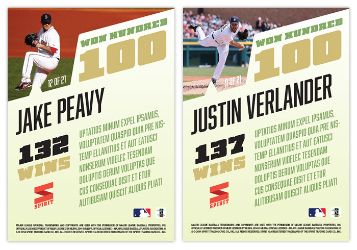
On the backside, there's an action photo filling the exaggerated W frame with the full 'Won Hundred' title and 100 unobscured to the right. With the name at an angle below, there's a brief write-up on the right along with a big bold wins total on the left.
Overall, the design is simple but with enough little details to keep it interested. I like the subdued color-palette as well as the asymmetry on both sides.
Thanks for taking the time to read any of the 100 posts I've made in the last 2+ years. Hopefully somewhere along the line I've done something to inspire you and whomever else may be out there in the card collecting/designing world. Let's see how the next 100 posts go.
sharp. simple. classy. Very nice insert set.
ReplyDeletealthough I have no clue what the back text says....
Thanks. The text on the back is Lorem Ipsum placeholder text (gibberish). It means "I'm a designer, not a writer."
DeleteInteresting color choices. I like the concept and design. The textures on the front don't do it for me.....but I think that's the first time ever with your cards.
ReplyDeleteCaptain Canuck......you aren't fluent in "custom-eeze"?
Great stuff. Congrats on 100 posts. I'm looking forward to the next 100 and more.
Cheers!
Thanks. You're by far the most active commenter ;)
Delete